ABSTRACT EXPRESSIONISM & ART POP – CLYFFORD STILL

Clyfford Still (1904-1980) was an American artist who made great contributions to the first generation of Abstract expressionism and large scale monochromatic painting. He made the shift into abstract painting from 1938-42 which is earlier than his colleagues who were still into representational painting. His works are categorized in the “color field” style. His approach in technique is to use thick layer of opaque paint and to depict rough forms to express aggression. There is no complicated psychological breakdown to what he does, he feels that art is simply the way of life.

PH – 1001 (1929)

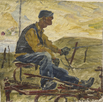
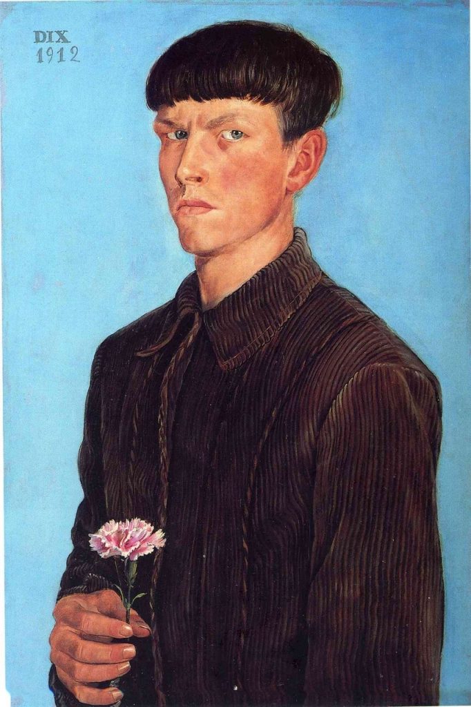
In his earlier figurative work he would often paint people and machines of farm life. I really like this painting and its sketchy style, the way he painted the fabric of the pants is loose but conveys texture. The profile of the man’s head is another aspect I like, especially how high the nose bridge is.

PD – 24 (1932)

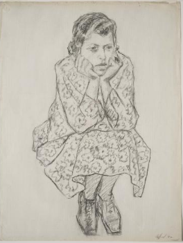
This is just a simple sketch but I find it interesting to compare his draftsmanship to his super simple abstract pieces. He has captured the subject really well and I love the woman’s snug pose. I would’ve loved to see this drawing colored in. Maybe I’ll recreate it and do it myself!

PH – 550 (1942)

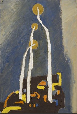
Here’s where things start to make a shift into the abstract realm. I don’t know what these 3 objects are, maybe lamp posts? Dandelions? Lollipops? I like the dull colours contrasting with the pops of yellow, orange, and blue.

1947-Y-No. 2, 1947 - Clyfford Still
1947 – Y – No. 2 (1947)

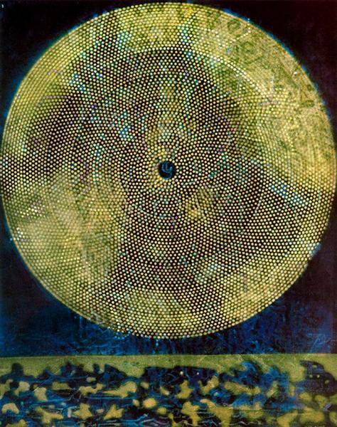
Now this one I really love. It looks like a nonsensical map but also a cow print with some blotches of color. There’s something about the irregular shapes fitting in together that makes it captivating to sit and stare at. Even though the forms are rough, there’s no brushstroke feel, it’s kind of like he stamped these shapes on the canvas. I think Still’s color field style of painting could be really cool wallpapers.

PP – 387 (1970)

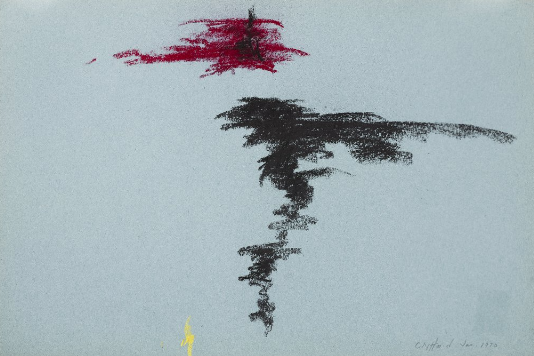
I found this one to be pretty eye-catching, to me it looks like a figure skater in motion spinning with their leg out. Looking at Still’s work, I want to try scribbling around with pastels and try out his style.

Sources:

https://search-credoreference-com.ezproxy.capilanou.ca/content/entry/bga/still_clyfford_1904_1980/0

https://collection.clyffordstillmuseum.org/listing

https://www.wikiart.org/en/clyfford-still/all-works#!#filterName:all-paintings-chronologically,resultType:masonry

CUBISM, DADAISM, & SURREALISM – MAX ERNST

Max Ernst (1891-1976) was a German painter and sculptor, contributing to both the Dada and Surrealist movement. His works were dream-like, humorous and favored poetic expression over plastic form. He attended the University of Bonn and is educated in literature, philosophy, and psychology. His academic background contributed to the evolution of the Surrealist ideology. As an artist, his approach was to challenge social norms and tradition by being experimental. Throughout both WW1 and WW2 he has managed to keep inventing new techniques and ideas in his work.

Image result for The Hat Makes the Man
The Hat Makes the Man (1920)

I remember I was in the school library in grade 10 and I saw a book on the shelf titled “Dada”. I’ve never heard of Dada before but I thought it was funny so I checked it out. This piece was included in the book and it stuck out to me. I didn’t know the meaning behind all these hats, and looking back at it now, I still don’t know. But apparently Ernst is challenging gender roles as these are women’s hats and he is juxtaposing the term “the hat makes the man”.

Image result for max ernst plane
Murdering Airplane (1920)

This is one of Ernst’s collages, criticizing the misuse of technology and the horrors of aerial warfare during World War 1. This is especially personal to him because he served during the war. I like how the only human aspects of the collage are colored, leaving the airplane in an ominous black and white. Ernst titling it the “Murdering Airplane” is interesting because murder is a human on human crime. Airplanes can certainly kill, but have no ability to murder. Ernst is commenting on the relationship between man and machine, and how technology is essentially an extension humans.

The Virgin Spanking the Christ Child before Three Witnesses: Andre Breton, Paul Eluard, and the Painter, 1926 - Max Ernst
The Virgin Spanking the Christ Child before Three Witnesses: Andre Breton, Paul Eluard, and the Painter (1926)

I wonder what baby Jesus did to make his mama beat him like that. This is definitely a different interpretation of the Virgin and child compared to the one’s I’ve seen before. I like the weird angle and distortion of Mary’s striking arm. But it’s that same quirky detail in her arm that I wished Ernst would’ve added in her feet because they appear too dull. Still a funny painting though.

Composition, 1943 - Max Ernst
Composition (1943)

I’m unsure of what these animals are supposed to be. The breasts are what’s throwing me off… Why do these bird creatures have human boobs? What I do like about it is the simplicity of the line work and how it transitions into different colours. The bits in yellows are also very pretty. The little and big creature look serene, but the one in the middle has it’s eye wide open. I wonder why she’s not sleeping peacefully with her other friends. Or maybe this is a three headed monster and she’s the one on watch.

Birth of a galaxy, 1969 - Max Ernst
Birth of a galaxy (1969)

Ernst did this piece in oil the same year as the moon landing, representing his fascination with new spheres in the universe. I love the dark blue colours and the repetition with the circular shapes. This piece is vibrant but also conveys feelings of contemplation.

Sources:

https://www.moma.org/collection/works/35478

https://search-credoreference-com.ezproxy.capilanou.ca/content/topic/ernst_max_1891_1976

https://www.theartstory.org/artist/ernst-max/artworks/

https://www.wikiart.org/en/max-ernst

Expressionism, Fauvism, & Early 20th Century – Otto Dix

Otto Dix (1891-1969) was a German painter, printmaker, and watercolorist. In 1910-1914, he completed his studies in Dresden which was the birthplace of the German expressionist group, Brücke. He was inspired by their emotionally driven gestural and dramatic style. His work made a shift during WW1, and he was inspired by Futurism and Dadaism, therefore incorporating strong colours and abstraction. He focused on the decaying post-war aftermath and the subjects he chose to paint were prostitutes, crippled soldiers, and veterans. He was an important figure in regards to portraying the uncensored reality of war and society through satire and grotesque manners.

Self-Portrait (1912)

This portrait is an example of his early work, it appears very traditional which isn’t what Dix is known for, however, I find it to be very beautiful. The texture of his corduroy jacket is remarkable, I can almost feel the fabric. I love how his expression is serious but he’s holding a tiny pink carnation. The shine on his fingernails is another detail I adore.

Memory of the Halls of Mirrors in Brussels, 1920 - Otto Dix
Memory of the Halls of Mirrors in Brussels (1920)

Dix is such a wild guy for painting this. Of all the paintings I’ve seen this semester, this one takes the cake for being the most shocking to me. I’ve never seen anything like it. The intimate scene is jarring enough but then Dix goes ahead and paints it again in reflections! I love the distorted perspective, especially that of the table. I also like that he combined two controversial subjects: war officer and prostitute. A double whammy for sure.

Pragerstrasse, 1920 - Otto Dix
Pragerstrasse (1920)
Image result for the skat players
The Skat Players (1920)

These two are haunting examples of crippled veterans Dix would paint. The first depict mutilated beggars on the street and the second are men playing skat, a 3 player card game popular in Germany. The wacky style of both of these draw me in. It takes awhile to deconstruct every that’s going on. I couldn’t help but laugh when I realized one of the card players were holding cards in between his toes.

Fritz Perls, 1966 - Otto Dix
Fritz Perls (1966)

Here’s one of Dix’s later works. It’s a portrait of the famous German psychiatrist Fritz Perls. The fact that Dix painted him shows the status he built for himself as an artist. The purple suit is magnificent and I like the contrast of it towards the yellow background. I think the pose is great too, the expression in the hands and tilt of the head give the portrait personality.

Sources:

https://search-credoreference-com.ezproxy.capilanou.ca/content/entry/bga/dix_otto_1891_1969/0

https://www.wikiart.org/en/otto-dix

https://www.moma.org/s/ge/collection_ge/artist/artist_id-1559.html

Survey 9 Rationale: KKK Infographic

I was assigned to do a geopolitical infographic for this week’s spread. I decided to do mine on the KKK because I felt like it could make to be a powerful spread and I was also interested in how they became so successful.

To keep my infographic easy to follow I decided to break down the KKK’s rise to power in 3 steps. Figuring out how to clearly correlate the number of klansmen to their icons was challenging but in the critique groups it was decided that differentiating the hoods by scale is the best option.

Judy also suggested that I could do little illustrations in the KKK title so that’s what I did. I included key elements I would associate with the Klan: a noose (with my name integrated in it), a burning cross, and the KKK symbol.

I wanted to make the spread appear strong and threatening. Therefore, I limited the colour palette, made the text straightforward, and showed the KKK’s impact through the growing mass of the hood icons.

I would give myself a 9/10 for this spread. I believe it’s a quick but compelling read. But, visually, I could’ve added borders or lines around some places to make it orderly and dimmed down the intensity of the legend.

Research Time: 1 hour

Design: 5-6 hours

IMPRESSIONISM & POST-IMPRESSIONISM – HENRI ROUSSEAU

Henri Rousseau (1844-1910) was a self-taught French artist, born in Laval, Mayenne. His work had child-like and imaginative qualities. He often painted tropical scenes, even claiming he lived in Mexico when he was younger, but later on he admitted that was untrue. Pretty weird thing to lie about. His real inspiration for jungle and exotic scenes were based on the Jardin des Plantes in Paris. He wanted his work to be taken seriously, and to be considered an academic artist. However, he was both praised and mocked for his naive style. Those who admired him were Picasso, Appolinnaire, and others of the Parisian avant garde community.

Carnival Evening (1885-86)

I have a lot of questions when I look at this painting: Why is there a couple dressed in carnival costumes in the middle of nowhere? Are they going somewhere or is their destination where they are right now? What even inspired Rousseau to paint this? This painting looks like a page out of a children’s storybook except without the narrative. In fact, I find that a lot of Rousseau’s work resembles picture books.

The Mill (1986)

This landscape painting is serene and very cute. I like the solid shapes, it looks like you could recreate this scene out of legos. The blues in the water are my favourite, appearing light by the mill and transitioning into a deeper tone in the lake. The man fishing in the foreground is what makes the piece for me, I feel like if he wasn’t there, it wouldn’t be as peaceful.

The Snake Charmer (1907)

Amidst a lush jungle, a dark figure charms a bewitched snake. I like the how the charmer is painted in the same colour as the snake, creating unity between them while also contrasting the dominant green colours. I enjoy all the detail and aspects one would eventually find if they really observed the piece. For example, the red and green parrots on the top branches.

The Football Players (1908)

This is a particularly fun painting of these rag doll-like men enjoying a game of football together. I like how it looks like 2 pairs of twins playing against each other. I’m rooting for team blue stripes. The detail in the abundance of leaves are spectacular. And the overalls colours are very harmonious, meaning the reflection of the orange costume with the trees and the blue costume with the sky.

The Wedding Party (1905)

At first glance, my eye immediately goes to that creepy disproportionate dog. I wonder why Rousseau chose to paint a weird dog right in the foreground. Maybe he found it comical, I know I do. Another thing I found odd was the way the bride’s veil drapes over the other woman, making the bride look like she’s floating. The strangeness of the piece gives it charm, however, I realize Rousseau wanted to be taken serious, so maybe I’m enjoying the painting for all the wrong reasons.

Sources:

https://www.wikiart.org/en/henri-rousseau/all-works#!#filterName:all-paintings-chronologically,resultType:masonry

https://search-credoreference-com.ezproxy.capilanou.ca/content/topic/rousseau_henri_1844_1910

https://search-credoreference-com.ezproxy.capilanou.ca/content/entry/bga/rousseau_henri_le_douanier_1844_1910/0

https://www.theartstory.org/artist/rousseau-henri/

Survey 6 Rationale – Paris Metro Spread

This week I had to do a regular spread on architecture. I was interested in the Paris Metro because I’ve seen the entrances by Hector Guimard before and wanted to know why they were so stylized.

The illustration of the entrance was done in gouache on mixed media paper, which was then pasted on the illustration board. I used a separate paper for the entrance to allow me more control of where the illustration went because I wanted to be cautious of the borders.

The background, title, and body text were all done directly on the board. Initially, I wanted all of the text to be in white with a dark background, but after doing the light coloured title I figured it was too tedious. I learned that in art nouveau the text became integrated with other aspects of the piece. Therefore, I made it so my title matched the stars. 

I would give myself an 8/10 for this spread. Although I like the look of the title, it could’ve been more engaging. The body text is, as I said during the critique groups, nasty. And the background should’ve been lighter to read the text better. But overall I think the simplicity is successful. All focus is on Guimard’s entrance, which I think I painted pretty well. 

Research: 45 mins

Design: 4 Hours

REALISM, PRE-IMPRESSIONISM, & PRE-RAPHAELITES – HONORE DAUMIER

Honoré Daumier (1808-1879) aka “Michelangelo of caricature” was a French artist known for his satirical cartoons criticizing Parisian society. However, due to the September Laws, which prohibited political satire, he gave up his caricatures and instead devoted his time to painting. He painted scenes of contemporary life, specifically the theatre and railways. He studied Rembrandt and Goya, however his style is more reminiscent of Goya’s later works. Unlike his wide reputation for his cartoons, his paintings were ignored while he was alive, however they greatly influenced Impressionism. He passed away of a paralytic stroke in Valmondois, Seine-et-Oise.

Gargantua (1831)

Daumier made this piece when he worked for the comic journal, La Caricature, which targeted the government, the law, and the bourgeoisie. This caricature of King Louis Philippe resulted in six months of prison for Daumier. I admire this drawing because of what it represents for artists vs censorship. Daumier pushed the “boundaries” too far with this one but that’s what makes me respect him. 

Past, Present, Future (1834)

This is another caricature of Louis-Philippe that I love. It depicts him as a pear, which is Daumier playing with the double meaning of the French word “poire”, translating to “pear” or “imbecile”. Daumier is showing the change of the King’s emotions during his reign and even poking fun at him through the exaggerated features of his droopy face and weight. Once again, Daumier is walking on eggshells with this one. I’m unfazed by these pieces of Louis-Philippe but I can only imagine the shock value these mocking caricatures had during its time.

Rue Transnonain (1834)

Daumier didn’t even have to depict Louis-Philippe to piss him off. This lithograph is considered one of Daumier’s best works, illustrating the events of the Massacre of Transnonain street. The Parisian public were rioting against the government in 1834 and an infrantry captain was shot down from a house on Transnonain street. The next day soldiers went into the building and killed everyone, including seniors, women, and children. Daumier published this a couple months after the massacre, it sparked so much controversy to the point that Louis ordered all copies to be destroyed. The year after, in 1835, the September Laws were enforced.

Laurent Cunin, Deputy and Peer of France (1832)

Before the September Laws, not only did Daumier make caricatures, he sculpted political members as well. This one is of Laurent Cunin-Gridaine, the Minister of Agriculture and Commerce. His experimentation with caricature sculpture hadn’t really been done before by his contemporaries. In 1832, he started to sculpt parliamentarians as a series, molding them with great exaggeration in unbaked clay and coloured with oil paints. Daumier was excellent at pulling out specific characteristics to show individuality. This sculpture series is probably my favourite of all of Daumier’s work. They look like they could be characters in a stop motion film!

The Third-Class Carriage (1862-64)

This piece best exemplifies Daumier’s interests with railway travel and the working class. The space Daumier paints is crowded and dirty, making the viewer feel claustrophobic. Interesting how a personality like Daumier’s who frequently mocked and taunted political figures, also painted pieces showing empathy. However, it also makes sense granted a big part of his job as a caricaturist was to observe society. 

Sources:

https://fr.wikipedia.org/wiki/Gargantua_(Daumier)

https://www.wikiart.org/en/honore-daumier

https://search.credoreference.com/content/topic/daumier_honoré_victorin_1808_1879

https://www.musee-orsay.fr/en/events/exhibitions/in-the-museums/exhibitions-in-the-musee-dorsay-more/article/daumier-span-classitaliquenoirles-celebrites-du-juste-milieuspan-4230.html?S=&tx_ttnews%5BbackPid%5D=649&cHash=db30bfd959&print=1&no_cache=1&

Rococo, Neoclassicism, and Romantism – Caspar David Friedrich

Caspar David Friedrich (1774-1840) was a romantic landscape painter from the southern Baltic coast of Germany. He studied at the Copenhagen Academy from 1794-8 before moving to Dresden where he stayed until he died. His works are defined by his odd and unusual use of lighting, creating an eerie atmosphere to every piece. His relationship with nature is the belief that god is all around us and humans are insignificant in the presence of mystical nature. Friedrich’s outlook was not shared among his contemporaries, therefore his influence during his time was not significant. However, after his death, his work first started to gain recognition in 1906 at a gallery show in Berlin. From then on he started to gain more popularity and now his works are well known in Western culture. 

Woman at the Window 1822

I find this painting to be very quiet and contemplative. It feels very personal to the woman and her mood, immediately I wonder what she’s looking at through the window. It appears to be a port outside, guessing by the tall pole of a ship. There’s precise vertical and horizontal lines of the interior space but the woman balances out the strict geometry with the curves of her dress. The lighting is fantastic, the yellowy orange luminosity reminds me of honey. This is definitely a favourite of mine. 

Seashore by Moonlight 1835–36

I like this piece for solely 2 reasons, the clouds and the light on the sea. The clouds are dramatic and overpowering, it was the first aspect of the painting I noticed and the reason why I was drawn to it. The lighting placed dead center on the sea is framed by two ship sails, creating balance and symmetry. The piece almost looks cinematic, like an opening shot of a film. 

The Abbey in the Oakwood 1809-10

In this somber painting we see Friedrich’s view of humanity vs divinity in nature. The human figures are walking amongst this unmended graveyard and crumbling abbey, while the knobbly oak trees stay standing tall and threateningly. Additionally, there’s a faint view of a crescent moon in the sky, going through an endless cycle. We see nature’s time is lasting forever, giving it a quality of being divine. On the other hand, human time is running out, making us insignificant. 

Wanderer above the Sea of Fog 1818

Just like “Woman at the Window”, the figure’s back is towards the viewer, creating a mood of self-reflection. He appears dignified in his green uniform and confident with his one foot propped up on the rock, leaning on his cane. The mist and fog of the sea with the mighty mountains in the back gives me the impression that the wanderer is standing in awe of his surroundings.

Cairn in Snow 1807

This painting is a haunting one due to the fact that Friedrich most often displays nature as powerful and everlasting, especially trees. However, the ones we see here are weak and neglected, even with some branches cut off. The cairn among the three trees is interpreted to be a burial site, touching on the theme of death. These oak trees are very similar to the one in “The Abbey in the Oakwood”, although both are spooky, they give off different representations. For this piece, it’s weakness, and the other is immortality.

Sources:

https://search.credoreference.com/content/entry/routromanticera/friedrich_caspar_david_1774_1840/0

https://www.britannica.com/biography/Caspar-David-Friedrich

https://www.wikiart.org/en/caspar-david-friedrich

Survey 8: Ouch! The History of Band-Aids.

Healing booboos since 1920, I’m sure most are familiar with the adhesive bandages: Band-Aids. 

Inventor of the BAND-AID, Earle Dickson.

Introduced by Earle Dickson, the band-aid was invented for his wife Josephine who would always cut and burn herself in the kitchen. What Earle did was prepare ready-made bandages, which were pieces of cotton gauze on a strip of adhesive tape. The tape remained sticky because he covered them with crinoline, a fabric similar to tulle. This prototype allowed Josephine to dress her own wounds without additional assistance. Earle pitched his invention to the company he worked for at the time, Johnson & Johnson. The company president, James Wood, picked up his prototype and began to market the product. 

Early BAND-AID box

Unlike today, they were made by hand, around 3 inches in width and 18 inches in length. Additionally, the sales weren’t too great either, in their first year they sold about only $3000 worth. Mainly because people didn’t know how to use them. However, Johnson & Johnson did achieve progress. Sales began to increase after the company employed salesman to introduce their new invention to doctors, pharmacists, butchers, and even the Boy Scouts. 

Mass-Produced BAND-AID 

In 1924, J&J brought in machines to mass-produce the bandages. These machines made bandages ¾ inches wide and 3 inches long. The wrappers were also being introduced for convenience, with little red strings used to open the product. They kept improving the bandages, selling them in different sizes and adding holes in the gauze pads for aeration and faster healing. 

Tin BAND-AID Packaging 

Two years later in 1926, J&J upgraded their packaging to the iconic metal tin over the cardboard boxes they’ve been using. From the immense success of Earle’s invention, he was rewarded by being named vice president and even elected to J&J’s board of directors. All thanks to Josephine’s poor cooking skills. 

Sources:

https://ourstory.jnj.com/first-band-aid-brand-adhesive-bandage

https://www.jnj.com/our-heritage/18-facts-about-the-history-of-band-aid-brand-adhesive-bandages

https://www.bandaid.ca/band-aid-history

Survey 7: The Wild Beasts of Colour

At the start of the 20th century, the Fauvism art movement began to gain recognition. The Fauves (meaning “Wild Beasts”) were known for their strong use of bright and pure colours. They valued bold linear patterns as opposed to realistic representations. The movement was short-lived and only lasted from 1905 to 1908, however in only a matter of 3 years the Fauves made a great influence on art history.

The Fauves enjoyed the emotional freedom that came through colour, but were also interested in the science behind colour theory. They specifically focused on complementary colours and how when applied beside each other on a painting, both colours will appear more vividly.

Woman with a Hat, 1905. Henri Matisse.
The Turning Road, 1906. André Derain.
Woman with Large Hat, 1906. Kees van Dongen.

Clearly from these pieces we see the Fauves have a passionate connection with colour. They experimented with intense colours to play with space, light, and atmosphere. For the most striking results, they would use paint straight out of the tube and apply their brushwork aggressively to the canvas. They were trying to convey sensations, not likeness. A pioneer of the movement, Henri Matisse, put it simply:

“When I put a green, it is not grass. When I put a blue, it is not the sky.”

Even if the subject matter the Fauves painted were traditional, the unnatural Fauve colours definitely turned common motifs into something brand new, like nudes, portraits, landscapes, etc. The contemporary audience of Fauvism believed the colours to be assaulting to the eye and thought the style was effortless and clumsy. But it just so happens that Fauvism’s “assaulting colours” would later on influence many important artists such as Munch, Kokoshcka, Kandinsky, and Rauschenberg.

Sources:

https://search-credoreference-com.ezproxy.capilanou.ca/content/entry/bght/fauvism/0

https://search-credoreference-com.ezproxy.capilanou.ca/content/topic/fauvism

https://www.tate.org.uk/art/art-terms/f/fauvism

https://www.mfah.org/art/detail/1549