The Great Exhibition of 1851 was the world’s first fair to showcase the vast scientific, cultural, and industrial progress. It was hosted in London and took place in the Crystal Palace, many countries were allocated their own exhibit and space. However, one country got assigned an excessive amount of space for their court. And that country was India.
India’s location within the Crystal Palace was honourable, placed in the southwest corner of the court, meaning that India was facing the beautiful Crystal Fountain.
Made from 4 tons of glass, this was the Crystal Fountain
The way the India exhibit had been set up was strategic, focusing on visual wonders and extravagance. Displayed hanging above were colourful exotic carpets and artifacts that had been meticulously arranged on counters. These foreign objects drew the viewers in, fascinating and inspiring them. Many items on display fueled new ideas for a second industrial revolution, which would have tools that were not only useful but also refined in their design.
A section of the India exhibit from Dickinsons’ Comprehensive Pictures of the Great Exhibition of 1851
There was a rich assortment of shawls, agricultural produce, elephant trappings, and jewels. One of the most fascinating jewels on display was the kohinoor diamond.
186 carat Kohinoor Diamond on Display
The kohinoor is one of the largest cut diamonds in the world and part of the British Crown Jewels. In the exhibit catalog the kohinoor was described as “The Great Diamond of Rujneet Singh” or “Mountain of Light”. The kohinoor also has a mysterious history and known to be worth £1–2 million. It was a pretty big deal and long lines were made to view the diamond. Interestingly enough, visitors were disappointed, and thought the diamond was way too dull.
Despite the let down of the kohinoor, the India court introduced attendees to a new and exciting foreign land with different cultures and innovations, it was a very exciting time!
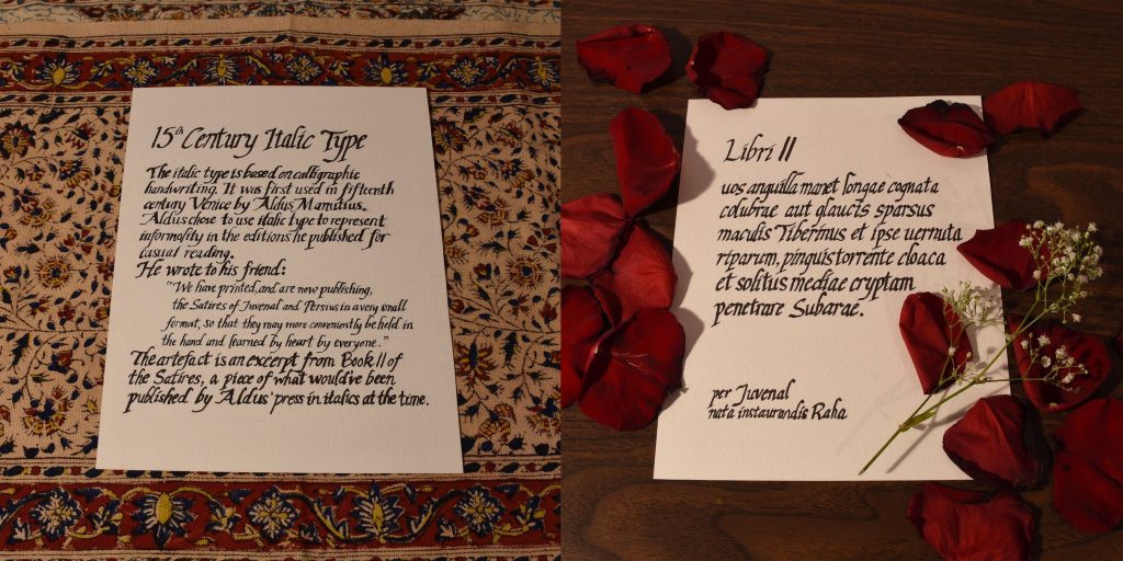
For my spread I had to do an artefact for typography. My team researched the history of italic type, so I decided to make a document that would’ve been printed in italics at the time. During one of the critique sessions Judy suggested that I could make my written part like a document as well and have a spread of 2 photographs. I liked the idea of making the whole spread an artefact so I went with it.
Executing the documents weren’t difficult, however, they were rather time consuming because I had to create a grid and draft it out in pencil first. But I managed to find instructions online on how to write italics in calligraphy, which made writing the documents easy and straightforward. Conveniently, we have calligraphy markers in our art kits so I used that on mixed media paper.
I would give myself a 9/10 for this spread. I think I could’ve adjusted my camera to take a better shot of the documents and have them be positioned similarly to make it more harmonious. But overall I’m satisfied with the end result of the documents themselves.
Back in the 19th century, when the manufacture of paper and the printing press was drastically improved, literacy rates increased at a rapid pace. Because everyone was reading, and everything was being read, people believed this drastic rise in reading was an epidemic! People named this new “disease”: Reading Mania.
Because the price of books took a drop in the 19th century, the everyday man and woman had just as much access as the wealthy. Literacy began to lose its prestige and would no longer be associated with high status. Members of traditional reading classes believed that there should be a hierarchy in who should be given information. They believed the common folk would ruin literature, literally the most bourgeois thing to be freaked out about.
You might be wondering, how exactly has everything become so cheap? Wood pulp and straw. This cheap paper was typically used for mass-market books being sold at crazy low prices. There was a couple different variations of mass media being spread such as:
Penny dreadfuls: Gothic stories sold for a penny
Pulp magazines: Made out of wood-pulp paper
Yellow backs: Books bounded with yellow strawboard and covered with bright yellow glazed slips. Sold from sixpence to a shilling.
Example of a Penny Dreadful: Varney the Vampire – A Gothic Horror Story
Example of a Pulp Magazine: The Golden Argosy – First All-Fiction Pulp Mag
Example of a Yellow-Back: The Mutiny In India – Inexpensive Reprint Edition of Popular Book
It wasn’t costly to produce these types of media, therefore they were an excellent medium for artists and authors to experiment with taboo, controversial, and peculiar subject matters. But because unusual themes were explored, the audience of young children who read these cheap books were exposed to violence and crime. The suicide and murders committed by young boys were blamed on the books. Those committing crimes who also enjoyed penny dreadfuls were thought to be a “victim” of the books. Interesting how this is similar in today’s world where a movie like “Joker” was deemed dangerous by critics who believed it will inspire gun violence and is an ode to incel white men.
I’m sure by now we all take italics for granted, whether we use it for emphasis or in our citations. But how did these slanted letters become a thing?
The history of italics starts in 15th century Venice and 2 dudes: a printer Aldus Manutius and his type designer Francesco Griffo. From Aldus’ published book in 1500, Epistole di Santa Caterina da Siena, we see just a sneak peak of Italics printed in the illustration of the book to the left and heart on the right.
The first words printed in italics, iesu dolce iesu amore and iesus.
Aldus was dedicated to publish Greek and Roman classics, but more specifically, Greek and Roman classics in small format. To produce small books for scholars at a low cost, he needed to save as much space as possible. Therefore, he had a type designed based off of informal letters done in calligraphy handwriting.
Enter Italic Type.
Aldus’ type designer, Francesco cut the new italic type only in lowercase letters to which he paired with Roman capitals. An example of this odd italic and non italic pairing can be seen in the first page of Virgil’s Opera, published by Aldus himself. It is the first book to include the italic typeface as the body text.
Opera by Virgil
Manutius was very excited about italics and wrote to his friend:
“We have printed, and are now publishing, the Satires of Juvenal and Persius in a very small format, so that they may more conveniently be held in the hand and learned by heart (not to speak of being read) by everyone.”
Later on, slanted uppercase letters were shaped to complete the Italic type family we know and love.
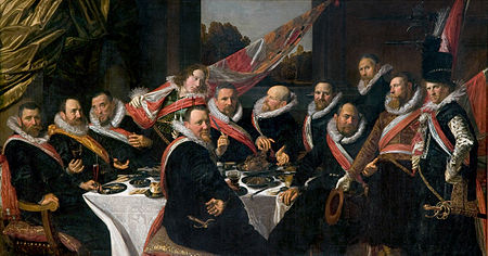
Frans Hals (1582-1666) was a painter from the Dutch Golden Age. His style of painting was lively, best expressed in his loose and unconcealed brushstrokes. What set him apart from his peers was the cheerful mood in his works, in which his subjects convey a sense of “joie de vivre”. This quality in his style revolutionize portraiture paintings. He also plays a great role in group portraiture, Hals was a master at capturing individuality and distinguished each character through poses and facial expressions. He painted many members of society: wealthy citizens, officers, councilmen, musicians, and even the loud mouthed fishwives and drunkards.
The Banquet of the Officers of the St George Militia Company in 1616
At this point of his career, Hals was not a well known portrait painter when he made this painting. However, he nails the composition by giving the illusion of casual conversation and space. Unlike group portraits from the past, Hals’ figures aren’t stiff or in dull poses. Furthermore, the group dynamic of political status is represented and each individual has a personalized expression. Not only do we see portraiture, Hals shows off still life and landscape in the piece as well. It’s clear as to why this painting was a success for Hals, as a reward he was commissioned to do additional portraits of the subjects and their relatives.
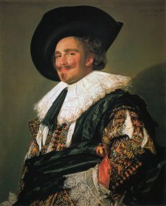
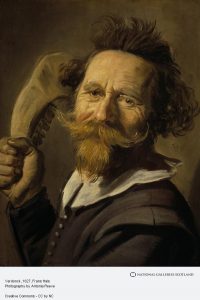
The Laughing Cavalier (c.1624)
This is considered the most highly regarded piece of all the Baroque portraits, and I can see why. Despite the title, the subject appears not to be laughing, however he does have a cheeky smile further emphasized by his glorious upwards mustache. And when looking at his eyes and flushed cheeks, he looks like he’s holding in a fit of the giggles. Hals directed the viewpoint to be at a lower angle and had the subject be at a slight turn with his hand on his hip, this accentuates the incredible detailing on his garments. The delicate lace, colourful embroidery, and thick textiles! This piece is lively and has an aspect of spontaneity from the subject’s joyful mood.
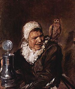
Malle Babbe (c.1633)
The unrestricted brushwork and freedom in the handling of paint is classic Hals style. This portrait used to be interpreted as a mythical witch figure but now it is discovered that Malle (defined as “loony”) Babbe was an actual individual who lived in Haarlem. Her name was Barbara Claes and she was a resident at Het Dolhuys, a local hospital for the mentally ill. The beer mug suggests a pub scene, in this case the owl might be a reflection of the Dutch saying, “drunk as an owl”. Although the painting at first glance is lighthearted, knowing the backstory makes it eerie, perhaps even a little sad.
Verdonck (c.1627)
This painting demonstrates Hals’ impressive skill in communicating personal traits and character. The man is most likely Pieter Verdonck, an aggressive fellow who was a member of the Mennonites in Haarlem. This is seen in his tousled hair and the jawbone in hand ready for a swing.
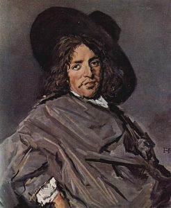
Portrait of Unknown Man (c.1660-63)
Although this is not one of my favourites from Hals, it is an important representation of his later work. This arrangement is more contained and reserved compared to his other pieces. The most significant change would be in colour, we see black and grey dominating the canvas rather than a vivid palette. However this change in style was not a personal choice, it was the sitters who’ve changed. The Protestants he depicted had a somber wardrobe.
Jacopo Robusti, also known as Tintoretto (1519-1594) was a Venetian painter whose works were defined in the Mannerist style by his representation of muscular figures, expressive gestures, and an understanding of perspective. The method in which he painted was bold, energetic, and speedy. He was certainly quick with a brush, resulting him with the nickname Il Furioso. He combined Titian’s handling of colour with Michelangelo’s study of forms and applied it to his skill set. Tintoretto was a lover of drama, the scenes he painted were theatrical, this style would later affect the Baroque period.
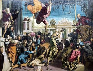
Miracle of the Slave (c.1548)
This is a great example of Tintoretto’s early work as it shows a daring colour palette and an unconventional composition of figures. The layout of the group is chaotic and filled with dramatic action, the forms almost get lost. It’s a difficult painting to digest, however the high energy makes it clear that this work was done by him.
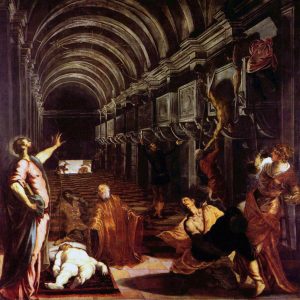
Finding of the Body of Saint Mark (c.1562-66)
I find that this painting is haunting due to the drama created between the dark and light tones and the distorted perspective of the architecture. My eye follows the arches towards the dark back wall, then down to the first scene of the painting, the discovery of Saint Mark. Next, I focus on the foreground, the second scene with the illuminated corpse of Saint Mark laid out on the floor. I admire this piece because of how it’s been organized for the viewer to follow a narrative.
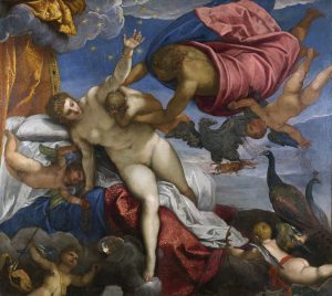
The Origin of the Milky Way (c.1575)
What I find to be the most striking about this painting is how Tintoretto manages to make the colours have an intense glow but also appear soft and delicate at the same time. However, to be quite honest I also find humour in the fact that there are dainty stars at the end of Juno’s spurting breast milk.
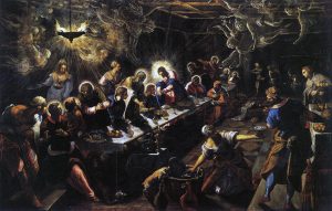
Last Supper (c.1594)
The Last Supper is a scene that many associate with Da Vinci’s interpretation, yet I find Tintoretto’s version more engaging. Just the different angle of the table creates so much more depth and drama to the piece versus a front facing view. I like how the halo around the head of Christ is acting as a light source affecting other figures, such as the woman on the lower right whose arms are lit but her head is casting a dark shadow. The other light source is coming from the lantern on the top left, illuminating the angels floating about near the ceiling. There is a mysterious energy to this piece further expressed by the divine nature of the angels.
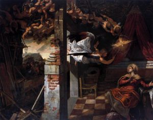
The Annunciation (c.1583-87)
This work best expresses how Tintoretto creates drama in a scene. The grand fleet of angels, the startled expression of the virgin, the expressive arm gestures, the chiaroscuro, and the view from an elevated position displaying the straw chair in the house, indicating poverty. I really like how the angels are all lumped together creating a single line of action.
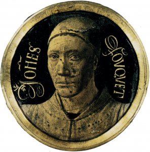
Jean Fouquet (1420 – 1481) was a French painter, illuminator, and miniaturist of the 15th century. During his time, his works were greatly recognized in the French courts as he was a fine portrait painter. Fouquet’s patrons were mainly Kings and nobles, in fact he was the official painter of Charles VII and Louis XI. However, appreciation for Fouquet went beyond his native land. He travelled to Rome and painted Pope Eugenius IV with his nephews, this proves Fouquet’s high distinction as an artist, although the painting now is unfortunately lost. Because of his travels, he managed to pick up on the techniques and styles of Italian masters. It was Fouquet who was responsible for introducing Renaissance art into France.
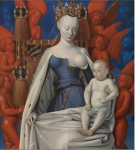
Madonna and Child. Left Panel of Diptych de Melun (c.1450)
This painting is a favorite of mine particularly because of the contrast between the pale skin of Madonna and Baby Jesus against the rich red and blue cherubs that fill the background. The shine and the spherical shapes of the cherubs almost make it seem like they could be plastic toys. The details on the throne and crown of shiny pearls, jewels, and giant golden tassels add extravagance to the piece.
Self-Portrait (c.1450)
This piece is the earliest self-portrait miniature created, which demonstrates Fouquet’s innovation. At the time, self-portraits and even signing ones work weren’t common. I find his signature interesting as it implies he wanted to claim ownership of the medallion and was aware of his status as an artist.
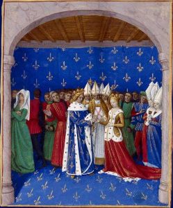
Marriage of Charles IV and Marie of Luxembourg (c.1455)
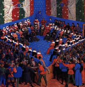
Cases of noble men and women (c.1460)
These two paintings are similar in the use of colour. The boldness of the red, blue, and green allow for the white and gold accents to pop out. They both have the blue background with the fleur-de-lis pattern, establishing Fouquet’s homeland. Out of the two I would say I like Cases of noble men and women better because of the unusual composition of the figures and how they’re placed all in a square without any focus subject in the center.
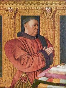
Portrait of Guillaume Jouvenel des Ursins (c.1465)
This portrait is successful in showing the power of the Chancellor of France. The golden architectural decoration in the background displays nobility. So does his exaggerated red robe with brown trimming. I believe the gold and red work together to frame his face, enhancing the look of strength and prestige.
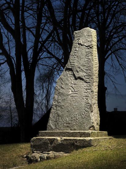
Often used as memorials to dead men, a runestone is a raised stone with runic carvings. Runic meaning a Germanic language alphabet. Today, most of these stones can be found in Scandinavia and Sweden. The majority of runestones date back to the late Viking age. This tradition of raised and inscripted stones have been around since the 4th and 5th century, appearing first in Norway and Sweden.
An early runestone from Sweden
The reason the Vikings had runestones were to claim their territory, brag about their achievements, communicate important news, and most of all honour their fallen brothers. 94% of all runestones have been raised to commemorate dead men. The inscriptions on the stones were all fairly similar. These were the general guidelines:
Name in memory of who the stone is for – may include their social status, place of death, or prayer dedicated to them
Who raised the stone
How the dead Viking and the one who raised the stone are related
A typical memorial runestone
Many of these runestones have been damaged by the Viking enemies or harsh weather, but some runes can be found in good condition, although the bright colours many stones once bared have completely worn off. Dominating colours used by the Vikings were red and white, some even say the runes were reddened with blood.
The Rimsø stone
Although runestones were dedicated to mostly men, some were also raised for women. The Rimsø stone in the photo above was raised by a Viking named Thorir in memory of his mother. Not only is this runestone interesting because it was for a women, engraved was an expression of emotion. Thorir claimed that the death of a mother is the worst thing that could happen to a son.
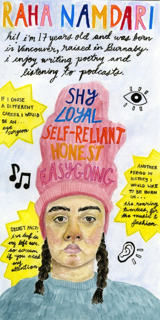
The media for my yearbook spread is watercolour, pencil crayon, markers, and ink on watercolour paper. I often work in multimedia and I wanted to represent that in the spread. My choice to direct the spread as a portrait rather than landscape was influenced by the five key words. I figured it would be easy to stack all 5 words on top of each other to create a clear layout. I managed to combine both the illustration of myself and the key words into one by fitting all the words into my beanie. The portrait of myself shows my face in a serious expression which represents what I look like most of the time. However, I do laugh and joke around a lot and that part of my personality is shown through the bright lettering and yellow stars. I wanted to pair the ridiculousness of the beanie and vivid colours with my blank expression to make the spread humorous and a little odd.