Tintoretto (Jacopo Robusti)

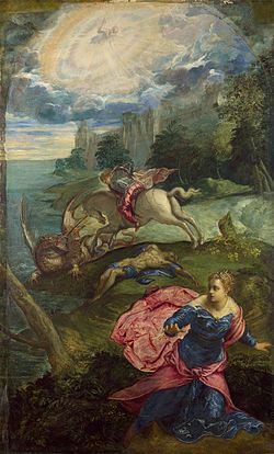
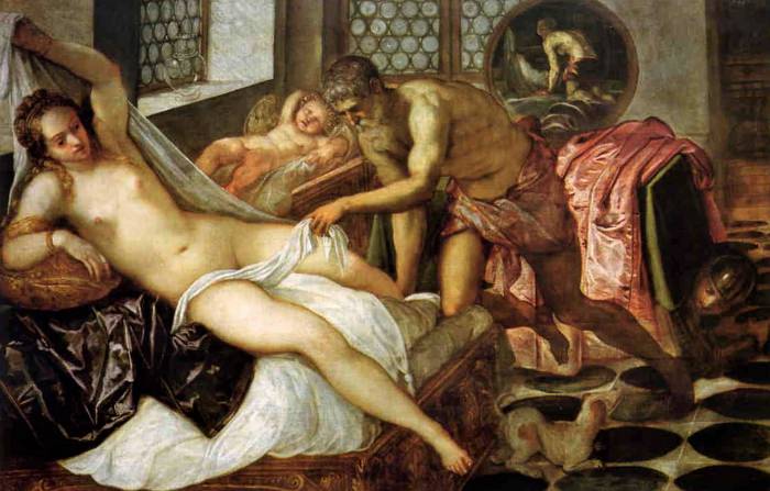
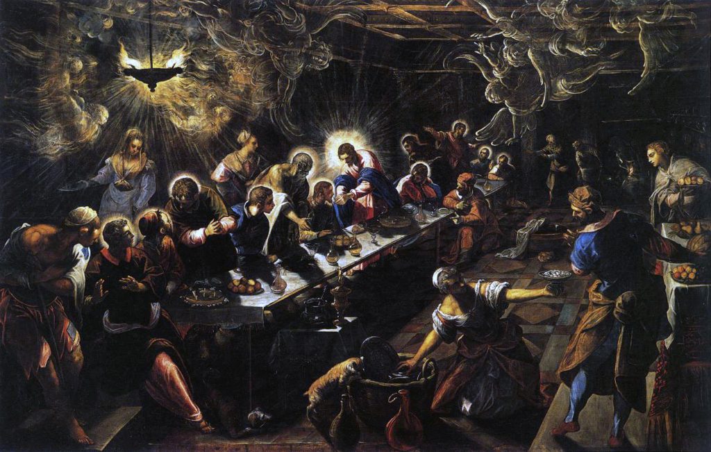
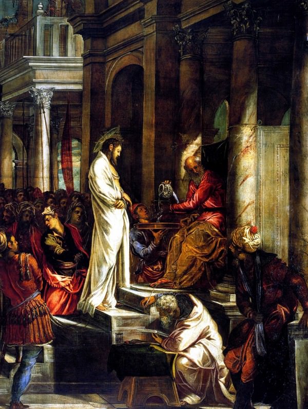
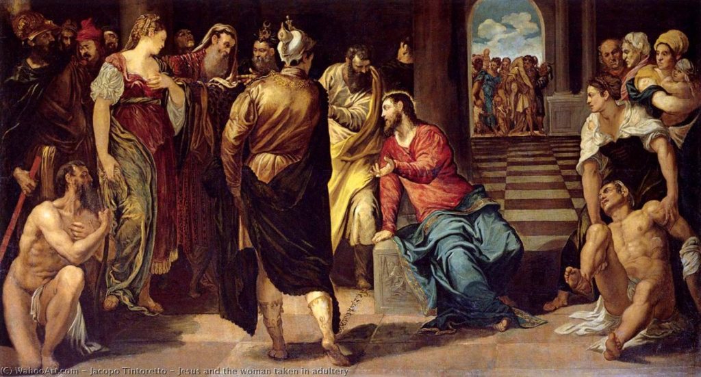
Tintoretto is a Venetian mannerist painter who wanted to shy away from the bright colours being used in Venice during that time. Thus, he employed “weird light and… broken tones” to add a dramatic effect and an emotional strain (Gombrich, 371). Ultimately, he desired to be unlike any other painter in the late 16th century. Many, however, did not appreciate his attempt at uniqueness. Giorgio Vasari, a well-known critic, wrote that he could “‘have become one of the greatest painters seen in Venice,'” but because his paintings had an unfinished look, he was overlooked. Regardless, he never intended to have the same, clean finish that other Venetian painters had; he didn’t want the smooth finish to “[distract] our attention from the dramatic happenings of the picture.” The pencil marks he left on his completed paintings overall added to his intense portrayals of “legends and myths of the past.”

In my opinion, Tintoretto should have been considered as one of the greats. His paintings were incredibly different from any of the other mannerist paintings in Venice during the late 116th century. They demonstrated natural movement and liveliness, whereas models in other mannerist paintings seemed posed. Additionally, his pencil strokes were deliberately left to create a climactic effect; had they been there unintentionally, I would understand the argument of his supposed carelessness. Finally, when Gombrich stated that El Greco’s art “surpass[ed]” Tintoretto’s due to the “medieval ideas” that “lingered” in his work, I was shocked because I felt more inspired by Tintoretto’s work than I did by El Greco’s. Evidently, it is a subjective matter, but I believe that Tintoretto does an amazing job at creating complex and mesmerizing pieces.
This image has an empty alt attribute; its file name is Christ-before-Pilate.-Scuola-di-San-Rocco.-Venice-.jpg
Tintoretto, “Christ Before Pilate,” Scuola di San Rocco, Venice: “Jacopo Tintoretto,” Italian Renaissance Art.com, https://www.italian-renaissance-art.com/Tintoretto.html. Accessed 29 September 2021.
This image has an empty alt attribute; its file name is Jesus-and-the-woman-taken-in-Adultery-Tintoretto-1024x551.jpg
Tintoretto, “Jesus and the Woman taken in Adultery:” “Jesus and the Woman taken in Adultery,” Most Famous Paintings, https://en.most-famous-paintings.com/MostFamousPaintings.nsf/A?Open&A=ARJCBM. Accessed 29 September 2021.
This image has an empty alt attribute; its file name is Saint-George-and-the-Dragon-.jpg
Tintoretto, “Saint George and the Dragon,” National Gallery, London: “Saint George and the Dragon (Tintoretto),” Wikipedia, 2021, https://en.wikipedia.org/wiki/Saint_George_and_the_Dragon_(Tintoretto). Accessed 29 September 2021.
This image has an empty alt attribute; its file name is Venus-vulcan-and-mars.jpg
Tintoretto, “Venus, Vulcan, and Mars:” “Jacopo Tintoretto,” Italian Renaissance Art.com, https://www.italian-renaissance-art.com/Tintoretto.html. Accessed 29 September 2021.
This image has an empty alt attribute; its file name is Tintoretto-Last-supper-1024x651.jpg
Tintoretto, “The Last Supper,” Basillica di San Giorgio Maggiore, Venice: “Last Supper (Tintoretto).” Wikipedia, 2021, https://en.wikipedia.org/wiki/Last_Supper_(Tintoretto). Accessed 29 September 2021.

Gombrich, Ernst. The Story of Art. 16th Edition, Phaidon Press Inc, 1995.
Proximity

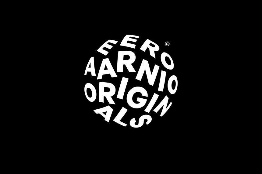
Eero Aarnio’s logo for his original design company is a great example of proximity. Even though Aarnio could have simply placed his company’s name in straight, horizontal lines, he wanted to make his design more complex and visually appealing. By placing the letters in a form of a circle, he portrays his “iconic design” of the ball chair. Therefore, his design becomes more symbolic and representative because he is relating it to a piece for which he is known. Regardless of the words being put in a circle, the proximity of the title makes it legible and easy to read.

Eero Aarnio, Eero Aarnio Originals: “Eero Aarnio Originals.” D&AD, Bond, 2017, https://libguides.capilanou.ca/citeit. Accessed 27 September 2021.

“Eero Aarnio Originals.” D&AD, Bond, 2017, https://libguides.capilanou.ca/citeit. Accessed 27 September 2021.

Closure

In this logo made for a toy store called Gund, we see an example of closure. The creators, Cynda Media lab, outline the ear shape of a bear on top of the red letters, then place a face below the ear silhouette. Despite not having outlined the chin, we are still able to imagine the rest of the figure. The logo “pays homage to the company’s tradition of capturing facial expressions in their toys,” (HOW Logo Award winners, Logo Design Love), and the aspect of closure allows us to focus on the facial features of the bear. Had Cynda Media lab used a black border to shape the face of the bear, we would concentrate on the entire image of the animal rather than zeroing in on his expression.

Cynda Media Lab, Gund Logo: “How logo awards winners.” Logo Design Love. David Airey, 2018, https://www.logodesignlove.com/how-logo-awards. Accessed 27 September 2021

“How logo awards winners.” Logo Design Love. David Airey, 2018, https://www.logodesignlove.com/how-logo-awards. Accessed 27 September 2021

Shape

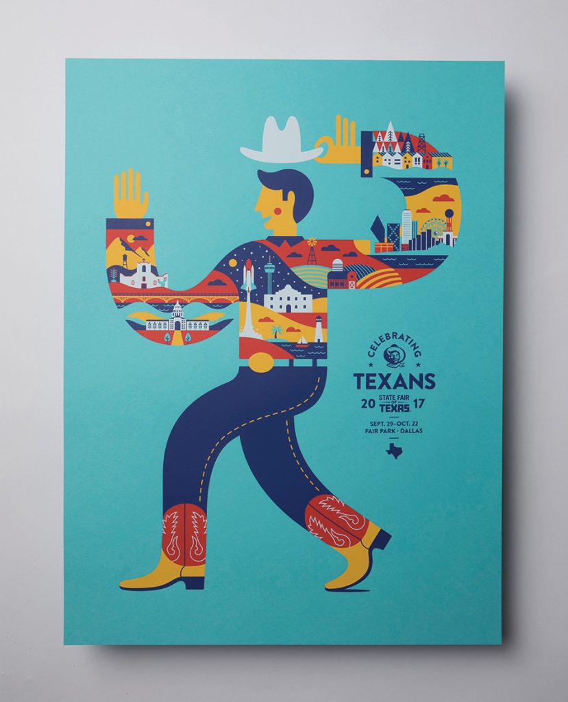
This poster created by Matchbox Studio uses many shapes to make up an entire figure of a man. Each form is used to demonstrate a different part of Texas and its culture. For instance, on the bottom of the man’s left arm, we can see Texas’ state capitol building, it is the second largest building in the United States. It comes after the White House in Washington D.C. In addition, the Tower of Americas is portrayed next to the rocket, which can be seen on the torso of the man. Overall, shape plays a big role in this poster by symbolizing major landmarks in Texas. These landmarks identify Texas as a state.

Matchbox Studio, Poster for state fair of Texas in 2017: “State Fair of Texas Poster” Print Magazine, Callie Budrick, March 1 2018, https://www.printmag.com/post/rda-60-poster-design-ideas/. Accessed September 21 2021.

“The State Capitol — Austin Texas” Hill Country News, MarLee Berry, September 27 2017, https://texashillcountry.com/10-famous-texas-landmarks-see/. Accessed September 21 2021.

Direction

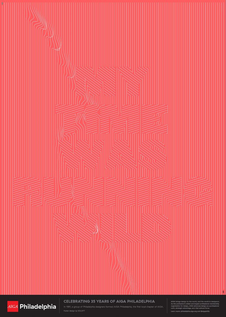
A good example of direction can be seen in this poster created by an organization called AIGA Philadelphia to celebrate its 35th anniversary. On this poster, we can see several lines going at different angles to create an illusion of letters that make up the saying “my time was running wild.” There is also a suggested line that goes down vertically across the design. This line points our eye towards the first word “my” all the way to the last one, “wild.” Without this line, the words would be more difficult to figure out and would seem more random than intentional.

AIGA Philadelphia, Poster celebrating 35 years of AIGA Philadelphia: “AIGA 35th Anniversary Posters” Print Magazine, Callie Budrick, March 1 2018, https://www.printmag.com/post/rda-60-poster-design-ideas/. Accessed September 21 2021.

Size

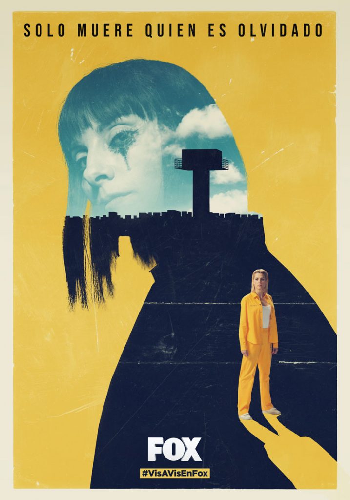
In this poster created by Joseba Elorza to advertise a Spanish show called “Vis a Vis,” there is a strong usage of size to convey the story of the show. The show follows a girl named Macarena Ferreiro, (the blonde woman in the bottom right), who is imprisoned for four tax crimes. She faces the prisoner who is considered the most dangerous, Zulema (The lady with bangs). To continue, by enlarging Zulema, Elorza portrays her as Macarena’s biggest foe during her time in prison. It establishes the dominance and power Zulema has over her.

Joseba Elorza (MiraRuido), Poster for Vis a Vis on Fox: “Vis a Vis” Mira Ruido, Joseba Elorza, https://www.miraruido.com/portfolio/vis-a-vis/. Accessed September 21 2021.

“Vis a Vis Plot Summaries” IMDB, ahmetkozan, https://www.imdb.com/title/tt4524056/plotsummary#summaries. Accessed September 21 2021.

My Yearbook Spread

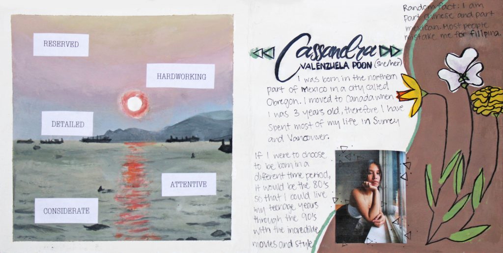
For my yearbook spread, the main mediums I used were collage and acrylic paint. I’m most comfortable with acrylic paint because it was the kind of paint I used at during my painting course at Sheridan College.

To begin, I wanted to incorporate a lot of natural objects because I’ve always been fascinated by outdoor scenery. Therefore, I painted an image of the sunset at Sunset beach in Vancouver and added some flowers. I drew a daffodil, an orchid, and a Mexican marigold. Each flower represents a different part of my life. The daffodil represents my mother. Her favourite flower is the daffodil and they remind me of her every time I see one. The orchid represents the Chinese side of my life. I see one at every Chinese function I attend. Lastly, the Mexican marigold evidently symbolizes my Mexican heritage.

Finally, this assignment took me around 7 hours. The first hour consisted of me drafting several ideas. I’m still not entirely content with this layout, however I settled for this one because I felt as though the minimalistic composition embodied my reserved personality. Further, if I were to rate my project, I would probably rate it as a 8/10. I deducted a point for the large amount of time I spent trying to choose a design. Then I deducted another because I felt like one side of my design looked more cluttered than the other and it overall did not feel entirely balanced.