Juan Gris

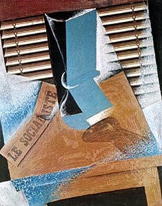
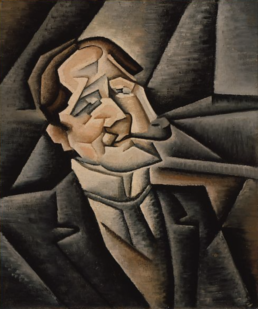
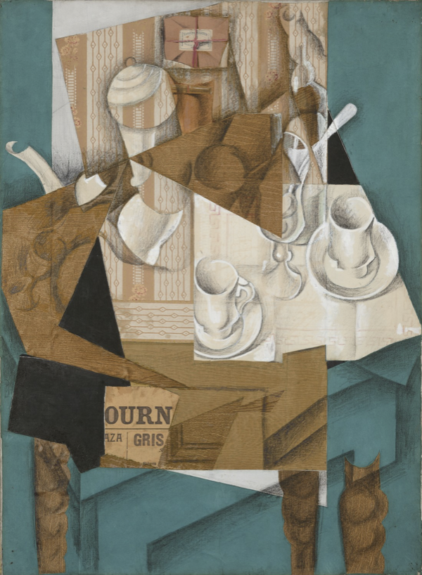
Juan Gris was one of the leading figures in Cubist movement who followed Picasso and Braque. His original name was José Victoriano Carmelo Carlos González-Pérez and was born in Madrid in 1887. Further, he attended the Escuela de Artes y Manufacturas in 1902 until 1904 where he studied math, physics, and mechanical drawing. This academic life did not interest him and he decided to move further with his natural ability to draw. Once he left school, he decided to study under a prominent artist in Madrid, José Moreno Carbonero who also taught Picasso and Dalí. In 1905, the cubist artist changed his name to Juan Gris and moved to Paris in 1906 a little while after his father’s death. During his first few years in Paris, he worked as a cartoonist for several magazines and periodicals. However, once he met artists such as Picasso, Braque, and Matisse; Gris was motivated to work on his own paintings. He began to gear towards Analytic Cubism using monochromatic colours, linear grids, and geometric planes; but later on in his career he shifted to Synthetic Cubism and created his own personal and mature version of it. Overall, he moved on to influence some great artists that came after him such as Salvador Dalí.

Moreover, I am personally not a huge fan of cubism in general. I am a lot more mesmerized by paintings that are similar to reality or that show a looser version of it. When things become distorted, I become a little more hesitant to enjoy the scene that the artist has depicted, but I do respect their techniques and ambitions. Although I must admit, Juan Gris’ version of cubism is a lot more captivating to me than Picasso’s. For some reason, his compositions are a more comforting to me. I do appreciate and recognize that not many people can pull off cubism. I feel that if I were to attempt my own version cubism, I would not be as successful as Gris was. All in all, despite the fact that I am not fond of this area in art history, I do recognize that Juan Gris has a special talent that not many possess.
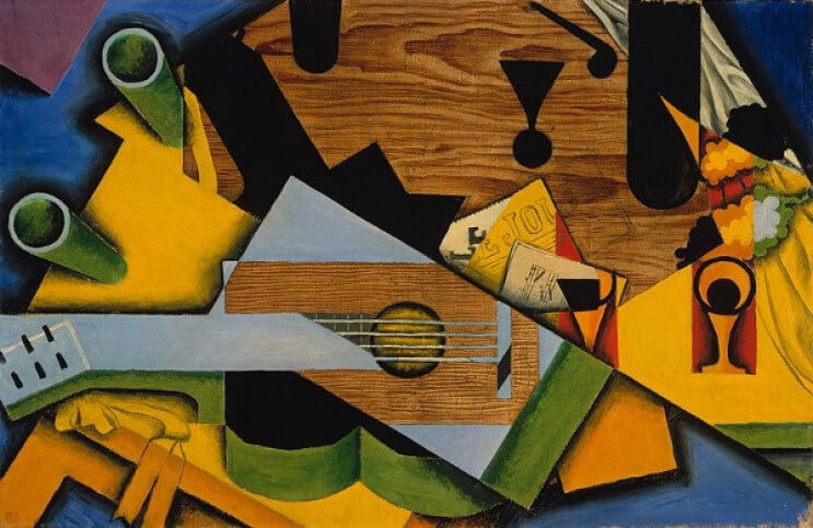
Still life with a Guitar. Source: https://www.ideelart.com/magazine/juan-gris
Juan Legua. Source: https://www.metmuseum.org/art/collection/search/490060
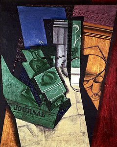
Breakfast (Le Petit Déjeuner). Source: https://www.moma.org/collection/works/35572

Sources

https://www.britannica.com/biography/Juan-Gris

https://www.theartstory.org/artist/gris-juan/life-and-legacy/
Revamping Architectural Styles in the Art Nouveau

A task assigned by a friend

The Emile Tassel House was an architectural job assigned to Victor Horta by his great friend, Emile Tassel. The house would become Tassel’s mansion and part of Horta’s series of townhouses. The other townhouses included the architect’s own mansion and studio as well as the Solvay mansion and the Van Eetvelde mansion with extension. These four mansions revived the traditional idea of the Bourgeois private houses: they combine residential and representational functions. Overall, they demonstrate the individual personalities of the owners while maintaining a cohesive style that treats architecture as a whole. This was the genius behind Victor Horta’s work.

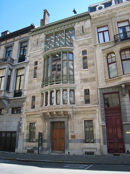
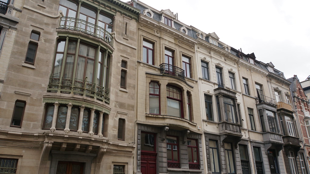
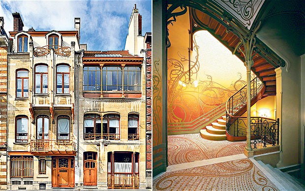
The innovative exterior of the Emile Tassel House. Source: https://www.berkshirefinearts.com/04-07-2011_victor-horta-s-art-nouveau.htm
Behind the elegance of the Art Nouveau aesthetic

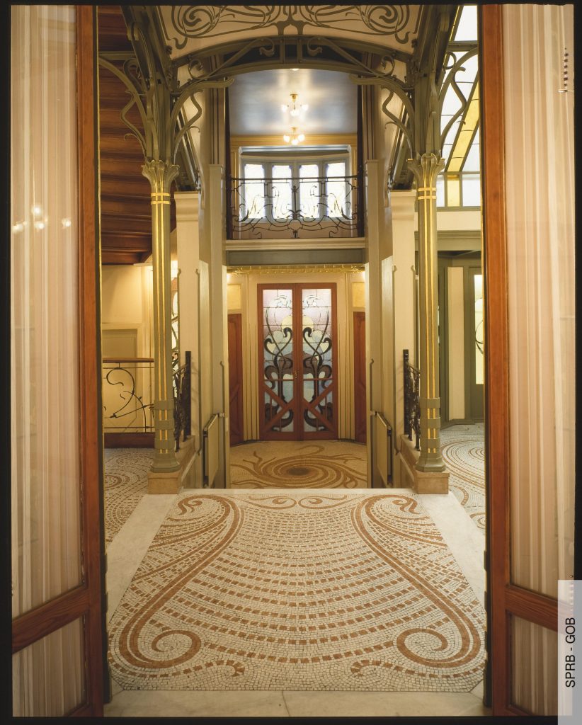
Horta’s stylistic choices made the houses distinctive compared to any others made during that time. These changes mainly came from the fusion of new materials that represented an entirely new look. The exterior of the structure was made to be fluid and smooth. Horta also decided to produce the columns that dominate the front portion out of iron instead of stone. This housed a bay window allowing his goal of creating a lightness to the building to become a reality. Further, Horta created unity through his continuous use of large brackets around the doors and windows. He also made a merger of nature and industry by putting the organic acanthus iron beams on the window displays. Lastly, the interior of the mansions combined stain glass windows, mosaics, wall paintings, and wrought iron that drew inspiration from Japanese art and plants. The rooms were built around a central hall which was an innovative move in this period.

The georgeous interior of the Emile Tassel House. Source: https://insideartnouveau.eu/en/edifices/the-tassel-mansion/
A pioneer in the history of architecture

These mansions, particularly the Tassel mansion, are said to be the first prime example of the Art Nouveau architecture movement due to its inventive plan and groundbreaking use of materials. They are the first perfectly designed Art Nouveau buildings in Belgium. The Emile Tassel House would mark the start of the aesthetics of Horta’s later townhouses. Although they were truly a unique style that was admired by many, they were only affordable to the haute-bourgeoisie which is why it never caught onto other architects. The other Art Nouveau structures in different European countries would draw inspiration from Horta’s “whiplash” style which applied to traditional buildings. However, the Tassel house impacted the Art Nouveau architect, Hector Guimard, who took on this style and put his own personal twist on it. All in all, Horta became iconic for his organic elements in his architectural designs.

Sources

https://insideartnouveau.eu/en/edifices/the-tassel-mansion/

https://en.wikipedia.org/wiki/Hôtel_Tassel

https://whc.unesco.org/en/list/1005/

https://insideartnouveau.eu/en/edifices/the-tassel-mansion/

https://www.berkshirefinearts.com/04-07-2011_victor-horta-s-art-nouveau.htm

https://www.telegraph.co.uk/travel/destinations/europe/belgium/brussels/8803574/Brussels-revisiting-the-magic-of-Victor-Horta.html

https://theplacesihavebeen.com/site_whs/major-town-houses-of-the-architect-victor-horta-brussels/

Historical Artifact Project

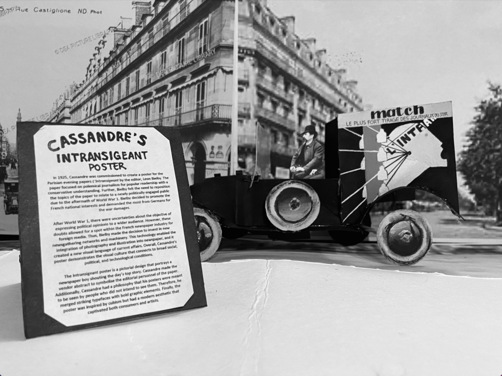
For my historical artifact, I decided to recreate Cassandre’s poster for the Intransigeant newspaper in Paris. The main thing that intrigued me was the fact that Cassandre is only one letter off from Cassandra which is what made me want to research it in the first place. The other reason was that this poster design style wasn’t necessarily an aesthetic that I loved, but I thought it would be more interesting to look into a topic that I wouldn’t normally choose. Further, I decided to put the poster onto a newspaper vehicle because I had a feeling that it would be the most logical place to find the poster in 1925. I also decided to print some photos of the streets in Paris and put them in black and white for the background of my photograph to make it look like the vehicle was driving around the town. I also added a little poster stand as my museum label to mimic the signs that restaurants or stores put out to advertise the specials.

If I were to mark my project, I would give myself a 7.5/10. I think that my vehicle turned out great, but I feel like the proportions of the background compared to the vehicle, and the vehicle compared to the sign aren’t quite accurate. However, I was proud of the fact that I wasn’t rushing to finish my artifact at the last minute and I managed my time well.

Final photograph
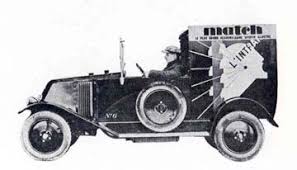
Reference photo #3 Source: https://www.moma.org/collection/works/218730

Sources for Artifact

https://www.rennart.co.uk/website.pdfs/CassandrePoster.pdf

https://www.thevintageposter.com/poster-detail/?inv=12063

https://www.philamuseum.org/collection/object/199890

https:www.alamy.com/stockphoto-lintransigeant-french-newspaper-original-reporting-armistice-news-173483984.html?pv=1&stamp=2&imageid=51B4A221=E9F0-4B19-BBD8-B847AA16035A&p=5665&n=0&orientation=0&pn=1&searchtype=0&IsFromSearch=1&srch=foo%3dbar%26st%3d0%26pn%3d1%26ps%3d100%26sortby%3d2%26resultview%3dsortbyPopular%26npgs%3d0%26qt%3dl%2520intransigeant%26qt_raw%3dl%2520intransigeant%26lic%3d3%26mr%3d0%26pr%3d0%26ot%3d0%26creative%3d%26ag%3d0%26hc%3d0%26pc%3d%26blackwhite%3d%26cutout%3d%26tbar%3d1%26et%3d0x000000000000000000000%26vp%3d0%26loc%3d0%26imgt%3d0%26dtfr%3d%26dtto%3d%26size%3d0xFF%26archive%3d1%26groupid%3d%26pseudoid%3d%26a%3d%26cdid%3d%26cdsrt%3d%26name%3d%26qn%3d%26apalib%3d%26apalic%3d%26lightbox%3d%26gname%3d%26gtype%3d%26xstx%3d0%26simid%3d%26saveQry%3d%26editorial%3d1%26nu%3d%26t%3d%26edoptin%3d%26customgeoip%3d%26cap%3d1%26cbstore%3d1%26vd%3d0%26lb%3d%26fi%3d2%26edrf%3d%26ispremium%3d1%26flip%3d0%26pl%3d

https://www.moma.org/collection/works/218730

Type can’t get any more fashionable than this

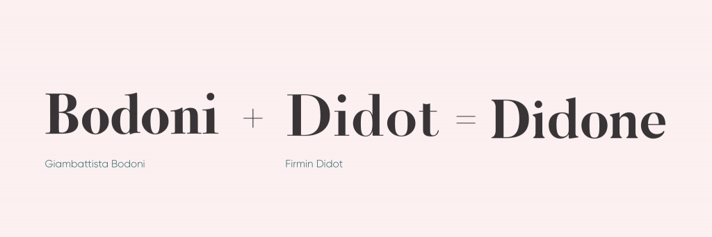
The birth of Didone. Source: https://www.madewithover.com/blog/didones-back-on-trend-after-250-years
The creation of Modern type

Modern type is probably one of the most seen genres of typefaces. Compared to the Old-style typefaces, it is elegant and trendy. Ultimately, it provides an organized aesthetic that other typefaces do not. However, how did this genre come about? Modern type is accredited to two printers: Firmin Didot and Giambatta Bodoni. It began in the late 18th century when Firmin Didot created his typeface Didot by taking the contrast of the thick and thin lines of transitional types like Baskerville, and enhancing it to a higher level. Later on, Giambatta Bodoni decides to build on Didot and Fournier’s work to create his own modern serif. These two inventions lead to a new term for these new types which is called Didone. This name comes from a combination of the names of Didot and Bidone, and it becomes the synonym for modern serifs.

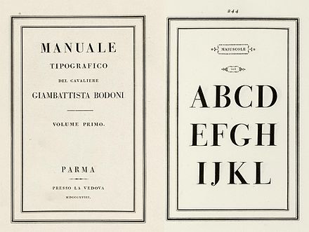
Bodoni’s beatifully composed Manuel Tipografico. Source: https://en.wikipedia.org/wiki/Didone_(typography)
What defines a Didone?

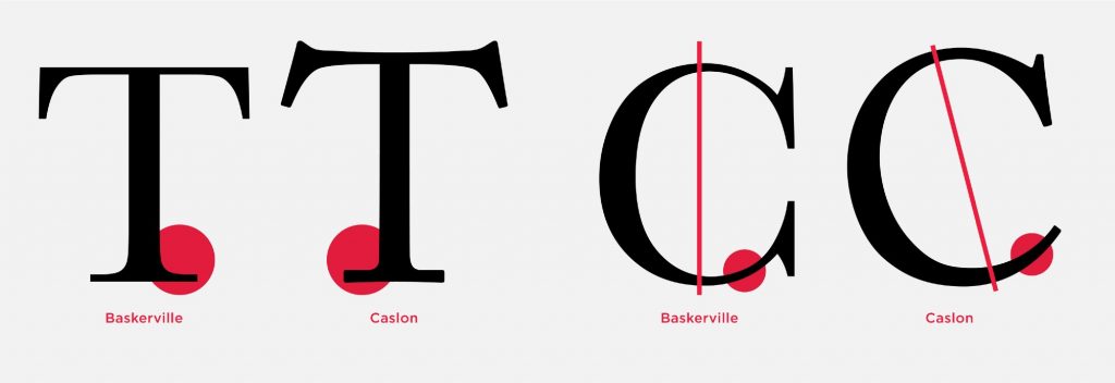
The main characteristic of a Didone font is the abrupt contrast between thick and thin strokes. The hairlines are unbracketed which is what differentiates it from a transitional font. For instance, if we were to compare the Didot and Caslon; we can see that Caslon has curves that connect its thicker lines to its thinner ones which is why we cannot consider it as a Didone. Further, modern typefaces are weighted along the y axis meaning that the vertical strokes are thicker. Thus, ultra bolded vertical lines from fonts like fat face still fall under the umbrella of modern serif. Lastly, Didones are unornamented: they have a “modern appearance.” Ultimately, they move away from the humanist approach; they become more precise than the handwritten letterform.

The visual differences of type throughout history. Source: http://typeandmusic.com/page/3/
Modern type in action

The thick and thin lines of Didone became known for being seen in fashion magazines across the globe. The fashion industry typically picks modern serifs because they look unhurried and controlled. They lead our eyes up and down the page which is why Didones are great for headers. Another reason as to why they are perfect of titles is because they come across as striking. Regardless, they are not very suited for big bodies of text. Due to its verticality, the horizontal rhythm doesn’t work. Considering that extended texts are supposed to make us read from right to left (or vice versa), the weighted y axis becomes contradictory and it overall does not make for a pleasing look. Finally, to this present day, there are different interpretations of modern type which is what makes it so widely used and known. They continue to be a staple of the fashion industry and are extremly identifiable in magazines such as Vogue and Bazaar. All in all, we can thank Didot and Bodoni for this trendy type genre.

Sources

https://ilovetypography.com/2008/05/30/a-brief-history-of-type-part-4/

https://en.wikipedia.org/wiki/Didone_(typography)

https://www.thoughtco.com/modern-typeface-1079102

https://www.madewithover.com/blog/didones-back-on-trend-after-250-years

http://typeandmusic.com/page/3/

https://www.vogue.com/article/zendaya-interview-july-vogue-cover-spider-man-homecoming