The Abhorring Spin to Art History

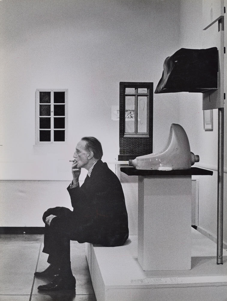
The urinal that changed the course of art. Source: https://www.artsy.net/article/artsy-editorial-duchamps-urinal-changed-art-forever
The inception of a controversial series

In 1917, a urinal was submitted to the American Study of Independent Artist as a display piece which was signed by “R. Mutt”. Marcel Duchamp submitted this piece to shine a new light on the perspective of art, but he didn’t want his artist status to impact the decision of the board members. Thus, he signed his piece under a new name. The Board of Directors voted to reject the urinal to be a part of the exhibition, contradicting the society’s constitution to accept all submissions. Regardless, they did this because they did not consider Duchamp’s store-bought object as a piece of art; and they said that it would be an indecent piece to demonstrate specifically to women. Subsequently, a discussion took place to decide the fate of the Fountain being displayed at the upcoming show of the Inaugural Exhibition. After conducting a vote amongst 10 board members, they came to the conclusion of excluding the urinal.
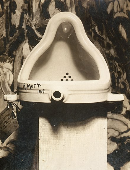
Is it truly disturbing, or am I just a female? Source: https://en.wikipedia.org/wiki/Fountain_(Duchamp)
The Uproar for a New Outlook on Art

Duchamp along with Walter Arensberg protested against the board for making the decision to turn down and “censor an artist’s work,” as Sophia Howarth wrote in her Tate article, Marcel Duchamp Fountain. Additionally, these two were not the only ones who disagreed with the board. Several people who followed the Dada movement in the 20th century also felt that it was an outrage. For instance, in the Dadaist magazine, The Blind Man, the photographer, Alfred Stieglitz, published a picture of the Fountain and captioned it “THE EXHIBIT REFUSED BY THE INDEPENDENTS.” The article assigned to the photograph wrote about it in high esteem, but still had many individuals who did not appreciate the concept of the Ready-Made.
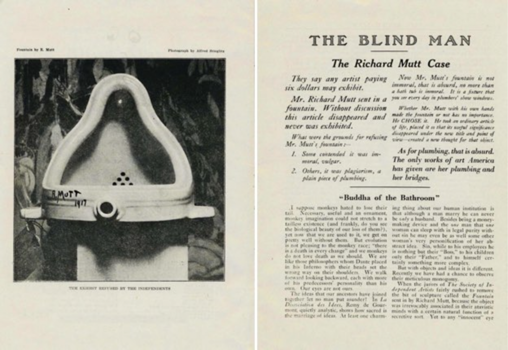
The Blind Man’s appreciation. Source: https://scalar.usc.edu/works/the-space-between-literature-and-culture-1914-1945/vol14_2018_goodyear
A Repelling Side to Artistic Movements

Honestly, the Dadaists did not need the Fountain to establish its belief in an anti-art idea. However, the concept behind the piece counted towards the revolution in art history and it became one of the first pieces of Duchamp’s Ready-Made series. In my opinion, the Ready-Mades are appalling and do no justice to art history. I understand that the whole point of its “genius” is that no one else had thought to do it, but it feels disrespectful to artists who worked really hard to create pieces that make their audience feel something. The idea of just buying an object and slapping a name on it is insulting to any piece that was assembled by hand and had a lot of thought put into it. Overall, the Dadaists had an interesting perspective on art, but there are pieces that make me feel outraged.
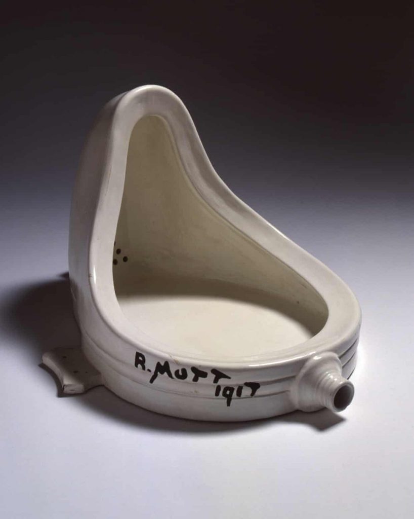
R. Mutt was the name to remember. Source: https://www.theguardian.com/artanddesign/2017/oct/20/examining-the-plumbing-of-marcel-duchamps-fountain-1917

Sources

https://www.philamuseum.org/doc_downloads/education/lessonPlans/Duchamps%20Fountain%20and%20the%20Role%20of%20Information.pdf

https://www.britannica.com/art/ready-made

https://www.tate.org.uk/art/artworks/duchamp-fountain-t07573

https://www.artsy.net/article/artsy-editorial-duchamps-urinal-changed-art-forever

https://en.wikipedia.org/wiki/Fountain_(Duchamp)

https://scalar.usc.edu/works/the-space-between-literature-and-culture-1914-1945/vol14_2018_goodyear
https://www.theguardian.com/artanddesign/2017/oct/20/examining-the-plumbing-of-marcel-duchamps-fountain-1917

Lisa Yuskavage

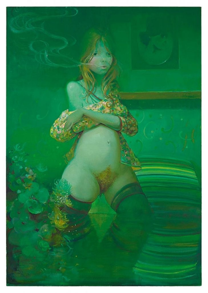
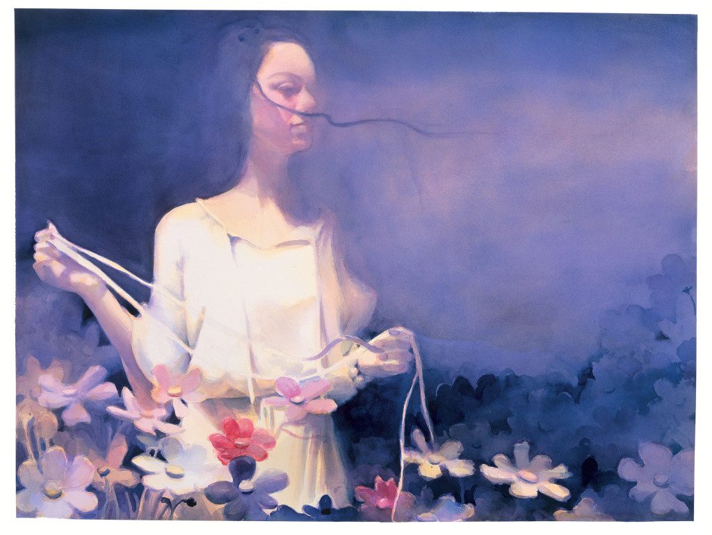
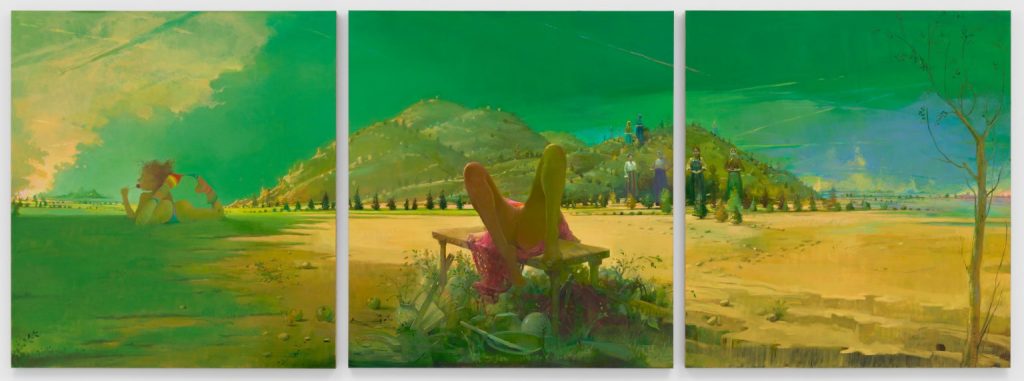
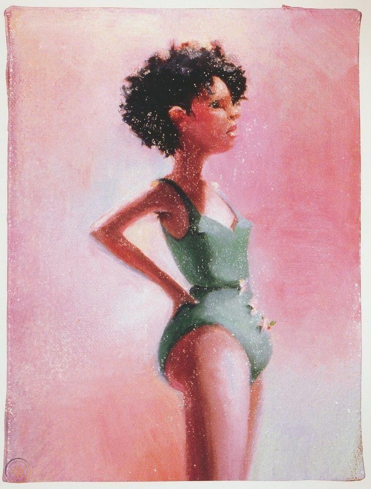
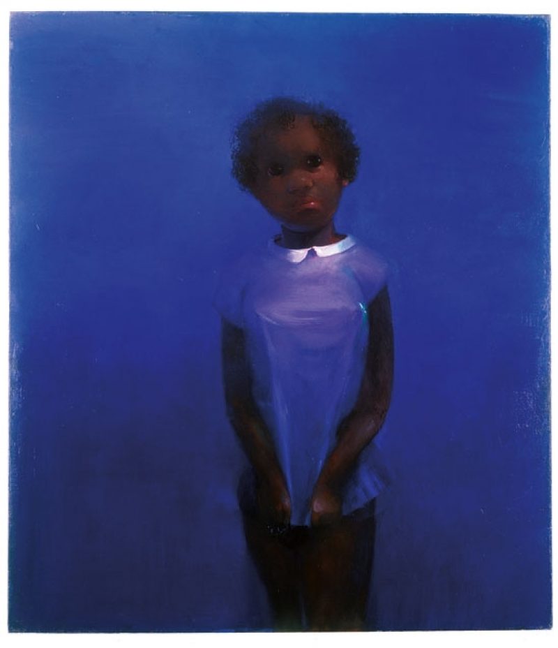
Lisa Yuskavage is an American painter who is known for her female figurative paintings. She received her BFA from The Stella Elkins Tyler School of Art at Temple University and her MFA from Yale University’s School of Art. Then, she went on to exhibit her work in several places such as the Seattle Art Museum and the Whitney Museum of American Art. Further, her work draws techniques from the high renaissance to depict these nudes. She combines this with a strong use of colour to demonstrate an overall mood. To continue, many critics have called upon the absurd proportions of these women. They state that her paintings set high expectations for what a women’s body should look like in this modern day. Yuskavage has responded by saying that she wants to invoke these reactions. She wants to create pieces that will produce different reactions to grab the attention of the audience. She also states that her paintings are supposed to seem anatomically impossible and are supposed to represent the far-fetched male sexual fantasies.

Overall, I am mesmerized by the work of Yuskavage. There is this fantastical quality to her pieces that draws my attention to her work. I wish I could see more representation in her paintings, particularly in body sizes. However, she has created this interesting concept with her inconceivable body proportions that adds an extra reason to admire her art. I think I’m also drawn into her work because she combines two different ideas in art: one that comes from the High Renaissance period and the other that feels more contemporary. Her work is ultimately a modern take on a classical part of art history.

“The Ugly” Source: https://www.worthpoint.com/worthopedia/lisa-yuskavage-contemporary-art-print-1800182736
“The Ones That Don’t Want To: Black Baby” Sources: https://bombmagazine.org/articles/lisa-yuskavage/
“A Girl in the Flowers” Source: https://www.yuskavage.com/artwork/3960
Triptych Source: https://yuskavage.com/artwork/3744

Sources:

http://www.artnet.com/artists/lisa-yuskavage/biography

https://ocula.com/artists/lisa-yuskavage/

https://www.theartstory.org/artist/yuskavage-lisa/

Historical Type Identification Poster

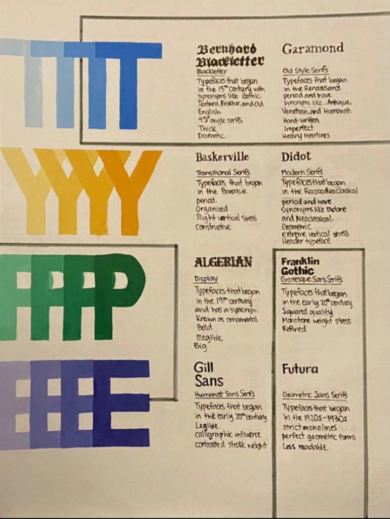
For my type poster, I struggled to find a nice design that would fit all of the required information. I kept sketching multiple designs and I felt that nothing worked. When I took a pause, I finally had an idea come to mind, which is the one reflected below. I wanted to design a poster that showed the playful yet constructive aspects of typography. I felt that the bright colours mixed with the geometric shapes demonstrated that concept.

I spent around 10 hours putting together the poster. However, if we wanted to include sketching time, then it would have been approximately 11 hours. Further, If I were to give myself a mark out of 10, I would give myself an 8. I’m fond of the design, but I think my typographic sections could have been better executed.