Daniel Pelavin

Daniel Pelavin is an illustrator, graphic designer, and typographer who grew up in Detroit, Michigan. He began his career doing apprenticeships at local art studios and later got his Master of Fine Arts in Graphic Design in New York. Pelavin is known for his knowledge of geometric forms, rich colours, and letterforms inspired by 20th-century culture. His work demonstrates a retro-futuristic style that also implements modernist and art deco elements. Further, He’s worked on book covers, postcards, posters, and typefaces. He created a well-known typeface called ITC Anna. Eventually, he won several awards from institutions such as the American Institute of Graphic Arts, Graphis Posters, Society of Publication Designers, etc. Since then, he has become a full member of the Graphic Artists Guild and the president of the Type Directors Club. He’s even had a studio in New York since 1979. All in all, I love Pelavin’s illustrations and graphics. However, I’m not very fond of his typefaces. I really like the colour palettes and shapes he uses to give each of his pieces a beautiful aesthetic.

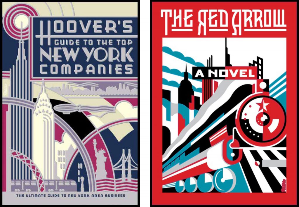
Art-deco Inspired Work. Source: https://blog.graphis.com/detroit-style-with-new-york-flair-graphis-master-daniel-pelavin/
After Hours Illustration. Source: https://www.artflakes.com/en/products/after-hours-2

Sources:

http://www.artoftheprint.com/artistpages/pelavin_daniel_heydiddlediddle.htm

https://blog.graphis.com/detroit-style-with-new-york-flair-graphis-master-daniel-pelavin/
https://prabook.com/web/prabook-login.html

Barbara Stauchaffer Solomon

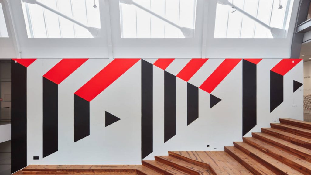
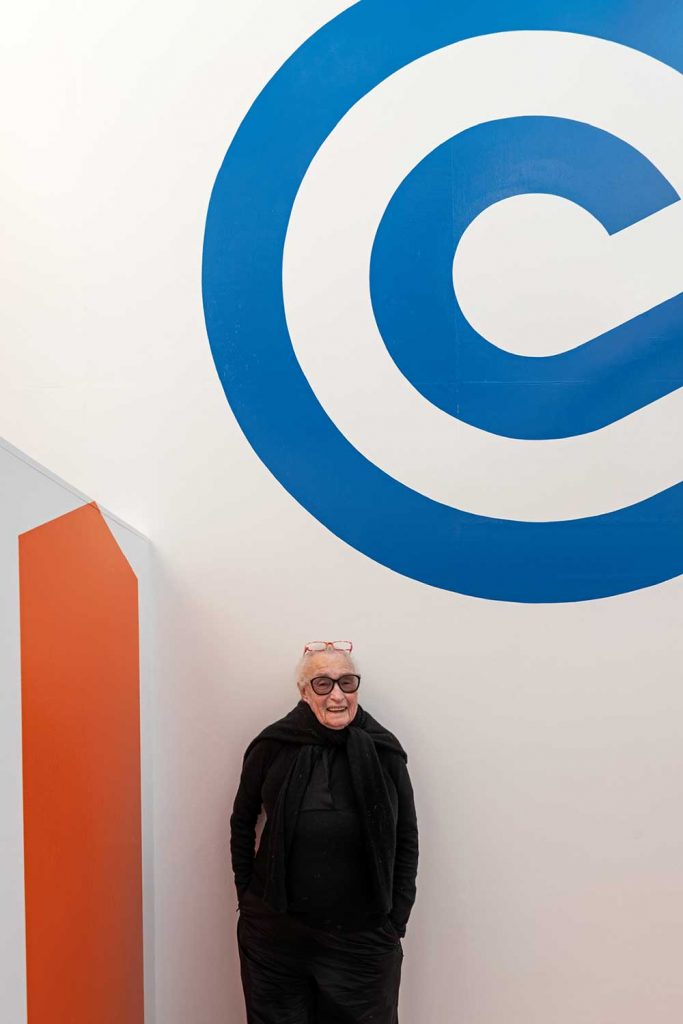
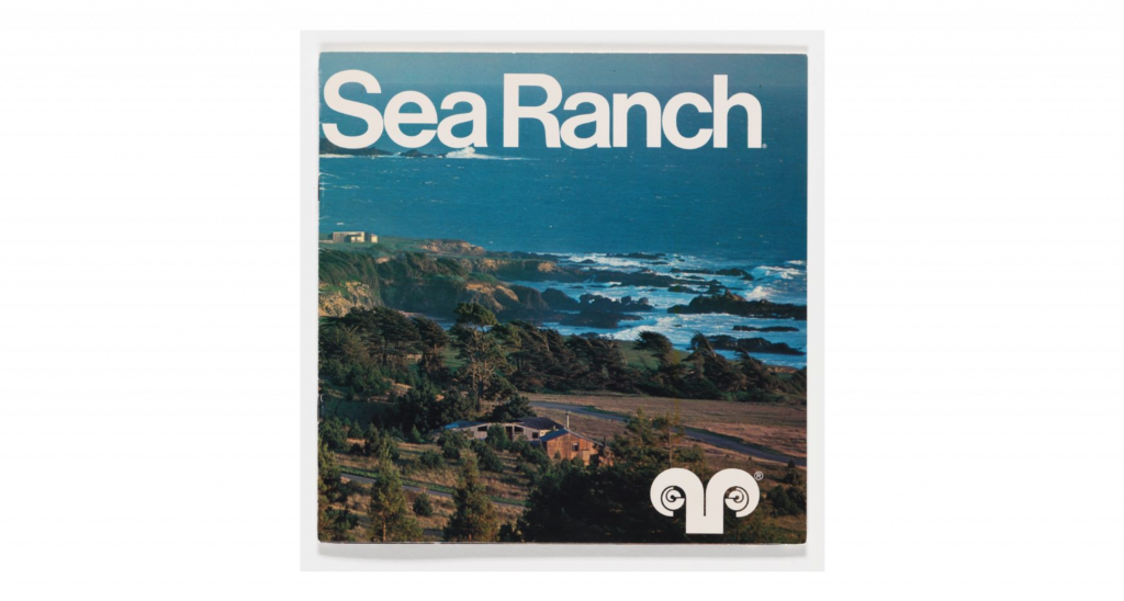
Barbara Stauchaffer Solomon is a multi-talented woman who was trained in dance and graphic design. She began studying dance in San Francisco, but later moved on to study painting and sculpture at the San Francisco Art Institute. After the death of her husband, Frank Stauffacher, she had to find a way to support her young daughter. She decided to move to Switzerland to study graphic design at the Basel School of Design because she knew that she would get paid more. At Basel, she studied under Armin Hoffman, and he became her main reference throughout her lifelong work. When she returned to the United States, she was hired at landscape architect Larry Halprin’s studio. This is where she did her first major project: Sea Ranch. The logo and supergraphics that were produced for this project influenced many designers. After that, many clients were a fan of the same minimalistic and modernist style that was created for the Sea Ranch. It was at this point that Solomon became known for defining supergraphics. Finally, Solomon decided to go back to school to study history, philosophy, and architecture at the University of California. This education allowed her to advance her writing skills and she now writes her own books. Overall, I think that Solomon is a major inspiration because she was able to push through difficult barriers in her life in a successful manner. Her work may be simplistic, but it is obvious that a lot of thought and hard work goes into her projects.

Sea Ranch Brochure with Logo. Source: https://www.sfmoma.org/artwork/2014.709/
Landscape 2018 at BAMPFA. Source: https://www.kqed.org/arts/13839094/barbara-stauffacher-solomon-bampfa-art-wall
“Blue Wave” Graphic at Sea Ranch. Source: https://design-milk.com/the-supergraphics-collection-collab-features-art-by-iconic-barbara-stauffacher-solomon/

Sources:

https://prabook.com/web/barbara.solomon/3756011

https://www.designweek.co.uk/issues/22-28-february-2021/barbara-stauffacher-solomon/

https://www.edwardcella.com/artist/Barbara%20S._Solomon/biography/