Clarence Cole Phillips, better known as Cole Phillips, was an artist most famous for his unique use of negative space, usually featuring stylish women. Phillips was an extremely popular illustrator of his time, and his popularity has not dismissed. Many tie his popularity to his signature fadeaway, but Phillips was much more than a one trick pony.
Beginnings & Time Magazine
Phillips initial contact with art was perhaps not the most conventional. Instead of drawing in a classroom, he sketched while working as a clerk for the American Radiator. As he came from a purely lower-middle class family, Phillips began with no other ambition to be a prominent illustrator, and took the job as a clerk, a job which he had no talent or interest in.
He soon quit his job there in order to attend Keyton College in 1902, where he published his first official works. More specifically he illustrated for the college’s monthly magazine, The Reveille. However in his junior year he dropped out, with the intention of working as a professional artist in New York. When he moved, he brought a recommendation letter from his old clerking job, which helped him gain a position as a clerk (and later a salesman) at the company’s New York location. However, a less than flattering illustration of his job cut his time there very short.
However, not all was over. A co-worker of Phillips recounted the story to J.A Mitchell the publisher of Life Magazine. Upon his request, the co-worker presented him Phillips illustration, and Mitchell loved it so much he offered Phillips a job as an illustrator at the magazine. Phillips initially refused the job offer, opting instead to take art lessons. However, after a short and sweet three months at art school he dropped out, and in 1907 he accepted the job. He proved to be immensely successful, and a favourite of the magazines audience, which got him many jobs to illustrate the covers. Within just a year of working at Time, Phillips established himself as popular as other illustrators of his time, such as Charles Dana Gibson and James Montgomery Flagg.
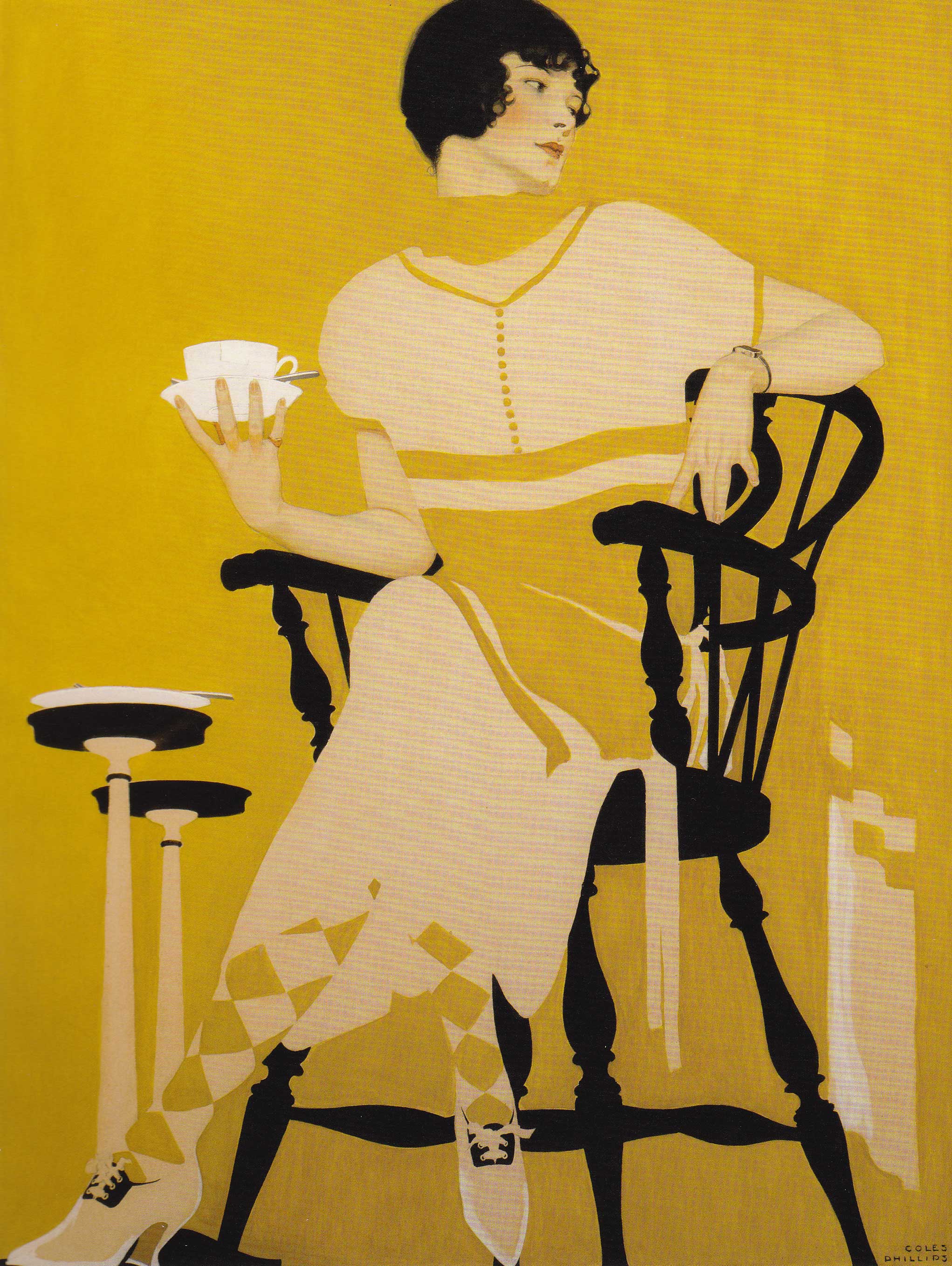
Fadeaway Girl

In 1908 Phillips would debut what would later become his most perhaps the most iconic signature: The Fadeaway Girl. The first example of this was his 1908 but it became a technique which he utilized many times throughout his career. The figure’s clothing blends into the background, with the form of their clothing is still clearly defined and readable through minute details and careful planning on Phillips part. While the fadeaway could be (incorrectly) dismissed as a mere gimmick, it is a technique which demonstrates Phillip’s skillful compositional skills. When arranging a n image in such a fashion, immense attention has to be paid to the shapes that the positive and negative spaces make, and how they interact. This is a skill easier said than done. He didn’t just limit the technique to clothing, he applied the fadeaway in many different ways such as in the poster below.

Phillips utilized this technique many times, and it remains very popular for contemporary artists to take their own stab at it.
Phillips Girl

Women were a primary subject of Phillips, and the women he drew can be seen as
as an modern reiteration of other ideals of beauty, such as Charles Dana Gibson’s illustrations of the “Gibson Girl”. The changing time for women were expressed in Phillip’s illustrations. The ideals which the elite, prim and proper socialite which the Gibson Girl stood for where replaced with more modern values. The women which Phillips drew were often depicted as active, fun, and modern. Some even cite these illustrations as one of the first pin ups.

In all, I quite like all of Phillips work. The lines are very clean and the colours are well picked : overall it has a very clean and sleek look to it. His fadeaway style in particular is very interesting and amazingly executed. I hope to improve my own work by studying and adopting some of his techniques.