IDES 244 RECONCILIATION PROJECT RATIONALE

When my group decided on Call to Action 63 from the Truth and Reconciliation Commission of Canada, we wanted to create an interactive youth program that covers Indigenous culture and history. We researched different aspects of Indigenous culture to see what we could teach students. After meeting with the prof and Bracken, we got feedback that the amount of information we wanted to cover was too vast. 

Bracken suggested making our program more specific, and mentioned the idea of focusing on potlatches. Me and my partner both liked that idea, as potlatches are essentially a summary of indigenous culture, practices, and beliefs. We both researched potlatches and decided on 5 key elements of the potlatch that is important: Gift Giving, Masks, Dance & Song, The Potlatch Ban, and Present Day Potlatch. After we decided on those themes, we brainstormed ideas for activities the kids will do for them.

Developing the potlatch program

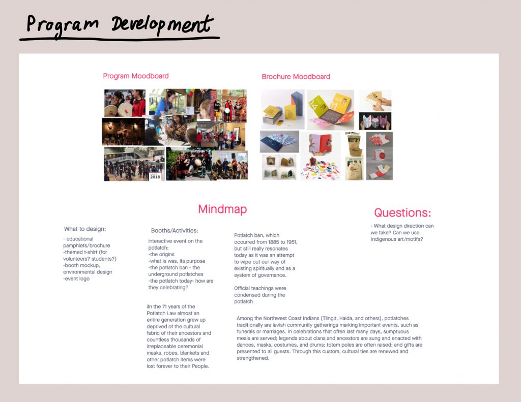
In order to execute our vision for the youth program, we came up with the idea to create a brochure for the students. But after discussion, the idea of a brochure turned into a work booklet that students will fill throughout the program. This way we can show what is being taught to the students. Along with a work booklet, we thought of making banners for each section as well. 

My role was to make the banners and draw the illustrations for the booklet. I chose an illustration style that was simple, graphic, and fun to catch the eyes of the young students. My process for each illustration was rough idea sketches, turned into a refined sketch, and then executed in Adobe Illustrator.

Some of my illustration process and inspiration
The Banners
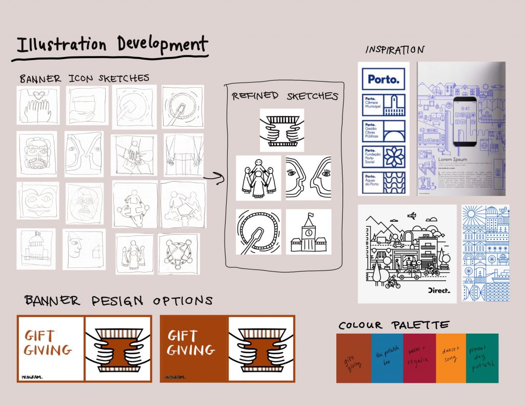
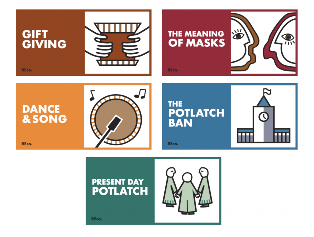
Gift Giving: I drew a bentwood box which is one of many types of gifts given during a potlatch.
Masks: This one was hard to figure out a concept for because I did not want to directly draw and stylize Indigenous masks. So instead, I depicted masks from a side profile. This way you also get the idea that the people behind the masks are important too.
Dance & Song: I drew a drum which is crucial for the background of Indigenous dances and songs.
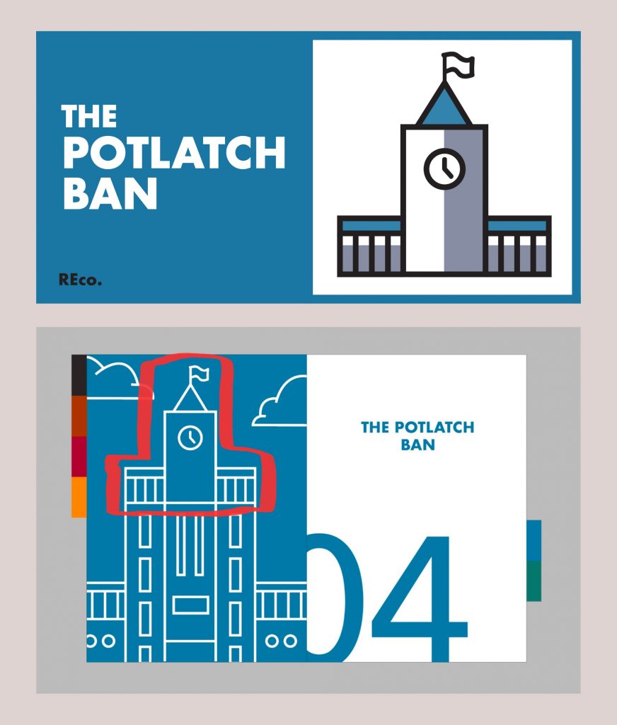
The Potlatch Ban: I drew the parliament building to represent the Canadian government.
Present Day Potlatch: I wanted to represent the idea of community, therefore I drew figures in a circle shape holding hands.
The illustrations seen in the booklet and banners are cohesive with each other, the icons on the banners match their corresponding page on the booklet. Here is an example of that.

Overall, at the start we were struggling to get a clear vision of what the program would look like and what message we were going to convey to the students. But once we nailed down on focusing on potlatches, everything started to fall into place. We ended up with a program that will engage young students by allowing them to be interactive and independent, as well as a program that is all visually cohesive, with a friendly and inviting tone. The visual elements help make the educational elements we wanted to push through stronger. We achieved our goal of making a program to practice reconciliation towards the culture and history of the Indigenous.

IDES 244 Reconciliation Project

The project objective is to educate middle school students on Indigenous history in an engaging way. We want students to develop understanding, empathy, and respect towards Indigenous culture, art, and heritage. 

Curriculums have been evolving to include resources on Indigenous people and perspectives, and we want to give students the opportunity to learn about Indigenous culture outside of the classroom in a meaningful and authentic manner. Sometimes the curriculum can seem repetitive, incorrect, and superficial. It’s important not to teach a washed-down version of their culture and history. It sets up students to not have a complete understanding of Indigenous people and the effort in reconciliation is lost. If we embed relevant and accurate material into the curriculum, students are more likely to learn, share, and appreciate the content. We are hoping to design a solution for students that celebrates and raises awareness to Indigenous history and culture.

Links:

https://thetyee.ca/News/2017/09/05/Bumpy-Start-for-BC-First-Peoples-Curriculum/

https://www.cbc.ca/news/canada/school-on-the-land-indigenous-teachings-get-kids-outside-the-classroom-1.5705328

https://www.theglobeandmail.com/news/british-columbia/new-bc-school-curriculum-will-have-aboriginal-focus/article25003962/

https://guides.library.ubc.ca/indigenous_ed_k12

UX Storyboard

For this UX storyboard assignment, I had Amanda Chu as my user persona. In my group we generated 3 possible stories inspired by Global Goals 5, 11, and 12.

3 Text + Story Options

Our first scenario was inspired Global Goal 11: Sustainable Communities and Amanda’s hobby of gaming. We decided to use Amanda’s gaming as a negative effect. Staying home to game instead of going out is the reality of a lot of young people, which made this story relatable.

Our second scenario was inspired by Global Goal 12: Substantially Reduce Waste Generation and Amanda’s trait of getting overwhelmed by the state of the world. A very popular way the youth are doing their part to reduce their waste is shopping sustainable fashion, which is why we incorporated thrifting. We chose the decision making trigger to be Amanda watching a Netflix documentary because many young people are influenced by the media they watch.

Our third scenario was inspired by Global Goal 5: End Discrimination Against Women and Girls, and Amanda’s hobby of gaming. Some of us in our group mentioned they experienced sexism in the gaming community. It’s very likely that Amanda would have a similar encounter.

Chosen Emoji Story

As a group we collectively decided that story #2 was the one we would turn into a storyboard. We felt that this story was easy to follow, and it had a clear structure with the climax (watching the documentary ) and solution (Amanda starts thrifting). The solution is realistic, and the moments leading up to her decision are all moments we can relate to.

Storyboard

I began the story with Amanda scrolling on her phone in bed, something we all do, to establish a realistic setting. I decided a news article would make her feel sad, because the volume of news we have access to nowadays can be overwhelming. In the second frame Amanda distracts herself with Netflix, another realistic habit we relate to. The third frame I made the largest because it is the climax of the story. She is hit with emotion from the documentary which ultimately leads her into the decision to start shopping sustainably. The fourth frame focuses on the realization of her environmental impact. It was essential to include a moment where we see Amanda self evaluate and the way she processes a solution. The last frame shows Amanda happily thrifting and the benefit of her decision to quit supporting fast fashion.

The one tweak I made to the story from the sticky note version was to eliminate her doing groceries at a zero waste store in the last part. I wanted the story to focus solely on sustainable fashion to keep things clear.

I feel like I managed to make a realistic storyboard that smoothly integrates the global goals and also gives us a look into Amanda’s behaviours and traits that matches the given psychographics of her character.

Canadian Design Today: THEO DIMSON

Theo Dimson (1930-2012) was a Canadian graphic designer most recognized for his film and theatre posters he designed in an art deco style. He got into the Ontario College of Art and Design with a scholarship and graduated in 1950. Dimson’s career ranges from commercial design for Hollywood films to commissions by Canada post.

9 Best Theo Dimson images | Graphic design, Canadian painters, Art ...

This is a great example of Dimson’s signature art deco style. The flatness and floral motif ring true to the art deco look. I like the contrast between the earthy tones of the illustration and the type that’s highlighted in bright blue. The little swirl of the lady’s hair which is then repeated again in the bulk of her hair is another detail I like.

This is one of many stamps Dimson was commissioned to do by the Canada Post. He designed this stamp to commemorate the Salvation Army’s hundredth anniversary. I like how his line work isn’t black, but a copper colour instead. It’s interesting the way he simplified the figures, especially the hand of the woman, the lines in between her 3 fingers aren’t there.

He designed the titles for the 1987 romcom movie Moonstruck. His choice in type was simple, as he used Futura. However, the way he overlapped the two O’s over each other make the world of a difference compared to if he hadn’t. Crazy how the smallest tweak of putting the two O’s together suddenly make a noteworthy design. I actually really love the movie Moonstruck and it was a pleasant surprise to find out Dimson was a part of it.

Sources:

https://gdc.design/fellows/theo-dimson-fgdc

https://www.theglobeandmail.com/incoming/art-deco-designer-brought-flamboyance-to-his-work-and-life/article549542/

https://postagestampguide.com/stamps/16202/the-salvation-army-1882-1982-1982-canada-postage-stamp

Postmodernism in Europe: KAREL MARTENS

Karel Martens (1930-present) is a Dutch graphic designer and typographer. Martens graduated in 1961 from the Arnhem School of Design where he studied fine art. He then began teaching at ArtEZ in 1977, and in 1997 he became a visiting lecturer and senior critic in the graphic design department at Yale University. He was an inventive book designer, however he also designed other printed items such as stamps, telephone cards, and signs. 

Dutch Phone Cards

This is one of Martens most notable works. He was commissioned to make a series of designs for Dutch phone cards. The digits have been overlapped with other digits in multiple colours which turns out to be a code for the Dutch national anthem. His simple design holds a lot of meaning and the way he made a code for the national anthem is clever.

Monoprints

These are archival cards from the Stedelijk Museum in Amsterdam that Martens collected to use for monoprints. I like how Martens limited himself and kept the design clean by using only basic shapes. The fact that he repurposed museum cards rather than a blank piece of paper adds extra interest.

Printed Matter (1996)

His book Printed Matter was claimed as the best designed book in the world in 1998 by the Leipzig Book Fair. I’m definitely not well-read enough in design books to have an opinion on if its the best in the world. But, what I can say is that each page is exciting and refreshing to look through, the thought he put into creating the book is evident.

Sources:

https://www.artsy.net/artist/karel-martens

https://en.wikipedia.org/wiki/Karel_Martens

https://medium.com/@amberbravo/dutch-master-karel-martens-and-the-power-of-restraint-a272615b5099

Supergraphics Innovator: Barbara Stauffacher Solomon

Barbara Stauffacher Solomon (1928-present) is an American graphic designer, artist, and landscape architect. She began as a dancer and trained in her hometown, San Francisco. Later on, she studied graphic design in Switzerland in the 50s. Solomon is credited as the innovator of supergraphics and is best known for her supergraphics she designed for the Sea Ranch in Northern California.

Athletic Centre at the Sea Ranch

The managers in charge of the Sea Ranch were over budget, but the interior walls were all plain white, and they needed to spice up the space. At the time, paint was affordable and so Solomon was hired to paint some interiors. Her experience training as a dancer when she was younger helped her paint the big walls. Regarding the design of the supergraphics themselves, Solomon was inspired by bold colours of paint straight out the tube, geometric shapes, and Helvetica type. I think Solomon did a brilliant job. She completely transformed the space, giving it character and memorability.

HearHear record store in San Francisco, designe by Barbara ...
HearHear Record Store, San Francisco

I love the interior of this record store. Solomon is bringing Swiss graphics to San Francisco, which the city had never seen before. But, her choice in bright colours stays true to the west coast.

CalExpo Water Tower

This is different than the supergraphics Solomon does for interiors of buildings, but I think this really shows off the range of different ways her supergraphics can be used. Something as boring as a water tower turns into a fresh art piece.

Sources:

https://eds-a-ebscohost-com.ezproxy.capilanou.ca/eds/pdfviewer/pdfviewer?vid=10&sid=48152139-56b3-4623-b654-f157430b5af8%40sdc-v-sessmgr01

https://www.architecturaldigest.com/story/barbara-stauffacher-solomon-the-seminal-sea-ranch-designer-is-having-a-surge-of-attention-at-age-91

Psychedelic Design Hero: RICK GRIFFIN

Rick Griffin (1944-1991) was an American artist and psychedelic poster designer. He grew up obsessed with surf culture and started his art career in high school. He was hired by a magazine to illustrate a comic strip of a cartoon surfer dude named “Murphy”, a character he created himself.

Griffin’s “Murphy” character makes the cover of  Surfer  1962
Griffin’s character “Murphy” on the front page of Surfer Magazine

I think Griffin was successful in giving “Murphy” a distinct look and illustrated him with great character. It’s impressive how Griffin already had an art gig in high school, he was definitely ambitious.

Fast forward to the 60s, Griffin began designing posters, and his work would soon define the psychedelic art era.

Grateful Dead “Aoxomoxoa” title & album cover by Rick Griffin 1969
Grateful Dead – Aoxomoxoa (1969)

This is a design Griffin did for the rock band Grateful Dead, initially as a poster for show promo, but the band loved it so much they made it their album cover. The themes of life and death Griffin is playing with in this piece creates a powerful contrast. I especially love how he made the sun rays squiggly and connected a squiggle with the skull right below it.

The Doors Poster (1967)

Griffin designed this poster for the rock band The Doors for a concert they did in Denver. I think this design would look really cool on a shirt and I love the colours he used. The alien creature offering the white pill is only what I can assume to be a drug reference. Psychedelia at its peak!

Sources:

https://eds-a-ebscohost-com.ezproxy.capilanou.ca/eds/detail/detail?vid=1&sid=37682b0a-d888-4de3-887c-b3130964a597%40sdc-v-sessmgr03&bdata=JnNpdGU9ZWRzLWxpdmUmc2NvcGU9c2l0ZQ%3d%3d#AN=9109233380&db=a9h

https://www.rickgriffindesigns.com/biography

Advertising Art Director: OTTO STORCH

Otto Storch (1913-1999) was an American magazine art director and advertising photographer who changed the game in the editorial design industry. He is most recognized for his work as an art director at McCall’s magazine, where he worked for 14 years. Things were not going so great for McCall’s when Storch arrived, their ad revenues were declining and no one was buying copies. Because the magazine had nothing to lose, they allowed Storch creative freedom. He took advantage of this opportunity, taking design risks and creating experimental layouts. His work influenced and revamped the look of American magazines in the 50s. Magazines were hot again!

I love how he’s going all out with the type here, while also integrating it into the photograph. You can see he’s throwing it back to 19th century wood typefaces, which wasn’t trendy at the time. Bold move, Storch. But this paid off, because people started using those wood typefaces as well, to the point it became cliché!

The reflection of the photograph to the type is brilliant. Definitely eye catching.

I love this corn spread. The giant corn looks delicious and Storch matches that beautiful yellow corn colour with the headline. Each letter of the headline looks like a little kernel, cute!

Sources:

http://westread.blogspot.com/2011/08/otto-storch-and-mccalls-fifty-years-ago.html

https://search-credoreference-com.ezproxy.capilanou.ca/content/entry/thgraph/storch_otto_1913_99/0

Back Cover Rationale

Judy and the Crate of Knowledge

When I got assigned to do a back cover for our class book, I knew I definitely wanted to do an illustration of Judy. I feel that although the periods, places, and things we’ve learned are important, the teacher is as well. I also don’t believe I’ve seen Judy on the other IDEA book covers before so this year is the year for it to happen!!!

We see Judy cycling out of the page with her iconic yellow boots and little knit purse, bidding us farewell but also leaving behind the things she taught us. I like how I managed to smoothly integrate bits of what we learned in class by putting such objects in the rear crate. The items I chose were just things that stuck out to me during lecture and readings. I included:

  • William Morris’ wallpaper
  • 15th century block book
  • Early writing tablet
  • Jobbing printer poster
  • Lucky strike cigarettes
  • Ukiyo-e print
  • Zang tumb tumb sound poem
  • A camera
  • Herbert Bayer’s banknotes

I used watercolours, watercolour pencil crayons, and ink. I wanted the style to be reminiscent of Roald Dahl book covers:

I like the loose and sketchy feel of my illustration, giving it a sense of childlike spontaneity. It’s quirky! It’s fun! I’d give myself a 9/10 for my back cover. It turned out just the way I wanted it to be. But I could’ve spiced it up more by incorporating all the typefaces we’ve learned.

CONTEMPORARY & POST MODERNISM – CY TWOMBLY

Edwin Parker “Cy” Twombly (1948-2011) was an American painter, sculptor, and photographer born in Lexington, Virginia. His works are graffiti-like, with speckles of detail from scratches, smudges, drips, pencil fragments and bits of written word. When defending his style he said:

“My line is childlike but not childish. It is very difficult to fake… to get that quality you need to project yourself into the child’s line. It has to be felt.”

Twombly’s approach to art is emotional and refined, but critics of his time would disagree. Artist and writer Donald Judd described his work to be “a few drips and splatters and an occasional pencil line,” and that “there isn’t anything to these paintings”. Damn Donald! What a harsh guy. Here’s one of Judd’s works:

Untitled (1973)

Is there anything to these wooden boxes, Judd? Ha! But I guess I do understand why someone would criticize Twombly’s paintings, or any abstract art in general. You can have an “I could do that myself” attitude about his art but I for one enjoy Twombly’s pieces.

Untitled, Rome (1960)

I love the unsystematic and chaotic feel of this painting, it’s like a page out of a scrapbook without the photographs. The different textures work well together. There’s numbers, rulered squares, squiggles, drips, writing, splotchy paint… Twombly puts it all on there! I agree with what he said about his work being childlike but not childish. This piece is planned disorganization.

Nine Discourses on Commodus (1963)

From 1962-64 Twombly’s works became more anxious and took on dark themes. This was a reflection of the somber mood in the early 60s from the Cuban Missile Crisis and John F. Kennedy’s assassination. There are bursts of colour but they have been restrained, leaving room to create negative space. In a couple of these there are grids, graphs, and geometric axes, an attempt to control mayhem with discipline and order.

Anabasis (1983)

I actually think this piece is really cute, to me it looks like a greeting card of some sort. It looks very much like a bicycle, especially the two wheels with spokes. The colours are calmer than what Twombly typically uses but I think it works nicely to create a peaceful spirit.

Untitled (Say Goodbye Catullus, to the Shores of Asia Minor) (1994)

This one is a big boy, 157 by 624 inches! Wow. Twombly used 3 canvases for this one and a variety of oil, acrylic, oil stick, crayon, and graphite. I like the heaviness all pushed to the right side of the piece. It starts out tame in graphite on the left but then gets increasingly more intense with the explosions of colour.

Leaving Paphos Ringed With Waves III (2009)

Crazy how this bright blue can evoke the atmosphere of the Mediterranean Sea. This looks like a book cover to me with the text being at the top right. All of these 3 colours work really well and I especially love the drippy spots.

Another reason why I like Twombly is because his work reminds me of one of my favourite contemporary artists, Lewis Rossignol. Here is an example of Rossignol’s work:

Image result for lewis rossignol
Anthony Bourdain (2019)

I’m unsure if Rossignol takes inspiration from Twombly but I definitely see similar techniques. The smudging, scraggly lines, pops of bright colour, neutral background, and messy handwriting. I just really love the style! Definitely going to try make my own Twombly-Rossignol hybrid drawing.

Sources:

https://www.wikiart.org/en/cy-twombly/all-works#!#filterName:all-paintings-chronologically,resultType:masonry

https://www.theartstory.org/artist/twombly-cy/life-and-legacy/#legacy_header

http://www.cytwombly.org/biography

https://www.instagram.com/lewisrossignol/?hl=en