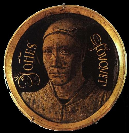
Self-Portrait
Innovation, attention to detail, intense colors, and use of perspective are some of the characteristics that I find when observing the work of Jean Fouquet, a French painter, and miniaturist who lived from 1420 to 1481. The originality in his work is in part due to the various influences that the artist had, as he drew on different sources: from Flemish artists such as Jan Van Eyck to Renaissance masters such as Fra Angelico.
Much information about his life is unknown, however, we do know that he was commissioned a portrait of Pope Eugene IV, which indicates that Fouquet was a renowned artist, since this honor was not awarded to any foreign painter. In addition to this, he also portrayed the King of France, Charles VII, and two relatives of Pope Eugene IV. He was likewise recognized for the illustrations he made in the illuminated manuscripts, and the miniatures he made in the Book of Hours stand out.
Among his best-known works is the Melun Diptych, which I consider is an incredible piece since it achieved an ideal harmony between all the elements, a fascinating composition, precision in the figures, as well as a striking and balanced color palette.
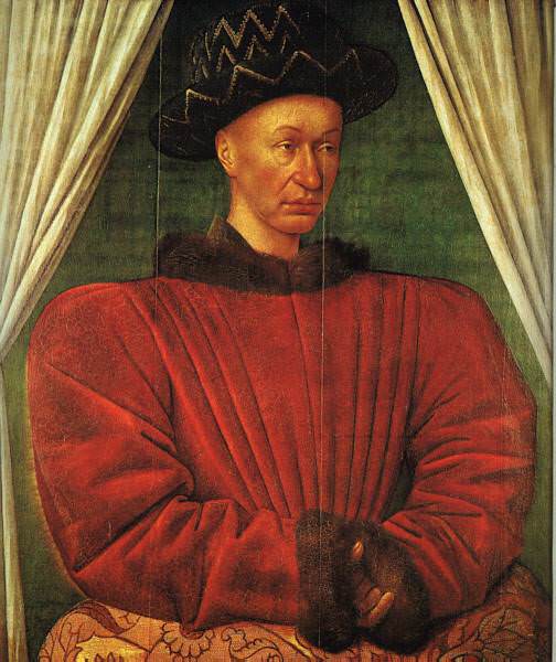
Portrait of Charles VII, King of France

Miniature from the Book of Hours of Étienne Chevalier 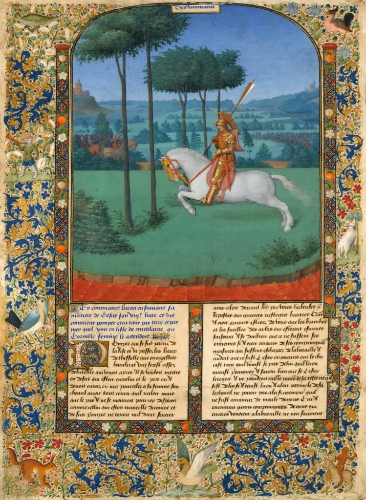
Miniature from the Book of Hours of Étienne Chevalier

Melun Diptych
References
E.H., Gombrich. (1995). The Story of Art (16th edition). Phaidon.
Ruiza, M., Fernández, T. & Tamaro, E. (2004). Biografia de Jean Fouquet. https://www.biografiasyvidas.com/biografia/f/fouquet.htm
Wikipedia. (2021). Jean Fouquet. https://es.wikipedia.org/wiki/Jean_Fouquet
Collins, N. (2018). Jean Fouquet: pintor francés, conocido por el díptico de Melun. https://es.gallerix.ru/pedia/old-masters–jean-fouquet/