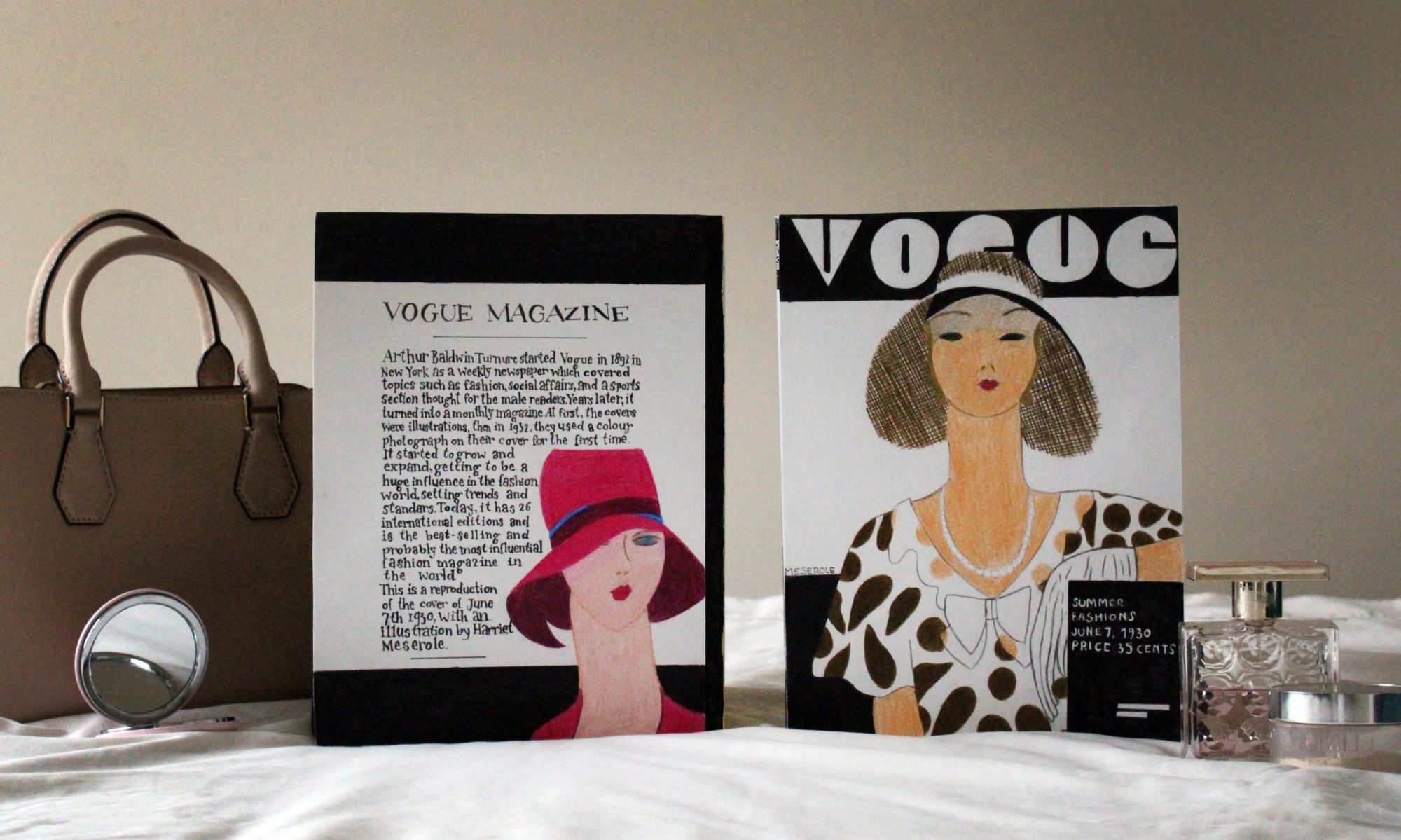
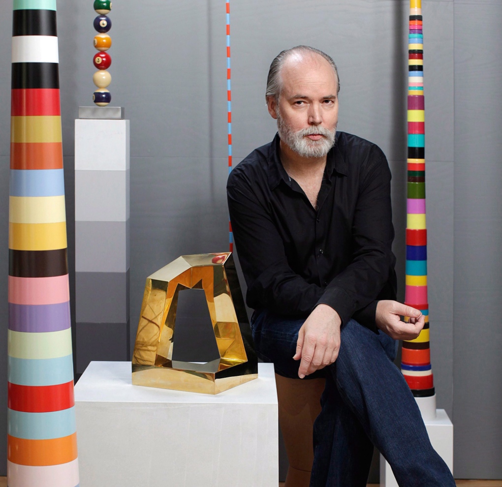
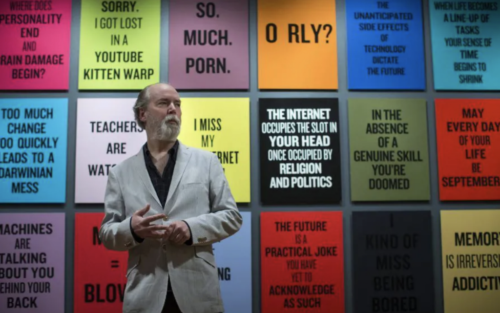
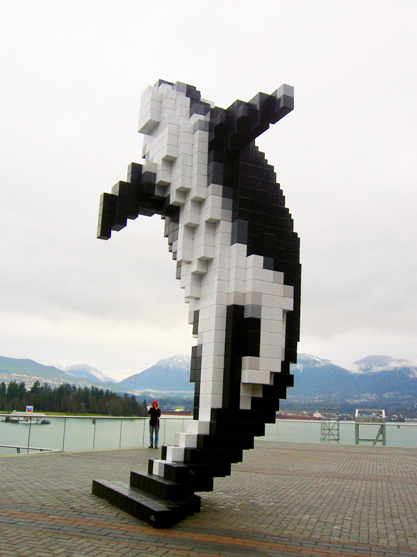
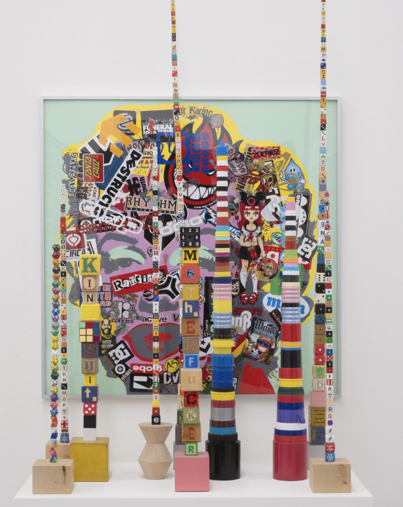
In 1961 in Rheinmünster, Germany, Douglas Coupland was born. Since the age of 4, he lived in Canada, where he would later study art at the Emily Carr Institute of Art and Design in Vancouver. After graduating, Coupland studied design in Milan, Italy and Sapporo, Japan. Though his life, he worked in various fields, including writing novels and scripts, sculpture, and different design areas.
His first novel, “Generation X: Tales for an Accelerated Culture,” is probably his most notable work, as it popularized the term “generation x.” As for his work in visual arts and design, his style was influenced by Pop art artists such as Andy Warhol, and he tends to use his pieces to criticize the reality of today’s society.
One of the things I like about his work is how colourful each of his pieces is, as well as his use of simple elements such as geometric figures. Thus, he creates striking and attractive pieces which are still simple. But definitely, what I find most fascinating about Coupland is seeing how a person can perform in so many different fields and stand out in each one of them.
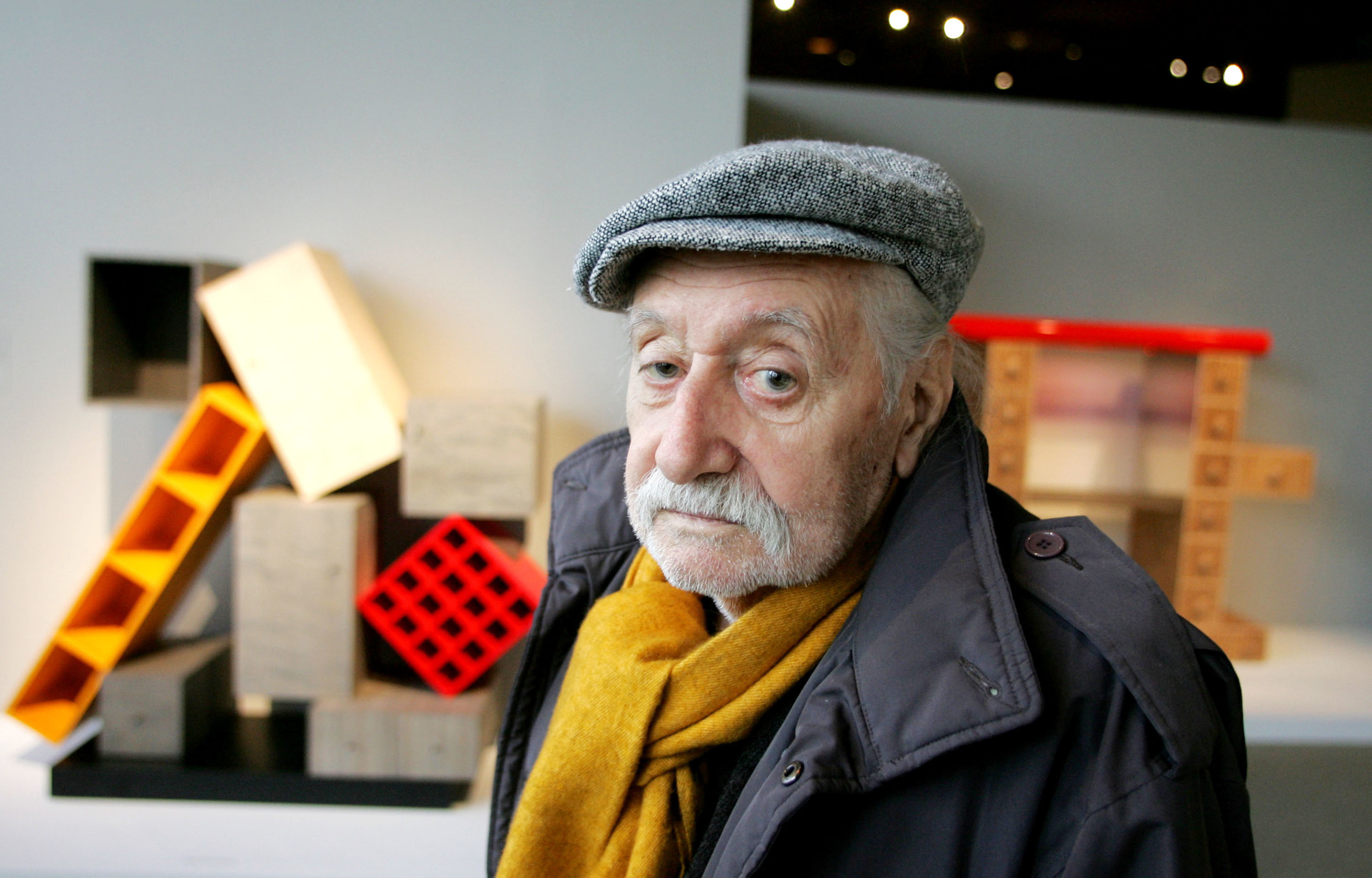
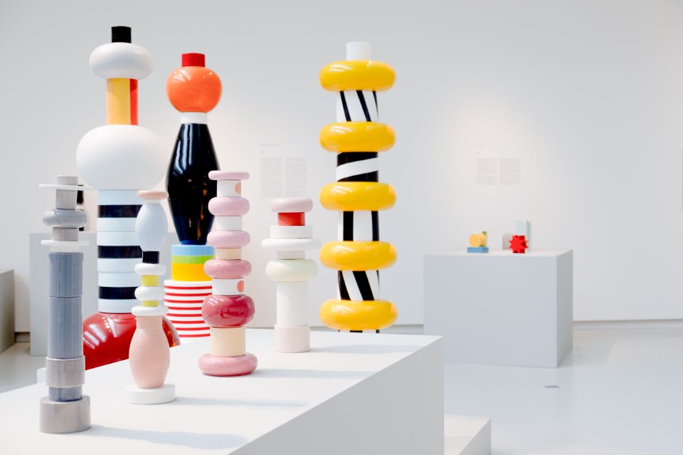
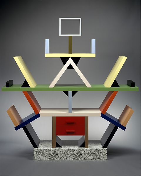
Ettore Sottsass was born in Innsbruck, Austria, in 1917. He grew up in Turin, Italy, where his father was an architect. There, he studied at the Politecnico di Torino and graduated in 1939. He gained interest in the design world after meeting the designer George Nelson on a trip to New York. Then, in 1948 he founded his own studio of architecture and graphic design. In 1980, he became one of the founders of the Memphis group, which he was a part of until 1985. In that year, he founded the studio Sottsass Associati.
His pieces are characterized by being colourful, unusual, innovative and geometric. This particular style can be evidenced in all the different products he designed: cutlery, furniture, sculptures, office machinery, jewellery and architecture. Among his most recognized designs are the Valentine typewriter, the Carlton bookcase, the Milano airport, the Ghella house and the Torino Esposizioni.
In my opinion, his pieces are eye-catching, and I find it fascinating how he achieves such captivating and unique pieces with so few elements. His works never look over-designed; there is a certain simplicity in everything he designed, but at the same time, they are striking.
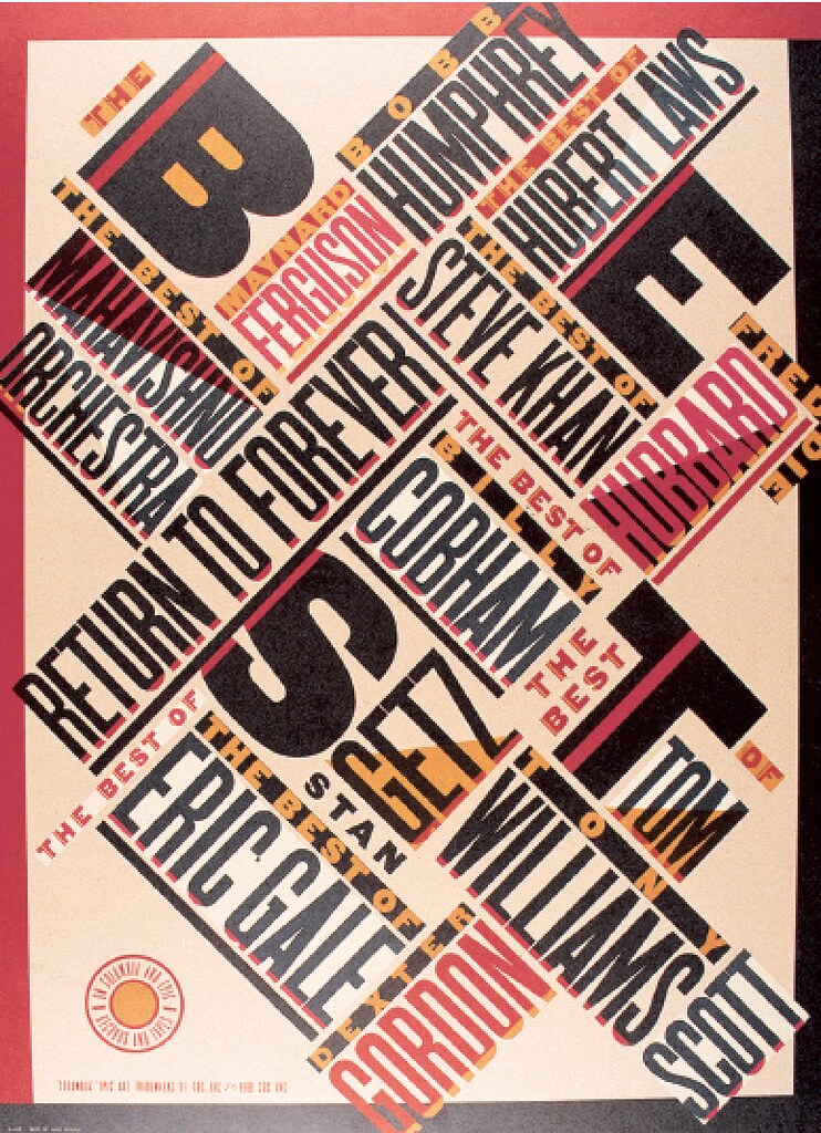
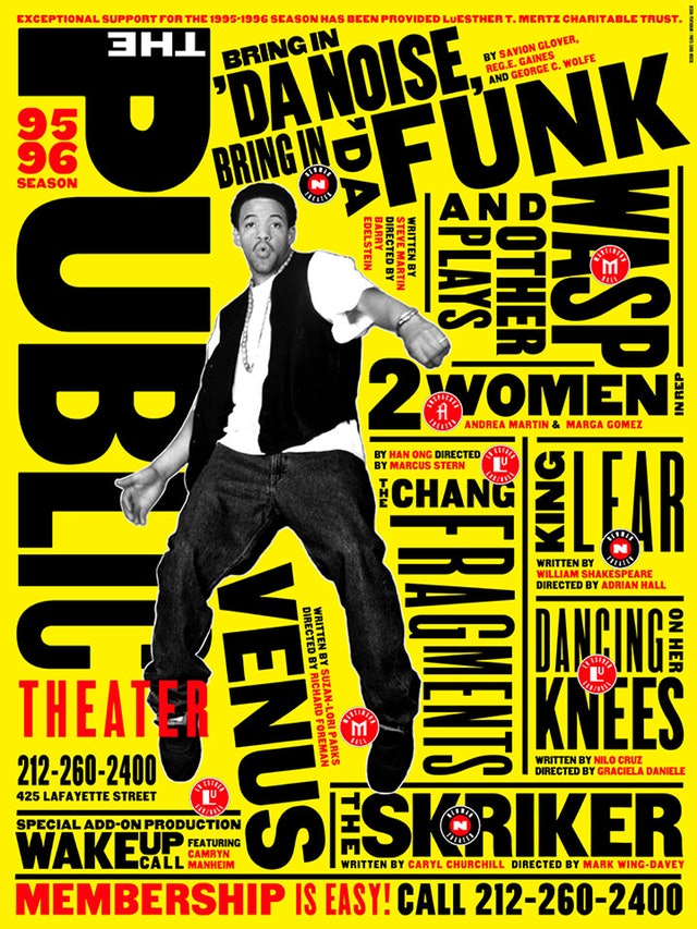
Paula Scher was born in 1948, and grew between Washington DC and Philadelphia.Then, she studied fine arts in Pennsylvania, and obtained her bachelor degree in 1970. She got married and moved to New York city, where she started working for Random House. Later, she worked for CBS records and Atlantic records. In 1984, she founded the company Koppel & Scher, with Terry Koppel. In 1991, she became part of Pentagram.
Her style is characterized for her use of typography, and for having influences from the Russian constructivism. Among her most important works, we can mention her branding projects for Tiffany and co, Windows, Citibank, and for The Public Theater.
Scher has also published a few books, including Make it bigger and MAPS.This last book is a compilation of her designs of more than 39 maps around the world, and I personally find it fascinating, and innovative. I am not specially interested in maps, but I think it is extraordinary the way she achieves aesthetically attractive design while being so busy at the same time and I admire her unique use of typography.
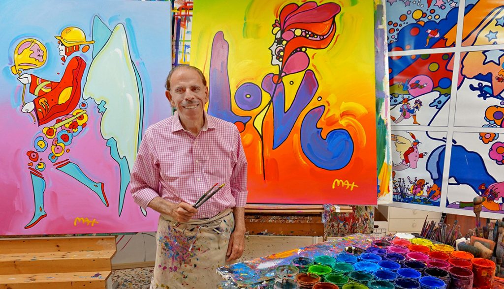
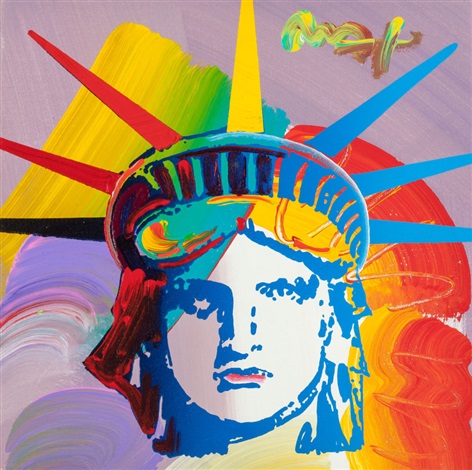
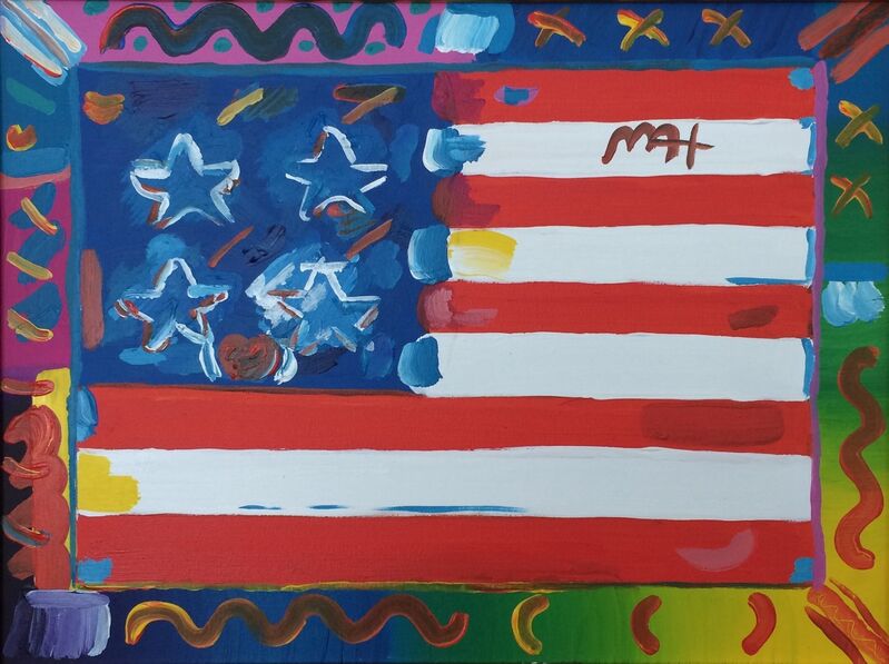
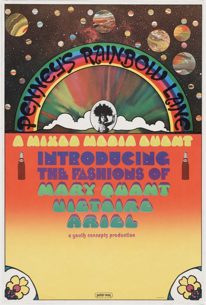
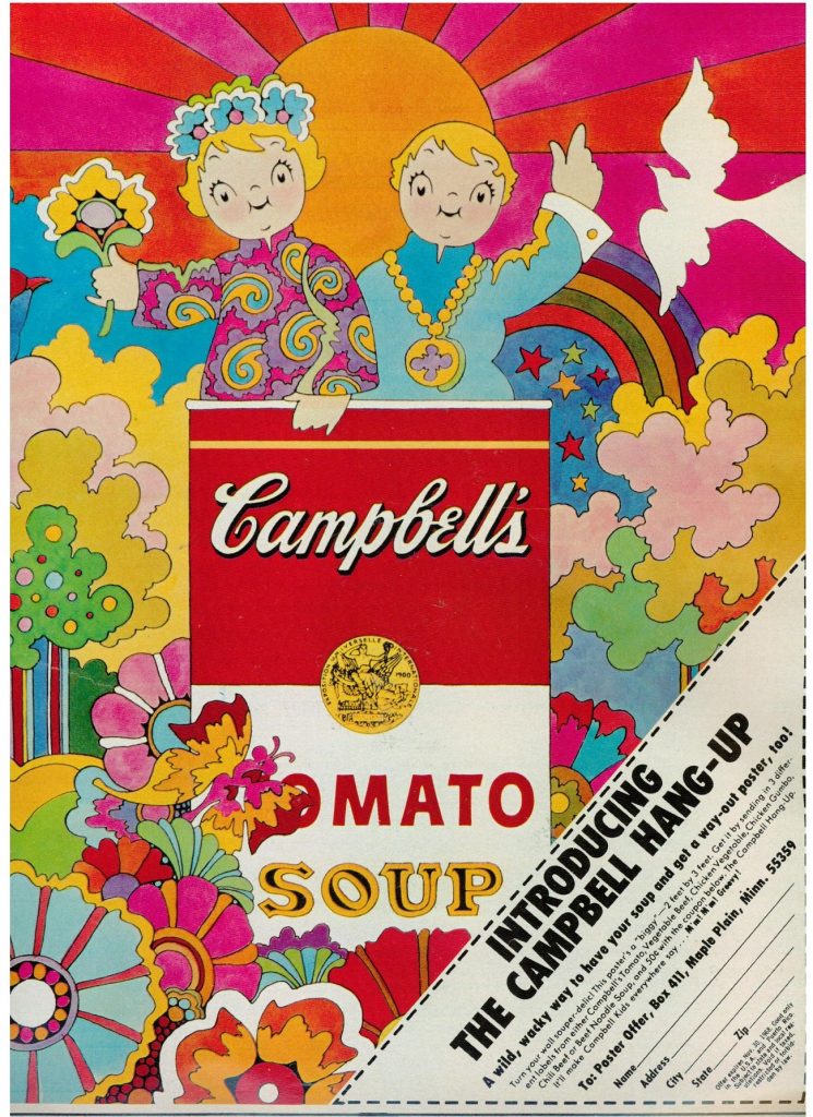
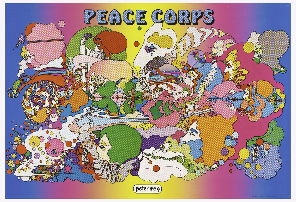
In 1937, in Berlin, Peter Max was born. The following year, his family moved to Shanghai. After a season there, they moved to Israel, Paris, and New York. All these experiences would influence his style and work as a designer in the future. Once there, since he had always shown his interest in art, he began his studies at the Art Students League of New York.
Today, Max is known for being the graphic designer who revolutionized the concept of modern art in the United States, becoming a symbol of pop culture. What stands out most about his psychedelic style is the use of many vibrant and bright colours in the same piece. In addition, he also includes icons of American culture in his works.
Thanks to his various trips, he was influenced by different artistic movements, such as Fauvism or Expressionism. What catches my attention about his work is his mastery of colour. He manages to make his works look balanced, despite the vast number of colours he uses, not to mention all the different elements that he includes. In my opinion, this is not an easy task, and only a good designer can achieve it.
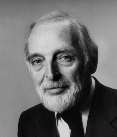
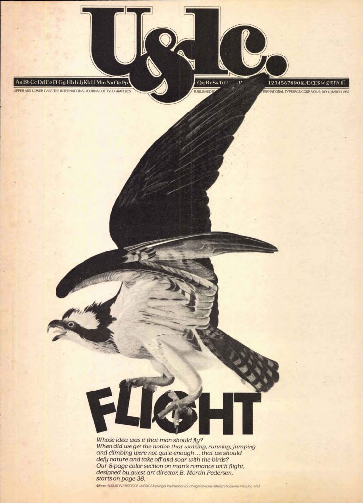
Herb Lubain, was an American typographer and graphic designer, born in New York in 1918. At the age of seventeen, he attended the Cooper Union School. Afterward, he started working as a creative director for different agencies until he finally created his own studio when he was 46 years old. He also became one of the founders of the International Typeface Corporation (a type manufacturer company) and the art director of Upper and Lower Case, which was the magazine of this company.
His innovative ideas rejected the traditional style; he wanted to use type in ways that hadn’t been seen before and explore all the new possibilities that came with the recently developed system of phototypesetting.
Between his highlights as a designer, we could mention the creation of the ITC Avant Garde typeface, and being the editorial designer responsible for the Saturday Evening Post, Eros, and Avant Garde magazines.
I enjoy looking at his pieces because they are expressive, and each one of them uses typeface in a completely different way and thus manages to evoke different sensations. This catches my attention and interests me a lot, since I want to learn more about using typography creatively in my designs.
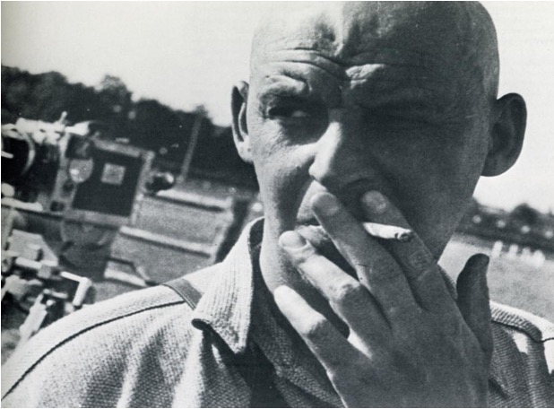
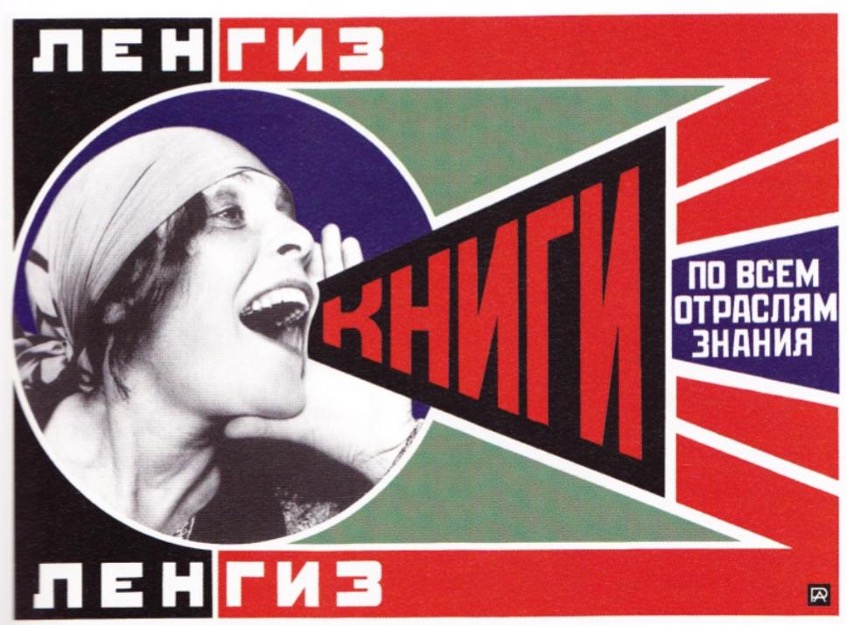
Aleksandr Mikhailovich Rodchenko was a genuinely multifaceted artist: a painter, sculptor, photographer, and designer. He was born in Saint Petersburg in 1891, which means he experienced the Russian revolution in firsthand. He formed as an artist at the Kazan School of Art and the Troganov Moscow State Academy of Arts and Industry.
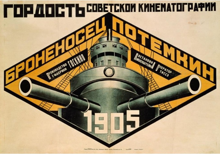
Battleship Potemkin poster (1925)
The Russian Avant-gardes
The Russian revolution was a very particular moment for art and design since this was the moment when the Russian avant-gardes emerged. Rodchenko was fascinated by these avant-gardes, and he was especially interested in Suprematism and Futurism, artistic movements which greatly influenced him. His main idols were Malevich and Tatlin.
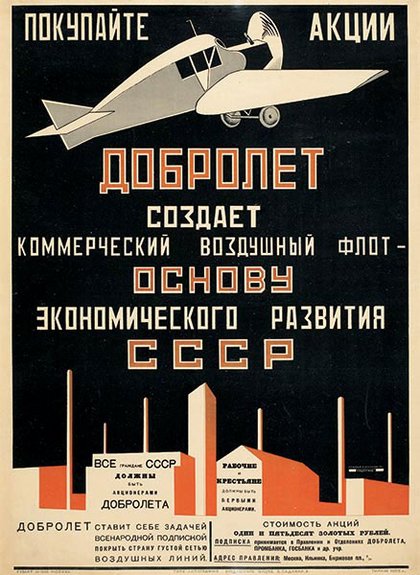
Advertisement poster for the state airline Dobrolet (1923)
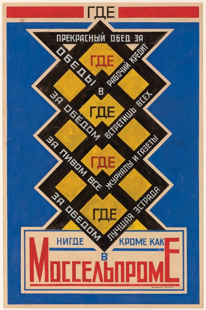
Advertisement poster for Mossel’ prom cafeteria (1923)
The first “Advertising agency”
In 1923, together with the poet Vladímir Mayakovski, they founded Mayakovski-Ródchenko Advertising-Constructor, which today would be considered an advertising agency. More than 150 pieces were created in this agency. Mayakovski, was in charge of writing the slogans, while Rodchenko of creating the visuals.
Please (1924)
Rusian Constructivism
Nowadays, Rodchenko is recognized as probably the greatest exponent of Russian Constructivism. In the field of design, this movement is based on the implementation of photomontage, geometric figures, symmetry, and the representative colours of the revolution: black and red. This is an art form at the service of the revolution, which mixes propaganda, art, design, engineering, and advertising, to create designs with short and very direct slogans that will influence the Russian society of the time.
Art and design are everywhere
What interests me most about this designer is to realize that art and design are everywhere, at all times in history. I like to see that the political, social and economic take place in these spaces, but the artistic part also plays an important role, even in critical moments such as wars and revolutions. I find it amazing to see art as a reflection of the society of the time; it shows us people’s ideologies, thoughts, and goals. For example, design during this time was intended to communicate messages about the revolution. However, it is not as simple as just writing the message. A good design is the one that best communicates these messages, and with this, it is possible to influence and even manipulate the reader
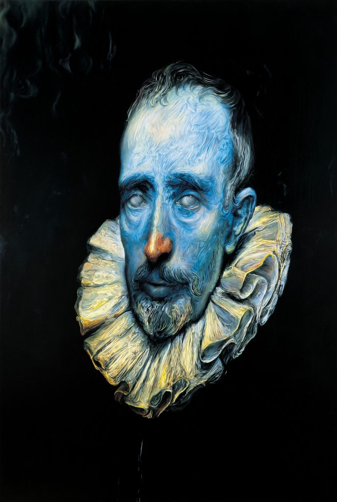
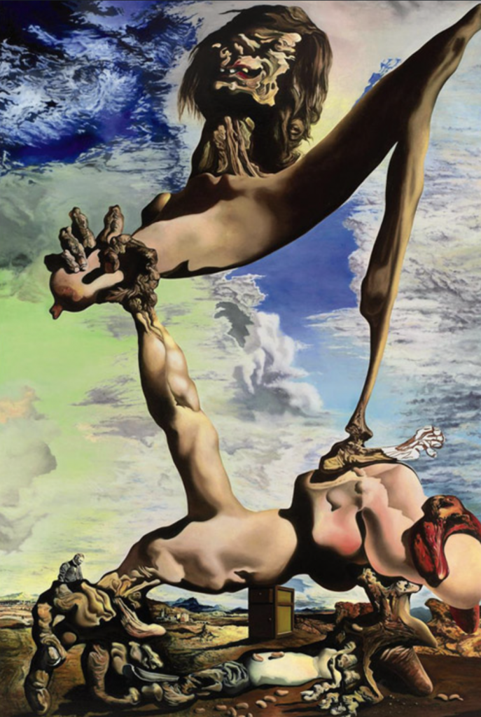
Glenn Brown, born in 1966 in Hexham, Northumberland, is an artist whose artwork is based on appropriation. Meaning, he takes an already-existing piece from some other artists and proceeds to reinterpret it. During this reinterpretation process, he changes characteristics of the original painting, such as the colours, texture, patterns, details, among others. This way, he achieves to create a new painting. Because of this, he calls himself an “artistic Dr. Frankenstein”. However, despite making these changes from the original piece, his art has, on occasion, been labelled as plagiarism.
Sex, 2003
Talking about his artistic formation, Brown began his studies at the Norwich School of Art. After that, he completed a Bachelor in Fine Art at Bath College of Higher Education, followed by a Master of Arts at Goldsmith’s College, University of London. As for his style, he tends to use blue and green colours in his art. Apart from this, he gives his paintings a morbid and intriguing look. Thus, originally beautiful and innocent pieces, are transformed into a rather terrifying image.
Mad Love, 1991
I find it fascinating how Glenn Brown has a very distinctive and recognizable artistic style of his own, despite starting from a pre-existing painting as a base. It is interesting to see how he gives his personal touch to a painting, making us see it from a new point of view, provoking ideas, thoughts and feelings totally different from the original painting. This fact is what caught my attention the most about him; I had never seen an artist who did this kind of thing until now. I was very impressed by what he did, and I enjoyed seeing his artwork and comparing them with the original pieces. In my opinion, I even like some of his paintings more than the originals; I find them more striking and shocking.
For this project, what made more sense for me was creating a timeline, and organizing the different categories chronologically. I also thought the best way to show the characteristics of the typefaces, was to make the example as big as possible. Therefore, I did various sketches with this concept. For me, the biggest challenge in this assignment was to find an interesting way to include all the text that was needed for the descriptions and characteristics. Because there were already going to be a lot of text elements, as well as big letters, I did not want to saturate the poster with unnecessary extra elements, I did not want it to look overwhelming. The desire of having a simple-looking poster, this reminded me a bit of the Bauhaus posters, and by looking at this kind of posters, I decided on the color palette. It took me around five hours to complete this project, including the time for the research, and all the sketching process. To be honest I would give myself a 5/10, since I do not live the way the text is organized, and I do not think it is a very innovative or creative concept. It does not even really looks like it has five hours of work. I would have liked to spend way more time creating something better, but due to personal circumstances, I had to rush.
I do like the way the big letters look, and I think the way I included the name of each category works well. I also think the colours are fine. The top heading could have been better, but I know for sure what annoys me the most about this piece, is how messy the text looks. If I had thought about this part more carefully, I believe I could have achieved a better-looking poster.
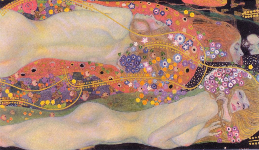
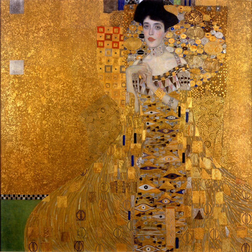
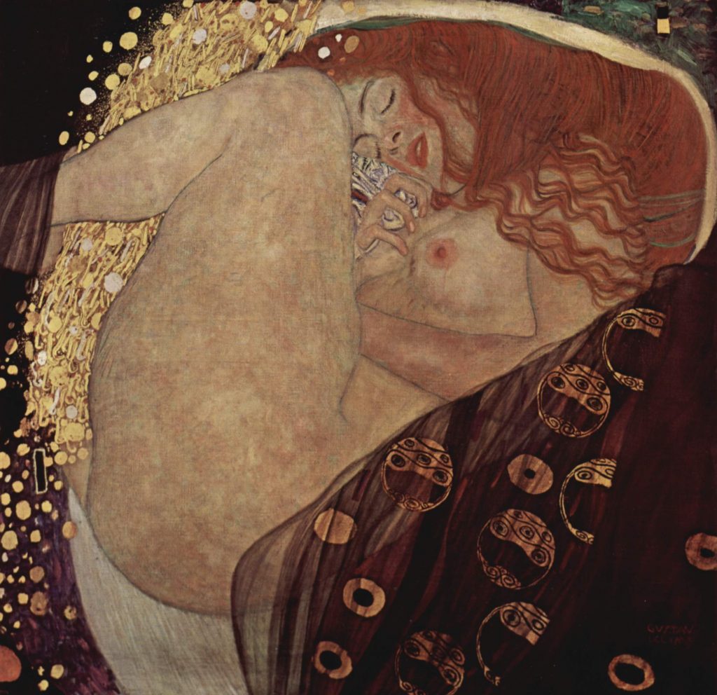
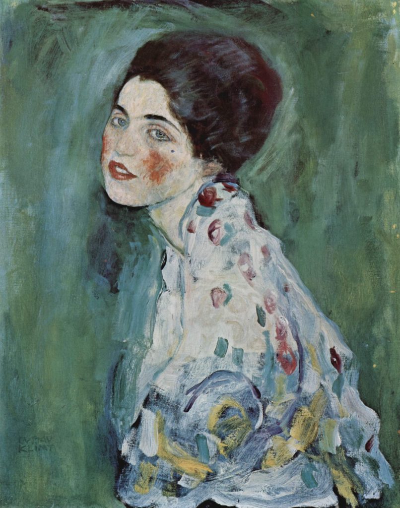
Gustav Klimt was an Austrian painter, born in Baumgarten in 1862, who became the most representative figure of the pictorial modernism of his time. He attended the school of applied arts in his hometown and triumphed as an author of large decorative paintings in an academic style. In 1897, his interest in avant-garde art led him to found, with some friends, the famous group called the Viennese Secession, of which he was the first president and leading exponent.
His unique artistic style was emerged after taking inspiration from very different sources, such as Byzantine art, the oriental style, the Arts and Crafts movement, and of course, Art Nouveau. Undoubtedly his most famous piece is The Kiss, which today is exhibited at the Österreichische Galerie Belvedere in Vienna. Besides, Klimt not only left his mark on the artistic world with his wonderful paintings, but he also did so by influencing great artists, such as Egon Schiele.
The Kiss, 1908
In his works, he used gold leaf, tempera and oil painting, and captured in his canvases characters that often show a “floating” appearance. He painted, above all, female figures, which are the best known and most valued of his production. In these work, he combined the realism of the portrait, with an extreme decoration of the backgrounds and dresses, in which yellow and golden tones and motifs inspired by butterfly wings or peacock tails predominate: this personally gives me the feeling of being in an unreal world, like a dream.
Portrait of Adele Bloch-Bauer I, 1903
I have always liked the use of gold leaf in art, which is one of the facts that makes me feel attracted to Klimt’s artwork. However, beyond that, I adore the pattern he creates, the stories he tells by painting characters in such particular poses, and all the little ornaments and details that he includes. His works seem quite expressive to me, when you see them you cannot be indifferent, they produce you some emotion, and I consider that this is the most important thing in any artistic creation.
An approach to architecture so particular and fantastic, that it almost seems unreal.
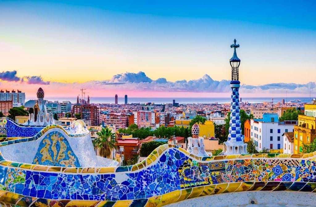
Park Güell, Barcelona
Park Güell is full of details everywhere, there is art wherever you look.
Who was Gaudí?
Antonio Gaudí I Cornet was a Catalan architect, internationally known as one of the greatest exponents of modernism. He was born on June 25 of 1852, in a family of coppersmiths. This allowed him to acquire a special ability to work with space and volume.
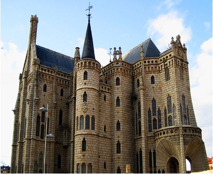
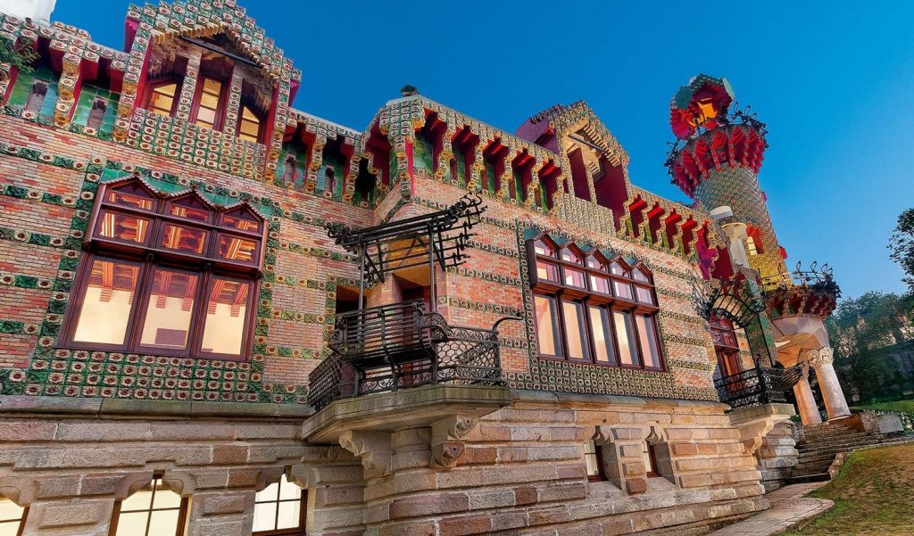
From an early age, he showed an interest in architecture. Because of this, he went to Barcelona, the most modern city in Spain at the time, to study architecture. And it is there, in Barcelona, where most of his great works are found today. Among them, his main masterpiece, the Sagrada Familia, and my personal favourites, Park Güel, and Casa Batló. However, he also has pieces in other Spanish cities, such as the Caprice in Comillas, or the Episcopal Palace in Astorga.
Episcopal Palace, Astorga
Caprice, Comillas
These are two of the few works by Gaudi that are outside the city of Barcelona, however, they are also in Spain, since all of Gaudi’s works are in this country.
Chains and arches: an astonishing method
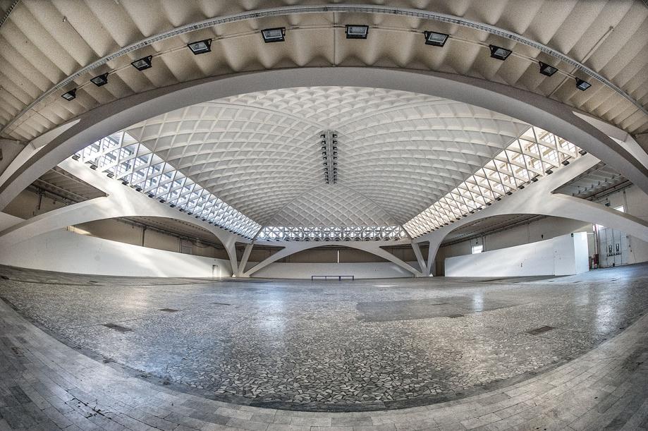
His first projects were a set of lampposts for the Plaza Real in Barcelona, the Girossi kiosks, and the Mataró cooperative. This last one turned out to be his first major work since this was the first time that Gaudí experimented with parabolic arches, which ended up becoming one of the outstanding characteristics of his architecture.
For achieving these arches, he devoted ten years of his life to developing a “hanging chain” model. He designed a complex set of hanging chains that he installed on the ceiling and used weights and suspension ropes. The arched forms that resulted from the experiment were what he was looking for as an architectural form, by turning them upside down. This would be fundamental to work on his design for the Sagrada Familia.
Sagrada Familia, Barcelona
The combination of the Gothic and the Art Nouveau style in this work achieves a very visually striking piece.
An impressive and magical architecture
Gaudí’s works are usually classified as modernist because of his desire to renew without breaking with tradition. Even though his modernist and Art nouveau influences are clear, his works have a very individualized and unique style.
My admiration for his work is mainly because I am a lover of everything that looks magical, fantastic, and I think that a work by Gaudí has that fairy tale essence. His works do not go unnoticed, they are something very different from what we are used to seeing daily. That is something I like when a visual work takes you out of everyday life, and for an instant, it transports you to another world.
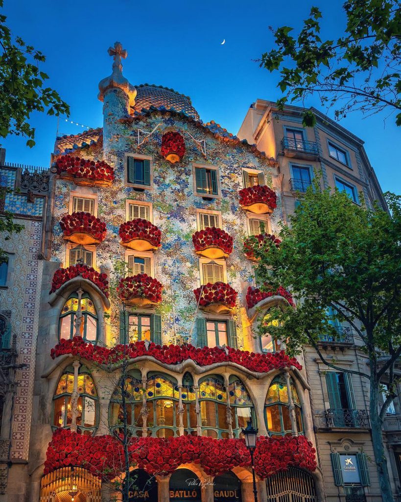
Casa Batló, Barcelona
The colors, the ceiling, the ornaments, everything in this building is eye-catching.