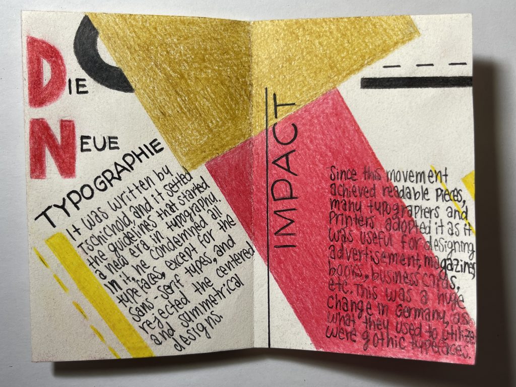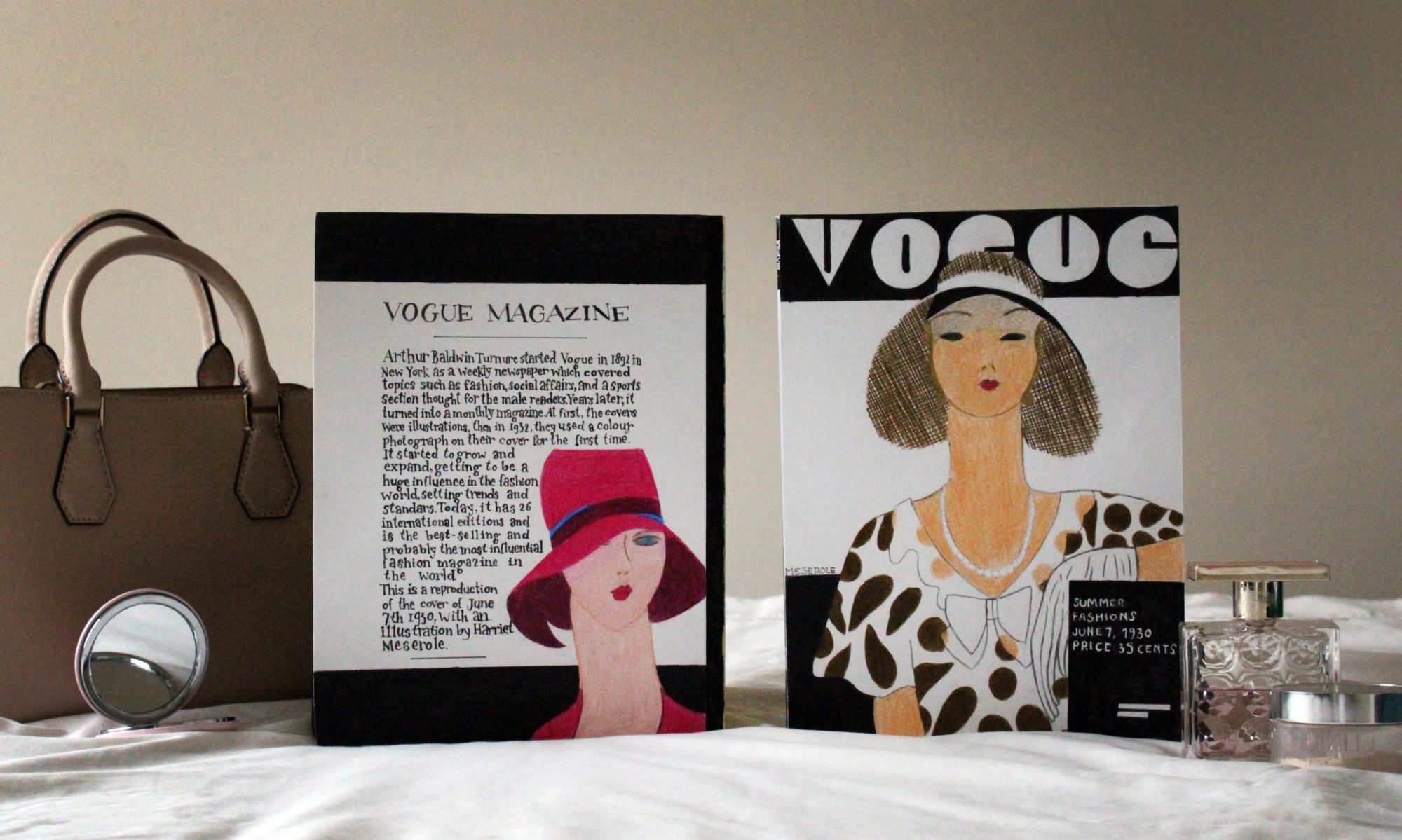
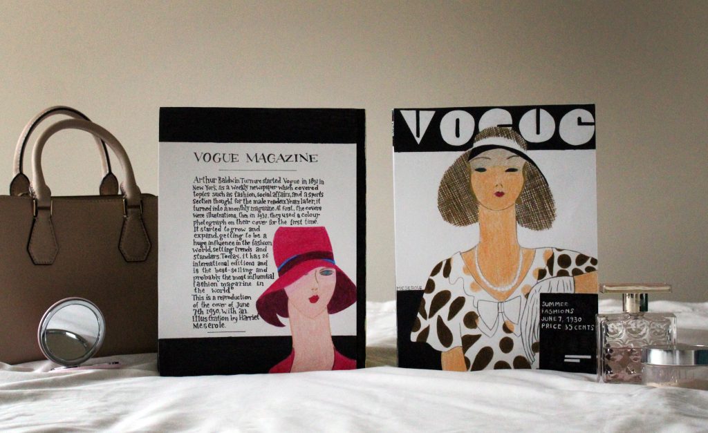
My artifact is a reproduction of the Vogue magazine cover of June 7th, 1930, illustrated by the American Harriet Meserole. The museum label is supposed to be the back part of a magazine, and it also includes an illustration by Meserole, this one was on the cover of the magazine of May 15, 1927. The elements in the photo intend to locate the magazines in a context of beauty, fashion, and feminity. At the same time, I wanted it to have a look of elegance, and simplicity.
I chose the topic of the Vogue magazine because it amazes me to think about the tremendous reputation and impact it has gained through the decades. I also like the fashion world, so it was an opportunity to get more knowledge of a topic that interests me. In the past, I had looked at some of the old Vogue magazine covers, and my favourites were those which had been illustrated by Harriet Meserole. I adore her style, the way she conveys sophistication, and the balanced colour palette. This was between the twenties and thirties, so it fits perfectly with the date restrictions provided on the brief. Because of this, I immediately decided I wanted to recreate some of her designs. I searched for her illustrations and chose two I liked and thought that worked well together.
It took me around six hours to complete this project and I would give myself a 8/10 because I think it looks good overall, I like the cohesion and simplicity it has. But on the other hand, it is not something too impressive from my point of view, and I do not like how the letters of the “VOGUE MAGAZINE” title look. I also wanted to include way more information about it, but I realized it would be too much text, and it would not look so good and would be hard to read.
References images:

Cover of May 15, 1927 – Harriet Meserole

Cover of June 7, 1930 – Harriet Meserole
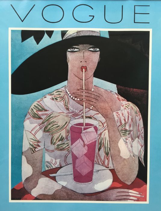
Cover of August 1, 1926 – Harriet Meserole
Research references:
https://en.wikipedia.org/wiki/Vogue_(magazine)#1892%E2%80%931905:_Early_years
https://www.vogue.com/article/vogue-covers-models-facts-history
https://www.quora.com/How-influential-is-Vogue-in-the-fashion-industry