Herb Lubain

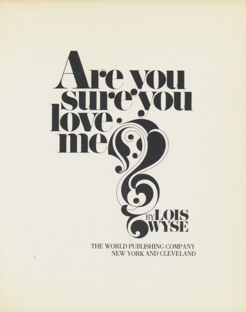
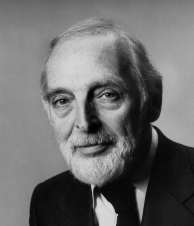
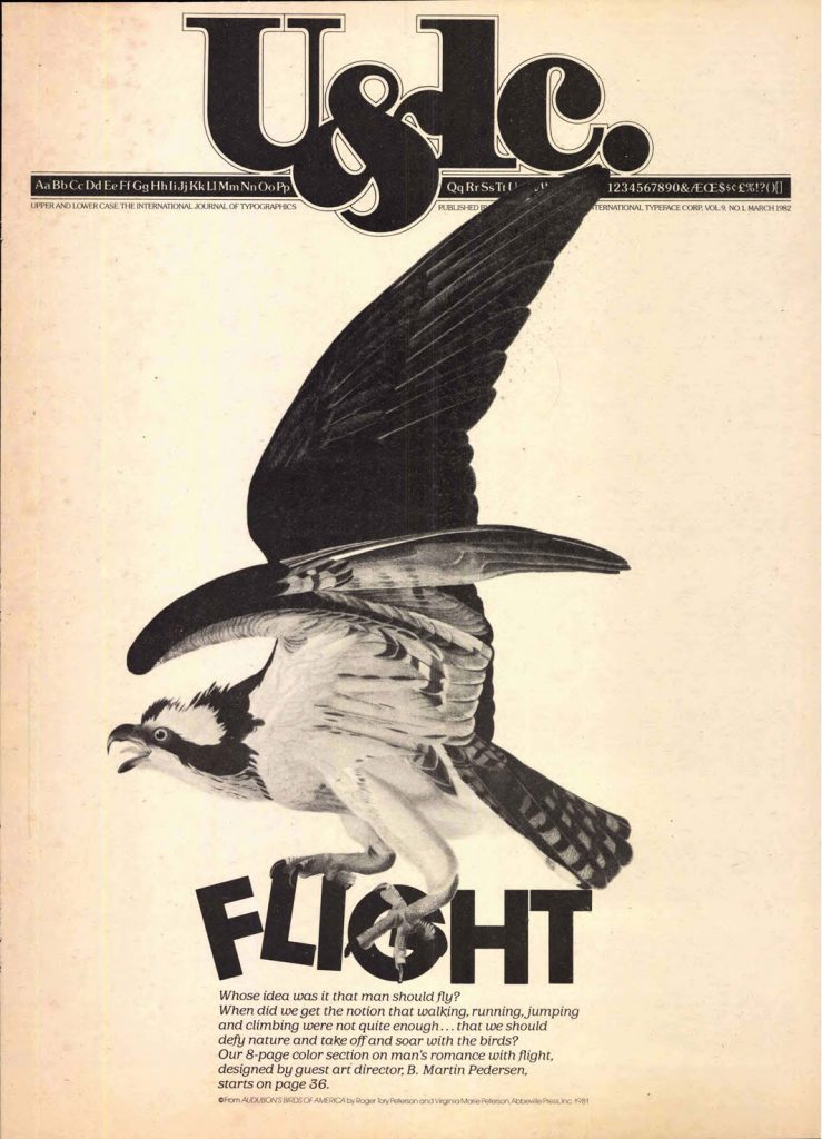
Herb Lubain, was an American typographer and graphic designer, born in New York in 1918. At the age of seventeen, he attended the Cooper Union School. Afterward, he started working as a creative director for different agencies until he finally created his own studio when he was 46 years old. He also became one of the founders of the International Typeface Corporation (a type manufacturer company) and the art director of Upper and Lower Case, which was the magazine of this company.

His innovative ideas rejected the traditional style; he wanted to use type in ways that hadn’t been seen before and explore all the new possibilities that came with the recently developed system of phototypesetting.

Between his highlights as a designer, we could mention the creation of the ITC Avant Garde typeface, and being the editorial designer responsible for the Saturday Evening Post, Eros, and Avant Garde magazines.

I enjoy looking at his pieces because they are expressive, and each one of them uses typeface in a completely different way and thus manages to evoke different sensations. This catches my attention and interests me a lot, since I want to learn more about using typography creatively in my designs.

Glenn Brown- Blog Post #5

Glenn Brown, born in 1966 in Hexham, Northumberland, is an artist whose artwork is based on appropriation. Meaning, he takes an already-existing piece from some other artists and proceeds to reinterpret it. During this reinterpretation process, he changes characteristics of the original painting, such as the colours, texture, patterns, details, among others. This way, he achieves to create a new painting. Because of this, he calls himself an “artistic Dr. Frankenstein”. However, despite making these changes from the original piece, his art has, on occasion, been labelled as plagiarism.

Talking about his artistic formation, Brown began his studies at the Norwich School of Art. After that, he completed a Bachelor in Fine Art at Bath College of Higher Education, followed by a Master of Arts at Goldsmith’s College, University of London. As for his style, he tends to use blue and green colours in his art. Apart from this, he gives his paintings a morbid and intriguing look. Thus, originally beautiful and innocent pieces, are transformed into a rather terrifying image.

I find it fascinating how Glenn Brown has a very distinctive and recognizable artistic style of his own, despite starting from a pre-existing painting as a base. It is interesting to see how he gives his personal touch to a painting, making us see it from a new point of view, provoking ideas, thoughts and feelings totally different from the original painting. This fact is what caught my attention the most about him; I had never seen an artist who did this kind of thing until now. I was very impressed by what he did, and I enjoyed seeing his artwork and comparing them with the original pieces. In my opinion, I even like some of his paintings more than the originals; I find them more striking and shocking.

References

https://glenn-brown.co.uk/

https://en.wikipedia.org/wiki/Glenn_Brown_(artist)

https://www.wikiart.org/es/glenn-brown

https://www.alejandradeargos.com/index.php/es/completas/9-invitados-con-arte/556-glenn-brown