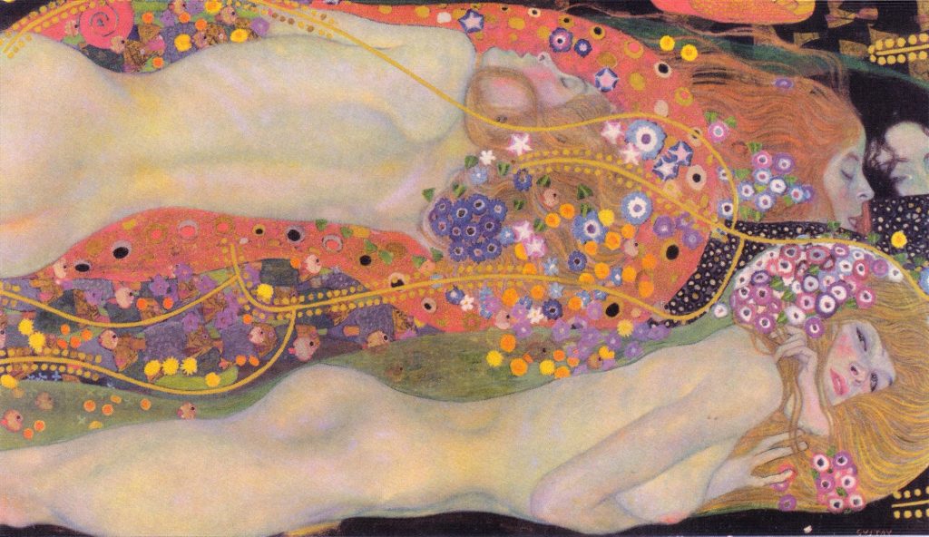
Wasserschlangen II, 1904
Gustav Klimt was an Austrian painter, born in Baumgarten in 1862, who became the most representative figure of the pictorial modernism of his time. He attended the school of applied arts in his hometown and triumphed as an author of large decorative paintings in an academic style. In 1897, his interest in avant-garde art led him to found, with some friends, the famous group called the Viennese Secession, of which he was the first president and leading exponent.
His unique artistic style was emerged after taking inspiration from very different sources, such as Byzantine art, the oriental style, the Arts and Crafts movement, and of course, Art Nouveau. Undoubtedly his most famous piece is The Kiss, which today is exhibited at the Österreichische Galerie Belvedere in Vienna. Besides, Klimt not only left his mark on the artistic world with his wonderful paintings, but he also did so by influencing great artists, such as Egon Schiele.
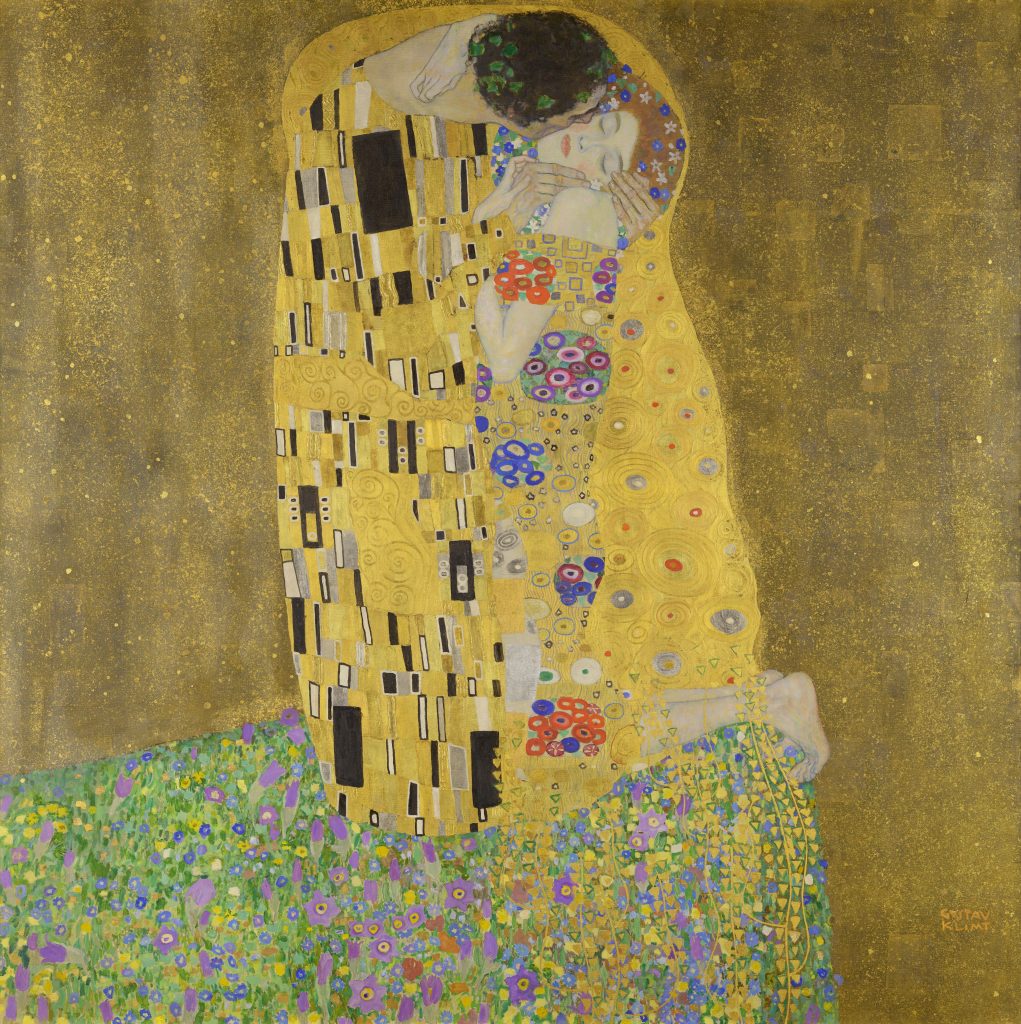
The Kiss, 1908
In his works, he used gold leaf, tempera and oil painting, and captured in his canvases characters that often show a “floating” appearance. He painted, above all, female figures, which are the best known and most valued of his production. In these work, he combined the realism of the portrait, with an extreme decoration of the backgrounds and dresses, in which yellow and golden tones and motifs inspired by butterfly wings or peacock tails predominate: this personally gives me the feeling of being in an unreal world, like a dream.
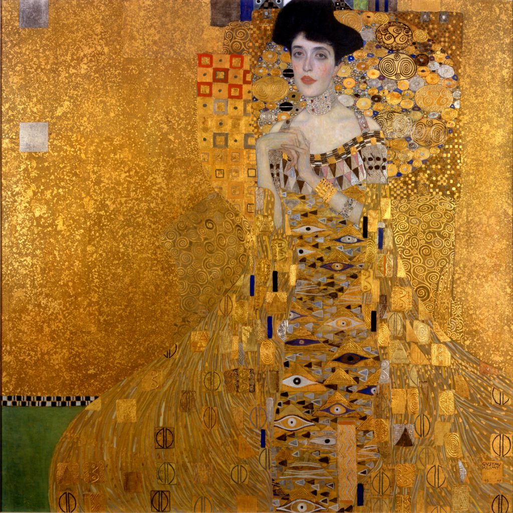
Portrait of Adele Bloch-Bauer I, 1903
I have always liked the use of gold leaf in art, which is one of the facts that makes me feel attracted to Klimt’s artwork. However, beyond that, I adore the pattern he creates, the stories he tells by painting characters in such particular poses, and all the little ornaments and details that he includes. His works seem quite expressive to me, when you see them you cannot be indifferent, they produce you some emotion, and I consider that this is the most important thing in any artistic creation.
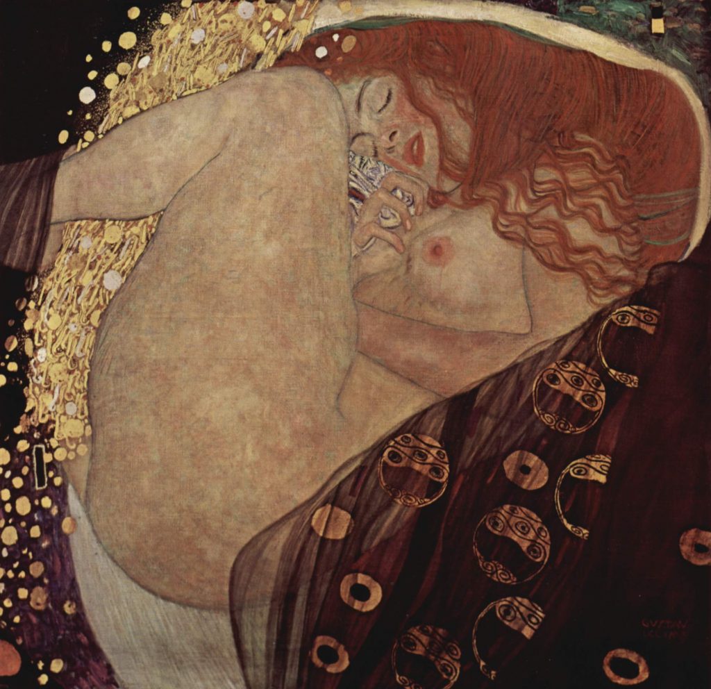
Danae, 1908
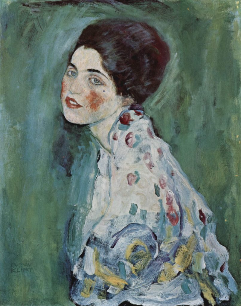
Porträt einer Dame, 1917
References
https://es.wikipedia.org/wiki/Gustav_Klimt