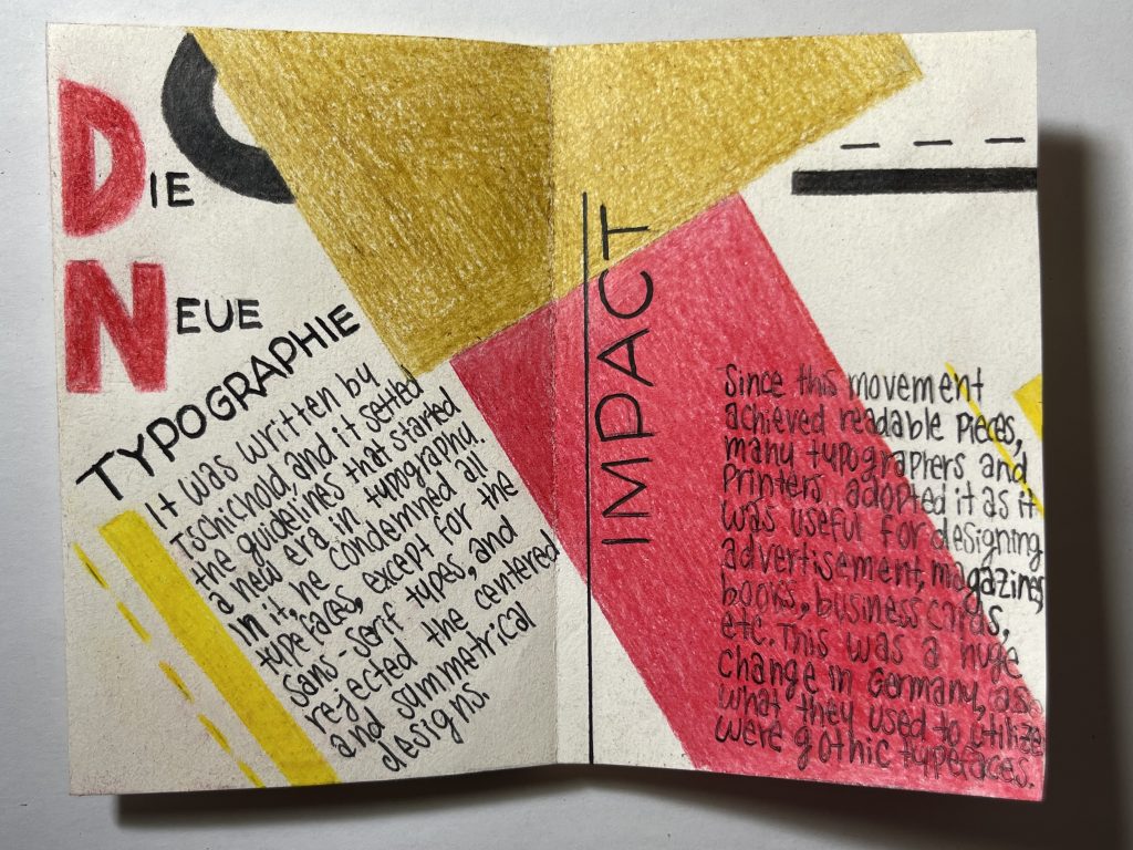
The father of Russian Constructivism
Who was Rodchenko?
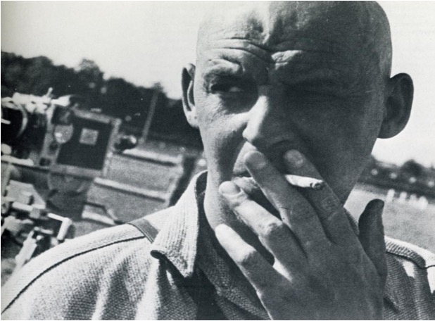
Aleksandr Mikhailovich Rodchenko was a genuinely multifaceted artist: a painter, sculptor, photographer, and designer. He was born in Saint Petersburg in 1891, which means he experienced the Russian revolution in firsthand. He formed as an artist at the Kazan School of Art and the Troganov Moscow State Academy of Arts and Industry.
The Russian Avant-gardes
The Russian revolution was a very particular moment for art and design since this was the moment when the Russian avant-gardes emerged. Rodchenko was fascinated by these avant-gardes, and he was especially interested in Suprematism and Futurism, artistic movements which greatly influenced him. His main idols were Malevich and Tatlin.
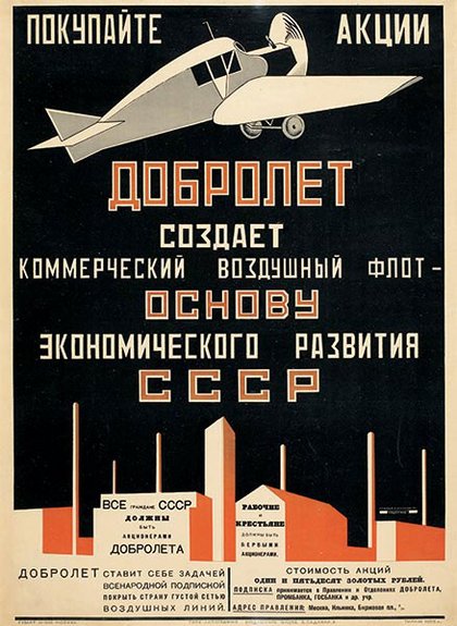
Advertisement poster for the state airline Dobrolet (1923) 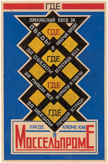
Advertisement poster for Mossel’ prom cafeteria (1923)
The first “Advertising agency”
In 1923, together with the poet Vladímir Mayakovski, they founded Mayakovski-Ródchenko Advertising-Constructor, which today would be considered an advertising agency. More than 150 pieces were created in this agency. Mayakovski, was in charge of writing the slogans, while Rodchenko of creating the visuals.
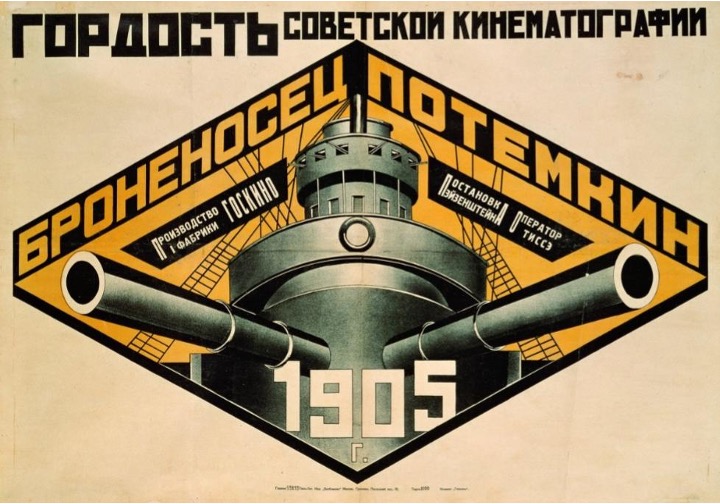
Rusian Constructivism
Nowadays, Rodchenko is recognized as probably the greatest exponent of Russian Constructivism. In the field of design, this movement is based on the implementation of photomontage, geometric figures, symmetry, and the representative colours of the revolution: black and red. This is an art form at the service of the revolution, which mixes propaganda, art, design, engineering, and advertising, to create designs with short and very direct slogans that will influence the Russian society of the time.
Art and design are everywhere
What interests me most about this designer is to realize that art and design are everywhere, at all times in history. I like to see that the political, social and economic take place in these spaces, but the artistic part also plays an important role, even in critical moments such as wars and revolutions. I find it amazing to see art as a reflection of the society of the time; it shows us people’s ideologies, thoughts, and goals. For example, design during this time was intended to communicate messages about the revolution. However, it is not as simple as just writing the message. A good design is the one that best communicates these messages, and with this, it is possible to influence and even manipulate the reader
References:
https://es.m.wikipedia.org/wiki/Aleksandr_R%C3%B3dchenko
https://www.elviejotopo.com/topoexpress/rodchenko-el-arte-y-la-revolucion/