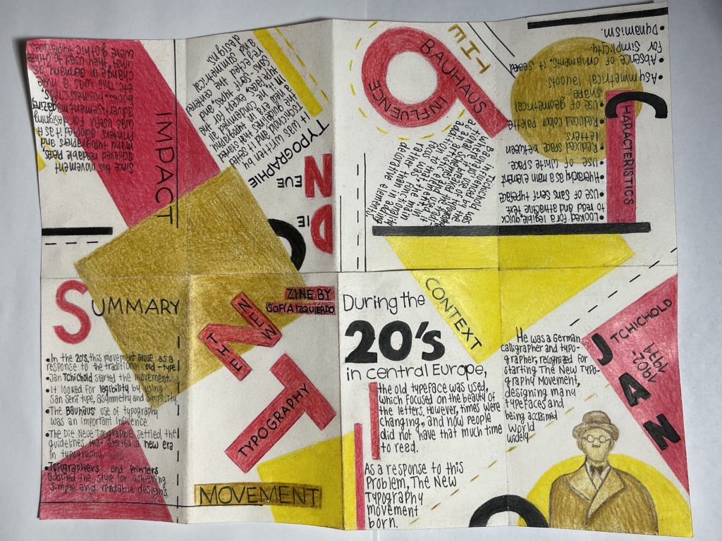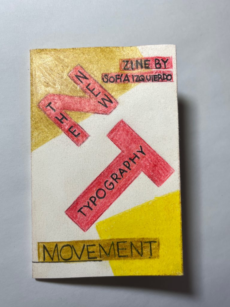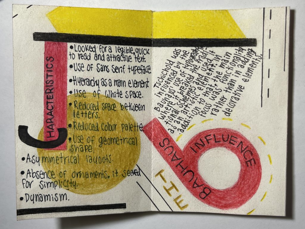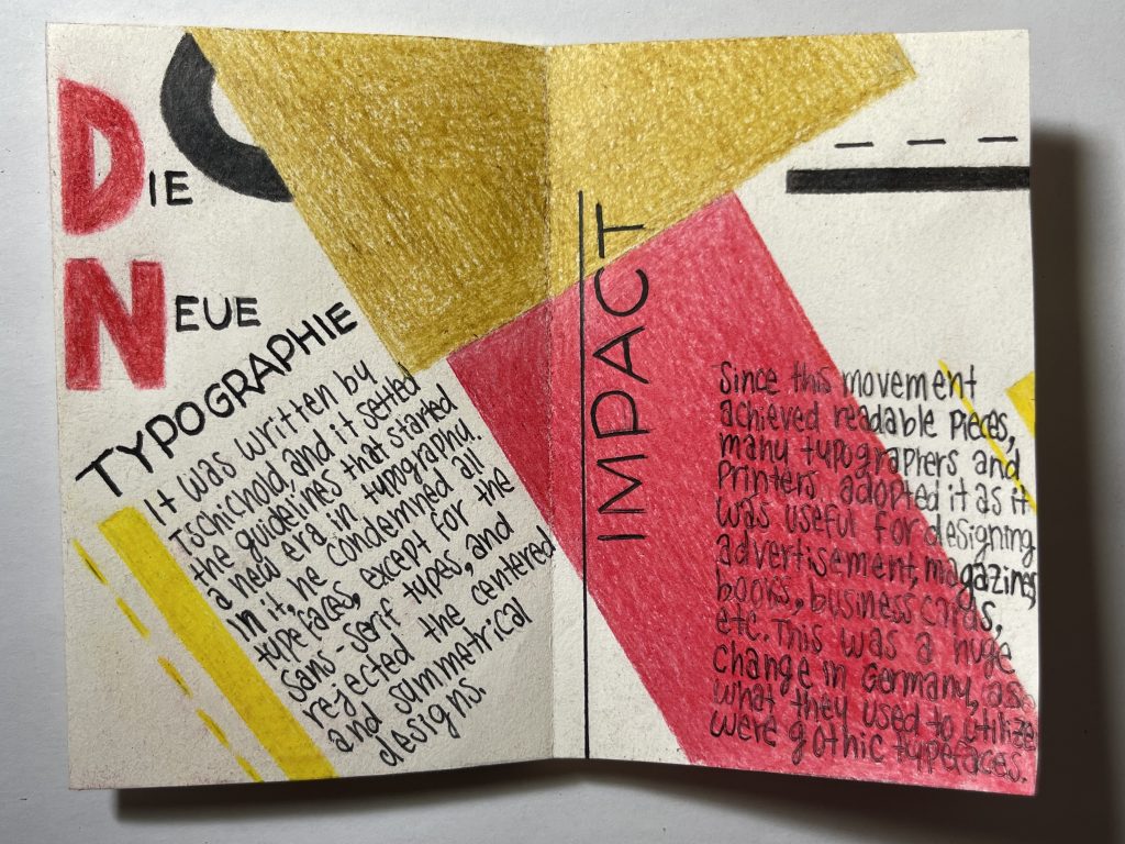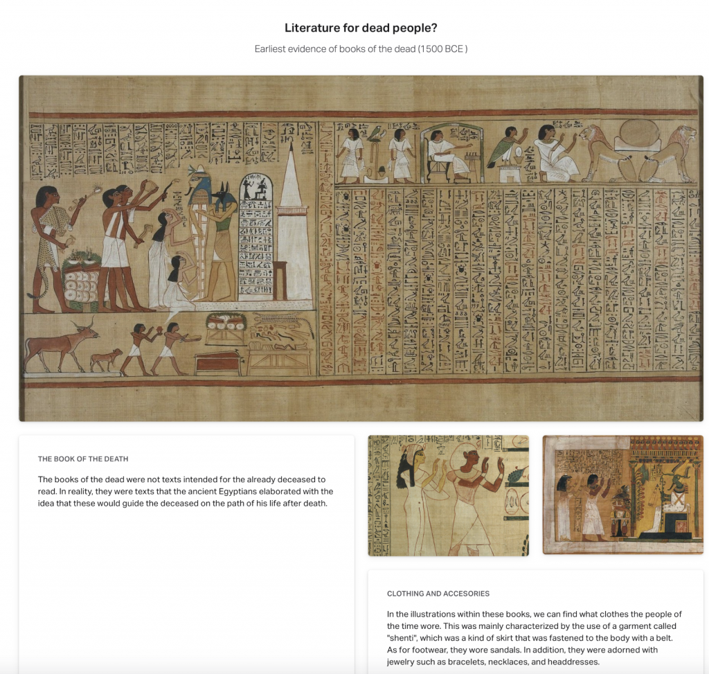

Self-portait
Joaquin Sorolla, better known as the “master of light”, was born in Valencia, Spain in 1863. From an early age, he showed his passion for art. His high school’s director noticed his talent and suggested he enter the School of Craftsmen of Valencia. At the age of thirteen, Sorolla did so, and two years after that, he goes to the Escuela Superior de Bellas Artes de Valencia. When he finished his studies, the painter Ignazio Pinazo introduced him to Impressionism. At that moment, he gained interest in the treatment of light in painting. Because of this, when we look at his artwork, we can tell the light is playing a main role.
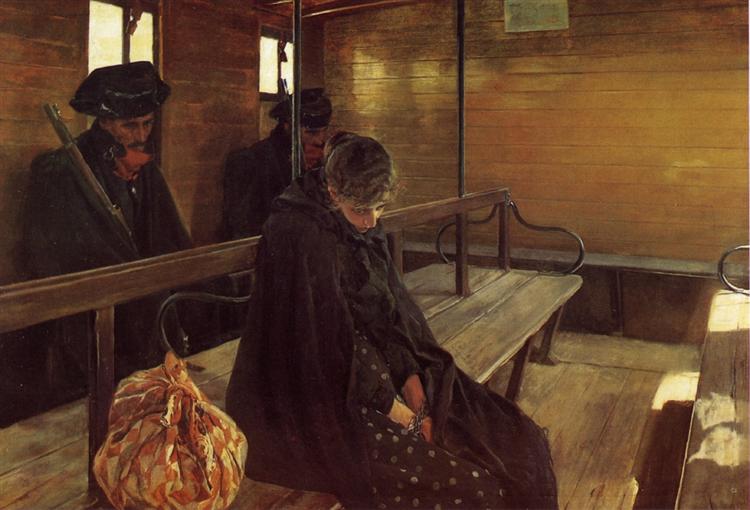
Otra Margarita, 1982
One of his most famous works is Otra Margarita. Like many of his first paintings, it portrays a scene as a way to criticize or protest against many situations of the social reality of Spain during that time. For this piece, Sorolla was inspired by a real situation he witnessed, in which a woman with two policemen who were taking her to prison for having murdered her baby.

Sad Inheritance, 1899
As the Impressionists used to do, Sorolla also adopted the habit of painting outside a studio. Thus, he used to go to the Valencian beaches to paint, and that is how he achieved many of his most well-known pieces. These were the first Sorolla’s pieces I ever saw, and since then he became one of my favourite artists. Although I also think his other kind of paintings are very well achieved, there is something about the way he paints the sea that amuses me; it gives me the feeling that it is in real movement. Besides, I really admire the way he manages to also capture a specific hour of the day with the way he paints the light. An example of this could be “Sad Inheritance”.

Sewing the sail, 1896 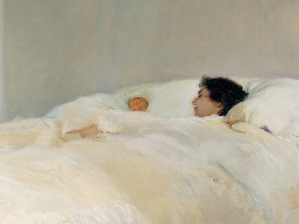
Mother, 1895
References
Sánchez, M. (2020, September 30). Joaquín Sorolla: biografía, obras y exposiciones. Alejandra de Argos. https://www.alejandradeargos.com/index.php/es/completas/32-artistas/41818-joaquin-sorolla-biografia-obras-y-exposiciones
Gavalda, J. (2019, August 10). Joaquín Sorolla, el pintor de la luz del mediterráneo. Historia National Geographic. https://historia.nationalgeographic.com.es/a/joaquin-sorolla-pintor-luz-mediterraneo_14569/2#slide-1
Wikipedia (2021, October 11). Joaquín Sorolla. https://es.wikipedia.org/wiki/Joaqu%C3%ADn_Sorolla