Majestic, bright, and ornate: letters that look like they have come from heaven

During the Middle Ages, the Illuminated Manuscripts became popular among Western European high society. These were made entirely by hand, and included religious content, such as psalms and prayers. The pages of these manuscripts were adorned with illustrations and the so-called “Initials”.
Initials were letters that could be found at the beginning of a sentence, paragraph, or chapter. The letters at the beginning of a chapter were the most elaborate and meticulously detailed of all, while those at the beginning of a sentence were the simplest. However, what is common among all of them is that they are always capital letters.
Initials became of vital importance; it was inconceivable the elaboration of an illustrated manuscript without the inclusion of them. They became so relevant, that kings and great religious leaders of the time implemented them in official documents. This was because they considered that initials gave these documents greater transcendence and beauty.
For the society of the time, the brightness alluded to divinity. As initials used to accompany religious texts, they wanted to achieve a connection with the idea of God. Because of these, we can notice there is a golden-shine effect on these letters. To obtain this effect, a thin gold foil was used. This was positioned on the letter, then sanded and polished, to finally stick it with a wet brush.
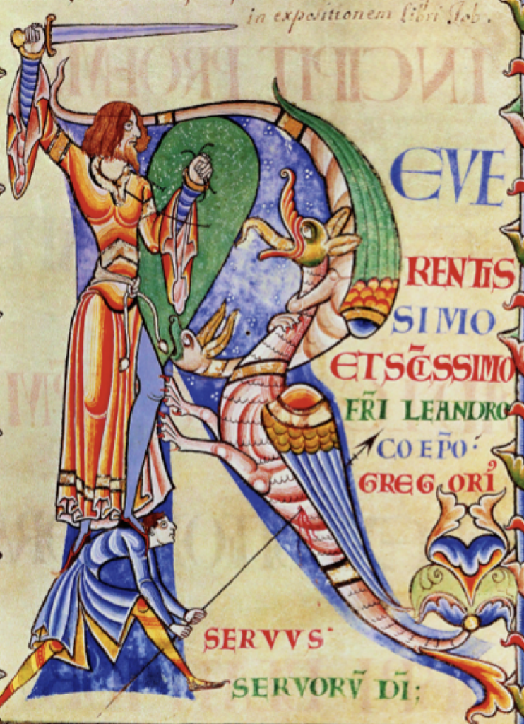
From the first time I saw one of these letters, I was completely amazed. I think about all the time and dedication it would take to make them, and it just seems incredible to me. I think the level of detail that they reached in each of the letters is admirable. In particular, I am interested in historical letters, a type of initials that instead of containing a random decorative design, seeks to represent some of the scenes that are being narrated in the text. In my opinion, this is a smart way to not only make the text aesthetic but also to illustrate it at the same time.
I’ve been so interested in initials, that months ago I wanted to try to make one. I took an existing letter “B” as a reference, and I designed one that shows the four steps necessary for the elaboration of the letters. The first is sketching, then drawing, adding the golden effect, and finally adding color.

My design 
Reference photo from: http://indeprofundis.blogspot.com/2016/06/manuscritos-iluminados.html
Initials began to fall into disuse after the invention of the Gutenberg printing press in the mid-15th century, as this caused a detriment in the production of manuscripts. However, it was not immediate. The illuminated letters continued to be used, and when there was a printed text, blank spaces were left so that initials could later be drawn there. Gradually, they began to be less used until they disappeared. The most recent illuminated manuscript with initials dates from the 17th century.
References:
Mark, J. J. (2018, March 06). Illuminated Manuscripts. World History Encyclopedia. Retrieved from https://www.worldhistory.org/Illuminated_Manuscripts/
Historiated Initial. (2021, April 13). Wikipedia. from https://en.wikipedia.org/wiki/Historiated_initiaI
Initial. (2021, September 14). Wikipedia. from https://en.wikipedia.org/wiki/Initial