I wanted my zine to have a coherent design with the topic chosen. Since my topic was The New Typography Movement, some of the elements I used were geometrical shapes, asymmetrical layouts, dynamism, capital letters, and a reduced colour palette. All of those are characteristics of the design pieces of this movement.
I had never designed a zine; indeed, I think I hadn’t even seen one before. I like the fact that after this project, I now know how to create a zine, which is probably something that I’ll use in the future. This is because I personally found it fun to play with the general design and make individual pages that connect and because I think it is a useful tool for communicating information in an entertaining way.
It took me around nine hours to complete this project, but to be honest, I do not love the overall result of the project, and I would give myself a 6/10. One of my mistakes was the size I chose, I noticed too late the size was too small to fit all the information I had, so I had to take a big part of that away. Also, most of the paragraphs do not look organized. I think I also used too much time researching. Another mistake is the fact that I didn’t read the brief carefully enough, and at first, I did all the research and sketches for the wrong topic, so I had to restart. If I hadn’t wasted all that time, I could have spent it on making a better brief (I am not counting the time spent in that first attempt in the 9 hours). Something I do like is the layout design, and I like to see the way it is all connected.
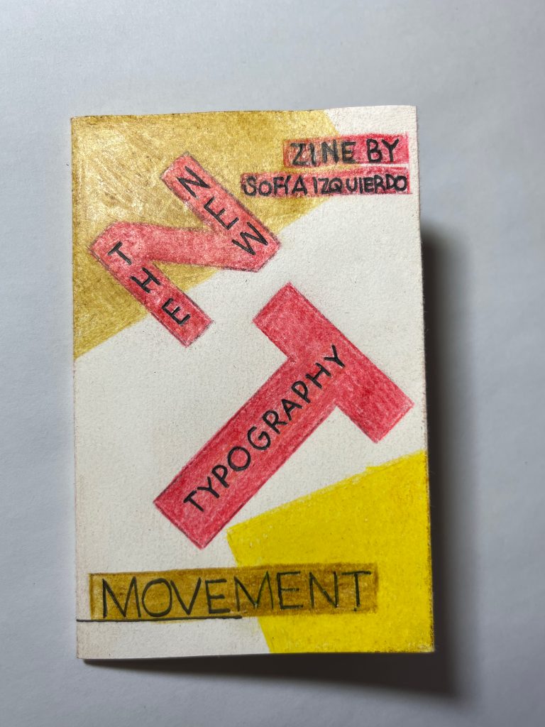
Front page

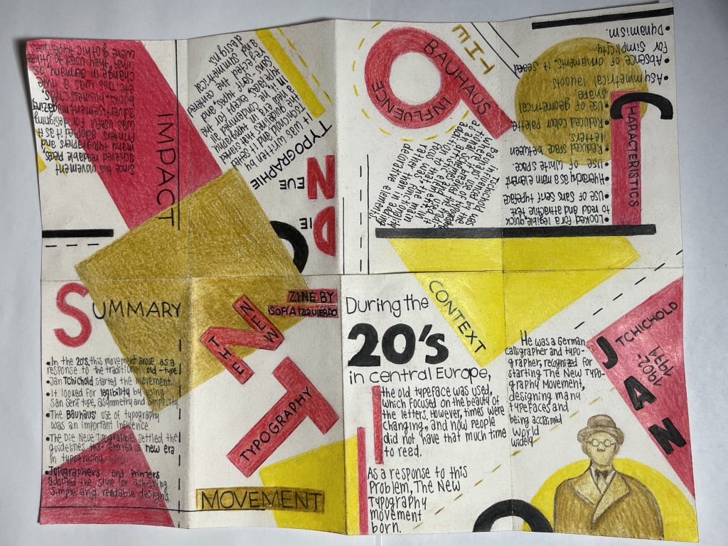
Pages 1 and 2
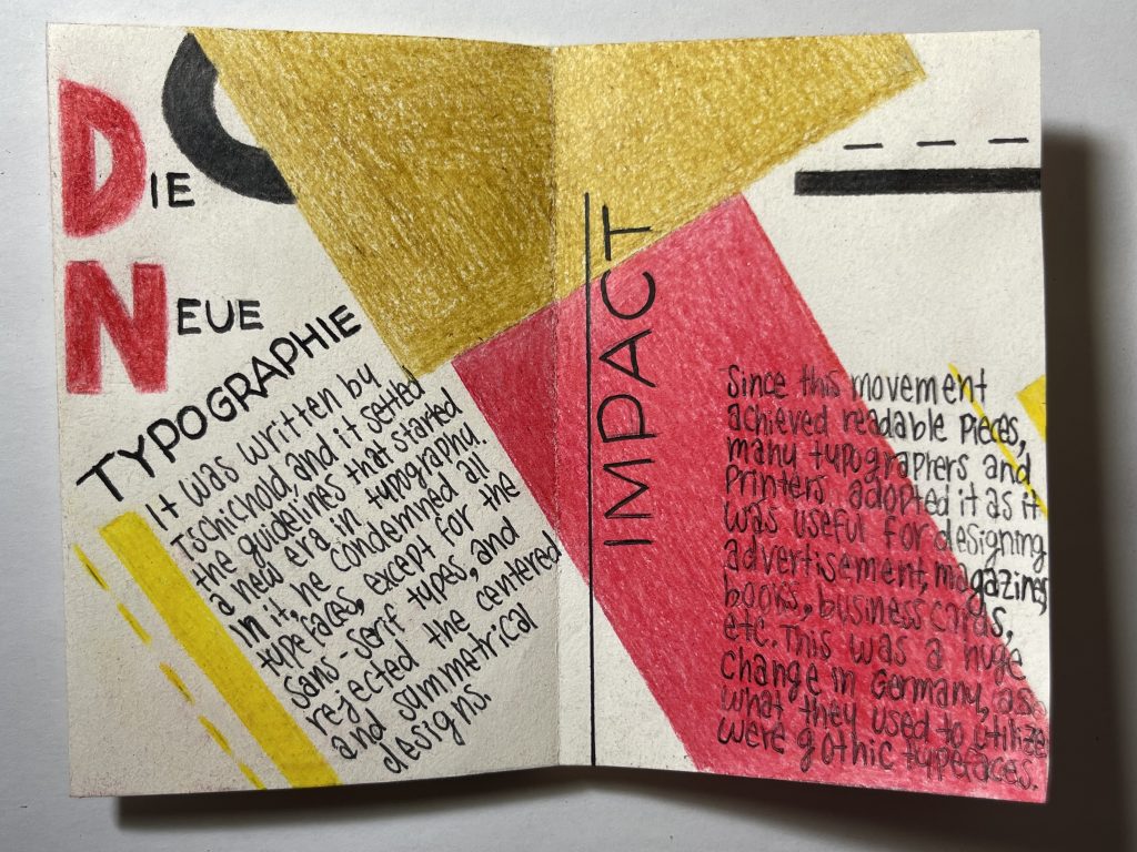
Pages 3 and 4
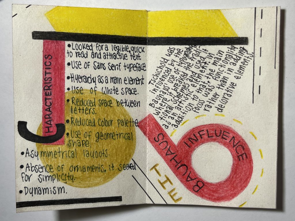
Pages 5 and 6

Back page
Research references:
https://www.unostiposduros.com/los-principios-de-la-nueva-tipografia-por-jan-tschichold/
https://www.unostiposduros.com/grandes-maestros-de-la-tipografia-jan-tschichold/
https://ericcraps.wordpress.com/2019/01/15/new-typography/
https://graffica.info/la-nueva-tipografia-laszlo-moholy-nagy-1923/
https://www.moma.org/calendar/exhibitions/1013
https://en.wikipedia.org/wiki/Jan_Tschichold#Typefaces
https://antoinesammut.blogspot.com/2014/01/new-typography-movement.html
https://ericcraps.wordpress.com/2019/01/15/new-typography/