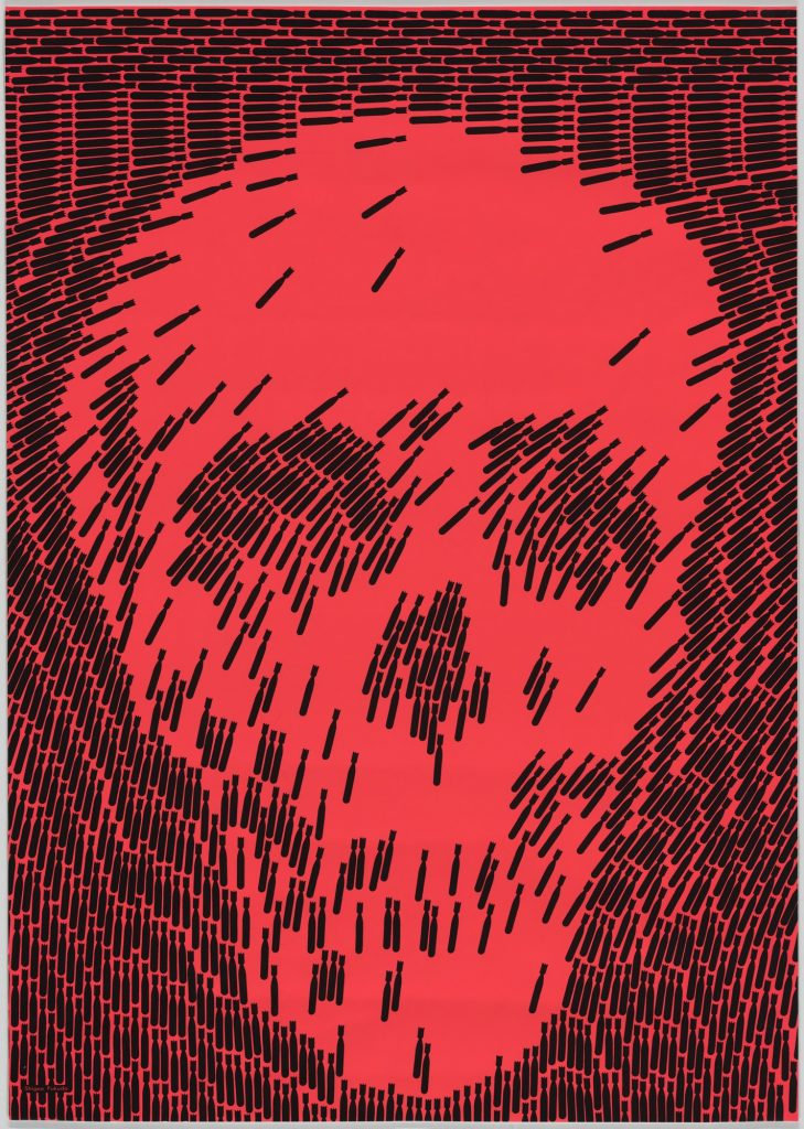
Shigeo Fukuda No More. Retrieved from https://www.moma.org/collection/works/7170
“No More”, which is the name of this piece, was created in 1968 by the designer Shigeo Fukuda.
Even though there is not a literal illustration of a skull here, that is the first image we identify. This is due to the proximity of the dark elements, which have the shape of falling bombs. The way these tiny elements are organized creates the illusion of a big skull, and in fact, is it easier to see the skull than to see what these small elements are. It is also relevant to mention that the falling bombs are identical elements, and because of this, this design shows how the concepts of proximity and similarity work simultaneously to communicate the message effectively. We would probably still see the skull face even if the bombs were from different colors or even shapes, but the fact that they all have this similarity makes it even more obvious.

