Visual Research II- Proximity

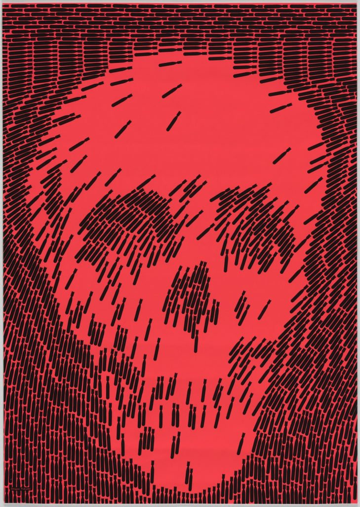
Shigeo Fukuda No More. Retrieved from https://www.moma.org/collection/works/7170

“No More”, which is the name of this piece, was created in 1968 by the designer Shigeo Fukuda.
Even though there is not a literal illustration of a skull here, that is the first image we identify. This is due to the proximity of the dark elements, which have the shape of falling bombs. The way these tiny elements are organized creates the illusion of a big skull, and in fact, is it easier to see the skull than to see what these small elements are. It is also relevant to mention that the falling bombs are identical elements, and because of this, this design shows how the concepts of proximity and similarity work simultaneously to communicate the message effectively. We would probably still see the skull face even if the bombs were from different colors or even shapes, but the fact that they all have this similarity makes it even more obvious.

Visual Research II- Closure

HOW Logo Awards winners. Retrieved from https://www.logodesignlove.com/how-logo-awards

This logo was designed by Cynda Media Lab for GUND, a North American manufacturer brand of soft toys.
This piece is a good example of the concept of closure, since we can easily identify that there is a head of a teddy bear in the bottom part of the brand’s name, but if we analyze it, we will notice that the “bear” is composed by just three small black items and negative space. Nevertheless, with only these simple elements, our brain can instantly recognize the whole face of the bear with its eyes, nose, and ears, without making any effort.

Visual Research I- Space

Yorgos Lanthimos is the designer of these two posters, in which he uses the negative space to produce creative images: on the first one a man hugging a “missing person”, and on the second one a woman doing this same thing. On each poster, we only see a few elements: a head, two hands, and the typography, but no other element is needed, because by using the white space in a clever way, Lanthimos obtains two posters very interesting to see. In addition to that, this makes the viewers of the posters feel intrigued and makes them want to see the film to understand what message is being communicated with this design. With just a few things, he accomplishes a lot, and this is all thanks to using space as a useful tool in the composition of a design.

Visual Research I- Size

Robert McGinnis
Breakfast at Tiffany’s movie poster
1961

The artist Robert McGinnis created a design that attracts people’s sight directly to the illustration of the main character of the movie, Holly Golightly. He accomplishes this by making her notably larger in size in comparison to the rest of the elements that make up the poster, such as the typography or the other illustration. She even exceeds the colorful “frame”, and this fact gives the illusion that she is way larger. With the management of the different sizes in each of the elements, McGinnis achieves a coherent hierarchy of importance in this piece, making the viewer focus first on the largest element, which would be the most relevant ones, in this case, the main character of the movie, and lastly on the smallest element.

Visual Research I- Color

Andy Warhol
Untitled from Marilyn Monroe
1967

As in many of Andy Warhol’s pieces, in this printmaking what stands out the most is the use of color. Warhol uses this element as a tool to give an unexpected twist to everyday images, such as his well-known Campbell’s Soup Cans, or in this case, the well-known actress Marilyn Monroe.

This is a very simple image, there are not many elements, or details, or a complex composition, or anything like that. Therefore, if it was not for the flashy colors, this image would go unnoticed as just another of the many Marilyn’s portraits. However, using these bright, uncommon colors, makes this piece look out of the ordinary. This way Warhol manages to turn it into an interesting piece and gets people’s attention with such a simple image.