Category Archives: Uncategorized

Decolonization Project – Process

I began the process of picking a topic by reading the Calls to Action of Truth and Reconciliation, where I was intrigued by the inclusion of child welfare. Admittedly, I hadn’t actually considered the role of the child welfare system in systematic colonization, probably in part due to the tone surrounding the entire issue. To be more specific, I had always seen the separation of Indigenous families framed as a perhaps regrettable, but necessary act. However, upon the barest research, that whole idea comes into question, especially when looking at Canada’s history with the subject.

I thought that an awareness campaign targeting non-Indigenous Canadians, specifically parents, would be a good idea. However, I wanted to specifically encourage non-Indigenous Canadians to pressure the Government to enact some for tangible change of Indigenous families.

And thus, I began ideating!

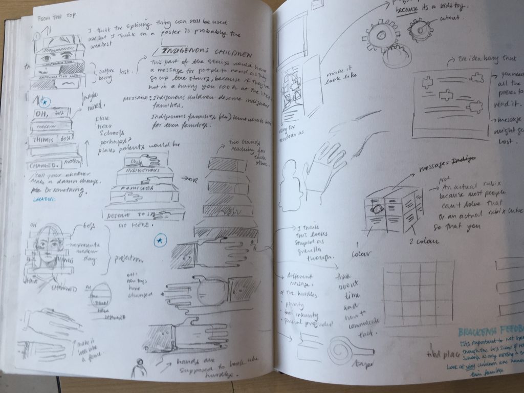
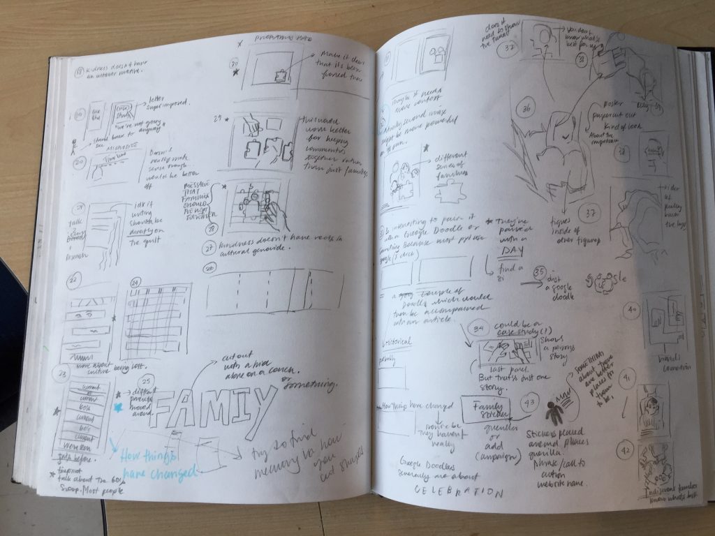
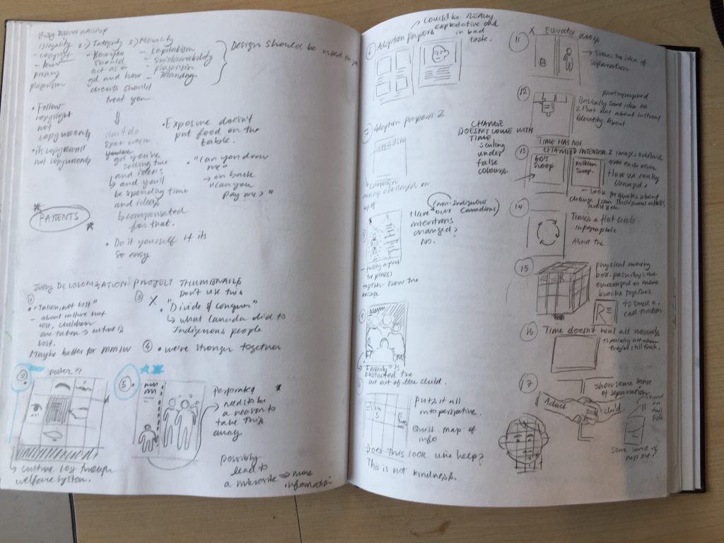
There were a few ideas here that I thought might have potential if carried out further, but I felt that my strongest concept was the idea of splicing images, which I felt could aptly represent some key elements associated with the problem.

Namely, the idea of splicing could represent culture and cultural identity lost through the separation of Indigenous families. This is an especially important idea to express because historically, the eradication of Indigenous cultures and cultural identity was purposeful. It was one of the driving forces behind Residential schools and the sixties scoop. Additionally, many Indigenous families report that this same motive drives much of the current separation of Indigenous families.

Another aspect which the splicing idea neatly expresses is the concept of time. Specifically, it can be used to clearly juxtaposed multiple different periods of time. The juxtaposition creates a system of rhythm and pattern, which establishes the fact that the separation of Indigenous families is a recurring problem.

However, the idea of splicing images is hardly new, and thus I had to find a way to put a new spin on it.
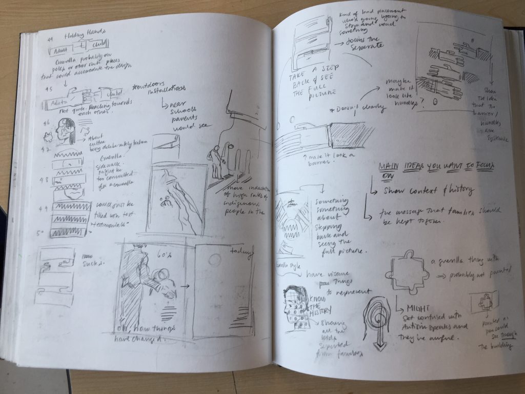
I thought about different ways in which I would apply the images which would strengthen the idea. One of the first ideas I settled on was the idea of using stairs. Ideally, the design would be placed near libraries and other places that parents regularly frequent.

I spoke with others who suggested that my campaign also be included as digital banner adds as well as on bus shelters. After looking at the breakdown of bus shelters, I thought about the natural division in the panels (three in total, two ones on the side and three ) and how I could take advantage of that. I considered breaking it down the center panel into three, and including my message on the side panels. Each panel would represent a different time period and would together they’d read “How Times Change”.
However, I ultimately rejected this idea in favor of spreading the photographs among the three main panels and placing my message underneath the middle panel, which represents the modern-day. I felt like this would emphasize the fact that it is not a problem of the past.

In the end, I think the idea has potential but still needs more work to push the idea further. Additionally, I think that my execution needs much more work and I intend to refine it as my design skills improve. Overall, I would give myself a 7.5/10. 

Colonization & Child Welfare

The Canadian Encyclopedia defines child welfare in Canada as “a system of children’s aid societies established by provincial and territorial governments, at times in partnership with private organizations, to provide services that supplement or substitute for parental care and supervision”. Which seems fine. Its a system often framed in the context of helping both children and their families achieve what’s best for them. However, upon any further inspection its history with colonization and the cultural genocide of indigenous people becomes plainly clear.

To begin with, the welfare child system is sometimes colloquially called “the millennium scoop”. And that within itself, that already says a lot. The name itself is a callback to the Sixties scoop, in which Indigenous children were taken (without either their parents or band’s consent) and readopted/redistributed into almost always non-Indigenous and middle-class families. This wave of family separation in 1951 and began to falter in the 1980s. Social workers were not obligated to have any sort of training or knowledge of Indigenous Welfare. Up to the 1980’s they weren’t even obligated to tell bands about the removal of the child. As one might expect, the mass forced separation of Indigenous families came with adverse repercussions for both the family and the child. Readopted children reported experience feelings of shame, isolation, and a total loss of cultural identity, and some reported sexual, physical and other kinds of abuse by their “adoptive” families. In almost all cases, the “adoptive” families were not capable of providing culturally specific care. To make matters even worse, birth records were kept hidden unless parents and children consented. This meant that many adoptees learned the nature of their heritage much later in life.

This act of cultural genocide was completely legal at the time thanks to the Indian Act. Specifically, section 88 which allowed provinces’ power over Indigenous child welfare.
The federal policies which Indigenous communities were dealing with (for example, the Indian Act and Residential schools) made many of this community’s prime targets. The combination of various legacies of colonialism and this new jurisdiction led to the mass removal of Indigenous children from Indigenous communities. Families living on reserves were especially affected, as they were even more likely to be dealing with poverty, socio-economic barriers, and high death rates. The “scoop” was framed as a solution, an act of “kindness” towards Indigenous children and communities (to problems which were created by settlers). However, it was little more than a thinly veiled extension of a legacy of recurring colonialism.

We can use the sixties scoop as a benchmark to judge the progress of today. Between the time when the sixties scoop began to recede and the current day there has been little change. There is a lot of talk about improving child welfare in BC, especially for Indigenous communities, but virtually nothing of substance has changed. Indigenous children are still disproportionately represented in the welfare system. Indigenous children are fifteen times more be in government care compared to non-indigenous children. To better illustrate this, in 2018 6,698 youth were in BC care, and 4,252 were Indigenous. This statistic is worsened by the fact that Indigenous children only make up 10% of the child population. Social workers often cite low income, inadequate housing, food insecurity and health concerns as reasons why Indigenous children should be removed. Like the past system, child welfare doesn’t take into account intergenerational trauma, systemic racism, marginalization, and disparities in social health. All of which are direct products of colonization.


Sources

http://www.westcoastleaf.org/wp-content/uploads/2019/09/Pathways-in-a-Forest.pdf
https://www.cpha.ca/what-are-social-determinants-health
https://www.thecanadianencyclopedia.ca/en/article/sixties-scoop

Barron Storey – Week 7

Barron storey is an illustrator fine, artist and art educator born in Dallas Texas on April 6th, 1940. Storey studied at the Art Center School in Los Angeles and at the School of Visual arts in New York.

Storey has worked as a commercial illustrator since the 1960’s, mostly for magazines. He has completed many covers and illustrations which have graced the pages of many prestigious magazines such as Time, National Geographic, Saturday Review and Reader’s Digest.

An example of one of Storey’s Time Magazine covers

Additionally, Storey is a leading figure in graphic novel circles, having illustrated and published a variety of different works. His most famous example is problem is illustrations for The SandMan : Endless nights by Neil Gaiman.

Storey’s illustration for SandMan

Storey also worked as a fine artist exhibited in galleries. One example of his works was his first solo exhibition at Anno Domini gallery which dealt with victims of suicide. The topic was unfortunately entertwined in her life, having lost his mother, his uncle, his brother, his ex wife and a close friend to suicide. He posed the question, asking if others had lost loved ones to suicides. Many responded and Storey sketched out portraits of each individual in his journal.

A view of the installation


Barron Storey
“The Dead Mother Drawing

Much of his work also resides in museums, including the Nation Air and Space Museum, American Museum of Natural History and the National Portrait gallery and at the Smithsonian institute.

Apart from his artistic career, Storey also worked and practiced in different fields. For example, he was a prominent art educator in various prestigious institutions. Storey taught at the School of Visual Arts, the Pratt Institute, and currently teaches at the California College of Arts and the San Jose State University. Many successful illustrators (especially in graphic novel circles) such as Peter Kuper, Bill Sienkiewicz and Daniel Clowes, have studied under him. Aside from teacher, Storey is also a gifted musician, as well as a playwright.

I am quite fond of Storey’s art style, especially his usage of texture. Interestingly enough, I find his fine art pieces to be especially compelling, which is usually not the case for me.

Sources

https://www.illustrationhistory.org/artists/barron-storey

John Alcorn – Week 6

John Alcorn has an incredibly versatile illustrator and designer, born of February 10th, 1935. His career spanned throughout the 60’s to the 80’s and through that period he accumulated an versatile body of work. His portfolio included everything from children’s book illustration, packing, corporate design, and dimensional design.

Alcorn began his art education by studying graphic design at The Cooper Admin. The first two years of study also included courses on illustration, graphics and advertising design which proved to be invaluable to his career. In his early career he worked he worked with a variety of clients, including Esquire magazine, a pharmaceutical advertising agency as well as the mythic Push Pins Studios. Afterwards in 1958 Alcorn joined  CPBS Radio and thus the CBS TV art department.


Image result for john alcorn cbs
Alcorn’s logo for CBS TV weather show

A year later, Alcorn halted his work there and opted to freelance. During this time he and his family moved to Florence where he mostly worked on book design. Specifically Alcorn designed the the typography, binding and advertising for Rizzoli books, as well also redesigned two Italian local Italian newspapers. In 1962 Alcorn designed and illustrated books. In 1981 he moved back to the United States and became the first artist in residence for Dartmouth College.

One of Alcorn’s book covers for Rizzoli

Some of Alcorn’s important accomplishments include the credits he designed for Amarcord, and other Federico Fellini Films.

Additionally Alcorn was commissioned to design a stamp for the US postal Service with the theme of colour in 1987. His finished product was a brightly coloured abstract flower which created the shape of a heart.

Alcorn’s postage stamp

Additionally, Alcorn’s work has been shown and exhibited internationally and in  many prestigious venues. He has had many one man shows hosted in Manhattan, Paris, Milan and Dartmouth. Additionally his work has been featured in Push Pins studios, who have toured all over the world.  Furthermore, he was received numerous awards, including form The New York Art Directors Club, the American Institute of Graphic Arts, The Type Directors club, The Society of Illustrators, The Bologna Children’s Book Fair and Cooper Union.

Sources
* https://visualmelt.com/John-Alcorn
* http://www.historygraphicdesign.com/the-age-of-information/the-new-york-school/249-john-alcorn
*https://onarto.com/john-alcorn-the-illustrator-with-golden-hands/

Leonard Baskin-Week 5

A woodcut self-portrait but Leonard Baskin, 1970

Leonard Baskin was an incredible Jewish artist, who worked in a variety of mediums such as sculpture, woodcut prints and illustration. Apart from these mediums, Baskin also contributed various different memorials including one for the Holocaust.

Baskin’s “The Morning Mother”, completed in 2000

Above all else, Baskin considered himself a sculptor, a view which was not shared with many others. Baskin is actually more widely remembered for the work he completed on paper. These illustrations and prints. His prints and illustrations are commonly celebrated for their unique line quality and the inventive use of woodcut printing. However, a large part of these works are in fact preparatory attempts for his sculptures.

Baskin began his art education at age fourteen, when he set on  being solely an illustrator, and attended the New York University’s school of Architecture and Allied Arts and at Yale University. It was in Yale university where Baskin first discovered his lifelong passion for printmaking. After briefly serving the US Navy during world war one, Baskin attended the New School for Social Research (now known as the New School) and studied in Paris and Florence. In his later years he taught at Smith College and at Hampshire college.

In 1942 he founded the Ghena Press, a publication company for which all fine press books were measured against.

Baskin’s Holocaust Memorial

Baskin also explored his Jewish identity and the holocaust in his works. Baskin’s father was a rabbi, and his brother followed his path, and went Baskin was young we worked at a Synagogue for extra cash. This upbringing helped create the context for much of his art pieces. Baskin went on to create many religious works, such as his illustrations of the Haggadah and of the 5 Biblical scrolls, as well as his “Angels to the Jews” series. Additionally he also created a memorial for the Holocaust which was erected in 1944 and  is in the First Jewish Cemetery in Ann Arbor, Michigan. The sculpture depicts an anguished, seated figure, with one hand covering its face, and the other outstretched towards the sky. Baskin also created a series of woodcut prints about the Holocaust.

One of the prints was five feet long and depicted a skeleton encircled by birds (owls and crows). The Yiddish proverb “The resurrection of the dead; we don’t believe in it. In any case, the owls and the crows will represent us” was printed onto the piece.

Additionally Baskin cited Ancient Greek and Egyptian art and mythology to be sources of inspiration. The influence and imagery of Greek mythology is notably prevalent, especially through his repeated usage of the prophetic character Sibyl, in many of his works.

Aside from visual art, Baskin was also a writer who wanted to bring attention to overlooked artist.

I am very disappointed by the fact that I’ve never heard of, or seen of of Baskin’s incredible work. Normally, sculpture isn’t my favourite medium but it’s impossible not to be captivated by Baskin’s sculpture. His prints and illustrations are also incredibly interesting, and I greatly admire Baskin’s quality of line.

Another Self-portrait, completed in 1952

Sources

  • https://www.davidsongalleries.com/artists/modern/leonard-baskin/
  • http://www.rmichelson.com/artists/leonard-baskin/
  • http://www.artnet.com/artists/leonard-baskin/

Saul Tepper-Week 4


Saul Tepper,  1899-1987 “Out of the Discussion”,Saturday Evening Post magazine story illustration

Saul Tepper was a American prominent illustrator, born on Christmas day 1899 to eastern European immigrants. Tepper began his career with art very young and continued with it for most of his life, eventually be inducted other illustrators hall of fame.

Beginnings

As the son of immigrants, Tepper inherited their work ethic and demonstrated incredible resolve, working hard all his life. By the time he was 19, he held a full time job in his own lettering studio. On top of this already arduous workload, Tepper continued his studies in art in the evenings. Specifically, he attended Cooper Union’s composition class (taught by William De Leftwich), as well as George Bridgeman’s “Ideas in drawing” at the Art Students League. He didn’t emerge as an illustrator until 1925 where he worked in the Van Dyke Studios. Afterwards he continued developing his illustrations with his apprenticeship under Harvey Dunn(which is generally cited to be his greatest influence).

Editorial Work

Tepper, 1931, “Electrolux

From there he began to illustrate for magazines. He started with Liberty Magazine, which then attracted the interest of other magazines such as Colliers,  which then got him commissions from more magazines including, Saturday Evening Post and Country Gentleman), Woman’s Home Companion, The American, Cosmopolitan and Good Housekeeping.


Tepper, 1928,
, an advertisement for Chesterfield Cigarettes

By the 1930’s Tepper had established himself in the field of illustration and could afford to request a high commission rate. His most noteworthy  commissions came from an advertising campaigns for Chesterfield cigarettes and General Electric and his WW II posters, and by Stetson Hats.

The next 13 years of his illustration career are often said to be his most productive years, working in the Hotel Des Artistes.

In the 1950’s Teppers worked as an adventure illustrator, but began to tire of the trade. He switched from illustration and worked as an television art director for  J. Walter Thompson and BBD&O. He mostly created work for commercials.

Style


Tepper, 1934

In general, Tepper’s art is often realistic, however he does include stylized elements. For example, Tepper generally but he often amped up the contrasts in lighting. Teppers bold usage of dramatic lighting is perhaps the most striking quality of his art. He often employed broader, less detailed strokes in background figures and objects.

Dean Cornwell, 1923,
Couple sitting at opposite ends of bench in moonlight

Teppers style of art is often compared to that of Dean Cornwell, another extremely successful illustrator of the time. This similarity is often attributed to the fact that both of them studied under the great Harvey Dunn.

Tepper, 1948, an illustration for the Saturday Evening Post

As for subject matter, Tepper didn’t really constrain himself to anything in particular. He did practically everything from romantic to adventure illustrations.

An Illustration by Tepper

Other Works

However Tepper’s talents and interests outside of illustration .Aside from his successful illustration career, Tepper had a love for music and produced several songs. He was eventually rewarded with a membership in ASCAp in 1941 for the songs he published. Tepper’s work would be recorded by artists like Nat King Cole, Ella Fitzgerald, Glenn Miller and Harry James.

Likewise, he was also a lecturer. Teppers spoke to students and professionals and alike and in many establishments, including Cooper Union, Pratt Institute, and the Society of Illustrators and Art Directors Clubs.

As a fan of Dean Cornell’s work, I am quite fond of of Tepper’s work. I think he has a very unique and successful style of semi-realism, which is both believable and slightly stylized. Additionally, his dramatic and excellent understanding of lighting is something I would like to apply to my own art.

Sources
* http://www.thekellycollection.org/a_tepp01.htm
* https://www.societyillustrators.org/saul-tepper

Neysa McMein- Week 3

McMein working in her studio

Neysa McMein was an incredible woman of many talents and interests, and being a successful illustrator was only one of them. McMein was born in Quincy Illinois January 24th, 1888. McMein’s art education began after she graduated from Quincy high School in 1907, and she moved to study at The School of the Art Institute of Chicago. It seems that McMein may have had some doubts about what she wanted to do, and she moved to New York city in 1913 to pursue a career as an actress. Her time as an actress was rather brief, but she participated in a few of Paul Armstrong’s plays. However, in 1914 she returned to visual art and studied at  the League of Arts Students. Additionally, 1914 marks the year where she sold her very first illustration. The illustration was sold to the Boston Star magazine.

In 1915 McMein began her career as a cover illustrator by selling her illustrated covers to The Saturday Evening pOst, and Puck Magazine. In later years, she would be commissioned by many prestigious magazines for her pastel illustrations women who were described as the “All American Girl”. These magazines would include, magazines such as McCall’s, Collier’s, McClure’s, Woman’s Home Companion, Liberty, Associated Sunday Magazine and Sunday Magazine.

McMein’s 1917’s cover for McClure’s Magazine

As the First World War began, McMein moved from the states to France. While in France, she worked for both the United States and French Governments and created posters. These posters were also utilized by the American Red Cross to fundraise. However, while in France she also helped worked as an entertainer(for the troops on the Western Front),and as a speaker in fundraising events. She was even awarded with an honorary position as a non-commissioned officer in the United States Marine Corps, an honour which was only awarded to three women.

McMine’s 1918 United War Work Campaign

Afterwards she worked primarily for McClure’s, and Good Housekeeping magazine. After the  war, it can be noted that she primarily depicted proud and confident woman for the New Woman Magazine. This can likely be attributed to her stance as a suffragette.

A cover for The Saturday Evening Post by McMein, 1917

Her 1917’s cover for The Saturday Evening Post exemplifies this quite nicely. It depicts a female aviator, long before there was much there were well known female aviators . In fact, it was 6 years before Amelia Earhart would receive her pilot’s license.

Other notable achievements include her creation of the Betty Crocker character ( a fictional housewife which embolden middle class domestic values of the time, and was used in advertising).

A portrait McMein completed in 1916 for a book cover, which she did not receive credit for.

However, in the late 1930’s the demand for her work decline. In 1938, McCall’s Magazine didn’t renew her contract to work as the cover artist. This was partly due to the fact that due to technological advances, photography was cheaper to print. As she was out of work,McMein turned to portrait. Interestingly enough, she continues to be remembered as a portrait artist. Initially she favoured pastels, but later in her career she used oils to complete her portraits. In 1984, McMein was inducted in the Illustrator’s wall of Hall of Fame.

I am fond of all of McMein’s work to some degree. I like the contrast between the soft medium she used, and the proud women she depicted. However, while I find that her older, pastel portraits of women are beautiful, but perhaps not especially interesting. I like her portraits very much, especially when she lets her strokes show.

Sources

https://www.britannica.com/biography/Neysa-McMein

https://spartacus-educational.com/Aneysa_mcMein.htm

http://www.americanartarchives.com/mcmein.htm

https://www.saturdayeveningpost.com/2016/03/celebrate-women-artists-neysa-mcmein/

http://www.americanartarchives.com/mcmein.htm

https://www.saturdayeveningpost.com/2016/03/celebrate-women-artists-neysa-mcmein/


Cole Phillips – Week 2

Clarence Cole Phillips, better known as Cole Phillips, was an artist most famous for his unique use of negative space, usually featuring stylish women. Phillips was an extremely popular illustrator of his time, and his popularity has not dismissed. Many tie his popularity to his signature fadeaway, but Phillips was much more than a one trick pony.

Beginnings & Time Magazine

Phillips initial contact with art was perhaps not the most conventional. Instead of drawing in a classroom, he sketched while working as a clerk for the American Radiator. As he came from a purely lower-middle class family, Phillips began with no other ambition to be a prominent illustrator, and took the job as a clerk, a job which he had no talent or interest in.

He soon quit his job there in order to attend Keyton College in 1902, where he published his first official works. More specifically he illustrated for the college’s monthly magazine, The Reveille. However in his junior year he dropped out, with the intention of working as a professional artist in New York. When he moved, he brought a recommendation letter from his old clerking job, which helped him gain a position as a clerk (and later a salesman) at the company’s New York location. However, a less than flattering illustration of his job cut his time there very short.

However, not all was over. A co-worker of Phillips recounted the story to  J.A Mitchell the publisher of Life Magazine. Upon his request, the co-worker presented him Phillips illustration, and Mitchell loved it so much he offered Phillips a job as an illustrator at the magazine. Phillips initially refused the job offer, opting instead to take art lessons. However, after a short and sweet three months at art school he dropped out, and in 1907 he accepted the job. He proved to be immensely successful, and a favourite of the magazines audience, which got him many jobs to illustrate the covers. Within just a year of working at Time, Phillips established himself as popular as other illustrators of his time, such as Charles Dana Gibson and James Montgomery Flagg.

Fadeaway Girl

In 1908 Phillips would debut what would later become his most perhaps the most iconic signature: The Fadeaway Girl. The first example of this was his 1908 but it became a technique which he utilized many times throughout his career. The figure’s clothing blends into the background, with the form of their clothing is still clearly defined and readable through minute details and careful planning on Phillips part. While the fadeaway could be (incorrectly) dismissed as a mere gimmick, it is a technique which demonstrates Phillip’s skillful compositional skills. When arranging a n image in such a fashion, immense attention has to be paid to the shapes that the positive and negative spaces make, and how they interact. This is a skill easier said than done. He didn’t just limit the technique to clothing, he applied the fadeaway in many different ways such as in the poster below.

Phillips utilized this technique many times, and it remains very popular for contemporary artists to take their own stab at it.

Phillips Girl

Women were a primary subject of Phillips, and the women he drew can be seen as
as an modern reiteration of other ideals of beauty, such as Charles Dana Gibson’s illustrations of the “Gibson Girl”. The changing time for women were expressed in Phillip’s illustrations. The ideals which the elite, prim and proper socialite which the Gibson Girl stood for where replaced with more modern values. The women which Phillips drew were often depicted as active, fun, and modern. Some even cite these illustrations as one of the first pin ups.


In all, I quite like all of Phillips work. The lines are very clean and the colours are well picked : overall it has a very clean and sleek look to it. His fadeaway style in particular is very interesting and amazingly executed. I hope to improve my own work by studying and adopting some of his techniques.

Walter Crane – Week 1

Walter Crane

Walter Crane, ca. 1886

Walter Crane, born August 15th 1845 in Liverpool, Lancashire, England was an illustrator and prominent figure in the Arts and Crafts movement but is remembered as the (unwilling) king of children’s book illustration. He worked in various different mediums, painting, designing wallpaper, ceramics, and stained glass yet he could never match the success he gained from illustrating children’s books.  

Beginnings & Apprenticeship

As the son of Thomas Crane, a portrait painter and miniaturist, and Marie Crane, daughter to a successful malt-maker, Crane’s interested in art was always fostered by his family. In fact, his brother Thomas would also go into illustration and his sister Lucy, would go on to become a noteworthy writer. In fact, it was his father, who was so impressed with his early watercolour work, that he introduced him to the wood engraver WJ Linton, who he would later be apprenticed to.


His apprenticeship to Linton began in 1859, and there he furthered his skill. He took influence from many sources and studied the work of old masters and contemporary artists such as Dante Gabriel Rossetti and John Millais. Crane showed a particular fondness for the work of the Pre-Raphaelites and their intense attention to detail is a quality which Crane absorbed and applied to his own work. However, Crane’s work is also indebted to the work done by Japanese illustrators. Many stylistic motifs which these artists utilized are present in his own works, such as the deep space and the flat perspective and colour. This particular quality would be most strongly expressed in his work with toy books. Additionally, during his apprenticeship, he was instructed in several printing and engraving techniques.

Political Work

Just as Linton helped develop Crane’s artwork he also impacted Crane’s views and morality, which were largely coloured his own ones. Linton was a staunch socialist, a position which Crane took up as well. Crane believed that his art was a tool to inspire social reform (many of which he was involved in). In his own words, he stated that capitalism was an “unwholesome stimulus” for art which only created a “catch penny abomination” of cheap, commercial art. In his mind, a socialist society would only benefit art, as it would allow artists to dedicated themselves solely to their art, and not how to make a living.
Crane was held to be one of the best 1800’s socialist artist and when not illustrating children’s books, he worked for many socialist periodicals.

Socialism and the Imperialistic Will O the Wisp, 1901 (engraving), Crane, Walter (1845-1915)

Additionally, he found many like-minded artists and was a prominent member of the Arts and Craft Movement with William Morris.

Toy Books

But all good things come to an end, and in 1816  his apprenticeship with Linton ended. However, he was quickly rewarded with a position as an illustrator for Eduman Evats, a leading woodblock colour printer at the time. Evans had him designing covers for “yellow back” books when Crane was only 18. However, it soon began clear that Crane struggled to produced everyday scenes. Evans aptly recognized his aptitude for illustrating children’s nursery rhymes, fairy tales and fables and switched him to illustrate “toy books”(illustrated children’s books). He also illustrated children’s colouring books. Here is where Crane formed his reputation, illustrating 17 toy books throughout his career.

“The Frog Prince and other stories”, 1874


The Academy

While Crane’s most recognizable works are his children’s book illustrations, he resisted his association with toybooks. While they are undoubtedly what solidified his career as an artist and illustrator he had no fondness for them. In an attempt to distance himself for children books illustration and completed some allegorical paintings and took to designing textiles, stained glass and wallpapers. His paintings were exhibited in the Royal Academy in 1862, but enjoyed very little success, probably due to their heavy socialist leanings.


Crane gave up submitting his work to the Academy and focused on taking his children’s book illustrations to a new level. In these works, he developed his style, with an intense focus on detail. His style was also greatly reminiscent of medieval wood engravings and illuminated books. In the end, he devoted his life to these books and changed the course of illustrations for children’s literature.


While I am aware that Crane wanted to distance himself from his children’s book illustrations, it’s clear why they were so popular. Crane developed a beautifully nostalgic style which call back to medieval paintings, all without sacrificing immense detail. While I also enjoy his realistic work, I still think that his stylized work demonstrates more of his skillset. It was harder to find his other works, I found several examples of his wall paper designs which I thought were beautiful.

Cover Rationel

My partner Tina and I were assigned to create a cover for the Idea 22 History book we’ve been making spreads for this term. We first struggled a lot with the design, and our initial sketches very much dependent on literally depicting the events, people, and inventions from different time periods. Unfortunately, these thumbnails would be rather weak cover designs, or at least would blend in with the hundreds of other history books.  

So, Tina and I switched gears and turned towards a more conceptual approach. Namely, we wanted to depict our major takeaways from the course, namely: the cyclical nature of history and the connections between the different events. From this ensued many thumbnails, including one with a map. I did some more thumbnails with the map, and while I could plot the main events and important ideas down, I found it difficult to connect them. Especially in a way illustrated timing well. I ended doing some more digging and came to look at some subway maps, which ended up as our final design plan.

We felt that the subway idea was particularly well suited to illustrate the idea of connections, as different art movements and events could be connected through subway lines. Additionally, we feel as though the railway lines also create a very linear movement, which also acts as a timeline to place points upon. This would solve the problem which the earlier map idea problem created, where I couldn’t show multiple events happening in conjunction with each other. To add more authenticity to my design I referenced various subways systems around the world, especially Paris’s one. Paris subway system, in particular, was particularly interesting because it follows Paris’s radial city plan. I borrowed the radial design, and make it the epicentre of my “city”, where I placed the text which reads “IDEA” twenty-one. Additionally, epicentre also could represent our current day, as all past events and design and fine art movements feed into.

We decided to extend this design into both the cover and the back, as we felt splitting it would greatly weaken the design.


Overall, I feel that our spread was fairly effective and I would give us an 8/10. I think that we had a very strong concept, but there were aspects that could have been perfected. This was especially evident in the way which the text was added. Additionally, the execution could have been a little cleaner in some areas. Perhaps markers would be a better medium compared to the paint.