We are updating ePortfolios and improving the way you sign in.
Please note that ePortfolios.capilanou.ca will be unavailable from 9 p.m. on Tuesday, Aug. 28 until 8 a.m. Wednesday, Aug. 29 while we make the changes.
We are thrilled to be hosting over 125 participants from institutions across Canada, the United States, and beyond for the AAEEBL 2018 Annual Meeting. A warm welcome to all of our guests from the Capilano community!
The application deadline for 2018/19 Portfolio Project Peer Mentors is Friday, May 18.
Are you a WordPress savvy Capilano student who enjoys working with your peers? Do you have strong communication and writing skills? Our peer mentors help fellow students with the art of crafting their ePortfolios throughout the Fall and Spring terms.
For more information, go to the University’s Centre Development Centre On-campus Job Boards for a complete job description and application details.
We are thrilled to be hosting the 2018 AAEEBL Annual Meeting here at Capilano University from July 23-26. The 2018 conference will on “Building Bridges with ePortfolios”.
We look forward to sessions that encourage attendees to explore the ways ePortfolios bridge our learning from one context to another:
Linking K-12 education to post-secondary education
Connecting post-secondary education to the workplace
Uniting faculty instruction with faculty research
Joining co-curricular activities to curricular activities
Relating classroom assessment to institutional assessment
Coupling faculty development with faculty practices
Spanning across high impact practices
Look for further updates on the conference in the coming months!
The Fall term is now in full swing. Line ups at Good Earth. A busy Library courtyard on these sunny crisp autumn days. And increasing traffic in the Writing Centre (Fir 402).
This term, there new faces in the Writing Centre. The Writing Centre instructors and peer mentors have been joined by the Portfolio Project Peer Mentors. The mentors are there to assist students and faculty alike with building out digital portfolios. This year, we have a growing mix of course- and program-based ePortfolio initiatives with participation from faculty and students in North Vancouver and the Sunshine Coast.
Drop-In Hours
Monday 11 am – 2 pm
Tuesday 11 am – 2 pm
Wednesday 11 am – 2 pm
Thursday 11:30 am – 2:30 pm
Friday 11 am – 2 pm
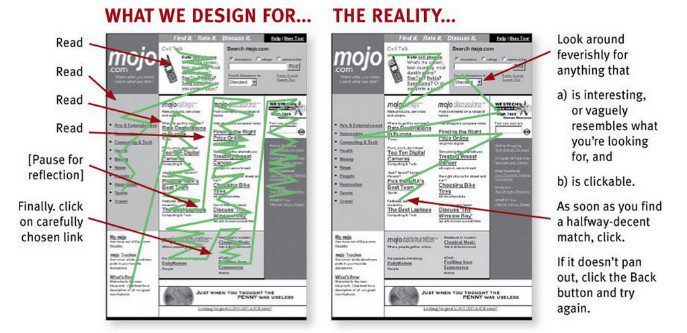
This is the most important tip, which makes it number 1 on our list.
People should just “get” how to use your website. Fear, doubt, and uncertainty creeps in when they have to think about how to use your website.
If they get frustrated with your website, they’ll leave and find another.
Example thoughts that cause fear, doubt, and uncertainty:
Imagine yourself driving and coming across a green stop sign. Do you stop or keep going?
Whatever you chose to do, you probably had to think about it. And that usually spells fear, doubt, and uncertainty.
Don’t try to reinvent the wheel. Most websites that try to do something new often come across gimmicky and hard to use.
Keep things simple and use the current website conventions. For example, if most websites have their navigation on the left or top, you might consider doing the same also.
Most people don’t read web content word for word.
That’s why it’s important to structure your content for scanning.
Headings, bold fonts, descriptive links, and white space are a few of the things to consider when designing and writing your content.
Long lines of text tend to make it difficult for eyes to track back to the beginning of the next line.
To make it easier for people to read or scan the page, keep content blocks narrow by limiting the characters to approximately 65 per line.
Narrow block example:
Capilano University is a teaching-focused university offering a wide range of programs and services that enable students to succeed in their current studies, in their ongoing education, in their chosen careers, in their lifelong pursuit of knowledge and in their contribution as responsible citizens in a rapidly changing and diverse global community.
Wide block example:
Capilano University is a teaching-focused university offering a wide range of programs and services that enable students to succeed in their current studies, in their ongoing education, in their chosen careers, in their lifelong pursuit of knowledge and in their contribution as responsible citizens in a rapidly changing and diverse global community.
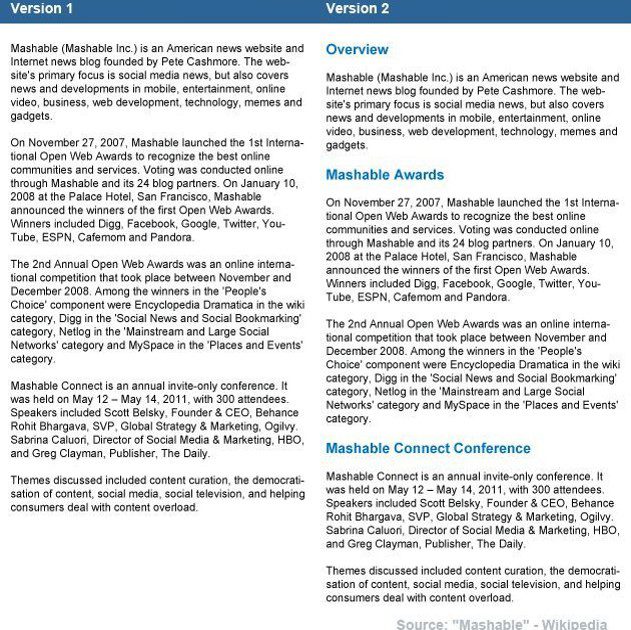
Headings help people scan pages for information. On the web, up to 6 different headers can be used: h1, h2, h3, h4, h5, h6.
Heading 1 (h1) tags are the largest and are most often used as the page title. The rest are used as subtitles to help divide content into different sections. Check out the 2 examples below. Which one would you prefer reading or scanning?
Capilano University’s ePortfolios use WordPress, which are already equipped with an editor that can work with heading tags, so go ahead and try them out!
Use white space to help improve visual hierarchy of your website. Grouping content together can help draw attention to the important areas of the site and help people find what they’re looking for.
Break long paragraphs into short 1-2 sentence paragraphs to keep ideas simple and easier to read. Emails are usually written this way for clarity and so can your website content.
Scanners often read the top line of each paragraph to gauge whether or not the topic is useful to them before reading the rest.
Example:
Capilano University has earned an international reputation for quality teaching, programs and services.
We strive to instill the knowledge, skills, motivation and attitudes that will enable our students to become independent thinkers and learners, and to contribute effectively in a rapidly changing world.
Capilano University is well known for providing a solid academic foundation and is committed to developing new and innovative programs in response to market demand.
We offer a complete range of preparatory courses, arts and sciences courses, business and management studies, creative and applied arts programs, health and human services programs, plus a range of services in support of student learning and success.
Credentials awarded include bachelor degrees, associate degrees, post-baccalaureate diplomas, advanced diplomas, certificates and statements of completion.
When you’re an expert, things appear to be much simpler than they seem. To help people understand your content, use words that a non-expert can understand. Not only does this make it easier to read and scan, people will spend less time trying to understand the meaning behind the text.
When writing for the web, edit your content to omit needless words. These words usually add fluff to your content, make important content less prominent, and increase page scrolling.
Examples of needless words can be:
These types of links can be seen as untrustworthy as it’s hard to tell where they go.
The best practice is to use descriptive links.
For example: “Many programs and courses can be found on the Capilano University Website”
Keep people where they left off. If you’re linking to an external website or to a document (.pdf, .docx, etc.), be sure to open the link on a new tab.
This will prevent people from leaving your site and they can go back to where they last left off by clicking the previous tab.
For internal links, open links on the same tab.
The goal is to get people to read and absorb your content. Larger fonts help you achieve that goal.
Don’t forget that it’ll make things easier on mobile devices. Fonts will be easier to read and links will be bigger and easier to tap.
The recommended paragraph font size is 14 – 16 pixels, which is roughly the same size as 12 point text on paper.
Have you ever clicked on link only to discover that it’s just underlined text?
It’s confusing and someone might actually try to figure out why it’s not working.
When you’re trying to emphasize text, use bold or italic instead.
When too many things are calling for attention, nothing seems to be important.
Having a full paragraph of bolded text is the most common mistake. Only bold sparingly to make sure only the important words are emphasized.
Example:Capilano University has earned an international reputation for quality teaching, programs and services. We strive to instill the knowledge, skills, motivation and attitudes that will enable our students to become independent thinkers and learners, and to contribute effectively in a rapidly changing world.
Capilano University has earned an international reputation for quality teaching, programs and services. We strive to instill the knowledge, skills, motivation and attitudes that will enable our students to become independent thinkers and learners, and to contribute effectively in a rapidly changing world.
Colours can make your website look much more lively, but at what point does it become too many colours?
Not only can it become distracting and hard to read, but it may cause issues for people with visual impairments and colour blindness.
Instead of using colours to emphasize or categorize text, use headings, bold or italic text, and bullet points instead.
Whenever possible, plan the actual size of the image you need for your website.
Over-sized images are very common on the web and are known to cause a number of issues including slow page loading speeds. They’re also responsible for eating up mobile data plans. Have you ever noticed that your data usage jumps up farther than you expect? Large image sizes may be the culprit.
You can use free tools like Picmonkey.com or iPiccy.comto resize your images. We recommend images that are less than 100 kb whenever possible.
On the example on the right, can you spot the difference between the two images? The top is 60 kb while the bottom is 30 kb.
Use alternative (alt) text for your images. Alt text is essential for people with accessibility screen readers, which helps them understand the content on the page.
If your image ends up breaking (broken link), the alt text takes it’s place.
Be conscious of people accessing and looking at files on their mobile devices. When you’re linking to files on your website, indicate how large the file is so they can decide if they want download it using their data plans.
When linking to .docx, .pdf, .xlsx, etc., make sure to add these extensions to links so that people know what to expect.
Avoid generic ‘click here’ links. Instead use the title of your file as the link and work it into a sentence.
Example:
Download and complete Paragraph Assignment 1 (.pdf) before Thursday, May 11.
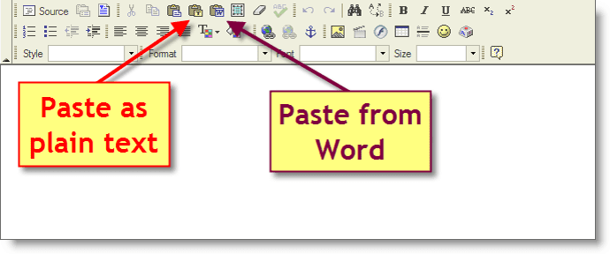
If you’re copying and pasting text from Word, use the WYSIWYG Paste from Word, Paste as Plain Text or Sweeper tool option.
This helps clean up the appearance of the text and removes unnecessary code from the back end.