I like to think that I am a very open book. I don’t spend a lot of my time concealing who I am. Instead, I choose to spend my energy bettering myself and others while remaining as true to who I am as possible.

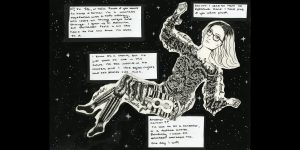
My design is an illustration heavy self portrait comprised of all the attributes that currently make me “me”. I chose to have the characteristics making up the parts of my body, as they are such integral parts of who I am. This ties into the idea of an “open book” as well. Everything I have to offer is right in front of you as long as you look.
My torso is made up of plant matter due to my strong connection with nature and all living things. I love caring for nature and surrounding myself with it at all times possible. I have an extremely deep rooted and intense friendship with all things green and alive. In a way it literally makes up a huge part of me, spiritually and emotionally. I struggle to describe how it makes me feel, but communicating it this way feels right. I am made up of nature and its ornate complexity makes me beautiful the same way it makes the world beautiful. When compared to others this portion takes up the most of my body for this reason. Similarly, it is also the area that surrounds my heart.
My legs are made up of various musical aspects, most prominently a guitar and/or ukulele. I grew up making music, and it is something that inspires me every day. My knees feature a rattlesnake twisted around them for two separate reasons. Similar to my torso, I feel a great connection to animals. However, rattlesnakes represent home for me as well. I grew up in Kelowna, where we have many beautiful animals but the most favorite of mine being the rattlesnake. My feet are made up of paintbrushes, because art is what grounds me, specifically painting. All the images on the legs are ones that inspire me and keep me going, hence why they are my legs.
I would give myself an 7.5/10. In my mind the illustration is done well, but the arrangement of the text and the formatting of it is lacking. Looking back the outline around the body is hasty, not to mention the issue of scaling. Next time I’ll make sure to format correctly and experiment with typography more.