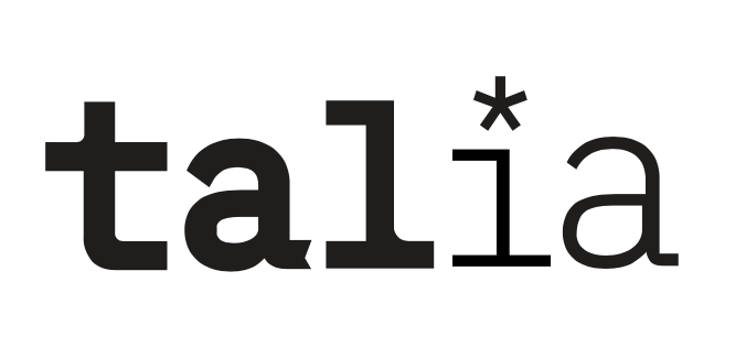
I chose my first and final logo because it ticked all my boxes. It feels fun and young, showing that I’m new potential in the industry by featuring my first name and even more casual nickname. I also think that this allows me to remain soft and approachable; I’ll never be worried about taking myself too seriously with this logo. It makes me feel capable but not disingenuously up-tight.
Additionally, the story behind my work is represented by the asterisk, indicating that there’s always something more to what I create. Design with roots in its community and tangible change is really important to me, and I am satisfied with how that comes across in this logo.
Technically speaking, I feel like I broke through a barrier while creating this logo, and that (on a personal level) it shows how far I’ve come in my ability to render out sketches and create custom type.
Compared to the rest of my work, this logo has just the right amount of my style infused into it and just enough of the opposite that, when placed on a finished piece, compliments the work without blending in completely.
On this project overall, I would give myself a high B to a low A. Reflecting on my personal ad, it detracts from the brand I was able to develop, and sticks out too much. That particular ad, although full of things and ideas I like, seems naive when all put together. Additionally, I veered away from my moldboards and my original intentions for my logo. Since I’m working for myself it’s fine, but were I working for a client there would be communication issues as to why the finished product didn’t resemble the moodboards.
For my final three blog posts, I wanted to choose a variety of executions that showed three different sides of myself. The first one (refer above) makes me feel capable, and decisive in my work. It’s bold and confident, but still unexpected with the serrated edge and the asterisk. Additionally, the tie-in to the name “Tal” makes me feel like I could enter a workplace feeling confident and professional with fresh ideas, but still have a friendly warmth.
As for the second, I wanted to play with the long-running joke of people mispronouncing my name while feeling fun and youthful. In the field, being young and fresh out of university can sometimes be a disadvantage, but this logo feels fresh and youthful in an abundantly lively way. This logo would make me feel like I brought something new and exciting to a team that needed a young face in the room.
Lastly, the bird logo is completely sentimental and a reflection of my personal accomplishments and interests. Drawn from my love of ornithology and my roots in fine art, this logo would make me feel like I could enter a tight-knit, “family” driven agency and have a meaningful conversation with a new connection if they asked about it.
Creating these logos gave me much more of a grasp on my personal brand. Looking back on my ad from our first week, I’m happy to say I’ve learned how to describe myself with only what’s necessary instead of throwing everything about me into one image.
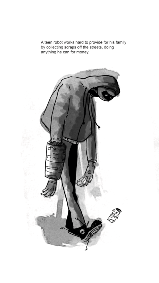
SP1-NKH is a curious, voiceless, teenage robot who collects garbage for a living when he stumbles upon a priceless treasure that makes him a wanted man – robot or otherwise, he has to stay on the run to keep his family safe.
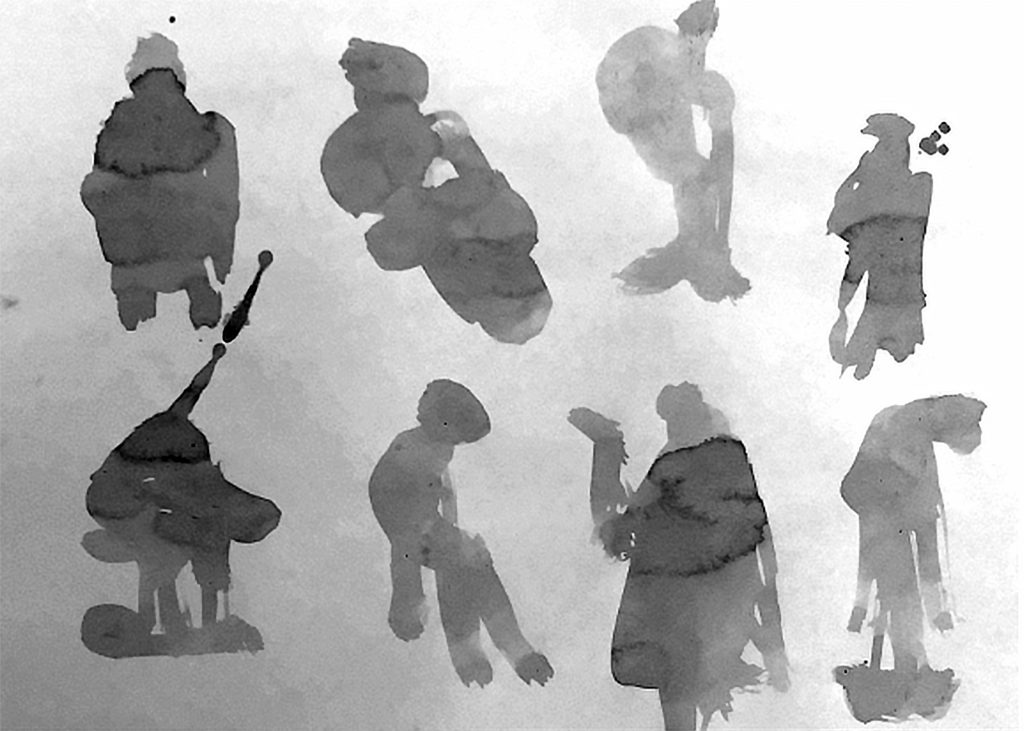
How did your character emerge from the blot exercises?
While creating the blot exercises, I realized I had a tendency to stick with one of two characters. Either they were long, gangly, and awkward, or bubbly and friendly, if not somewhat pompous. I was drawn to this character during the blots because of the way a head emerged suddenly from the bottom.
The inkblots used as a base for SP1-KNH. I originally used the bottom left example, but ended up drawing from a similar design two spots over for the end product.
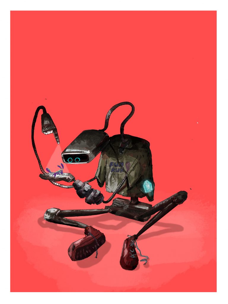
SP1-KNH in his early development. (pronounced Spinch. Yes, like Spinach. He doesn’t mind because he…well. He’s a robot. He doesn’t know what spinach is. Kind of embarrassing, if you ask me. Every time he runs into a human gang member chasing him down they call him Spinach. It always takes a second for his system to calculate whether he should be afraid or not because the word just sounds so silly. Is it a mean term? A command perhaps? An invitation for tea? His data bases can’t recall. Better run anyways.)
Spinch in action. Curious, gangly, and hates wielding guns.
SP1-KNH
How does your illustration style support the mood of your character?
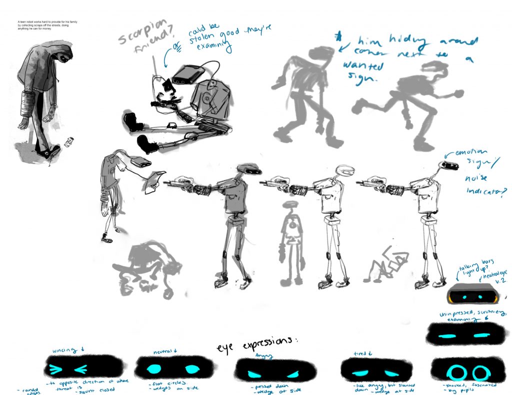
For the final execution, I envisioned SP1-KNH in a rough, dystopian world filled with bright lights, exotic neon, tempting alleyways, and alien bugs. Being a robot Spinch fits in enough, but his damp colouring and out-dated parts hashed with scrapes and rust make him stand out just enough to show he doesn’t belong. Since Spinch wouldn’t talk, the expressiveness of his arms and eyes are crucial to communicating with others. His rope-like arms and neck create a teenager-like hunch in his back, with no real choice or disposition to him. The only exception to this is his eyes, lively and versatile, showing that he is still a soul full of life. I wanted him to feel gangly, shy, child-like, but still curious and kind. In his world, Spinch would be compared to a toy left in the lost and found.
Lighting, Tone, and Color
Pt. 1: Included as an isolated image for clarity.
In this isolated image, we can see how beaten up and wiry Spinch is. Although he sits on a flat coloured background, we see exactly what a juxtaposition he would be against a lively environment. We easily associate someone like Spinch with back allies, dirty floors, and scrapyards.
Pt. 2 Photo-collage and illustrated composition.
Here in his final illustration, we see Spinch examining a new friend by flashlight while he is hunted down by city gang members. He is illuminated by pure light, making him seem innocent and curious while the threat lurks behind him (highlighted by red neon, to show they are menacing). In the background, we see an innocent shop-owner (highlighted by the green neon lights to show his innocence) pointing them in the direction of the boy with the glowing treasure in his pocket. The scene is very dark, as Spinch would do the majority of his garbage-rummaging by night alongside alien raccoons to avoid suspicion.
A set or series of images, with or without text or written narrative, that outline a story. There is no set format to comics, all are differing and unique in their own form.
“Juxtaposed pictorial and other images in deliberate sequence, intended to convey information and/or to produce an aesthetic response in the viewer.”
Cartoon:
“Amplification though simplification.”
An art form that exaggerates and simplifies a drawing down to its most valuable characteristics. Comics can be both-hyper specific (ie. a character simplified down to beady eyes, a large hook nose, birth mark over their mouth) and extremely general (ie. Calvin and Hobbs)to help the viewer connect in varying degrees to the characters.
Gutter:
“That space between the panels.”
The space between drawings that communicates a shift, and works alongside closure to allow the viewer an understanding of a change in the story. See Panel to Panel Transitions to see what changes can occur.
Closure:
“Closure is an agent of change/time/motion in the medium of comics and the viewer is a willing collaborator.”
“Mentally completing that which is incomplete based on past experience.”
Most comics will vary in how scenes change from one to another. Closure is what happens when the reader bridges the gap using information or observed facts from the story to, in their mind, complete what happens in between frames. Essentially, the viewer processing is acting the ampersand between cause & effect.
Ie. An action. In frame one, we see Fred winding up for a punch. In frame two, we see his victim dazed on the floor with stars around his head. Although we didn’t see Fred hitting the other man, we know it happened due to the common trope of dizziness.
Panel-to-Panel Transitions
How aspects of the comic change in between panels. This can be a change in time, perspective, location, etc. See below for common panel transitions.
Moment-to-Moment: A heartbeat between panels, with very little time passing in the change.
Action-to-Action: Panels communicate large or small parts of actions in a scene.
Ie. Frame one: Fred winding up for a punch. Frame two: Fred’s fist flying through the air. Frame three: Fred’s fist making contact with somebody’s face.
Subject-to-Subject: The change is communicated by switching subjects but staying on the same scene or idea. Think action, reaction.
Scene-to-Scene: Change involves larger changes in time and location/space.
Aspect-to-Aspect: Focuses on describing a place, idea, or mood by switching subjects/settings/views. For example, we can describe New York in different panels showing buisiness men, small apartments, and homeless men in front of a brick wall. We’re still focusing on the same thing, New York as a whole, but visually describing different aspects of it.
Non-Sequitur: “No logical relationship between panels.”
Bleed:
“When a panel runs off a page.”
The frame of a panel is released and set free onto the page. It can travel off the page completely, or fill up parts of it. Especially great for dramatic impact.
Motion Lines:
“Zip-ribbons. Motion lines represent objects moving through space.”
Artistically licensed lines that communicate motion and change.
Synaesthetics:
“Art that might somehow unite the senses and in doing so, unite the different artforms which appealed to those different series.”
Artistically licensed stylization that describes an abstract feeling or emotion by visually manipulating one of the 5 senses.
Representing abstract ideas or feelings in a
Comics use “living lines” that can represent other senses or feelings without having to actually use that sense.
Many students debate over the benefit of taking notes digitally or traditionally. In favor of typing, it is extremely convenient and provides immediate results. However, working by hand often offers different benefits and utilizes different parts of the brain that offer higher memory retention and cognition. The written word at its core serves as a symbol for an object, and carefully handcrafting a picture of an object will prove more effective for memory retention than pressing buttons to create the same symbol. There is a dissonance when typing on a computer, as the student is only half engaged with the act of note taking and the absorption of information. Lastly, writing by hand requires a significant amount of editing, requiring the student to synthesise the information instead of hoarding it as one would with a laptop. This essay will be based on a 2012 paper from Pam Mueller and Daniel Oppenheimer titled “The Pen Is Mightier Than the Keyboard: Advantages of Longhand Over Laptop Note Taking,” in which they discuss the brain’s activity when engaging with both methods.
To look at it briefly, the science of handwriting compared to typing is simple. Writing can be simplified to drawing small pictures of your subject. Although we are not directly drawing the object we are trying to remember, the word serves as an interchangeable symbol. For example, the written word “dog” symbolizes the actual animal the same way a photograph or simple drawing would. They are all equal when concerning memory retention. When you think about it, of course hand crafting a visual representation of an object is going to ingrain the object in your memory more than pressing three buttons would. After conducting three studies testing students’ general understanding of content with half of the students taking notes by hand, Mueller and Oppenheimer state, “those who wrote out their notes by hand had a stronger conceptual understanding and were more successful in applying and integrating the material than those who took notes with their laptops.” This is certainly due to the aforementioned use of the written word as a symbol.
One might assume that because writing is a more strenuous activity that requires more mental processing, the same parts of the brain are being used for both forms of note taking. Simply put, writing requires more brain activity as opposed to a different type of activity. Handwriting and typing utilize the same three parts of the brain: the left supramarginal gyrus, the left superior parietal lobule, and the left premotor cortex. This means that the brain is utilizing both processing and fine motor skills for each activity respectively, but writing by hand activates more sections of the temporal lobe.The temporal lobe and hippocampus are responsible for episodic memory, allowing you to store and manage information. This could be a factoid you learned in class or something as simple as the taste of a coffee you enjoyed with a friend last week. The important part is that it facilitates the retention of external information. Additionally, writing involving the complex movement of a pen in your hand requires more attention than typing. As Meuller and Oppeinheimer state in their essay, writing by hand is a more intricate and time consuming activity, thus requiring more editing down of information from ear to page. While writing notes one cannot reproduce a lecture word for word by hand. A laptop provides a much more immediate result and requires less editing, but also requires less analyzing of information. Students become familiar with the minimal movement and disengagement from typing due to high typing speed, autocorrect, and ability to immediately identify errors. As a result, typing note takers passively engage with both the lecture and note-taking, and in turn retain minimal information at the end because they are only half invested in both activities. It’s a passive physical process typing on a computer, whereas writing by hand requires cognitive awareness and information editing.
With handwriting, you’re synthesising information and evaluating what content is the most important, because you have less time to record. This way of thinking is purely analytical, taking only the information that is crucial. With laptop writing, the method of note taking is more verbatim, and the net of what is regurgitated into the notes is much more widespread. This can be summed up by a review of Mueller and Oppenheimer’s paper published by Scientific American Journal in 2014, stating;
“Mueller and Oppenheimer postulate that taking notes by hand requires different types of cognitive processing than taking notes on a laptop, and these different processes have consequences for learning. Writing by hand is slower and more cumbersome than typing, and students cannot possibly write down every word in a lecture. Instead, they listen, digest, and summarize so that they can succinctly capture the essence of the information. Thus, taking notes by hand forces the brain to engage in some heavy “mental lifting,” and these efforts foster comprehension and retention.”
We can think of writing by hand as more of a survival method, taking only the essentials for what we need and using them to our advantage. Typing is more of a hoarding method, grabbing everything close to you regardless of its use.
From a personal angle, I prefer taking notes by hand when it is more historical or process based information. However, in classes that have heavy demonstrative lectures (like our tech lab classes, for example) I find that I have to take notes on a laptop to get each step down so I’m able to effectively work within a system like photoshop.
In conclusion, writing by hand offers many different benefits to that of typing. Although typing satisfies an immediate result and writing is a slower form of note taking, writing serves as a symbol of a word that encourages deeper memory retention. The slower form of writing requires more analytical processing and extracts only the essential information while typing resembles more of a hoarding mindset, allowing less room for absorption and retention.
Mueller, Pam A., and Daniel M. Oppenheimer. “The Pen Is Mightier Than the Keyboard.” Psychological Science, vol. 25, no. 6, 2014, pp. 1159–1168., doi:10.1177/0956797614524581.
Starting this project, I knew that my views on decolonization and indigenous relations would be vastly different than my target market’s. When talking to my mom about the issue she brought up the inconsistencies in medical care when treating aboriginal children and families, and eventually we landed on the topic of the foster care system.
Initially, I wanted to focus on the failure of the government dating back to the Sixties Scoop. I knew I wanted to focus on the individuals to gain empathy from the target market, but I knew I couldn’t call the children broken or incomplete, and at the same time I couldn’t villainize the parents partaking in the foster care system who were providing positive experiences.
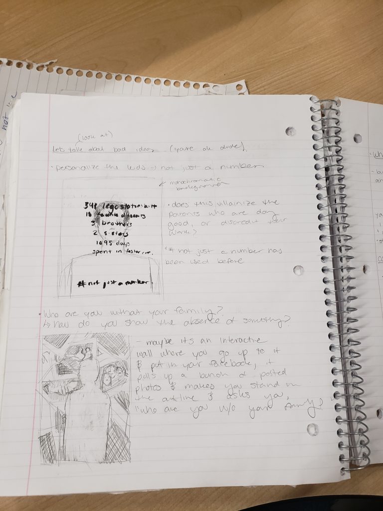
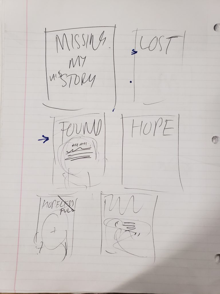
Rejected ideas that lead to the “Found” posters
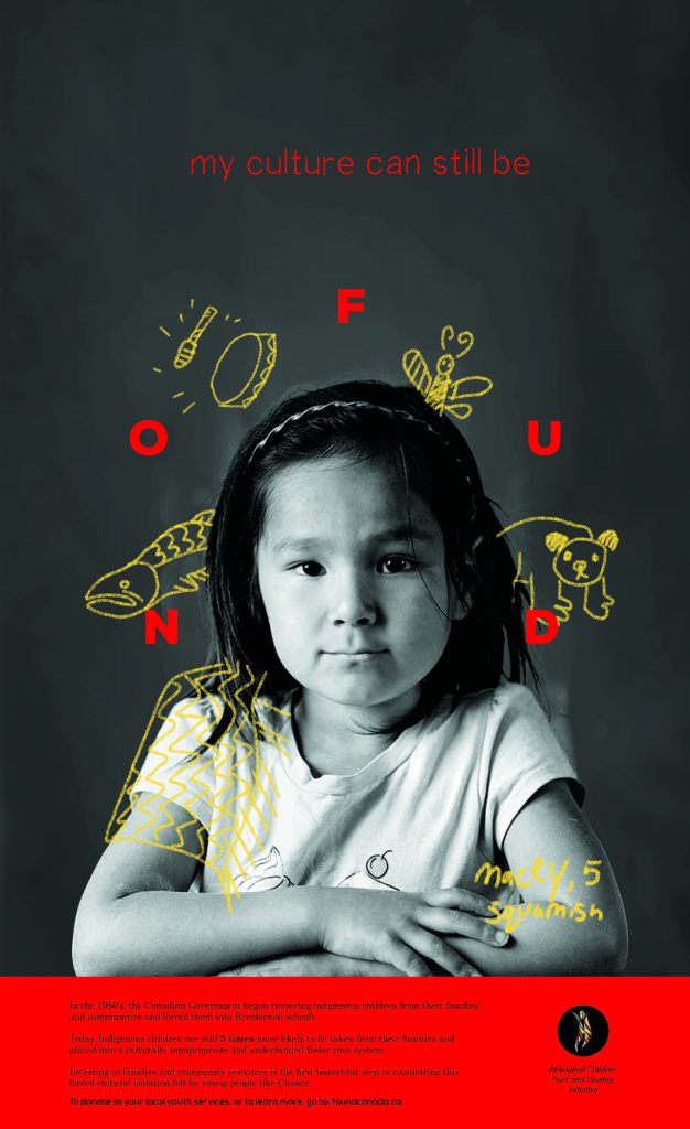
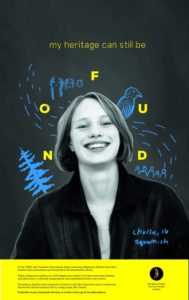
With this in mind, I originally landed on the phrase “Missing But Not Lost,” intended to address the Indigenous identities of the children separated from their communities who’s culture/language/family ties were “missing but not lost,” intending to build awareness for the issue and inspire change in elections. However, this sounded too close to the Missing and Murdered Indigenous Women campaigns, and it pointed fingers in the wrong directions. It was through ideation with peers and professors like Vida that landed the idea of the “FOUND” posters. The idea of being found vs. yet to be put the exact positive spin on the campaign that I needed, and gave footing to the funding it needed. Although this removed it from the direct problem (intergenerational trauma and a lack of parenting skills due to the Canadian Government) it re-contextualized the campaign into one of hope and community building, not loss and mourning.
To keep with the positive, youth centred theme I chose to utilize bright colours and children’s illustration. I wanted the posters to be eye catching and dynamic to make them stand out. (See mood boards above.) I understood that the target market would easily look past a regular poster with a child’s face on it, so I wanted to play to the emotional appeal by showing showing a child in a way that they would want their own to feel. Happy, whole, and inspired. This is also why I decided to incorporate an animated aspect into the campaign, to catch the eye and confront them with an image that seemed alive as opposed to static.
Concept for animated version of posters that could be applied in multiple ways.
These animations could take form in a number of ways. A short 5 second ad with a simple found logo and link at the bottom, a long form narrated commercial, replacing the photography and illustrations exactly the same as the posters above, an animated card on the website, etc.
Final Poster 1/3Poster 2/3Poster 3/3 (Color when importing into WordPress extremely oversaturated, please refer to PDF for accurate color.)
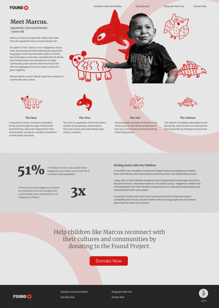
I also decided to include a website to provide an opportunity for education and further explanation of the initiative. The first step in removing cultural barriers is always education, allowing the viewer to build sympathy and de-mystifying the other group step by step. At Found.ca, the visuals match that of the poster, and then provides culturally relevant information for each of the illustrations to start educating the viewer in an approachable and comfortable way. Now that you have an emotional tie to the main child shown (Marcus) and you feel like you understand him a little, it explains the reality of the situation lower down the page as to not shock you with it straight away.
Landing Page Design for Found.ca, the face of the campaign lead by the Aboriginal Children Hurt and Healing foundation.
Overall, I wanted this campaign to be an approachable, positive way to address, educate on, and fund the very intense process that is rebuilding culture within indigenous youth that have been separated from their communities. The Found project builds up and helps fund organizations that help youth to reconnect with their cultures, languages, communities, and families. These are local youth groups, night-classes for Indigenous languages, Indigenous lead art camps, etc. that contribute to a sustainable community children in foster care would not have had they been without services that the Found project provides.
Self Evaluation
Although I’m happy with my final product, research, and strategy rationale, I think my ideation process and workflow could have been streamlined. I stressed myself out too much in the beginning stages and delayed my working time significantly. In the final product, I am happy with the aesthetic and art direction. I worked very hard on the copyrighting and hierarchy but recognize that there is always room for me to improve in those two areas. If it makes sense, I’d give myself a low A for execution and a B for process.
Indigenous Families are separated 3x more often than white families in favour of placing the children into a broken underfunded foster care system.
“The Sixties Scoop” refers to the mass separation of indigenous children from their families in 1960’s Canada, where they would be taken away to Residential School. Although promised as a temporary action, almost all of the children fell extremely ill, lost the skill to communicate using the language they shared with their families, or died inside these schools. Instead, the children who survived became displaced, forced to assimilate into white communities that refused to accept them on an equal level.
Cut to present day, and the Canadian Government has just been sued for the exact same offence. Indigenous families are separated by social workers and government officials three times as often as white families. This is due to prejudices and misrepresentation of First Nations in Canadian healthcare, as well as a long-standing double standard regarding what it takes for a parent to be deemed as “fit” to care for children. For example, although a white parent and indigenous parent might be enduring similar struggles, the bar for the indigenous parent is unrealistically higher. Because of this, children are taken away much more often than in white families even though the household could be exactly the same. In Manitoba during the early 80s, provincial officials estimated they took in 600-700 indigenous children every month.
“A recent study found that 52% of children under 15 in foster care are indigenous. Yet Indigenous children are just under eight per cent of the under-15 population in Canada today.
More than 90 per cent of Manitoba’s 11,000 kids in care are Indigenous. In B.C. 64 per cent of our 6,804 kids in care identify as Indigenous, even though they make up just under 10 per cent of the population under 19.”
Katie Hyslop, TheTyee.ca
The children would then be placed in chronically underfunded foster care systems, where the adults responsible for care are grossly under assessed and without proper monthly allowance. This meant children were placed in abusive homes without sufficient opportunity for care, often with no opportunity to maintain their culture. This underfunding is the direct fault of the Canadian government, and the system they operate on is still modelled after the settlers ideas of First Nations upon first contact.
“Like every social issue facing Indigenous people in Canada, the origins date back to colonization.
The earliest settlers’ writings show their misunderstanding of Indigenous child-rearing and how their feelings of racial and cultural superiority clouded their judgments.
Early missionaries saw First Nations child-rearing practices as ‘negligent, irresponsible and uncivilized’ because they refused to physically punish their children and respected them as individuals, instead of seeing them as clean slates on which to write. Settler governments viewed Indigenous people, adults and children, as wards of the state. The 1876 Indian Act, …effectively gave government control over First Nations people’s lives, dictating where and how they would live, hunt, work and play…And how their children would be raised. Three years after the Indian Act was passed, then-prime minister Sir John A. Macdonald sent MP Nicholas F. Davin to the United States to study its system of industrial boarding schools for Native American children.”
Katie Hyslop, TheTyee.ca
To say this issue is multi-faceted would be an understatement. It is a perfect example of the cyclical damage caused by residential schools and the Canadian governments neglect to repair it. It demonstrates the depth of the mis-representation of Indigenous families, while showcasing the direct role that the government plays in perpetuation those stereotypes. As of September of 2019, the Supreme Court ruled in favour of the Indigenous groups suing the Canadian government. It was intended that as of 2020, each child affected up until 2006 would be payed out a maximum of $40 000 dollars each for the trauma the government caused. The Trudeau Government announced in November that they planned to settle the class-action lawsuit after asking for an appeal in October.
With this project, I hope to do two things.
Educate non-indigenous Canadians on the humanitarian crisis and cyclical, deep-rooted nature of the displacement of indigenous children in the foster care system in an engaging, emotionally appealing way that bridges the gap of these being real families, as opposed to groups and statistics on the news. I want families who aren’t necessarily invested in the affairs of first nations children to realize the depth of the issue and that our past of residential schools are not yet behind us.
Create a call to action for those who are entitled to compensation to utilize an advertised service (most likely a website, or office in their city) to take the next steps in receiving compensation.
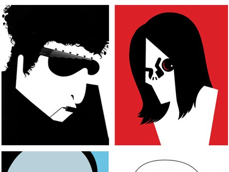
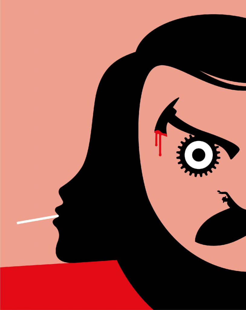
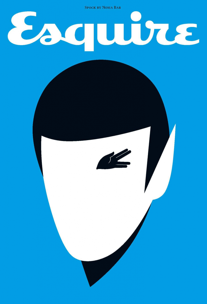
“Bar’s work has been described as “deceptively simple”, featuring flat colours, minimal detail and negative space to create images that often carry double meanings that are not immediately apparent.”
Noma Bar is an Israel born graphic designer and illustrator who’s work has gained numerous recognitions and awards in recent years. His provocative, stark works are extremely conceptual while utilizing the most simplistic forms. He has truly refined the conceptual image, and is known for his flawless rendering of the “visual innuendo.”
Bar boasts a heavy publication list, including, but not limited to the likes of:
“Time Out London, BBC, Random House, The Observer, The Economist and Wallpaper*. Bar has illustrated over one hundred magazine covers, published over 550 illustrations and released three books of his work: Guess Who – The Many Faces of Noma Bar in 2008, Negative Space in 2009 and Bittersweet 2017, a 680 page 5 volume monograph produced in a Limited Edition of 1000 published by Thames & Hudson.”
~ Dutchuncle.com
Noma’s career is currently based in London, but began in his childhood. He would make caricatures of his teachers at school, and although crude, showed his potential from an early age. He also credits his creative influence to his neighbour, who would create life-sized sculptures out of extra farm machinery parts. He says that this laid the groundwork of his artistic visions, saying that it showed him that ‘you could take something and make it into something radically different, just by composition. That is the basis of all my work now.’
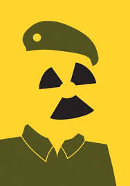
During the 1990 Gulf War, while seeking refuge in a bomb shelter in Israel, he noticed the striking resemblance that Iraqi leader Saddam Hussein’s face had to a radioactivity symbol, and he created the first portrait that would later exemplify his symbolic style. He would go on to create similar images of Hitler, as well as icons of the times.
He would study calligraphy, graphic design, and Hebrew typography at the Jerusalem Academy of Art where he would refine his graphic style. He would meet his wife and fellow graphic designer Dana Bar. Upon graduating in 2000, Bar would move to London to pursue his career, with his first major publication afterwards being a full page of William Shakespeare for the popular publication Time Out London. The couple is currently settled in Highgate, where they work doing freelance and contract labels, and live with their two daughters Mia and Lili. Bar has produced multiple books collecting his works in recent years, the most popular being “Guess Who? The Many Faces of Noma Bar,” and “Negative Space,” both acting as a purchase-able portfolio of his extensive works.
In summary, Noma Bar is a unique illustrator of the day. There are not many who can compare to the sheer intellect and wit that is able to be conveyed by such minimal shape and line. As a budding designer and illustrator, I can easily say how admirable his work is. It’s always easier to include more, to overcomplicate your pieces and to justify them via the image. Bar’s work sits on a level of sophistication that makes this a non-issue. He’s able to convey recognizable and high-level concepts while providing the smallest amount of information possible, something that I think all illustrators should strive for sometimes. He really redefines what the word “graphic” (giving a vivid picture with explicit detail) means. Unlike others, Bar trusts the audience to fill in the missing pieces on their own. The work stands on it’s own, and that’s hard to come across.
The word “extraordinary” didn’t mean much to me until I discovered the world of illustration. Unlike photos, or even abstract fine art, illustration was able to take the mundane and make it just that, more. More than ordinary, but in a way that was believable and somehow more than real.
I’ve often found that while searching through the lists of illustrators for these blogs that there is one who stands out among the rest. While perusing this particular collection of names, however, there was nobody that jumped out to me. There was Braldt Bralds who has one of the most interesting names of all time and happens to paint only cats, which was interesting enough, but then I stumbled upon Francis Livingston.
Livingston’s work didn’t immediately catch my eye. The first images that come up after searching his name are city landscapes and beautifully lit buildings. Sure, they’re well done, and somebody else could easily write five hundred words talking about his quality of light and faithful devotion to intricate colour studies. But I wasn’t about to spend my time on just buildings when there were so many more attention grabbing artists out there.
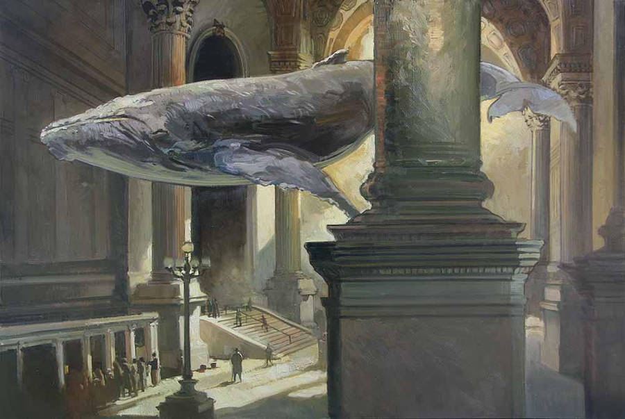
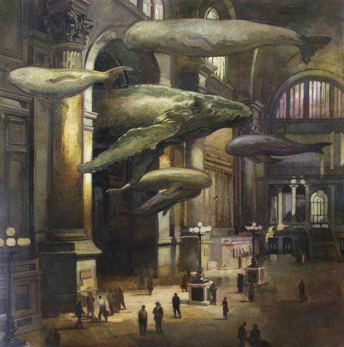
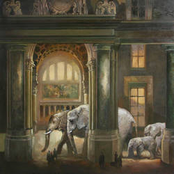
But then I found this picture.
“Light Stream, 2012-2019”
I was in awe, and immediately enthralled with the work of this man that I knew quite literally nothing about. He could be a murderer, for all I knew, but I didn’t care. This was one of my most favourite pieces I’ve ever seen, and it will be for a long time. Something about the quiet grandeur of the scene, the humbleness of the paint strokes and the nonchalant nature of the whale that peacefully swims above the unassuming crowd. This illustration makes me want to be there, to live in the world that Livingston has so deftly crafted.
And yes, obviously his quality of light and immaculate handling of colour and brushstroke quality is incredible. We can’t really talk about his work without recognizing his ability as the rest of the artistic world has. His biography on medicinemangallery.com touches the edges of his reputation, stating:
“Born in Cortez, Colorado, Francis Livingston is in the top ranks of American illustrators, and his work has been widely published. Francis Livingston’s paintings have been exhibited in San Francisco, Los Angeles, and New York. Livingston was awarded both Gold and Silver Medals from the New York Society of Illustrators, San Francisco Society of Illustrators, and Society of Illustrators of Los Angeles.”
~ medicinemangallery.com
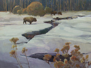
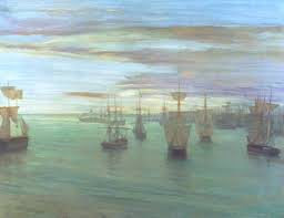
Livingston credits his inspiration to the likes of Sargent and Whistler, and studied Diebenkorn alongside the more modern Wayne Thiebaud. Looking at his more traditional illustrative works, this makes perfect sense. We can see that his landscapes strike a jarring resemblance to Whistler (as shown below), but add a twist of the “Bay Area flare” that Livingston was surrounded by during his formative years as an artist.
Winter Landscape by Livingston
“Crepuscule in Flesh Color and Green: Valparaiso” James Abbot McNeill Whistler, 1886.
After a 10 year teaching career in San Francisco at the Academy of Art College, Livingston and his family relocated to Idaho. Much like James Elliot Bama Livingston completely switched genres and client bases. His earlier career had consisted of painting the San Francisco Board Walk for years, but now focuses on the stretching plains of the mid-west (see “Winter Landscape,” above).
However, his newest work consists of ones similar to the original “Light Stream” that caught my eye. Livingston continues to combine natural elements with 20th century architecture and mundane scenes to create striking, jealousy-inducing images. He creates a whole other universe within his paintings, which now tend to fall under the category of fine art instead of illustrations. Livingston brings to life the classic “Night at the Museum” concept in a lively, mature, more believable way. Additionally, he does so with the intent of making it seem situationally realistic. It’s this factor that makes these works of Livingston’s resonate so intensely with me. It appears as if you’ve just hung around Penn Station too long and you’ve just caught a glimpse of some of the largest creatures on earth commuting home from work.
That being said, I think this quality will give Livingston’s work lasting importance. Perhaps not in the eye of critics, or even in the world of professional illustration. These are the type of images that children see that make them want to become illustrators–much like the drawings that I credit my ambition to–that leave lasting impressions and stay in their mind forever. Dreamlike images (in my experience) tend to be far more impressionable than landscapes or portraits, no matter how great the lighting or colour palette is. I guess what I’m trying to say, in my oh-so-round-about way, is that Livingston’s works deserve value and permanence because of how inspirational and extraordinary they are. They made me feel like I did when I first discovered art and illustration, sitting on the carpeted floor of my childhood bedroom, putting together puzzles of a golden fairy queen, realizing that I wanted to create things like that. Personally, it’s works like these that deserve recognition and lasting praise over landscapes and immaculately done portraits.