Jan Steen

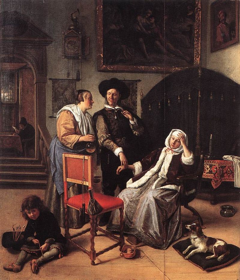
Jan Steen (1626-79) was a Flemish painter best known for his lively rendition of the everyday scene. Steen’s youth found him studying at the University of Leiden, but dropped out after two years to take a painter’s apprenticeship. He studied under the direction of Jan van Goyen, Nicholas Knupfer, and Adriane van Ostade. In 1648 he co-founded the Leiden guild of artists. His work is often referred to as a “comedy of manners,” satirical interpretations of contemporary society. Steen’s work focuses on the regular citizen, and many are titled by seemingly mundane activities when compared to the dramatic Italian works that preceded the Baroque era. “The Dancing Couple,” “Doctors Visit,” “Adolf and Catharina Croeser on the Oude Delft,” and “The Happy Family” (pictured below) are all perfect examples showing where Steen’s interests lay.

The Dancing Couple
Adolf and Catharina Croeser on the Oude Delft


Doctors Visit


The Happy Family (The Merry Family)

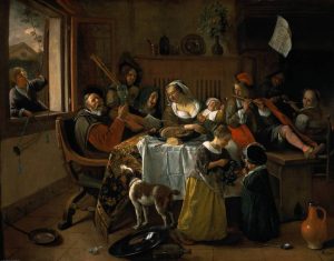
Steen has been described as “a man with no restraint” (riksmuseum.nl), and I can understand why biographers may describe him as so. In the 17th century painters were focusing on an authentic representation of human experience and form, and the audience would need some adjusting. For baroque artists, coming off the tail of mannerism, this would not have been an uncommon experience. However, in comparing his work even to others at the time I highly favor his work. If I were to compare him to someone like Caravaggio, I would say that they were complete opposites who complimented eachother.  Caravaggio’s work was intense, precise, heartfelt and dramatic. Steen is heartfelt but joyful, simple, and full of life. Caravaggio’s characters seem to writhe in pain on each canvas, where Steen’s bustle with joyful activity. This is excellently displayed in the pieces displayed below. Additionally although Steen still worked in chairoscuro, it is because of the movement of the body and the joy of the characters that it affects each artists work so differently. We see below Caravaggio’s Supper at Emous, and although it resembles a similar scene to Steen’s The Merry Familiy,  the seperation in the two artists style is defined between these two pieces.

Image result for Supper at Emmaus
Supper at Emaus, Carravagio, Oil on Canvas


Resources:

https://www.britannica.com/biography/Jan-Havickszoon-Steen

https://www.rijksmuseum.nl/en/rijksstudio/artists/jan-havicksz-steen

Anything but Humans! The Restricted Beauty of the Islamic Manuscript, Survey 2

Lecture Review

Todays lecture covered the year zero the year 1450 CE. We focused on the evolution of print and text, as well as the illuminated manuscript and the evolution of paper. Some key titles are…

  • Parchment
  • Codex and Codeci
  • Uncials and Half-uncials
  • The effects of Barbaric invasions
  • Gothic text and international influence of text
  • The Printing Press (Bi Sheng, China)
  • The Printing Press (Johan Gutenberg)

I found this lecture particularly interesting. It was fascinating to find out how innovations in text and print were reflected all throughout the known world. Especially in the instances of Sheng and Gutenberg, where they came up with the exact same technology with zero communication whatsoever.

Middle Eastern Illuminated Manuscripts

Illuminated manuscripts of the middle east provided a wide arrange of topics and information, straying far from the typical religious text found in the West. Islamic illuminators were unable to depict humans. The Islamic faith did not allow any renderings of God’s creations with souls, and the lack of such set these manuscripts apart from their European counterparts. People and animals (anything with a soul) were strictly banned from being depicted. All illustrated codecis of the area instead featured natural details, but the majority of the illustrations consisted of embellished designs. The style these books were created in was highly decorative, ornate, and detailed. Artists would work on a commission for months or even years, working primarily in royal workshops with an array of other workers.

In early production the majority of commissioned manuscripts were Qur’ans, religious texts of the Islamic faith. Illuminators would work with the scribes to create elaborate texts to lead the faithful by God’s word. After the scribes produced and decorated the paper, the illuminators would create their inks. Different inks were made up of various minerals, both for colour and for pigmentation.

  • Gold
  • Silver
  • Lapis lazuli/Indigo (dark blue) and azurite (light blue)
  • Orpient (for yellow) and malachite (for green)
  • Cinnabar (for red)

Ink was first mixed with a glue-like substance called albumen. This made the ink dry glossy, and it was not until the 16th century that artists switched over to a matt texture. This was achieved with gum arabic, sap derived from the acacia tree. The artist would then create a rough draft. This would be achieved with a fine layer of light ink or by using a device called a pounce. To pounce, the artist would lay a transparent layer over the rough draft and prick holes around every outline. Then, they would lay it over the new paper and pound a cloth bag of pigment into the holes, creating an outline where the paper once was. This technique would continue to be used into the high renaissance by muralists and fresco painters. Multiple artist were a part of the drawing process, with junior artists filling in large portions and blocks of colour.  After each page was completed, illuminators would add finishing touches. These ranged from gold leaf accents to chapter headings and initials. The very last step would be to burnish the page with a rock of glass stone.

Pigments, crystals and minerals including lapis lazuli, azurite, malachite, cinnabar, orpiment and realgar
  • All the different minerals used to create the ink colours. On the bottom, we see Lapus Lazuli (right) and Azurite (left). On the left of the second row we see Orpient and Malachite.

    An Illuminated Qur’an
  • Here we have the left side of an illuminated manuscript Qur’an. It was done in 1282 CE, by the Turkish Scribe Muhammad ibn Mustafa İzmir’i. We can see the ornate drawings, gold leaf embellishment, and just how much the different pigments stand out against one another.
A close up of an illuminated manuscript, in the process of being digitized and restored.


Sources:

https://www.library.yale.edu/neareast/exhibitions/exhibit20071.html

https://www.metmuseum.org/toah/hd/isbk/hd_isbk.htm

https://www.google.ca/search?q=gum+arabic+definition&oq=gum+arabic+defi&aqs=chrome.0.0j69i57j0l4.3214j1j7&sourceid=chrome&ie=UTF-8

https://www.google.ca/search?q=quran+definition&oq=q%27uran+definitio&aqs=chrome.1.69i57j0l5.8039j0j7&sourceid=chrome&ie=UTF-8

Photos:

Gemstone photo: https://www.google.ca/url?sa=i&rct=j&q=&esrc=s&source=images&cd=&cad=rja&uact=8&ved=2ahUKEwjq54nB1dndAhWOIjQIHeQsC3YQjRx6BAgBEAU&url=https%3A%2F%2Fwww.pinterest.com%2Fpin%2F318559373634332661%2F&psig=AOvVaw0fNeFzmOKUXTMLM4g5SUje&ust=1538085601632032

Left side of the Qu’ran:

https://www.google.ca/url?sa=i&rct=j&q=&esrc=s&source=images&cd=&cad=rja&uact=8&ved=2ahUKEwjq7a7Q1tndAhWQIDQIHZ0oBN8QjRx6BAgBEAU&url=https%3A%2F%2Fwww.flickr.com%2Fphotos%2Fmedmss%2F4690467017&psig=AOvVaw1XQi3UQlp6Kx2CeNCk9ZPW&ust=1538085898119322

Close up: https://www.google.ca/url?sa=i&rct=j&q=&esrc=s&source=images&cd=&cad=rja&uact=8&ved=2ahUKEwiEhu7S2dndAhWkKX0KHZiMCCwQjRx6BAgBEAU&url=http%3A%2F%2Fblogs.shu.edu%2Farchives%2F2017%2F11%2Farchives-news-conservation-and-digitization-of-17th-century-illuminated-manuscript-quran%2F&psig=AOvVaw1XQi3UQlp6Kx2CeNCk9ZPW&ust=1538085898119322

Paolo Veronese

Paolo Veronese (Venice, 1528-1588) first gained notoriety when commissioned to work with Venetian authorities to decorate the Palazzo Ducale. He first gained public admiration here, but later went on to become a master of fresco, and is most well known for said pieces. Veronese is hailed for his compositions of foreshortened groups, as well as his masterful pairing of figures in motion against strong, sturdy backgrounds. He was a master of lighting and texture, adorning each figure with the richest fabrics that could be soft to the touch. Additionally, he is one of few of his time who personified the biblical figures. Veronese’s Jesus and Mary became real people at the tip of his brush. Their genuine expressions and renderings break the typical relationship the audience has with religious artwork. The juxtaposition is one that will later define his work, but first showed up in the ceiling piece of “The Story of Esther” (pictured last below).

His style defines itself with masterful juxtaposition and illusionist perspectives. It is although the viewer is walking among his pieces; the audience is removed from their roles as observers and placed directly among the action of the piece. The Summit Lighthouse in their article “Paolo Veronese” describes his legacy.

“The striking use of color was not Veronese’s only gift to Renaissance art. Paul saw beauty as the most powerful catalyst for enlightenment, and he endowed the figures of Jesus, the apostles and saints with lifelike expressions. By associating them with easily identifiable places and things, he put them within the reach of the common people…
With fresh perspective, he approached serious and sacred subjects with a simple familiarity that shattered the idolatry inherent in previous medieval and Renaissance painting—an idolatry which had separated the common people from God and his saints and oppressed them with a sense of their own sin. Veronese opened the world of the holy to all, portraying it with a delight and a sense of mirth.”

A prime example of Veronese’s collection  of skills is his series “Four Allegories of Love,” pictured below.

Scorn, Four Allegories of Love
Happy Union, Four Allegories of Love
Respect, Four Allegories of Love
Unfaithfullness, The Four Allegories of Love
The Story of Esther, ceiling piece

Articles and Photos:

https://www.nationalgallery.org.uk/paintings/paolo-veronese-unfaithfulness

https://www.nationalgallery.org.uk/paintings/paolo-veronese-scorn

https://www.nationalgallery.org.uk/paintings/paolo-veronese-respect

https://www.nationalgallery.org.uk/paintings/paolo-veronese-happy-union

https://www.britannica.com/biography/Paolo-Veronese


Robert Campin

Robert Campin (1375-1444) led one of the most mysterious and intriguing careers as a painter in the Early Renaissance, one that is still debated today. Labelled as one of the most talented artists of his time, Campin was highly successful and created many breathtaking pieces of art. However no work was signed or dated, leading to great speculation between Campin and “The Master of Flemalle,” an unidentified painter responsible for ornate panels that were monumental in their skill of perspective, observation, and composition. Campin primarily painted Biblical subjects, as well as private commissions. He is credited to being a main innovator in the Flemish shift between Gothic and Renaissance styles. The Getty Museum summarizes his contributions, writing “Campin humanized subject matter, breaking with the aristocratic taste and romantic mood of the ornamental International style to portray the Annunciation taking place in a contemporary middle-class Tournai home. The sculptural solidity and naturalistic detail of his style show sculptor Claus Sluter’s influence. Campin’s influence, mediated through his pupil Rogier van der Weyden, was widespread.”

Madonna and Child (1430), Saint Veronica Displaying the Sudarium (1430), Trinity of the Broken Body (1410). Pictured here are the mystery panels of “The Master of Flamelle.” One can easily observe the masterful rendering of the subjects, the innovative composition and acute attention to detail.

I chose Campin because of the mystery of his personality and how clearly his work stands out from the other artists of the time. It is intensely realistic, painful and beautiful. Additionally, the backgrounds intrigued me almost as much as the piece itself. I feel like it is something rarely seen in the time of the early renaissance, where you have a steady, close background with a repeated pattern. Each background, whether it be a complex scene or a simple pattern, compliments the subject of the photo with realistic simplicity and depth. Campins work features a deep understanding of textures, expression, and form. He uses dramatic shadows and rich, vibrant colors to compliment a neutral background that would otherwise take away from the subject. This is excellently displayed in his work Virgin and Child before a firescreen, where the warmth and seemingly critical affection of the Madonna while she breastfeeds her child is highlighted by the excellent depiction of her pale skirt, as well as the cool backdrop.

Here we see the Virgin and Christ, a quiet and enclosed scene. The expert rendering of her skirt is neatly juxtaposed against the warm background, with the attention being drawn to the only exposed skin on the painting with its distinct separated warmth. The Virgins cheeks are round and healthy, while Christ is twisting and posed, a definite influence of the Gothic Era.
Again in this piece we experience Campins excellent depiction of reality. Both in the face, the colouring and texture, and the folding of the fabric. Campin was not susceptible to the “idealization” of his subjects. He painted them as they were.

https://www.britannica.com/biography/Robert-Campin

https://en.wikipedia.org/wiki/Robert_Campin

Getty Museum Robert Campin: http://www.getty.edu/art/collection/artists/3536/robert-campin-netherlandish-about-1375-1444/

Roman Fashion, the Average Citizen to the Emperor

Lecture Summary 

This weeks lecture covered the time span from 35000 BCE to the year zero. We covered the origins of writing and language, from cave art dating back 40 000 years to the perfection of the Chinese written language on paper. Something I found particularly fascinating was the idea of the evolution of Korean language. It is the youngest alphabet in the world. In a time where reading and writing was reserved for the upper classes, Korean Hangul was easy to read, write, and speak due to its phonetic nature.

Weekly Research

First century Rome was a tumultuous but successful place. After years of unrest, the years 0-100 AC would contain more victories for Rome than ever before, reaching its peak just after the end of the first century. Roman people were proud of their accomplishments and of their empire, and dressed in a distinguishable style to reflect this.

The average Roman man often came packaged in a wool toga or tunic, with individual styles for each gender and age. Common men wore plain white, and were officially allowed to wear one ring intended to seal letters with wax. However, some defied this rule and adorned themselves and their clothing when possible to show off. Casual wear consisted of tunics (or tunica) were mid thigh length dresses, often worn with a hooded cape (a paenula) and broach. Standard footwear was strapped sandals, custom to the Mediterranean climate. Pants were classified as barbaric, and did not make an appearance in Rome unless in military wear. Togas were more formal, and signified status more so than the average tunic.

  • White applied to all men
  • Off-white and purple to upperclassmen
  • Bleached fabrics for politicians
  • Dark wool togas were worn after a loved one had passed
  • Purple and gold was reserved for dignitaries, generals, and eventually emperors

Women were dressed modestly. Their dress consisted of floor length, long sleeved woolen togas. Togas would later be exclusive to men in the second century. Women of a lower class could also wear tunics, but they were more fitted to the female body with belts. Women of wealth and status could wear a stola, a sign of a dignified married woman. It was a piece of cloth (wool, linen, or silk in higher classes) intricately wrapped around ones upper body. A palla, a long shawl like piece of rectangular cloth, could be worn by any woman and would have similar effect. Pallas were more casual, and excluded the face, therefore being less formal. Women of all classes loved jewelry. It was more commonly found on higher class women, the pieces featuring intricate designs and subjects.

Status was expressed through dress as well. It was thought that the more fabric a person has on, the more they can afford, the wealthier they are. Rich colours and high quality fabrics also represented wealth. Jewelry, high quality cosmetics, and adornments did too. Orange clothing was gaudy and flashy, where purple and gold signified class and royalty.

Typical wear of the Roman Woman, from low to high class
Men’s wear of all classes.
20120227-clothes -Roman_Museum_029d.jpg
Roman sandals typical of all classes and genders.


Photos: https://www.romawonder.com/fashion-ancient-rome-togas-underwear-wedding-dresses/

http://factsanddetails.com/world/cat56/sub369/item2069.html

Bibliography

https://www.vox.com/world/2018/6/19/17469176/roman-empire-maps-history-explained

Lee, Timothy B. “40 Maps That Explain the Roman Empire.” Vox, Vox, 19 Aug. 2014, www.vox.com/world/2018/6/19/17469176/roman-empire-maps-history-explained.


https://www.historyonthenet.com/the-romans-clothing/

“The Romans – Clothing.” History, 19 Mar. 2018, www.historyonthenet.com/the-romans-clothing/

https://owlcation.com/humanities/Womens-Clothes-in-Ancient-Rome

Lewis, Linnea. “Women’s Clothes in Ancient Rome.” Owlcation, Owlcation, 24 Jan. 2018, owlcation.com/humanities/Womens-Clothes-in-Ancient-Rome.


Bowman, Karen. Corsets and Codpieces: a History of Outrageous Fashion, from Roman Times to the Modern Era. Skyhorse Publishing, 2016.

Cummings, Valerie, et al. The Dictionary of Fashion History: Based on a Dictionary of English Costume, 900-1900 by C.W. and P.E. Cunnington and Charles Beard, Now Completely Revised, Updated and Supplemented to the Present Day by Valerie Cumming. Berg, 2010.

141 Yearbook Spread assignment

I like to think that I am a very open book. I don’t spend a lot of my time concealing who I am. Instead, I choose to spend my energy bettering myself and others while remaining as true to who I am as possible.

My design is an illustration heavy self portrait comprised of all the attributes that currently make me “me”. I chose to have the characteristics making up the parts of my body, as they are such integral parts of who I am. This ties into the idea of an “open book” as well. Everything I have to offer is right in front of you as long as you look.

My torso is made up of plant matter due to my strong connection with nature and all living things. I love caring for nature and surrounding myself with it at all times possible. I have an extremely deep rooted and intense friendship with all things green and alive. In a way it literally makes up a huge part of me, spiritually and emotionally. I struggle to describe how it makes me feel, but communicating it this way feels right. I am made up of nature and its ornate complexity makes me beautiful the same way it makes the world beautiful. When compared to others this portion takes up the most of my body for this reason. Similarly, it is also the area that surrounds my heart.

My legs are made up of various musical aspects, most prominently a guitar and/or ukulele. I grew up making music, and it is something that inspires me every day. My knees feature a rattlesnake twisted around them for two separate reasons. Similar to my torso, I feel a great connection to animals. However, rattlesnakes represent home for me as well. I grew up in Kelowna, where we have many beautiful animals but the most favorite of mine being the rattlesnake.  My feet are made up of paintbrushes, because art is what grounds me, specifically painting. All the images on the legs are ones that inspire me and keep me going, hence why they are my legs.

I would give myself an 7.5/10. In my mind the illustration is done well, but the arrangement of the text and the formatting of it is lacking. Looking back the outline around the body is hasty, not to mention the issue of scaling. Next time I’ll make sure to format correctly and experiment with typography more.