Mentored Portfolio Project: Phase 2 Imagine/Ideate/Explore

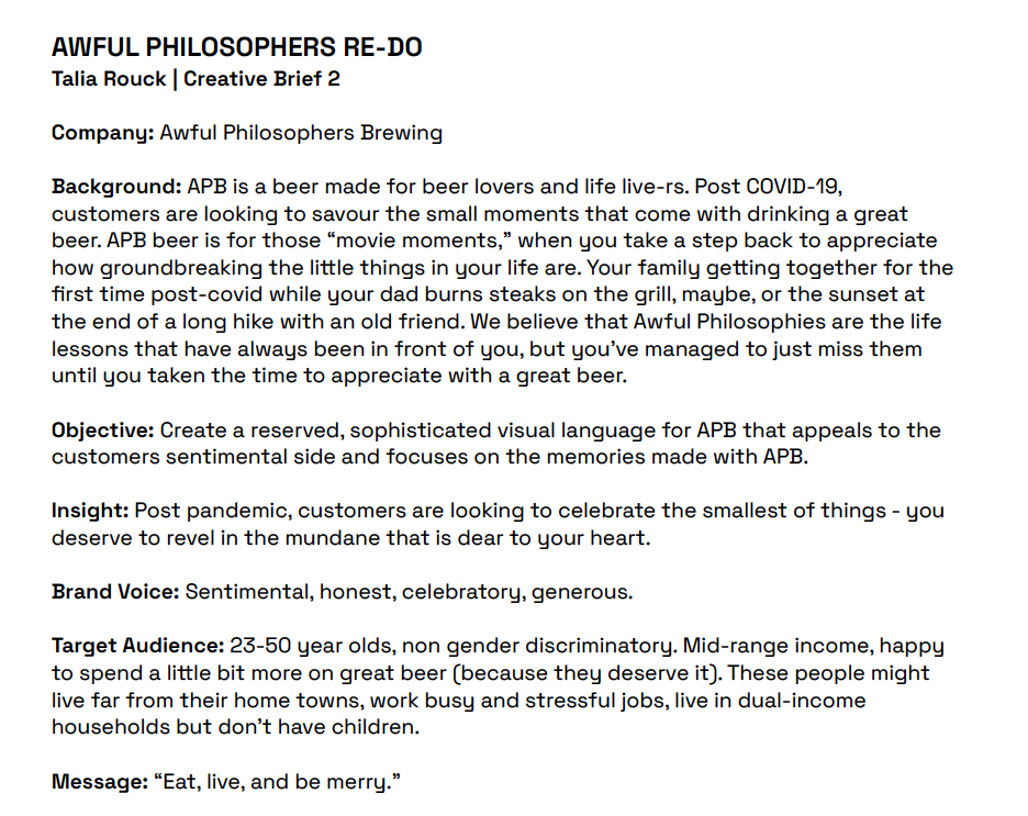
This phase took longer than expected! I found that although our initial ideation on our beer brand had potential, since I was using a brief that I created in the first half of second year I was stunted by my original perception/plans for the project. After (multiple rounds of) artboards and tone revision meetings with Patrick, we landed on a brand look/feel that accomplished our original goals and tone revisions, but did so in a much more empathetic and genuine way.

I learned so much in these last couple of weeks nailing down the brand. First, it’s hard to play in the space of “making fun of a group because it’s true and a safe place to play in,” within the beer category. The original brief played off of the snobbish closed-door culture of craft beer drinkers. Turns out, if you’re making fun of these people that makes you exactly the same as them. This is where I realized that although the potential for the idea was there, it resembled my 2nd year, less refined design style than one I wanted to convey now as an almost fourth year student. This stage of problem saving also made me realize what I wanted my voice to be as a designer.

Secondly, there was a lot of knowledge brought to the table about printing and realistic beer business practices. Everything from printing limitations on shrink-wrapped cans to 2-inch clearance areas on alcohol shelving, there’s always so much to learn in specific product categories, which was great and helped narrow down the decision-making process as we continued with the brand revisions.

The most challenging aspect certainly was the conceptual 180 I pulled at the last minute. The old brand just wasn’t sitting right, and I felt like the art direction I had originally brought to the table was stunting my ideation process instead of aiding it, not to mention that the project felt stuck in the style of 2nd year Talia. Although I was confident in the decision, the most challenging part was getting the confidence to present it in that manner. However, this was also the most rewarding, because in order to justify my changes I ended up doing tons of target market research, student peer reviews, and conceptual work to make the brand stronger. At the end of it all, I was able to present the change in a way that made it obvious that it was the correct choice.

Out of 10, I think I’d give myself a 9? Usually, I wouldn’t, but because I did so much work to justify my changes and be 100% sure I was following through with the right concepts, I’m able to say that I fully explored multiple avenues and pushed my ideas as far as possible with the time we had.

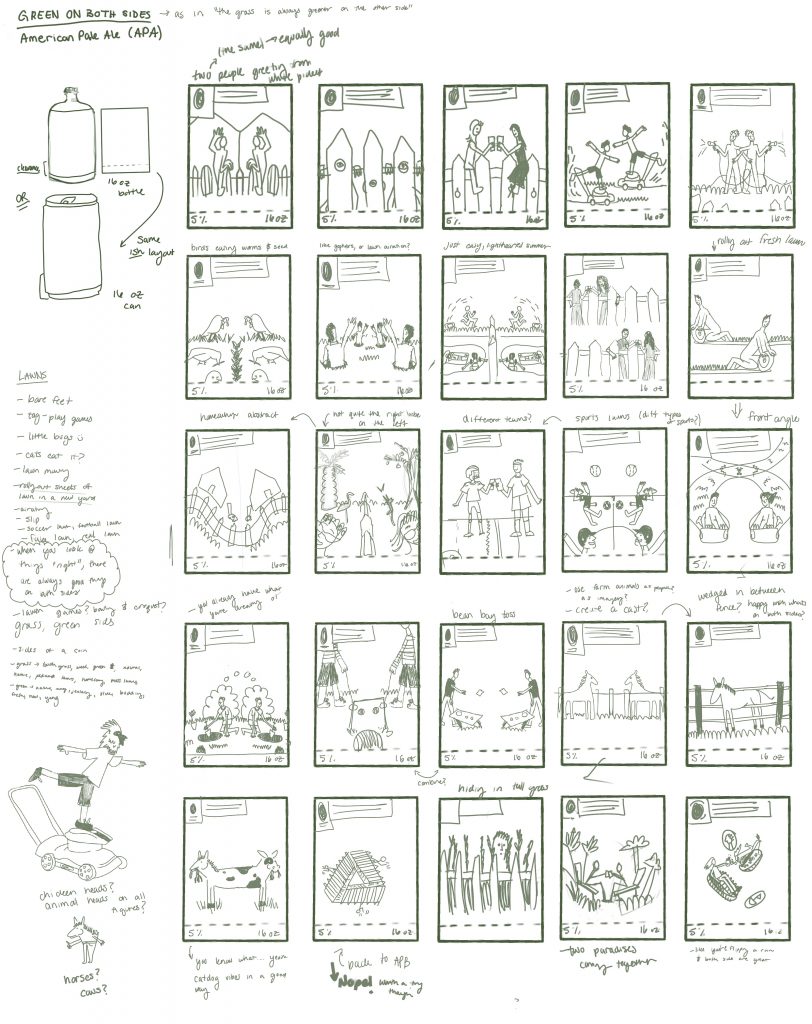
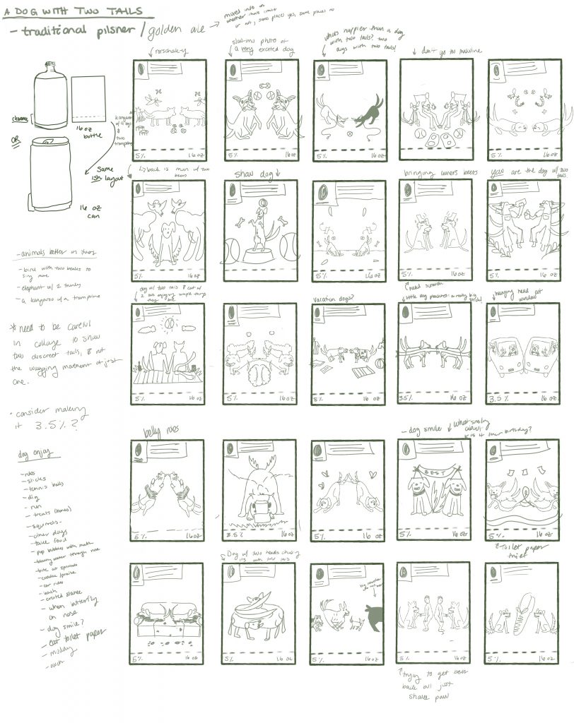
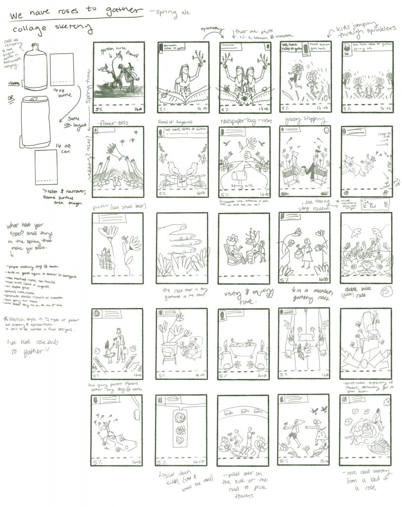
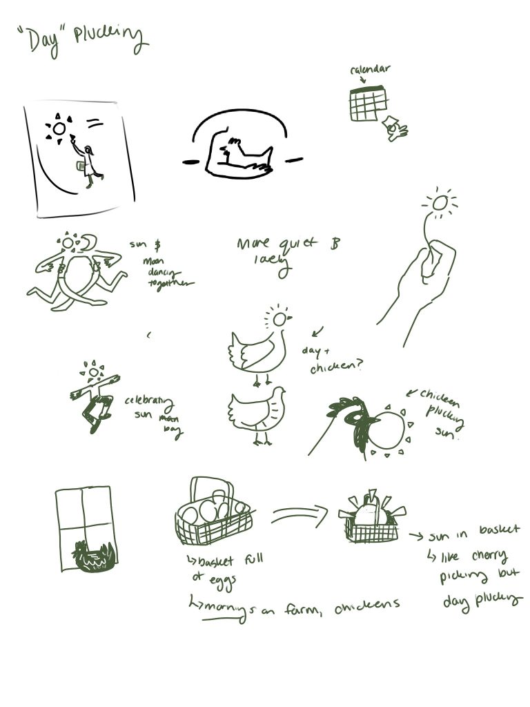
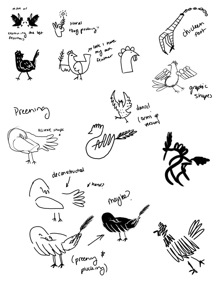
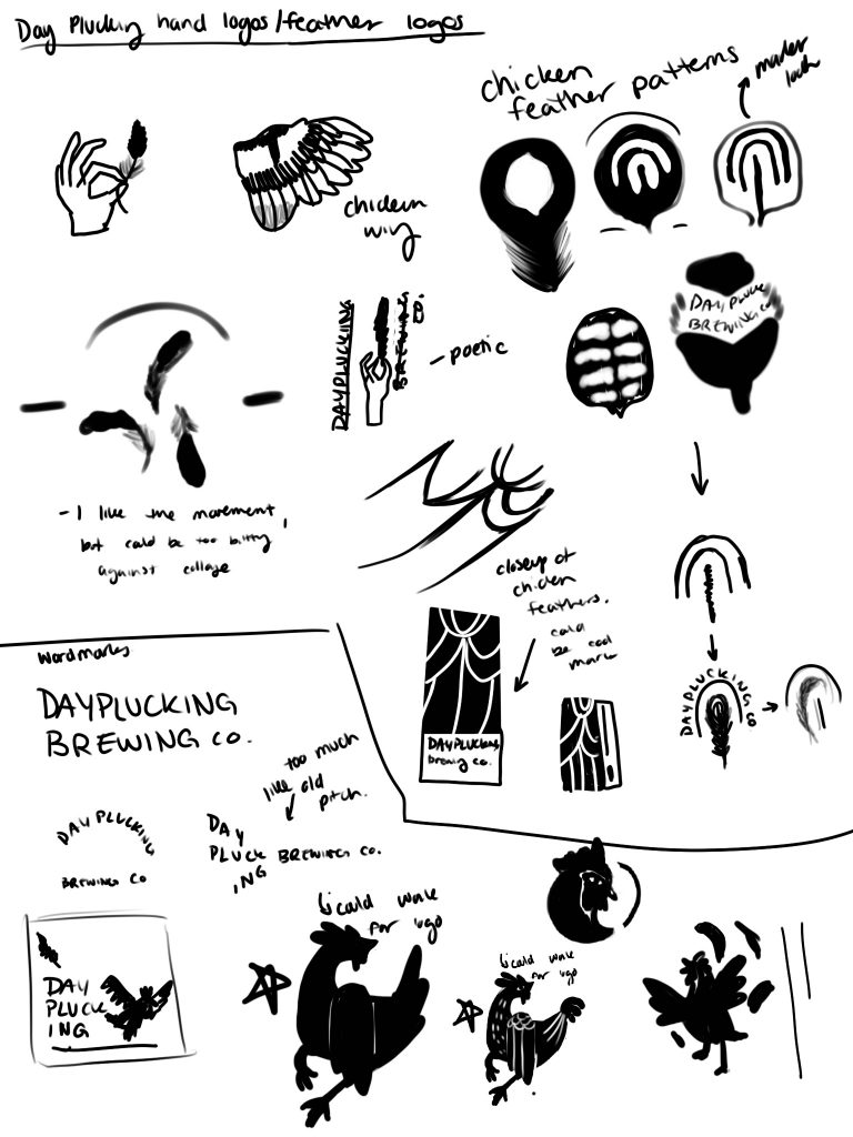
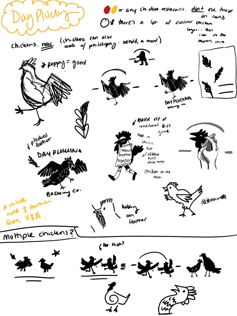
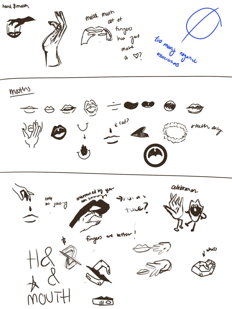
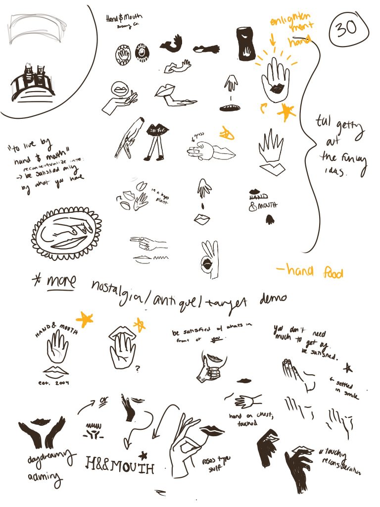
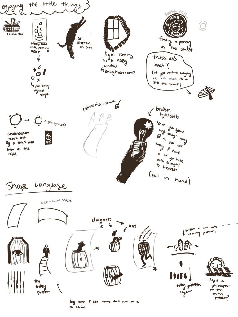
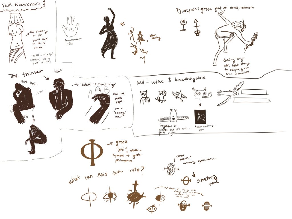
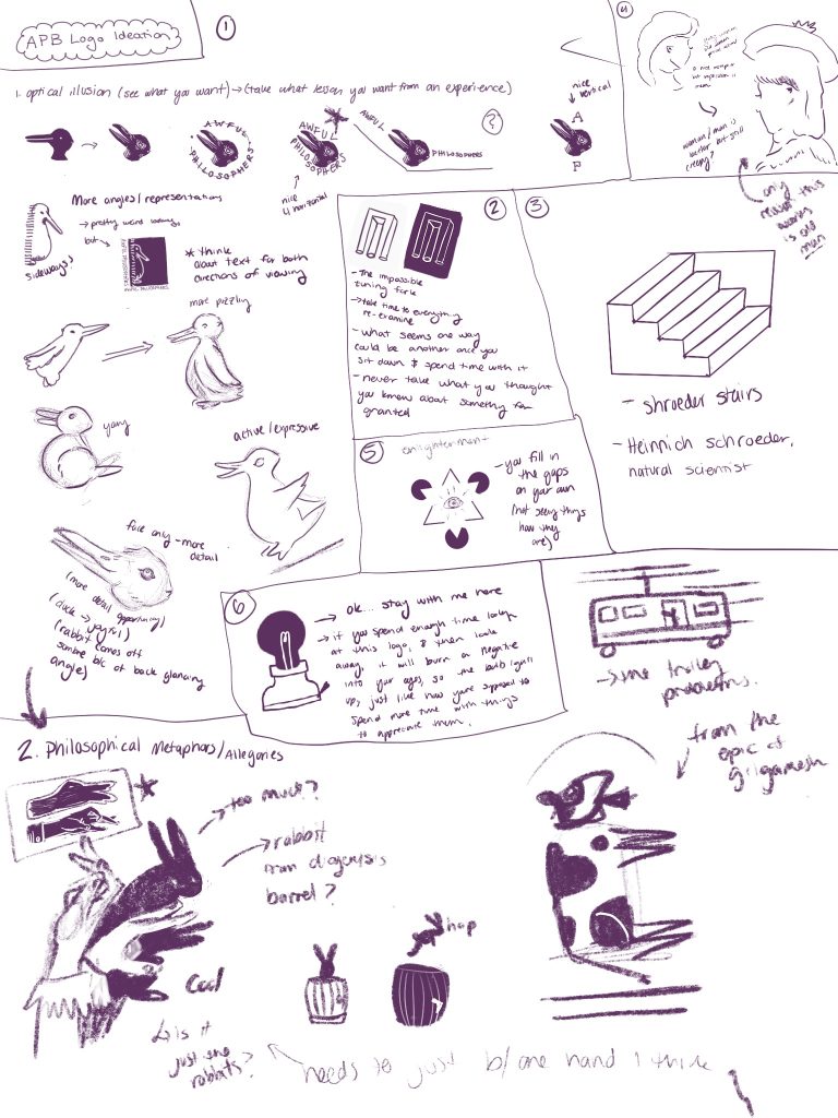
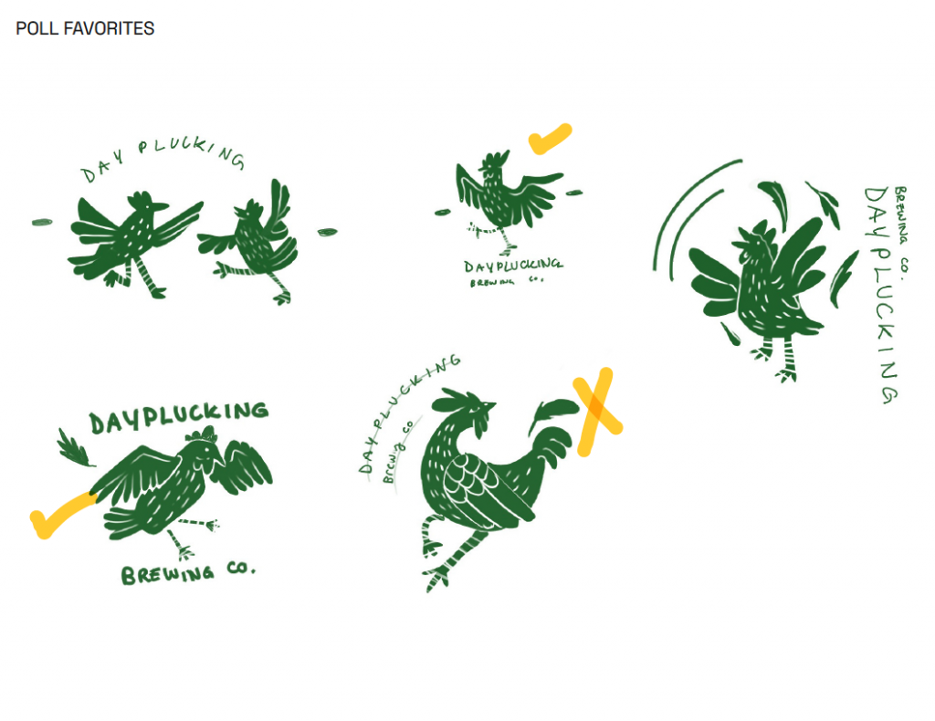
Sketches for composition and logo ideation including discarded brand directions:

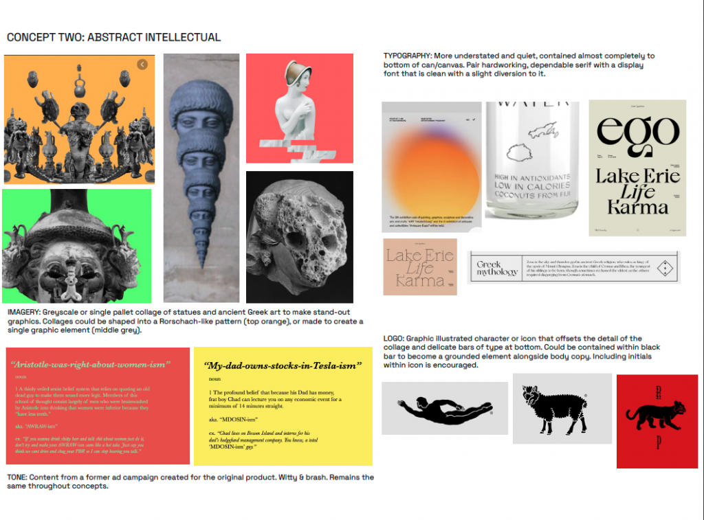
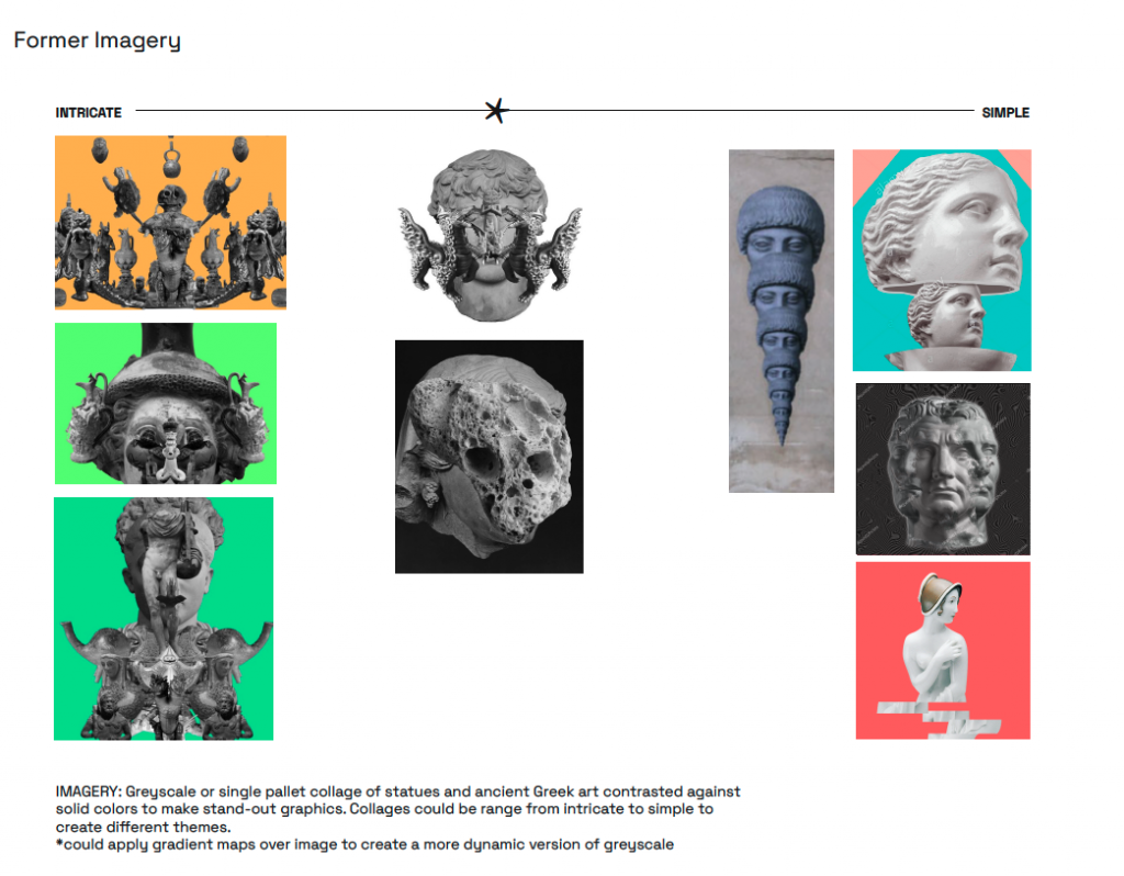
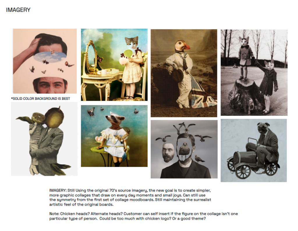
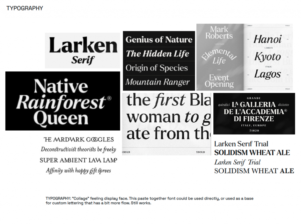
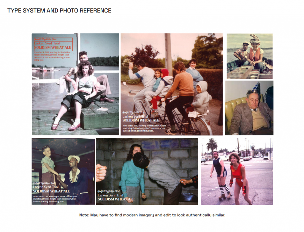
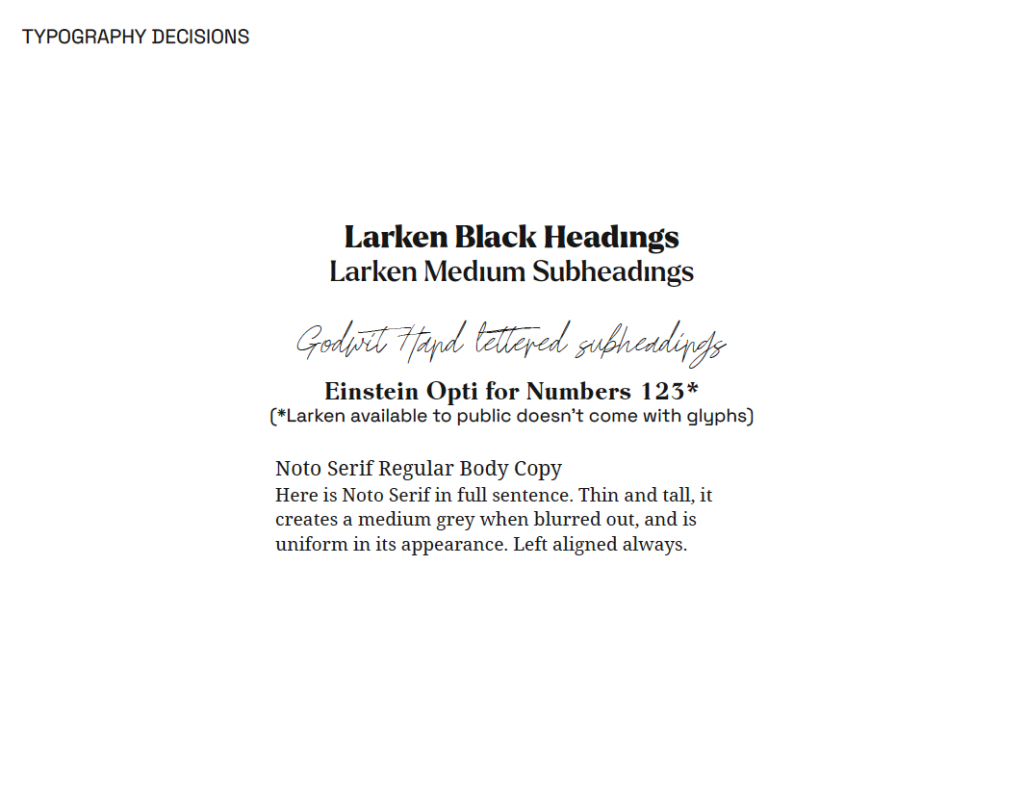
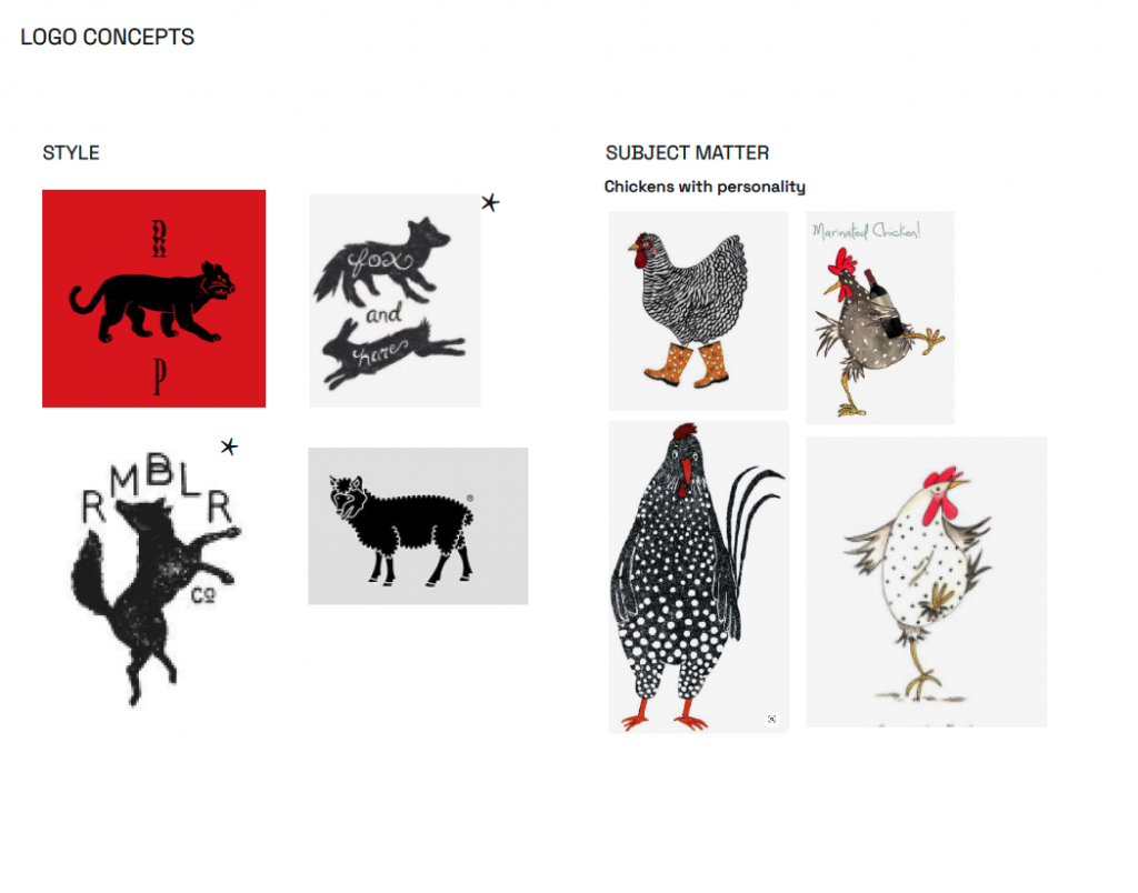
Final Moodboards (Previous brand iterations not included, but are available if you’d like to see them)

Mentorship Phase 1 Gather and Define

I really enjoyed phase one. I found that the most rewarding part was discovering what the most effective way to communicate with my mentors was and how we can fit each other into our work schedules while maintaining steady communication. Additionally, we decided to revisit an old project of mine, and watching the product get re-vamped and take an improved form in comparison to my original second-year execution is extremely fulfilling (I’ve come so far!).

I came out of the research phase with several insights into the beer industry and what to take into consideration while developing a new brand. Including, but not limited to;

  • More sessional, lower alcohol content beers are becoming more and more popular 
  • Craft beers have oversaturated the market. 
  • People are growing tired of “specialty” beers, as there is so much competition that either 
    • Everyone ends up doing the same thing
    • Everyone tries to out-do each other in a tiring way 
  • “People-centered beer” brands are going to shoot upwards
    • “In 2021, as we recover from the impact of COVID-19, integrate the lessons that the “big pivot” of 2020 taught us, and continue to grapple with polarization and civil unrest, I expect to see industry leaders continue to make groundbreaking strides in welcoming, empowering, and listening to the people that make beer possible.”
  • Whiskey is slowly replacing the craft beer in the alcohol lovers bar as a collection item 
  • With less access to liquor stores and restaurants this year, variety sample packs are growing more and more common 
    • “…breweries think inside the box, leveraging delivery to diversify their products by offering special holiday gift boxes, mixed packs, new subscription clubs, and more. In 2021, it won’t just be delivery itself that sets the trend. But rather what breweries can put inside the box will be the hallmark of the year.”
  • Restaurants are more likely to stock canned brands now, as draught beer access relies entirely on indoor, in-person seatings. With delivery and out door seating being a huge priority at the moment, cans and bottles are the most realistic option.
  • 12-pack boxes are getting more and more common:
    • “The pandemic brought about a widespread consumer shift to buying in bulk—in toilet paper and beer alike. Drinkers increasingly bought 12-packs of beer, returning to trusted lagers and IPAs. People don’t buy 12-packs of new beers for trial and experimentation, says Bandy of Indeed. “If people buy a 12-pack, it’s something they like at all times of day and occasions.””
  • Digital integration to brand storytelling is on the rise with COVID and entirely virtual interaction. Animated packaging, scannable cans, etc allow a new touchpoint with isolated customers
  • After quarantine, more non-alcoholic beverages are needed and wanted from customers.

Additionally, Emily and Claire are experts in the beer field, and were able to provide me with more intimate knowledge of the industry and it’s customers. I learned that although stereotypes can be fun to play up, you have to be exceedingly smart with the education so they don’t fall into what I call “Family Guy Territory,” where the brand unintentionally resonates with the group they’re trying to make fun of.

My biggest challenge was resisting my old brief. I found that because I’d had so much distance from the original project, I was resigned to the brand I had created a year ago and was complacent when it came to my original revisions of it. I was attached to something that, although it felt like a good idea to second year Tal, wasn’t as strong anymore and needed to be changed.

Although it seems pre-emptive to give myself on-base research and brief writing while it’s still subject to change (currently awaiting a tone change approval within an approved brief), I’d give myself a 9/10. I came back with some solid research, delved into the industry and its current trends, and after initial feedback, was prepared to completely re-create a brand I thought was settled.

Logo Concepts

For my final three blog posts, I wanted to choose a variety of executions that showed three different sides of myself. The first one (refer above) makes me feel capable, and decisive in my work. It’s bold and confident, but still unexpected with the serrated edge and the asterisk. Additionally, the tie-in to the name “Tal” makes me feel like I could enter a workplace feeling confident and professional with fresh ideas, but still have a friendly warmth.

As for the second, I wanted to play with the long-running joke of people mispronouncing my name while feeling fun and youthful. In the field, being young and fresh out of university can sometimes be a disadvantage, but this logo feels fresh and youthful in an abundantly lively way. This logo would make me feel like I brought something new and exciting to a team that needed a young face in the room.

Lastly, the bird logo is completely sentimental and a reflection of my personal accomplishments and interests. Drawn from my love of ornithology and my roots in fine art, this logo would make me feel like I could enter a tight-knit, “family” driven agency and have a meaningful conversation with a new connection if they asked about it.

Creating these logos gave me much more of a grasp on my personal brand. Looking back on my ad from our first week, I’m happy to say I’ve learned how to describe myself with only what’s necessary instead of throwing everything about me into one image.

Personal Ad Takeaways

This process, as always, reminded me that ideas are fluid and can change form as you build them out. Additionally, I learned a lot about where my skillsets restrict me with a shorter project, and how to reshape my ambitions to still communicate my goal with less time available.

This process was wonderful in terms of self-reflection and learning to distill myself. Before this project (and course in general) if you asked me to give you a quick pitch about myself I would’ve turned to someone else and asked them to do it for me, purely out of not knowing what things about me people saw as the most forthcoming. Creating “me” laid out in a poster really helped me to articulate what features of myself I feel are most prominent and do me the most justice.

My target audience for the personal ad was leaders of small, passionate agencies and freelance clients looking to do creatively fulfilling collaborations.

For my mood boards, I’d give myself an 8. I feel like I could have found more accurate material for where I’d like to work (but maybe the exact place in my mind doesn’t exist yet and I need to make it when I open an agency when I’m 40…who knows). My design execution/illustration page was a bit of a struggle in the design execution department. My brief centres around being completely unique and not predictable, which limited what I drew from considerably. I wanted to draw more abstract inspiration and come to my own conclusions in the space between those reference points.