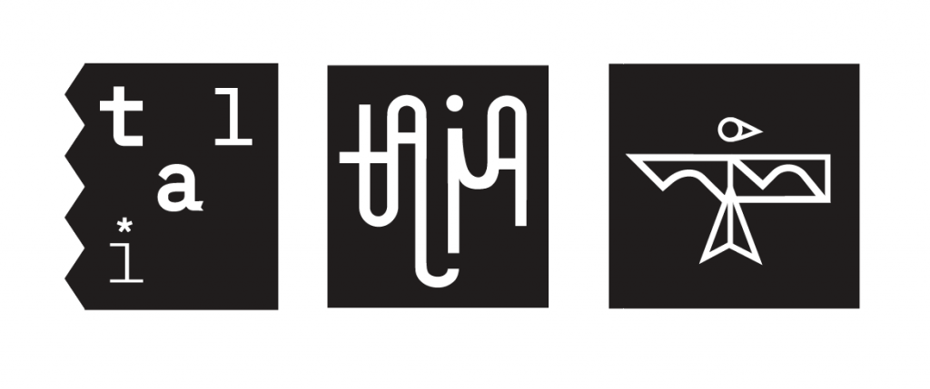
For my final three blog posts, I wanted to choose a variety of executions that showed three different sides of myself. The first one (refer above) makes me feel capable, and decisive in my work. It’s bold and confident, but still unexpected with the serrated edge and the asterisk. Additionally, the tie-in to the name “Tal” makes me feel like I could enter a workplace feeling confident and professional with fresh ideas, but still have a friendly warmth.
As for the second, I wanted to play with the long-running joke of people mispronouncing my name while feeling fun and youthful. In the field, being young and fresh out of university can sometimes be a disadvantage, but this logo feels fresh and youthful in an abundantly lively way. This logo would make me feel like I brought something new and exciting to a team that needed a young face in the room.
Lastly, the bird logo is completely sentimental and a reflection of my personal accomplishments and interests. Drawn from my love of ornithology and my roots in fine art, this logo would make me feel like I could enter a tight-knit, “family” driven agency and have a meaningful conversation with a new connection if they asked about it.
Creating these logos gave me much more of a grasp on my personal brand. Looking back on my ad from our first week, I’m happy to say I’ve learned how to describe myself with only what’s necessary instead of throwing everything about me into one image.