Henrik Drescher – Lecture 9

“In his artist statement, Drescher writes: “Since an early age I’ve been an image scavenger, my mind has always been alert to image debris, keeping ideas and images in books, which then spill into my painting and illustration. In my image making I try to register the idea of ‘everything at once,’ a sort of Sears & Roebuck mail-order catalog filled with an inventory of all that has ever existed in the course of organic history and human memory…scars, tattoos, cracks, memories, impressions, flashbacks, and forgotten instructions.”

~ hdrescher.com

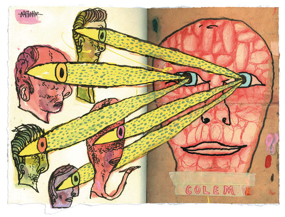
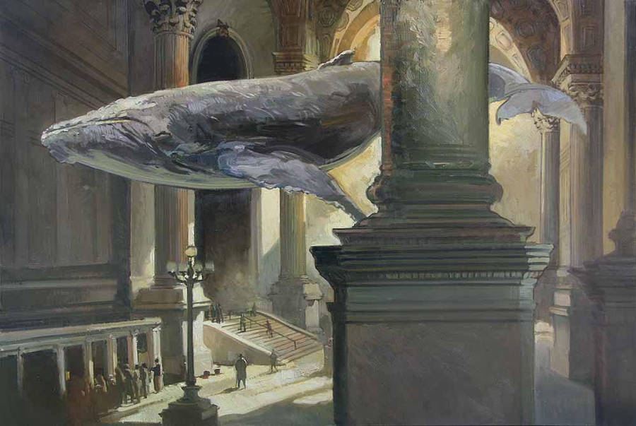
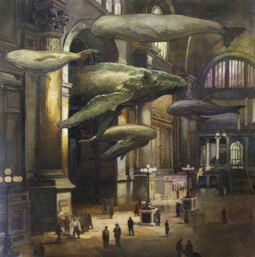
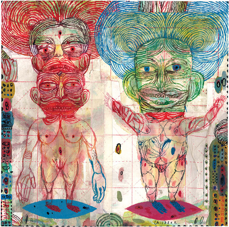
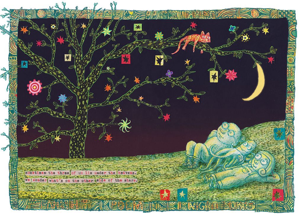
Self describing his works as “everything at once,” Dreschers work is loud loud and visually abrasive in the best way possible. He incorporates so much texture into his work that viewing it is almost a tangible experience. If it was possible to use a physical sensation to describe an artwork, Drescher’s peices would be itchy.Although an illustrator, he manages to blur the line between fine art and classic illustration, bringing personal metaphor into every work he creates.

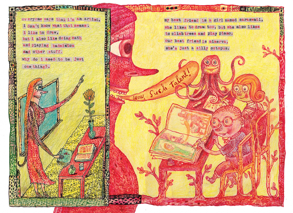
His children’s books are for the most part, more comfortable, although his titles are anything but. (See below, McFig and McFly, a Tale of Jealousy, Revenge, and Death). Through using a calm colour palette and a decisively more friendly line, he changes his jarring style into one that is more viscerally settling.

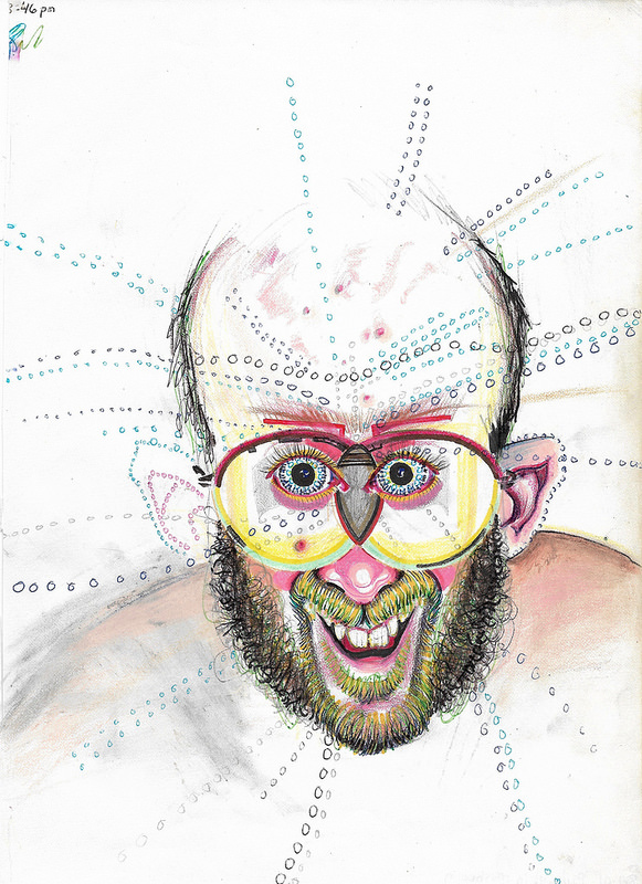
Otherwise, his work is similar to that of a mushroom trip. Don’t worry, I’m not basing this off of a personal experience but rather the work of Bryan Lewis Saunders, a fine artist who has become famous for creating a body of work that can certainly relate to Drescher’s aesthetic. Lewis has created upwards of 8500 self portraits under the influence of different drugs (I don’t know about you, but I didn’t even know there was more than 8000 drugs). The piece I’m specifically referring to, seen below, has that same itchy and tangible quality. Both Saunders and Drescher’s work has the same effect on me. I’m not sure if it’s the searing stares of Bryan’s self portraits, or the way I can practically feel the beard hair of Saunders 2-cap taking portrait that reminds me of Drescher’s unsettling, almost auditory line work.

The rest of Saunders work can be found here: http://bryanlewissaunders.org/drugs/

Although his pieces vary greatly, they bare a striking resemblance to Dresher’s illustrations, mostly in the way that they both induce that tangible physical response. Some of them are plain terrifying, and they’re certainly an anti-drug PSA if I’ve ever seen one, but they’re worth checking out.

Back to Drescher: his signature noisy style began in notebooks, taking form in rough sketches he created while travelling. Originally born in Copenhagen, Drescher immigrated to the United States when he was 12, and would attend the School of the Museum of Fine Arts in Boston on a full ride scholarship. In the years after his education, he took his career on the road and travelled throughout North and Central America and Europe. His sketchbooks are the root of all of his portfolio work, he claims, filled with ideas, images, and icons from his travels. He still creates extensive sketchbooks today, and claims that the majority of his ideas come from them. Drescher takes inspiration from these for client work and for his personal fine art career.

“Winter,” from Drescher’s ambiguously titled “Geriatric Kamasutra”

Publishing his first book in 1982, he would go on to create more than 50 books in his career. The titles range from children’s books, fine art collections, notebooks, kamasutra’s, and others. Drescher is currently working as a freelance illustrator for major publications in North America. Nowadays, he credits the work of Chinese landscape painters as the main inspiration for is work, a result of 10 years living there. He has been recognized by the United States Library of Congress, showing his work in an entirely solo exhibition.

Overall, Drescher brings a completely fresh perspective to what it means to be an illustrator. His work stands out from his contemporaries in a way that in my mind is rivalled only by 8000+ drugs. His work defies category, but still resonates with the viewer. Although they do admittedly make me physically uncomfortable–if I haven’t mentioned that enough in this post–they bring comfort in other arenas. His pieces harbour and indescribable sense of nostalgia and familiarity. Maybe it’s the fact that his illustrations have so much going on that doesn’t make sense that make everything else in the world of similar diagnosis feel better. Or maybe I’m reading into it way too much, but the more work of his I discover the more I appreciate its business and jumble of textures.

http://www.hdrescher.com/illustration/

Francis Livingston

The word “extraordinary” didn’t mean much to me until I discovered the world of illustration. Unlike photos, or even abstract fine art, illustration was able to take the mundane and make it just that, more. More than ordinary, but in a way that was believable and somehow more than real.

I’ve often found that while searching through the lists of illustrators for these blogs that there is one who stands out among the rest. While perusing this particular collection of names, however, there was nobody that jumped out to me. There was Braldt Bralds who has one of the most interesting names of all time and happens to paint only cats, which was interesting enough, but then I stumbled upon Francis Livingston.

Livingston’s work didn’t immediately catch my eye. The first images that come up after searching his name are city landscapes and beautifully lit buildings. Sure, they’re well done, and somebody else could easily write five hundred words talking about his quality of light and faithful devotion to intricate colour studies. But I wasn’t about to spend my time on just buildings when there were so many more attention grabbing artists out there.

But then I found this picture.

“Light Stream, 2012-2019”

I was in awe, and immediately enthralled with the work of this man that I knew quite literally nothing about. He could be a murderer, for all I knew, but I didn’t care. This was one of my most favourite pieces I’ve ever seen, and it will be for a long time. Something about the quiet grandeur of the scene, the humbleness of the paint strokes and the nonchalant nature of the whale that peacefully swims above the unassuming crowd. This illustration makes me want to be there, to live in the world that Livingston has so deftly crafted.

And yes, obviously his quality of light and immaculate handling of colour and brushstroke quality is incredible. We can’t really talk about his work without recognizing his ability as the rest of the artistic world has. His biography on medicinemangallery.com touches the edges of his reputation, stating:

“Born in Cortez, Colorado, Francis Livingston is in the top ranks of American illustrators, and his work has been widely published. Francis Livingston’s paintings have been exhibited in San Francisco, Los Angeles, and New York. Livingston was awarded both Gold and Silver Medals from the New York Society of Illustrators, San Francisco Society of Illustrators, and Society of Illustrators of Los Angeles.”

~ medicinemangallery.com

Livingston credits his inspiration to the likes of Sargent and Whistler, and studied Diebenkorn alongside the more modern Wayne Thiebaud. Looking at his more traditional illustrative works, this makes perfect sense. We can see that his landscapes strike a jarring resemblance to Whistler (as shown below), but add a twist of the “Bay Area flare” that Livingston was surrounded by during his formative years as an artist.

Winter Landscape by Livingston
“Crepuscule in Flesh Color and Green: Valparaiso” James Abbot McNeill Whistler, 1886.

After a 10 year teaching career in San Francisco at the Academy of Art College, Livingston and his family relocated to Idaho. Much like James Elliot Bama Livingston completely switched genres and client bases. His earlier career had consisted of painting the San Francisco Board Walk for years, but now focuses on the stretching plains of the mid-west (see “Winter Landscape,” above).

However, his newest work consists of ones similar to the original “Light Stream” that caught my eye. Livingston continues to combine natural elements with 20th century architecture and mundane scenes to create striking, jealousy-inducing images. He creates a whole other universe within his paintings, which now tend to fall under the category of fine art instead of illustrations. Livingston brings to life the classic “Night at the Museum” concept in a lively, mature, more believable way. Additionally, he does so with the intent of making it seem situationally realistic. It’s this factor that makes these works of Livingston’s resonate so intensely with me. It appears as if you’ve just hung around Penn Station too long and you’ve just caught a glimpse of some of the largest creatures on earth commuting home from work.

That being said, I think this quality will give Livingston’s work lasting importance. Perhaps not in the eye of critics, or even in the world of professional illustration. These are the type of images that children see that make them want to become illustrators–much like the drawings that I credit my ambition to–that leave lasting impressions and stay in their mind forever. Dreamlike images (in my experience) tend to be far more impressionable than landscapes or portraits, no matter how great the lighting or colour palette is. I guess what I’m trying to say, in my oh-so-round-about way, is that Livingston’s works deserve value and permanence because of how inspirational and extraordinary they are. They made me feel like I did when I first discovered art and illustration, sitting on the carpeted floor of my childhood bedroom, putting together puzzles of a golden fairy queen, realizing that I wanted to create things like that. Personally, it’s works like these that deserve recognition and lasting praise over landscapes and immaculately done portraits.


https://www.deviantart.com/francis-livingston/gallery/ https://www.medicinemangallery.com/francis-livingston-biography/ https://www.tate.org.uk/art/artworks/whistler-crepuscule-in-flesh-colour-and-green-valparaiso-n05065

Steff Geissbuhler

Geissbuhler is hailed as one of the most important designers in the field of integrated brand and corporate identity. His portfolio owns almost every form of media; from posters and illustrations to architectural graphics. He is the founder of Geissbuhler design, his self titled independent design company.

Born in Zofingen, Switzerland, Geissbuhler entered the world of design through Geigy Pharmaceuticals designing promotional material for them. This encompassed advertising, packaging, and other medias. Prior to this, however, Geissbuhler studied at the Basel School of Art and Design to get his diploma in graphic design, where he studied with Arman Hoffman and Emily Ruder.

After Geigy, he went on to teach at the Philadelphia University of arts and packed up his whole family to move in 1967. He would later go on to become the chairman of the Graphic Design Department. He would move to New York in 1973 and continue his career while raising a family there.

Geissbuhlers body of work is perhaps one of the largest to be seamlessly integrated into every day society. His work is everywhere, and it carries an undeniable presence along with it. His perfected style speaks volumes, whether it’s in the form of the iconic NBC peacock, or in the Alvin Ailey logo that is entirely made up of dancers bodies. Geissbuhlers creations are responsible for a massive chunk of corporate culture, identity, and what it means to be successful within a brand.


Although he didn’t do the stereotypical Paula Scher-esque super-graphics, he did do these amazing pieces of large scale environmental graphic design. Although Geissbuhler’s designs were considerably less abstract and more logo centric, they still stand out as iconic pieces of design that have been integrated into the environment.

Take this installation titled “Freedom Movement” Geissbuhler did for Radio Free Europe in Prague. From one angle it reads “LIBERTY” in English, and “SVOBODA,” also meaning “liberty” in Czech, the same word from the other angle. I can’t help but be reminded of Scher’s painted on super-graphics, especially in the way that if you were to look at this from virtually any other angle it would appear to only be a miss-matched heap of metal with nicely cut edges.

While perusing his website, there was a long long list of experience, past employments, founded companies, and achievements. At the very bottom of seemingly endless blocks of all capitalized text was a single bolded phrase.  

MY FAMILY IS MY GREATEST ACHIEVEMENT.

I’m not sure why I feel the need to include that, but when you’re reading lines and lines of capitalized Helvetica Light, it’s nice to know that the people behind such influential professional portfolios don’t entirely live by their work.

“I’M HAPPILY MARRIED TO MY WIFE AND PARTNER, ELISSA, AND HAVE FOUR TERRIFIC AND TALENTED SONS, PHILLIP, A PHYSICIST, LIVING NEAR BOSTON; LUKE, A CINEMATOGRAPHER, LIVING IN BROOKLYN, NY; ALEX, AN ACTOR AND MASTER TRAINER, LIVING IN HARTSDALE, NY; AND BEN GRADUATED WITH A DEGREE IN SCULPTURE AND LIVES IN SEATTLE.
MY FAMILY IS MY GREATEST ACHIEVEMENT.”

~STEFF GEISSBUHLER