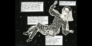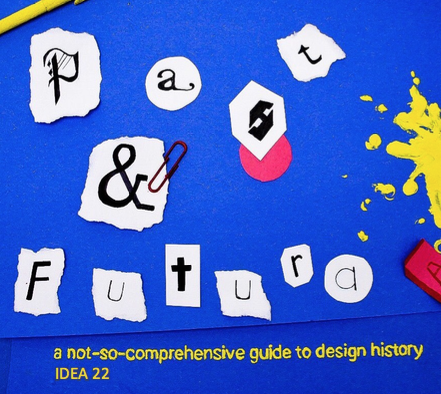
For the final assignment, I was paired with Janelle. We chose to do separate designs that would still have the potential to work together given the chance. Janelle chose to do a fully illustrated backside, and I chose to do a sort of in-progress shot for the front side, using tactical materials that we are all so familiar with during our first semester. I chose to do this design for a multitude of reasons; I wanted to represent the class and our first semester here at IDEA, which has been full of traditional mediums and a multitude of paint splatters and construction paper scraps. I also wanted to honour the class’s humour, as we all have taken on a similar outlook as we’ve grown together through the months (yes, puns have become a common factor within the group, whether we like it or not).
I wanted to depict a project mid-progress, including how messy and hap-hazard it was. I found myself searching for design solutions in this project in this exact way, and thought it would be nothing but appropriate to embody my ideas thus far. I chose the primary colour scheme to keep the eye pleased and at ease, while keeping each object emphasized and separate while all still remaining cohesive. The title is of course a reference to the communications history course, and the heavy focus on fonts and type.
Overall, although unplanned, I think mine and Janelles sides work nicely together. It’s as if the front cover is the class starting the project, and Janelles illustration on the back is the finished product. If I could change anything, I would suggest the two sides be more similar in their colour palettes. Janelle and I mostly depended on one another for critique and ideation, something that we both expressed that we struggled with. I was glad to work with her regardless of the more independent approach we used. The front and back covers we designed could be selected on their own and be a nice compliment to any other student’s work they could be paired with.
Overall, I would grade myself as an 8/10. I like my concept, but again it could have been more integrated with Janelles. However, the image did turn out exactly how I envisioned, and I am very happy with the concept and work that I put into it. Breaking out into a non-illustrative design pushed my comfort zone a little, and I am proud of myself for that.
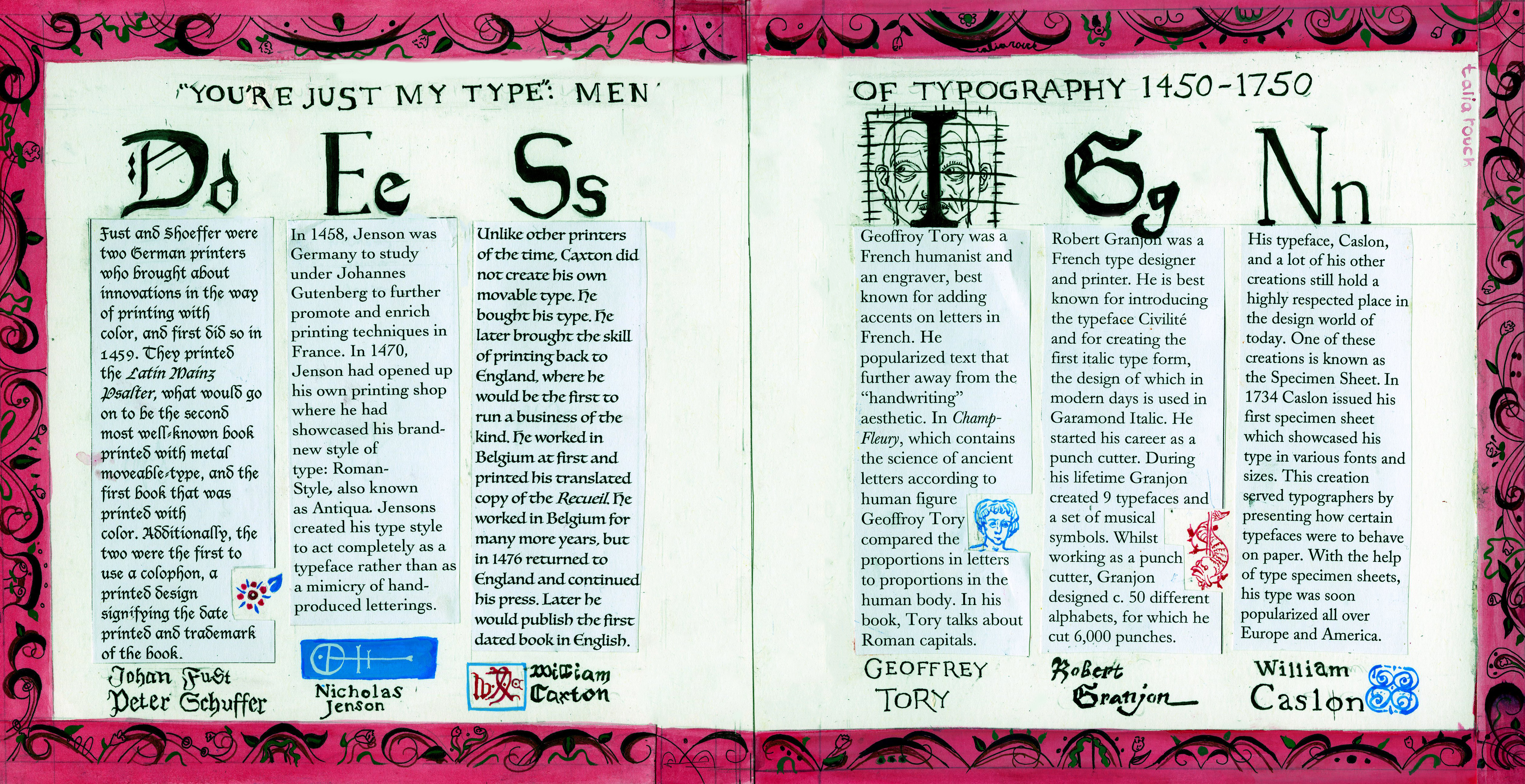 For my spread I chose to focus on the style of decoration and type-dependent designs of the time, specifically those closer to the 18th century. The examples used in my blog post, Text me! are the primary inspirations for the illustrative styles. Each paragraph is done in the typographers most used or personal typeset to provide a viewer with the progression of text as the years passed. Nicholas Jenson done in the type face Jenson, and Fust and Shuffer’s paragraph is written in Frakture, the most commonly used font within their works.The text is displayed in a horizontal manner, each paragraph under a letter of DESIGN, since our topic assigned for this week was “Design and Type”. Each letter is customized to the typographer as well, giving the viewer a large-scale view of what their typeface looked like to really emphasize the difference between the two. This allows for the minute differences between them to be discerned easier. I included spot illustrations to provide information about the author without including more text than necessary. For Fust and Shoeffer, I included a small flower from the cover of The Latin Mainz Psalter, their first “Debut” into the printing world. Nicholas Jenson’s paragraph features his colophon below his set of text. William Caxton’s illustration is also his version of a colophon, a very ellaborate signature of “WXC”. Geoffrey Tory’s paragraph includes a close up of a common figure used in the Champ Fleury, done in his signature line work interpretation of the human figure. Granjon’s includes another colophon of his, and Caslon’s includes a small design featured at the bottom of his type specimen sheet. I chose to title it as “You’re just my type’: Men of typography 1450-1750” to keep such an academic and fact driven topic fun and lighthearted.