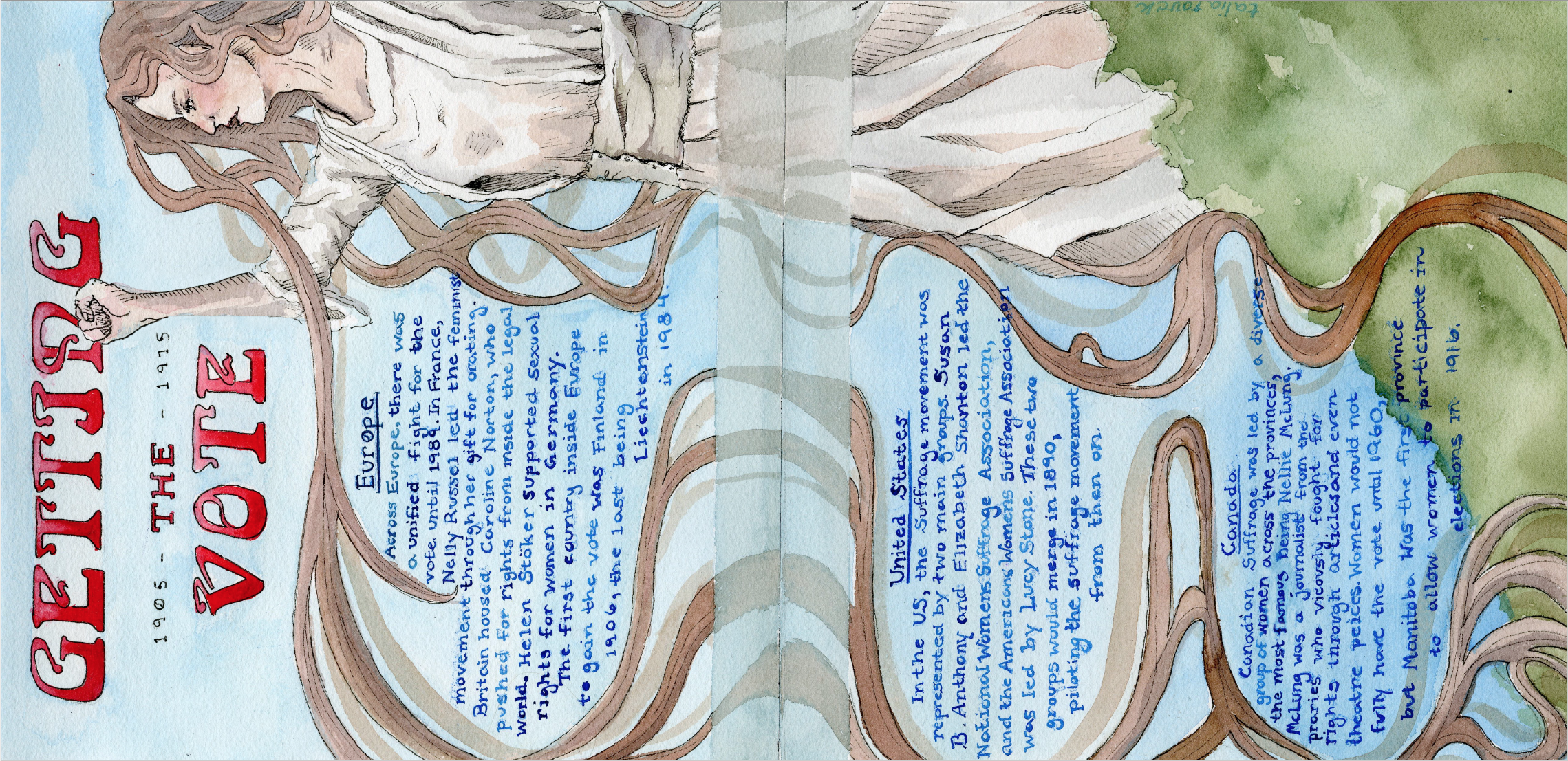
For this spread, we focused on women’s suffrage in the years 1905-1915. I wanted to contrast the typical feminine depiction of the Art Nouveau style of the time with the brazen determination of the Suffragettes. I had a couple of struggles with this layout–I forced myself to redo it three times. I knew that i wanted to depict a strong woman, but I kept running into barriers of how to illustrate it in a way that would do the cause justice, especially with the factor of the airy art nouveau colour scheme and whiplash curves. Finally I settled on the design attached here with some brainstorming help from classmates. I chose to have the suffragette large and featured across both pages, and vertically to make the figure stand out even more in her size. The blue background and text is symbolic of art nouveau as well as to introduce an aspect of stereotypical masculinity that the suffragettes were fighting against. I wanted this aspect to contrast with the idea of feminism and the character on the ride hand side. For my title, I used Arnold Boecklin Std Regular, a font that was typically used in decorative art nouveau posters. I would give myself an 8/10, simply because the text could have been done better, especially the area in the last paragraph where it bleeds onto the green of the bush.