Herb Lubalin studied at the Cooper Union of New York and continued on to build a reputation of being one of the most influential designers of the late 20th Century. During his career he would take on the role of art director, in house designer, and would open his own company: Herb Lubalin Inc.
Lubalin’s reputation is very expansive. He boasts a large portfolio of logo designs, corporate branding, and others, but is primarily known for his innovative and groundbreaking word marks. Before this section of his career, he worked for the likes of Eros, Upper and Lowercase, and Avante Garde as an art director creating provocative and eye-catching cover works.
Overall, Lubalin’s career revolutionized the use of type. Instead of being a part of the image, he made type become the image. As seen with his inventive word marks, the type is the only thing that’s needed to tell the story, and he does so without using any illustration or additional visual material.
Geissbuhler is hailed as one of the most important designers in the field of integrated brand and corporate identity. His portfolio owns almost every form of media; from posters and illustrations to architectural graphics. He is the founder of Geissbuhler design, his self titled independent design company.
Born in Zofingen, Switzerland, Geissbuhler entered the world of design through Geigy Pharmaceuticals designing promotional material for them. This encompassed advertising, packaging, and other medias. Prior to this, however, Geissbuhler studied at the Basel School of Art and Design to get his diploma in graphic design, where he studied with Arman Hoffman and Emily Ruder.
After Geigy, he went on to teach at the Philadelphia University of arts and packed up his whole family to move in 1967. He would later go on to become the chairman of the Graphic Design Department. He would move to New York in 1973 and continue his career while raising a family there.
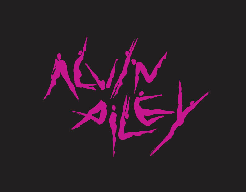
Geissbuhlers body of work is perhaps one of the largest to be seamlessly integrated into every day society. His work is everywhere, and it carries an undeniable presence along with it. His perfected style speaks volumes, whether it’s in the form of the iconic NBC peacock, or in the Alvin Ailey logo that is entirely made up of dancers bodies. Geissbuhlers creations are responsible for a massive chunk of corporate culture, identity, and what it means to be successful within a brand.
Although he didn’t do the stereotypical Paula Scher-esque super-graphics, he did do these amazing pieces of large scale environmental graphic design. Although Geissbuhler’s designs were considerably less abstract and more logo centric, they still stand out as iconic pieces of design that have been integrated into the environment.
Take this installation titled “Freedom Movement” Geissbuhler did for Radio Free Europe in Prague. From one angle it reads “LIBERTY” in English, and “SVOBODA,” also meaning “liberty” in Czech, the same word from the other angle. I can’t help but be reminded of Scher’s painted on super-graphics, especially in the way that if you were to look at this from virtually any other angle it would appear to only be a miss-matched heap of metal with nicely cut edges.
While perusing his website, there was a long long list of experience, past employments, founded companies, and achievements. At the very bottom of seemingly endless blocks of all capitalized text was a single bolded phrase.
MY FAMILY IS MY GREATEST ACHIEVEMENT.
I’m not sure why I feel the need to include that, but when you’re reading lines and lines of capitalized Helvetica Light, it’s nice to know that the people behind such influential professional portfolios don’t entirely live by their work.
“I’M HAPPILY MARRIED TO MY WIFE AND PARTNER, ELISSA, AND HAVE FOUR TERRIFIC AND TALENTED SONS, PHILLIP, A PHYSICIST, LIVING NEAR BOSTON; LUKE, A CINEMATOGRAPHER, LIVING IN BROOKLYN, NY; ALEX, AN ACTOR AND MASTER TRAINER, LIVING IN HARTSDALE, NY; AND BEN GRADUATED WITH A DEGREE IN SCULPTURE AND LIVES IN SEATTLE. MY FAMILY IS MY GREATEST ACHIEVEMENT.”
“A modern renaissance man — one of a rare breed of intellectual designer-illustrators, who brings a depth of understanding and conceptual thinking, combined with a diverse richness of visual language, to his highly inventive and individualistic work.”
~(miltonglaser.com)
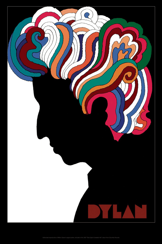
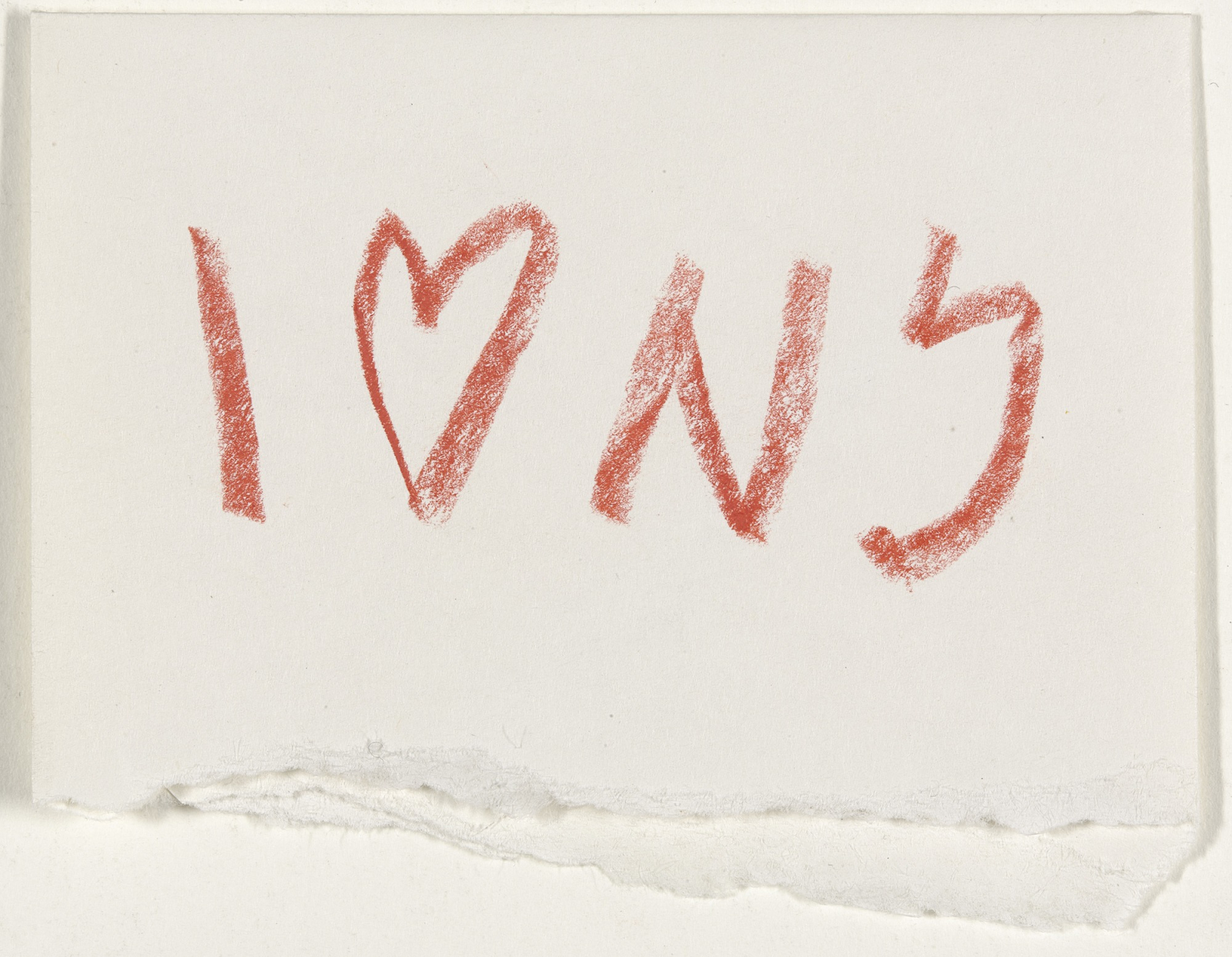
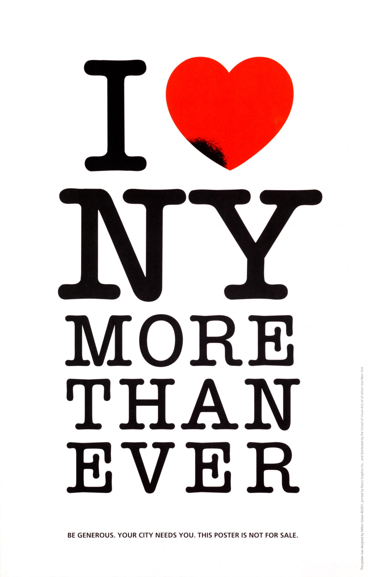
When you think of iconic mid-century design, you think of Milton Glaser. Responsible for some of the most iconic images of North American advertising, Glaser continues to create even today into his late 80’s. He’s the man behind the “I <3 NY” logo, the Bob Dylan poster, and more recently, Trumps famed “Space Force.”
He began to build a name for himself with the co-founding of Pushpin Studios (1954) in collaboration with Seymour Chwast, and would continue the reputation he built for himself by once again cofounding the New York Magazine in 1968. In 1977 he would design the most commonly used logo of all time, the famous I Love NY. Originally Glaser had been bored of the project, not finding a singluar design that did the idea justice, and came to a point where he decided to do the work pro-bono. Thats right, Glaser did not receive a cent for what is now one of the most easily recognizable images in the world. He ended up scrawling down something in the back of a taxi cab and calling it a day.
Originally used to boost citizen morale and the general conception of what was a ratty and crime-stricken New York, Milton created the logo. In efforts to push the image into the public eye, the city decided to withhold copyright claims for a number of years. When they finally did, the crackdown on public use was so intense that even Milton got sent a cease-and-assist letter for using his own design.
Glaser boasts a prolific portfolio consisting of almost 400 works, including “posters for Lincoln Centre, Carnegie Hall, Juilliard, the Holocaust Museum… Cooper Union, the Philadelphia Zoo, the 1984 Olympic Games, the Van Gogh Estate… the Metropolitan Opera, Bob Dylan, and others.” (hyperallergic.com)
A short overview of his accomplishments includes, but is not limited to:
Designing over 50 magazines,
Remodeled Washington Post, La Vanguardia, O Globo
Created over 400 promotional pieces in his career
Graphic and Architectural Design
2004 Lifetime Achievement Award
2009 National Medal of Arts
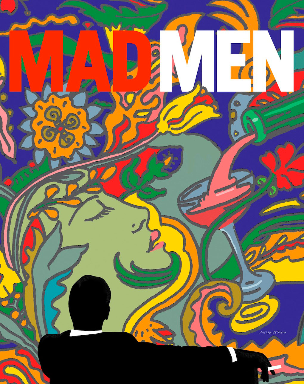
In the way of the psychedelic 60’s, Glaser contributed many influential pieces to the world of music. His work for Bob Dylan remains one of his most iconic works, but also proudly owns works for Aretha Franklin, and others. The work is trademarked by his signature limited colour palette, flat, islamic inspired geometry, and countless historical/artistic references that show through each piece. In a modern sense, Glaser showed his expertise in the realm of 60’s design when he created the graphics for the final season of Mad Men, debuting in 2015.
Although one would typically end a post like this with the classic “In summary…” it’s hard to put the works of Milton Glaser in to a few simple sentences. Only a small part of his career has been covered in this post, and there are years and years worth of revolutionary design that comes with the name “Milton” attached to it. He is often regarded as one of the most influential designers to date, and for good reason. He is equal to the likes of Saul Bass, Paul Rand, Peter Saville, and others, and will always be regarded as a pioneer of modern design, as well as what it means to be a working creator.
“Pintori is considered the source of all the initiatives contributing to the Olivetti image: design coordination, graphics, typography, advertising image, sales-outlet design, and furnishing,”
(H. Waibl)
Giovanni Pintori is an Italian born designer and fine artist, most well known for his advertising work with Olivetti typewriters. He was born in Sardinia in 1912 to a dairy farmer. However, after pursuing art during his early education he was able to obtain a scholarship to the ISIA in Monza. Here Pintori studied under influential designers Marcello Nizzoli and Edoardo Persico.
It was post-graduation that brought Pintori to Olivetti, and after just three years with the company he was promoted to head of the Development and Advertising department. He designed countless ads that were suited to billboards, papers, advertisements in magazines, each one gaining Olivetti an impressive international reputation for the innovative and exciting ads. During the 1950’s alone he would be recognized for his work with solo exhibitions, awards, and honorary diplomas. as listed by storymarks.it;
“In 1950 he won his first of a series of awards: the Palma d’Oro of Italian Federation of Advertising.. In 1952, the MoMA in New York organized the exhibition Olivetti: Design in Industry, in which his work is widely represented. In 1953 he joined the ACI (Alliance Graphique International). In 1955, with an exhibition at the Louvre, a room dedicated to his work for Olivetti. Also in 1955 received the Certificate of Excellence of Graphic Arts of AIG (the Association of American graphic designer) and the following year, the Gold Medal and Diploma in First Line Award Graphics and Fiera Milano. In 1957 he was awarded the diploma of the XI Triennale Grand Prize in the same year he exhibited in London with the AGI.”
Pintori was best known for his use of color, geometry, and unexpected combinations of designs. His imagination and creativity set him apart from his contemporaries in huge way, as he truly was revolutionizing the idea of corporate identity.
Pintori was able to create an exciting, dynamic brand identity for something that was perfectly suited to graphic design; type. More specifically typewriters, but his work was best known for his innovative use of type and integration into the image. Personally, I’ve heard and seen examples of the phrase “Type should work with the design, not just stand on top of it,” and no body of work better exemplifies this for me than Pintori’s. He worked with a bland object and made it exciting, desirable, and modern, and his designs fit all of the same attributes.
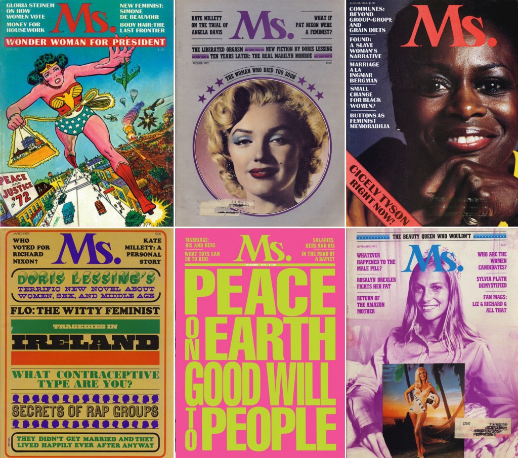
Bea Feitler was a Brazilian-born art director and designer who is most recognized for her revolutionary photographic concepts that appeared on the likes of Ms, Harpers Bazaar, Vanity Fair, and Rolling Stone Magazine. Her work can be summarized as professional, fun and youthful while still maintaining the essence of class and sophistication. Her work primarily featured female subjects, and being one of the few female art directors of the time, Bea was able to capture her models in a profound yet honest fashion.
“Bea Feitler only lived 44 years, but filled them with energy, enthusiasm and a passion for life and design. Hundreds of people attended her memorial service, and as a living tribute her friends and family established the Bea Feitler Foundation, which funds a full one-year scholarship for a junior graphic-design student at the School of Visual Arts. She believed a graphic designer’s work matters because the culture is expanded and enriched by those who shape and form information. She is missed for the vision, passion, and vitality she brought to each day’s life and work and remembered for her profound contribution.”
~ American Institute of Graphic Arts, 1990
Like many of her contemporaries, Feitler’s childhood was shaped by the after-effects of World War Two. Her Jewish parents fled Nazi Germany to Rio de Janeiro, where Feitler would be born in 1938. The War ended and the family moved to New York, where Feitler was introduced to the design that was embedded into the east-coast culture. She was enthralled by illustration, the ballet, fine art and fashion, hobbies which naturally led her into the world of design. She studied design at the Parsons School of Design, and would land her first major job creating album covers for Atlantic Records.
At only 25, Fielter was appointed as an art director for the famous Harpers Bazaar. She had been working as an art assistant with former Parsons instructor Marvin Israel who was impressed with her work, and promoted her and fellow student Ruth Ansel to co-directors in 1961. This promotion launched her career into a seemingly unstoppable whirlwind of success. In the next 20 years Bea produced creative content for the likes of Rolling Stones, countless book designs, and most prominently, the Relaunch of Vanity Fair and the introduction of Ms. magazine. Her work with this companies was forward thinking and refreshing. Feitler was constantly creating innovative ideas that spoke to the female viewer directly, as well as appealing to the general audience with their dynamic visuals and expertly paired body copy.
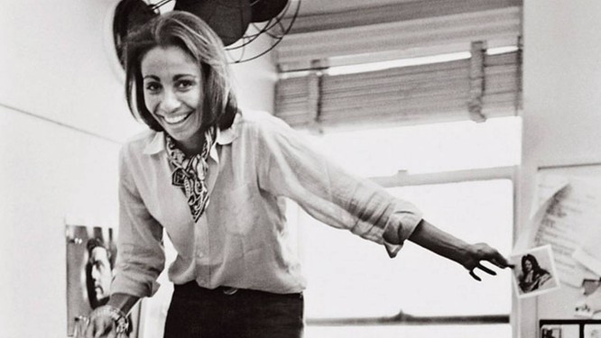
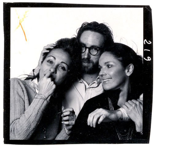
From left to right; Bea Feilter, Bill King, Ruth Ansel, 1965.
Throughout her career Bea gained several reputations; she was full of energy and quick witted, kind and professional, and was always willing to foster talent where she saw it. She introduced famed photographer Annie Liebowitz to fashion during Feilters reboot of Vanity Fair. She paid attention to at the time student Keith Harring when nobody else would.
When recounting all of Feilters accomplishments, it’s hard to believe that her career only spanned 20 or so years. On April 8th, 1982 Bea lost the battle against cancer. Her absence was felt all across the art world, and she is still continuously recognized as one of the most influential art directors of her time.


