Elektro The Moto-Man: Yes, This Really Happened. Survey 10


Stop everything you’re doing and read this. You think pop culture is weird now? Get a load of this shit.

Elektro the Moto-man was, indeed, the worlds first robot celebrity. He doesn’t quite stand up to apples Siri and Amazon’s Alexa, but has some pretty astounding endearing qualities for the day.

Standing approximately 9 feet tall, the man-made-of-gears represents an odd optimism that was harboured among American citizens during the great depression. People were looking forward to better times, and that meant being terribly imaginative. Things were pushed to futuristic extremes, and Elektro was quite literally the physical embodiment of it.

He was talented! Tall! Handsome! And could perform a whopping 26 tasks! Ladies, who needs a man when you can have a nine foot robot who can smoke?

If it sounds like Elektro’s creators were trying to make him be the optimal interesting human, you’d be correct. He (It?) was designed to be an entertainer above all else. He could blow up balloons, smoke a cigarette, even flirt with audience members using his 700 words of built in vocabulary. Flirting was popular with Elektro. “Toot” was a popular adjective within his vernacular, because it was the 1930’s and when you’re a 9 foot electric human in the 1930’s, that’s what you call people. Obviously.

Image result for elektro the moto man
SEE? I told you. He can smoke.

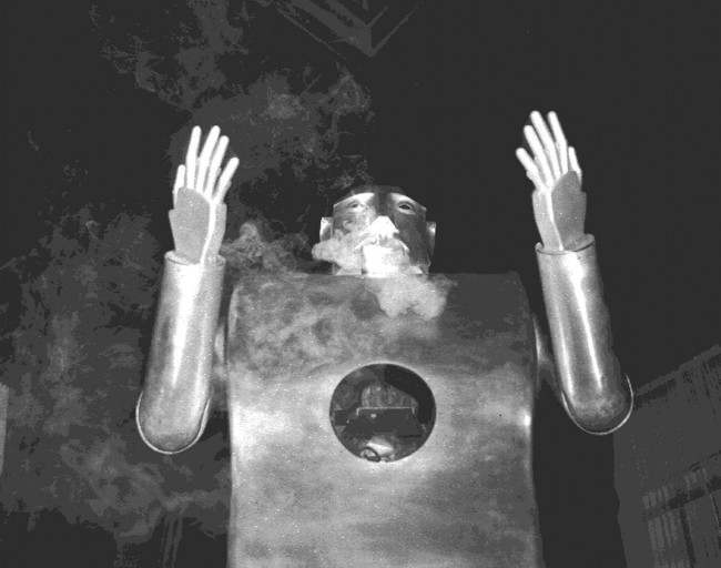
His limbs were functional, he could move them, but whether or not he could successfully walk is unclear. His (still unsure if this situation requires pronouns) body consisted of gears, a speaker, and aluminum sheets, which appear to be spray painted gold. A dream man if you ask me, even complete with a bushy moustache.

The phenomenon was popular at the time, but Elektro the Moto-Man has mysteriously been swept under the rug within the discussion of history. Possibly because he was solely created for entertainment and didn’t serve the public in any other way than making them laugh and blush on occasion, but most likely because people prioritized the War and the technical innovations that occurred in more useful areas (no offense, Elektro).

Image result for elektro the moto man
The poster for Elektros big unveiling.

However, whether Elektro is on the covers of our history books or not, there is no question of his influence. Today we see artificial intelligence making its way into almost every aspect of our homes: we have Google Homes, Amazon’s Alexa, and not to mention Siri.

You could say that a direct descendant of Elektro is Sophia the Robot, a highly controversial AI creation that pushes the boundaries of technology and blurs the lines of artificial humans and real breathing ones. Perhaps we would never have these robotic companions had it not been for our faithful Elektro.

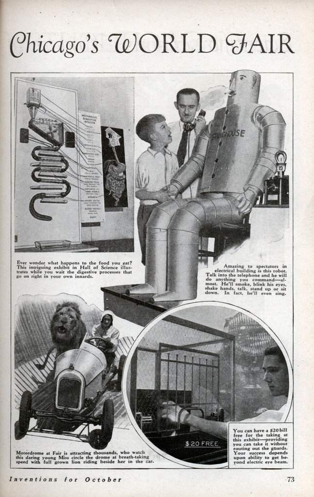
Our tin-clad companion was first unveiled at the New York World’s Fair in the 30’s but now stands tall in the Washington D.C. National Building Museum. Well, kind of. It’s a replica, but pretty damn close to the real thing. No word on whether his flirting game is still as strong, but one can only hope.

Lecture Summary:

Today we had our last lecture! I’ll never see “Done Talkin'” again, and I’m a little heartbroken. I’ve really genuinely enjoyed this class and the lectures that come with it. It’s fascinating to see the context in which our entire modern communication is built, and I feel fulfilled leaving with a whole new lexicon of inspiration to work into my art. Thanks Judy, for being so patient with us and always being kind. I really appreciate your class and the way you’ve taught it.

Anyways, sappy shit over, today we talked about the 1930’s and 40’s. This is a particular topic that I happen to know quite a bit about, so it was really nice to learn more about a time period that I’m passionate about. I was particularly interested to hear about the designers migrating to the US, seemingly in flocks, and the way that they immediately brought American design from a mediocre-genre to an iconic representation of businesses on an international level. Especially the Container Company, and their conceptual representations of their brands. It was kind of mind blowing that business ads did not have to directly focus on the product. I’ve never seen that before, but I’ll certainly be incorporating it in to future projects.


Sources:

https://www.history.com/news/1939-worlds-fair-new-york-technology-robot-flashback

https://www.theatlantic.com/technology/archive/2011/02/elektro-the-moto-man-one-of-the-worlds-first-celebrity-robots/71505/

https://www.grunge.com/101415/bizarre-things-happened-great-depression/

1939 New York World’s Fair Presented By Elektro The Smoking Robot – In 80 Photos

Bauhaus Furniture: Concussed Edition, Survey 9

Image result for bauhaus furniture

The Bauhaus (1913-1933) was a school of art and design that existed in        pre-war Germany before being shut down by the Nazi party in the face of World War 2.  Founded by Walter Groimus, the primary objective of the Bauhaus was to redefine the relationship between function and design. In other words, as stated by www.metmuseum.com, the objective was to “reimagine the material world to reflect the unity of all the arts.”

Image result for bauhaus furniture

The Bauhaus housed a multidisciplinary focus. Students learned painting, architecture, sculpture, and design, as well as specialized workshops like cabinet making, among others. Their coursework was intensive and diverse, allowing students to make creations that drew on a large vocabulary of historical and artistic references. Students themselves were diverse as well, bringing their own cultural influences and social-economic lenses to each discipline.

“The Bauhaus combined elements of both fine arts and design education. The curriculum commenced with a preliminary course that immersed the students, who came from a diverse range of social and educational backgrounds, in the study of materials, color theory, and formal relationships in preparation for more specialized studies.”

~ www.metmuseum.com

Image result for bauhaus furniture

One of the most culturally impactful outputs of the Bauhaus was their furniture. It was created with the goal of “form follows function.” The furniture and cabinetmaking department was headed by Marcel Breur, who is said to have “reconceived the very essence of furniture, often seeking to dematerialize conventional forms such as chairs to their minimal existence.” (metmuseum.com).

An excellent example is the chair below. The extremely basic design is complimented by the unique use of material, contrast, color and essence of extremist minimalism. In contrast to the arts and crafts/art nouveau movement of the previous decades, the modern qualities of the Bauhaus designs were refreshing to say the least. This had an especially profound effect in its homeland of Germany, notorious for its heavy gothic design style during the early 20th century.

Image result for bauhaus furniture

Lecture Summary:

Unfortunately I was not able to attend this weeks lecture, but I was able to review the notes and handouts. The things that jumped out to me tended to stay within the geo-political sphere, mostly the famous “Persons Case” in Canada with the supreme court. This is always something that I’ve been appalled by, and to an extent I can’t believe that this event had to happen at all in history. Additionally, my spread from a couple weeks ago focused on women’s suffrage, and the persons case highlighted the Famous 5. I found that I will always be partial to women making advances in government throughout history, but that feeling is not the same for current politics. I also gravitated towards The Lindberg making its way across the Atlantic, as plane technology is something that I’m still fascinated by today every time that I’m in one. Slightly terrifying, but very cool to know where it all started.

Sources:

https://www.metmuseum.org/toah/hd/bauh/hd_bauh.htm

https://i.pinimg.com/originals/9a/ff/fc/9afffc258132091576588ad0ec82d94a.jpg

https://dengarden.com/interior-design/Bauhaus-Furniture

https://www.widewalls.ch/bauhaus-design/

Bold of You to Assume You’re Better Than Everyone: Russian Suprematism, Survey 8

Russian Suprematism

Suprematism, the Russian design movement of the 1920’s, was founded by Kazmir Malevich in response to zaum, or transrational poetry of the day. Many critics describe the Suprematist movement as “highly austere and serious,” but there is a strong element of abstract absurdity that is found as a running theme throughout the genre. The not-so-humble name directly states Malevich’s stance on the movement; it was supreme, and would conquer all other genres of art from past to future.

Related image

But what is it actually? The common audience might look at Suprematism, as well as Constructionism, and say “What’s the purpose of this? It’s just a bunch of shapes and lines and blocky text that doesn’t really make any sense.”

This is true, but it does hide a deeper meaning. Although Russian Suprematism may resemble a rudimentary Atari video game, the artists aimed to comment on the real world (AKA the Russian revolution and political environment under Lenin) by “removing the real world entirely and leaving the viewer to contemplate what kind of picture of the world is offered.” (theartstory.org)

The three visual characteristics of the Suprematist movement were red, white, and black. This was to represent the Nationalists during the Russian revolution (white) and the Bolsheviks, in red. Composition remained open to interpretation. Pieces of the movement can be read virtually any way. Geometric pieces can be seen as floating in space, a birds eye view (pieces that fit more so into this view were later characterized as “Arial Suprematism), or alternatively, from the inside looking out. Energy and tension were also very important components in this movement, and the artists favorite shapes were pure geometric forms. Malevich was in a similar mind to the Grecian philosopher Plato, who believed that geometric shapes were the purest form of beauty.

“Sensitivity is the only thing that matters and it is expressed by absolute forms: the rectangle, the triangle, the circle, the cross.”

Suprematist design was of course the inspiration for Constructivism. To a similar, Atari-sentimenting viewer, it is almost impossible to distinguish the difference between the two. To keep it short and sweet, Constructivists believed that materials commanded the form. Suprematism worked towards losing form completely and moving towards “true abstraction.”

Despite their differences, these two movements have been some of the most influential in history and to the world of graphic design in particular. The simplicity of the suprematist movement combined with it’s somehow maintained abstract message describes perfectly the movement of graphic design in modern day. Constructivism took these main principles and applied them relentlessly to their posters. They took the barren nature of Suprematism and used it to communicate effectivley to a general public that might not understand a complex artistic interpretation of an important message, like those discussed in both movements.

The conditions that this movement was born out of was undeniably shitty, but the inspirational creative wake that it left behind was undeniably great.

Lecture Summary:

This week we focused on the first world war, and everything that came with it. The wars are something that I’ve come across quite often in my education, but I was really happy to look at Russian culture and communication styles, because I feel that in any history course it is always a large group that is skimmed over. The Russian revolution brought a whole different type of art style on to the scene, and unfortunately wasn’t spread to other countries for quite some time. I am such a HUUGE fan of the tri-color schemes and the simple geometric representations, although it’s something that I struggle to execute in my own design work. I’ll definitely have to do some further research, most likely using the website this last picture is from. Interestingly enough, he used those photos and redesigned them in a more 3-D, modern approach, which I find incredible. I’d love to recreate any of the World War propaganda posters with a modern twist, and I actually think it would make a really interesting project within this program.

Resources:

https://www.theartstory.org/images20/new_design/collage/suprematism.jpg?2

https://www.theartstory.org/images20/new_design/collage/suprematism.jpg?2

https://medium.com/@PaulStayt/suprematism-constructivism-a2336332776c

https://mir-s3-cdn-cf.behance.net/project_modules/max_1200/680ea341998071.57bca54faeb63.jpg

https://www.theartstory.org/movement-suprematism.htm

https://markhickenfineart.wordpress.com/2015/06/02/compare-and-contrast-examples-of-suprematist-constructivist-and-neo-plasticist-painting-and-sculpture/

The Other Car Guy Who Was a Nazi: Survey 7: The First Mercedes

(Don’t worry, he wasn’t a full Nazi yet)

Daimler-Benz (who became a Nazi later–closer to the 1930’s) and his company invented the first petrol powered car; 35-HP Mercedes. Unfortunately Daimler died shortly before the perfection of the vehicle, but was present in the beginning projects and was directly involved in the prototypes that lead up to it.

The BPM is regarded as the first production car. In lamens terms for those of us who don’t know anything about cars, is a vehicle designed to be propelled by an internal combustion engine like we have today. Gone were the days of horse-drawn carriages and stepping in questionable mud puddles on the cobblestone streets: you now had the option to drive. Compared to other vehicles, the 35-HP was lightweight, and had a low centre of gravity, making it safer than previous engine powered models of the time. Mercedes.com, when speaking about the revolutionary quality of the 35-HP, states: “It signals the end for the carriages used in automobile manufacturing. The development of this pioneering design, which is considered to the first modern automobile,

Image result for first mercedes

Prior to the 35-HP, however, Mercedes came up with an engine powered “omnibus.” To the general public nowadays, it looks a lot like an incomplete 35-HP. It appears as if the front was completely ripped off and unfinished, but hey, if it gets you where you need to go, who cares? It somewhat resembles an industrialized version of Cinderella’s carriage (displayed below. I have a point.)

Mercedes-Benz: Corporate history.

Image result for cinderellas carriage

The reason I make that comparison is not null.  This actually does serve a purpose: you can really see between the two how heavily influenced the first engine powered vehicles were by horse drawn carriages. This progression is also where the term “horsepower” comes from.

Although the 35-HP was a highly innovative and world changing invention, it is easy to see the progression as to how it arrived in society. This also was the stepping stone for the Ford Model T, one of the most consumer friendly cars in history, and one that made more of an impact on transportation due to its extreme availability. It goes without denial that the 35-HP set the standard and foundation for motorized vehicles going forward into the 20th century.

To address the Nazi thing: Mercedes Benz’s  was known for employing civilian labor, prisoners of war, and concentration camp internees during war times in his factories.  Mercedes approximate 65 000 employees consisted largely of this demographic. After the war, they did admit to  Nazi affiliations.


Lecture Summary: Survey 7

This weeks lecture covered the time span of 1905 to 1915, and discussed in depth the profound effect that modernism, expressionism, Japanism, and other artistic influences had on architecture and social discussions. We touched on “The Armory Show,” a modern art show in New York that displayed huge names in several different genres of art. I found it fascinating how intense the public’s reaction to it was.  It always confuses me that work that we know now as iconic and monumental was so often hated in the original time of it’s debut. We see this all throughout history, and it makes me question what will be the standing legacy of our time? Will it be the things that we as artists support, or the things that the public reject? What are the movements of today that will end up defining a society, and will they coincide with this phenomenon or is the view of the public changing?

https://www.google.com/url?sa=i&rct=j&q=&esrc=s&source=images&cd=&cad=rja&uact=8&ved=2ahUKEwj32ouw0rHeAhWN0VQKHdkzBRMQjRx6BAgBEAU&url=https%3A%2F%2Fwww.daimler.com%2Fcompany%2Ftradition%2Fdaimler-taxis%2Ftype-8.html&psig=AOvVaw3-ke4w3KO5mneUcoyNvwxf&ust=1541108410910748

https://www.mercedes-benz.com/en/mercedes-benz/classic/history/corporate-history/

url


Bad Bitches of the 20th Century: The Suffragettes of Canada, Survey 6

Women’s suffrage in Canada was a long fought battle that yielded little results for many years. Suffragettes of the time had many issues to tackle, the first of which was the need to become “people” (a problem that wouldn’t be addressed until the later date of 1929). Full citizenship was granted to men in the mid-19th century, but explicitly excluded female voters. Like I said, women had many a battle to tackle, but they decided to start with the issue of voting, to give them a platform to influence social reform. By the end of the 19th century it was clear that there were several layers of social reform that needed to occur internationally pertaining to female treatment and their position in society.

“Suffragists were not a homogeneous group; nor did they focus only on suffrage. Campaigns also called for improved public health, equality in employment and education, social assistance and condemnation of violence.”

~ thecanadianencyclopedia.ca, Womens Suffrage in Canada

Suffrage in Western Canada began in the 1880s. Victoria, BC, served as a social hub for the suffragette movement. Protesting would occur often; women were not ashamed to voice their opinions. They were nothing short of desperate to. Due to the lack of definition of women as peoples, women faced discrimination in every avenue they were allowed into. Crimes against women were seldom followed through with, and violence against a women in the home was not made illegal until 1983 by the Canadian government. The issue of abuse was one of the primary driving factors for Suffragettes in America and Canada alike. To be blunt, women were tired of being beaten, raped, and abused, and wanted to do something about it as quickly and as effectively as possible.


Suffrage Meeting

“Since the earliest years of the province’s history it had been widely believed that women’s roles in society should be limited to the domestic sphere. Women did work outside of the home, often out of economic necessity, but many faced low wages, poor working conditions and even violence. In addition to discrimination in education, women were considered by many to be less rational than men and of a different temperament – excuses often given to justify their exclusion from voting and public life.”

~ www.leg.bc.ca

The turn of the century experienced rage like Canada had never seen before. After a House of Commons ruling in 1885 that defined voting as only available to white male citizen Canadian minorities pushed even further to be heard.

The Suffrage Campaign 

Young University students were the first among this group to lead the newly fuelled protests going into the 1900’s, and walked behind the support of Woman’s Christian Temperance Union, one of the largest women’s groups in Canada, as well as one of the largest advocates for the suffrage movement. Additionally, figures in Central Canada spear-headed their own movements, like journalist Nellie McLung.  The Canadian Encyclopedia describes McLung as  “The Prairie movement’s dominant figure.” Her literature helped perpetuate support for the suffrage movement by shunning anti-feminists. McLung also participated in a Satirical mock-parliament piece (alongside  A.V. Thomas, F.J. Dixon, Amelia Burritt, Dr. Mary Crawford) in which they debated whether to give men the vote. Women separately found support in the farming, labour, and social gospel movements.

Nellie McLung
Political Equality League Presents Petition, 1915
The Women of the Satirical piece: “Political Equality League Presents Petition, 1915,” that debated over the right of men in the voting sphere.

Success! Kind Of!

January 16th, 1916, Manitoba is the first province to grant women the right to vote. Although viewed as a monumental success, it was still 16 years after the suffragette movement began. Saskatchewan followed suit and passed the women’s vote in 1916 under a liberal government. As for our lovely British Columbia, the Canadian encyclopedia states that “British Columbia was the only jurisdiction in Canada to put women’s suffrage to a referendum of male voters, during the provincial election of 1916. Bolstered by the favourable results (43,619 to 18,604 ballots), the new Liberal government approved women’s suffrage on 5 April 1917.”

Image result for canadian women's suffrage
A 1917 poster advocating for suffrage in the East, comparing the levels of successful areas of North America.
Image result for canadian women's suffrage
Women protesting in the Maritimes after women in Manitoba, Saskatchewan, and BC are given the right to vote.

1917 finally saw Ontario catch up to the West, and on May 24th of 1918 women were allowed to vote in federal elections. HOWEVER, all was not won. The law still restricted indigenous, Asian, younger than 21, and women without citizenship from voting. Quebec Women had to wait until the absurd date of April 25th, 1940 to finally partake in elections. Those excluded in the federal bill of women’s voting rights waited much longer than their white Canadian counterparts. It was not until the UDHR (Universal Declaration of Human Rights, created by John Humphries) introduced in 1948 that people of “foreign” heritages could vote. Lastly, indigenous women were still banned from voting until only 58 years ago in 1960.

Lecture Summary

This week we covered “Dreams and Designers,” and we covered the years 1895 to 1905. We spoke about Women’s suffrage, obviously, as well as the aftermath of the Victorian Era and the progression of the Art Nouveau movement. I personally was enthralled with the idea of art the pre-cursors to modern art. The movement of symbolism and the beginning of the “emotional artist” is something that resonates with me. Architecture is not something that I particularly take care to notice, but the period of art nouveau particularly caught my eye. The one domed red glass ceiling especially made me take interest!

https://www.thecanadianencyclopedia.ca/en/article/suffrage

https://www.leg.bc.ca/wotv/pages/womens-suffrage.aspx

https://www.cbc.ca/strombo/news/women-the-right-to-vote-in-canada-an-important-clarification.html

https://www.cbc.ca/archives/how-canadian-women-became-persons-in-1929-1.4669584

https://www.cbc.ca/strombo/news/women-the-right-to-vote-in-canada-an-important-clarification.html

https://www.leg.bc.ca/wotv/pages/womens-suffrage.aspx

https://www.google.ca/search?ei=897QW4zoCY-90PEPocqLuAg&q=canada+bc+prohibition&oq=canada+bc+prohibition&gs_l=psy-ab.3..0i71k1l8.10384.10703.0.10871.0.0.0.0.0.0.0.0..0.0….0…1c.1.64.psy-ab..0.0.0….0._CQFlflgj8w

http://www.transitionhouse.ca/ACrime.html

Sure It’s Shiny…But was it worth it? The Crystal Palace vs. the MLC Crystal, Survey 5

The Crystal Palace

On the heels of the industrial revolution, the amount of product and merchandise was at a monumental height. All over the world, people were producing consumer goods. India was prolific for it’s printed luxury fabric and rugs, while Japan was fresh on the scene with Ukio-e prints and obsession-inspiring accessories. Today, we have museums to exhibit interesting worldly items like these.

Prince Albert, husband to Queen Victoria, decided that the rest of London should be able to experience the phenomenon that was worldly culture. It was the first World’s Fair of 1851, titled “Great Exhibition of the Works of Industry of All Nations” that gave cause to the construction of one of the most extraordinary buildings of the Victorian era.

The Crystal Palace was designed to house the World Expo, starting construction in 1850. It was designed by Sir Joseph Paxton, a resident greenhouse builder.The building was an odd combination of iron and glass. Brittanica .com states the staggering dimensions of the building, citing;

” It consisted of an intricate network of slender iron rods sustaining walls of clear glass. The main body of the building was 1,848 feet (563 metres) long and 408 feet (124 metres) wide; the height of the central transept was 108 feet (33 metres). The construction occupied some 18 acres (7 hectares) on the ground, while its total floor area was about 990,000 square feet (92,000 square metres, or about 23 acres [9 hectares]). On the ground floor and galleries there were more than 8 miles (13 km) of display tables.”

A full view of the Crystal Palace after being moved to Sydenham.

To give you an idea, the Palace of Versailles covers a total area of 63,154 m2, while the Crystal Palace covers a whopping 92000. The glass was chosen to due Paxton’s background with greenhouses, and the lifting of the glass tax a few years prior allowed the 300 000 large sheets (fabricated in the largest size ever made) to be obtained easily and at a much lower cost. The total cost of the building was approximately 2 million euros, which in today’s cost would

Blueprints for the Front arch of the Crystal Palace.

The building process was as follows (as per http://www.vam.ac.uk):

  • Work started in August 1850. First, the whole site was enclosed with hoardings
  • Trenches were dug
  • Then the concrete foundation was laid
  • Underground iron pipes formed the base for the columns
  • By the end of October workmen were raising 200 columns a week
  • At the same time, girders were added to support the galleries and roof
  • The most difficult part of the job was hoisting the main ribs for the transept roof
  • All 16 were fixed in one week
  • The height of the roof was designed to leave the trees undisturbed
  • The roof for the main part of the building was added
  • Glazing wagons ran in grooves in the gutters
  • In one week 80 men put in over 18,000 panes of glass
  • The boards from the hoardings were used to make the floor
  • The interior was painted red, yellow and blue
  • The Great Exhibition opened in the Crystal Palace on 1 May 1851.”
An arial drawing of the Crystal Palace by Charles Burton

After years of glorious shows and exhibitions, the Crystal palace was brought down by a number of forces. November 30th, 1936, 85 years after the vision of the World Exposition came to life, The Crystal Palace was destroyed by a fire. The majority of the Palace was completely ruined, and shortly after all that remained was again ruined by war explosives (1941). All the money and hard work proved obsolete: the cost of reconstruction was deemed unrealistic during wartimes and it was never rebuilt.

The Michael Lee Chin Crystal –  The Royal Ontario Museum

A modern day equivalent of this architectural, gem-like masterpiece could be hard to find. The Louvre is a similar structure, but was done similar to the time of the Crystal Palace. Canada holds a unique gem in the world of museum architecture; and I mean that quite literally.

Image result for ontario crystal museum
The traditional building next to the new Crystal addition, added and completed in 2007.

The Royal Ontario Museum is home to the Michael Lee-Chin Crystal, an architectural and visual marvel. Inspired by it’s namesakes natural gem collection, the Crystal Palace and the M.L.C Crystal share many similar qualities in that respect.

The Royal Ontario Museum speaks on it’s new addition (added in 2007), highlighting what a feat it was to create. On their website, they state:

“Considered to be one of the most challenging construction projects in North America for its engineering complexity and innovative methods, the Lee-Chin Crystal is composed of five interlocking, self-supporting prismatic structures that co-exist but are not attached to the original ROM building, except for the bridges that link them…

The original concept art of the Crystal, done on a napkin.

The exterior is 25% glass and 75% extruded-brushed, aluminum-cladding strips in a warm silver colour. The steel beams, each unique in its design and manufacture and ranging from 1 to 25 metres in length, were lifted one by one to their specific angle, creating complicated angle joints, sloped walls, and gallery ceilings. Approximately 3,500 tons of steel and 38 tons of bolts were used to create the skeleton, and roughly 9,000 cubic metres of concrete were poured.”

The biggest difference between the two, besides the obvious juxtaposing forms, would be the materials. The Crystal palace was composed almost entirely of glass and iron, while the M.L.C. Crystal features aluminum and steel.

Image result for ontario crystal museum
A full view of the Crystal.

However, the success that the Crystal Palace experienced was not shared by the M.L.C. Crystal. People hate this thing.  “Revisiting Canada’s Most Hated Building,” “The Crystal Not Necessarily an Attraction,” and my personal favourite, “Toronto Still Not sure if it Likes the Crystal Or Not,” were just a few of the titles that came up with a quick google search. The Crystal Palace was a massive success; people viewed it as a marvel of it’s time and as a beautiful addition to London. The MLC Crystal, although modern and innovative and just as much of an architectural marvel is widely disliked. Some even want it taken down completely. The $30 million addition might not be worth it in the eyes of the public after all, perhaps they would have preferred the Victorian Crystal Palace instead of their own.

Lecture Summary:

This week’s lecture covered many things, but the one that stood out to me the most was the first world fair, better known as the Great Exposition. The Crystal Palace was created with the sole purpose of housing the World Fair, and I find it appalling that such a beautiful and intensive structure was taken down multiple times. Yes, I understand that it was a bomb threat, but still. Also, a worlds fair! How cool! The middle class world for the first time was able to see what living elsewhere was like, and I can only imagine the art that came out of Europe after this event. Imagine being in London, creating your traditional art, and then seeing all of this mind blowing shit all in one room. Crazy. I love lectures even more the more we progress through the years, because we get to see photos of people living their lives! It’s so much easier to grasp the information and empathize now that we have real images of people and what they were experiencing.

Sources:

http://en.chateauversailles.fr/discover/estate/palace

http://www.vam.ac.uk/content/articles/t/the-crystal-palace/

https://www.britannica.com/topic/Crystal-Palace-building-London

https://www.rom.on.ca/en/about-us/rom/michael-lee-chin-crystal

https://www.google.ca/url?sa=i&source=images&cd=&cad=rja&uact=8&ved=2ahUKEwj58u3Xwo7eAhViyFQKHTh3An0QjRx6BAgBEAU&url=https%3A%2F%2Fwww.azuremagazine.com%2Farticle%2From-crystal-10-years-later%2F&psig=AOvVaw0tR9ue8limAaSaZafQlO_Q&ust=1539901615746231

https://www.google.ca/search?q=ontario+crystal+museum&source=lnms&sa=X&ved=0ahUKEwi_y9_-w47eAhW3IjQIHWeZAzoQ_AUICSgA&biw=2558&bih=1194&dpr=1

https://en.wikipedia.org/wiki/The_Crystal_Palace


Bookbinding At a Bargain – Survey 4

Survey 4 Summary: Steam and the Speed of Light

This weeks lecture mainly focused on the innovations of the industrial revolution and their contributions to the phenomenon of mass production. We began by touching on the French revolution, world exploration and a changing political climate with the crowning of Napoleon Bonaparte. During the “long 18th century” we see climbing literacy rates, a call for reformed social structure, and as mentioned, and increase in mass production. One of the most commonly produced items was books, with approximately 600 being produced in the crowning year of Queen Victoria. There were several machines that allowed this level of production, like the invention of the Steam Engine (invented by James Watt), lithography (Alois Senefelder), chromolithography, or printing in color (invented by Godfrey Anglemon) as well as several new typefaces used specifically for consumer benefit. These included the first modern typeface Didot, Robert Thornes Fat-faces, and Vincent Figgins Egyptian. All were used to advertise to the middle class consumer. We also discussed the invention of Braille, as well as the Joseph Nieps  first photographs using the Heliogravure. Lastly, we touched on the Japanese art form of Ukiyo-e, a minimalistic impressionist style that focused on the entertainment district of Japan. My interests during this lecture primarily lie in the typefaces and Ukiyo-e, due to the secrecy of the latter and the matter in which it was transported to the US. The fact that the artform inspired the movement of Japan-ism and Impressionism was astounding to me. I was blown away that these pieces of art that were valued very little in their own society could have such a profound impact on the Western world. 

The Quality of Bookmaking During the Industrial Revolution

It’s hard to imagine that at one time books were once a high class luxury item.  Now we see cheap copies of paperbacks almost anywhere. Books inhabit every retail environment, whether it be gas station comics or questionable grocery store romance novels, they’re more than easily attainable today.  To make things easier, Canada has a staggering literacy rate of 99%, meaning that even if people don’t necessarily want to buy books, there is nothing stoping them from being able to do so.

The industrial revolution saw a vastly different environment.  The average literacy rate throughout Europe was an approximate 50% in the year 1800, with the majority of said statistic consisting of white Englishmen.  However, this number was growing throughout Europe, and quickly. This increased demand for books called for a faster method of production, cheaper materials, and ideally, less man power.

Image result for latin mainz psalter
The Latin Mainz Psalter, an example of one of the first books printed in colour and on Vellum, calf skin.

Prior to the industrial revolution, books were hand-made, bound in leather, printed on parchment or vellum (high quality calf skin), and hand painted often with precious mineral inks and with gold.

With the invention of the steam engine (done by James Watt in 1765) books were able to be mass produced with significantly less man power. Bookbinders also found many ways to cut costs as the century went on to make the product more consumer friendly and to satisfy the expanding demand.  The first cost-cut was in the paper. Vellum was unsustainable and very expensive, so there was a desperate search for an easier alternative. At first paper was switched over to a linen, cotton, or hemp base. This was called “rag” paper. However, as with any product in high demand, the price rose quickly and there was once again a search for more. It was not until the latter half of the 19th century that “modern” paper was created. As stated by www.ibookbinding.com:

“It was not until the 1840s that the initial development of the papermaking machine in England and experiments in ground wood pulping in Germany and Nova Scotia enabled the commercial production of paper, which used wood fibre as part of its composition”


History of Marcus Aurelius, dated 1836, features an embossed starched cloth cover with a gold foil.
A book of poems, dating 1834, seen with a cloth binding instead of the formerly used leather one.
A book detailing the manufacturing of paper and all methods to create it. This particular book was made out of straw paper, during the experimental phases before wood pulp had been settled on.

In addition to paper, bookbinders found many other ways to make production cheaper and easier. Leather covers were replaced by starch cloth and cardboard, and were decorated less and less. Cloth tapes replaced the former chords or vellum strips formerly used in the sewing process. The bookbinder would also apply a false band to create the authentic handmade feel. The invention of chromolithography aided in lowering the cost and employee count by getting rid of the need for hand painted illustrations, as did the invention of the sewing machine in 1832 by Phillip Watt. This enabled companies to sew in bindings, instead of doing it by hand. Bookbinding could now be done by the publishers themselves, eliminating another middleman. In 1860, machinists (those who would be working the printing presses and binding machine) would be making an approximate weekly wage of $10.00 a week for 60 hours.  Eliminating more employees brought down the cost even further, approximately $520 a year per employee.

So if the quality changed…shouldn’t the price?

Mass production enabled books to become a commonplace object in Europe during the industrial revolution. In fact, from the years 1450-1800 there were 1 726 166 total books produced, with a staggering 641 166 of those being produced in the last half of the 18th century. In the mid 18th century, illustrated books that were short in length cost an average 3 dollars, with custom and luxurious books being much more. 3 dollars in the 18th century was enough to buy food for 1 family for 1 week. Now, the average American family of four spends an average of $239 a week for food.  Compared to the prior cost of books (handmade books could cost the same as a farm), 1 week of food was much more affordable.


Sources:

https://www.vam.ac.uk/blog/museum-life/tradition-and-transformation-in-19th-century-bookbindinghttps://www.ibookbinding.com/blog/bookbinding-history-and-introduction/https://ariettarichmond.com/paper-early-1800s/https://historyofinformation.com/expanded.php?id=500https://www.officialdata.org/1800-dollars-in-2018?amount=0.15https://hlq.pennpress.org/media/34098/hlq-774_p373_hume.pdfhttps://knoema.com/atlas/Canada/topics/Education/Literacy/Adult-literacy-ratehttps://www.quora.com/How-many-people-could-read-in-1800s-Europehttps://en.wikipedia.org/wiki/History_of_the_steam_enginhttp://digitalcollections.lib.washington.edu/cdm/singleitem/collection/historicalbookarts/id/986/rec/5http://digitalcollections.lib.washington.edu/cdm/singleitem/collection/historicalbookarts/id/994/rec/1https://www.google.ca/url?sa=i&rct=j&q=&esrc=s&source=images&cd=&cad=rja&uact=8&ved=2ahUKEwjS99GM4__dAhX6HjQIHbOlB7sQjRx6BAgBEAU&url=https%3A%2F%2Fen.wikipedia.org%2Fwiki%2FMainz_Psalter&psig=AOvVaw1t6RGoDy6HQJdiJLgjaH_M&ust=1539394902290523https://www.bookstellyouwhy.com/advSearchResults.php?action=search&orderBy=relevance&category_id=0&keywordsField=vellumhttp://digitalcollections.lib.washington.edu/cdm/singleitem/collection/historicalbookarts/id/994/rec/1


“Text me!” (Survey 3)

Survey 3 Summary

This weeks survey focused on the 16th and early 17th century, specifically on the innovations of design and typography, as well as briefly touching on architecture, fine art, and culture of the time. We covered the effect of each era on text and the production of literacy.  For example, the Humanist movement brought many scientific and educational published works due to the withdrawn attitudes of citizens in regard to the Church.

Prominent Figures in the 17th Century of Text Design

Johan Fust (1400-1466) and Peter Shoeffer (1425-1503)

Created the First Colour Printed Book

Fust and Shoeffer were two German printers who brought about innovations in the way of printing with color, and first did so in 1459. They printed the Latin Mainz Psalter, what would go on to be the second most well known book printed with metal moveable-type, and the first book that was printed with color. Prior to their achievement color had always been addition that was included by hand; this made the printing costs much more expensive and much more tedious. There is no definite solution for how they achieved this. It’s possible that it was achieved in multiple presses, or each color was painted on and pressed all at the same time. Additionally, the two were the first to use a colophon, a printed design signifying the date printed and trademark of the book. This device is still used today but focuses more on the publisher and not the printer themselves. Fust and Schoeffer would go on to print the Clementine Constitutions (1460), the Sixth Book of Decretals (1465) and multiple other works.

The Latin Mains Psalter

William Caxton (1422-1491)

First Printer in England

William Caxton

Caxton, a printer in England, had originally taken on the task of translating Raoul Le Fèvre’s Recueil des histoires de Troy, but was faced with the arduous task of hand printing and illustrating the complex piece. To solve this problem, Caxton moved to Cologne, Germany and learnt the complex process of printing via a press. Unlike other printers of the time, Caxton did not create his own movable type. He bought his type. After living in Cologne he brought the skill of printing back to England, where he would be the first to run a business of the kind. He worked in Belgium at first and printed his translated copy of the Recueil, titling it The Recuyell of the Historyes of Troye, printed in French. He work in Belgium for many more years, but in 1476 returned to England and continued his press in Westminster Abbey. Later he would publish the first dated book in English. This was the Dictes and Sayenges of the Phylosophers that was dated November 8th, 1477. Caxton would begin the movement of printing in England,

Image result for the recuyell of the history of troy
The Recuyell of the History of Troy, As Translated into English


SOURCES:

https://en.wikipedia.org/wiki/Johann_Fust#Fust_and_Schoeffer

https://en.wikipedia.org/wiki/Peter_Sch%C3%B6ffer

https://www.rct.uk/collection/1071478/the-mainz-psalter

https://www.britannica.com/biography/William-Caxton

https://www.britannica.com/biography/William-Caxton

https://en.wikipedia.org/wiki/Mainz_Psalter

Anything but Humans! The Restricted Beauty of the Islamic Manuscript, Survey 2

Lecture Review

Todays lecture covered the year zero the year 1450 CE. We focused on the evolution of print and text, as well as the illuminated manuscript and the evolution of paper. Some key titles are…

  • Parchment
  • Codex and Codeci
  • Uncials and Half-uncials
  • The effects of Barbaric invasions
  • Gothic text and international influence of text
  • The Printing Press (Bi Sheng, China)
  • The Printing Press (Johan Gutenberg)

I found this lecture particularly interesting. It was fascinating to find out how innovations in text and print were reflected all throughout the known world. Especially in the instances of Sheng and Gutenberg, where they came up with the exact same technology with zero communication whatsoever.

Middle Eastern Illuminated Manuscripts

Illuminated manuscripts of the middle east provided a wide arrange of topics and information, straying far from the typical religious text found in the West. Islamic illuminators were unable to depict humans. The Islamic faith did not allow any renderings of God’s creations with souls, and the lack of such set these manuscripts apart from their European counterparts. People and animals (anything with a soul) were strictly banned from being depicted. All illustrated codecis of the area instead featured natural details, but the majority of the illustrations consisted of embellished designs. The style these books were created in was highly decorative, ornate, and detailed. Artists would work on a commission for months or even years, working primarily in royal workshops with an array of other workers.

In early production the majority of commissioned manuscripts were Qur’ans, religious texts of the Islamic faith. Illuminators would work with the scribes to create elaborate texts to lead the faithful by God’s word. After the scribes produced and decorated the paper, the illuminators would create their inks. Different inks were made up of various minerals, both for colour and for pigmentation.

  • Gold
  • Silver
  • Lapis lazuli/Indigo (dark blue) and azurite (light blue)
  • Orpient (for yellow) and malachite (for green)
  • Cinnabar (for red)

Ink was first mixed with a glue-like substance called albumen. This made the ink dry glossy, and it was not until the 16th century that artists switched over to a matt texture. This was achieved with gum arabic, sap derived from the acacia tree. The artist would then create a rough draft. This would be achieved with a fine layer of light ink or by using a device called a pounce. To pounce, the artist would lay a transparent layer over the rough draft and prick holes around every outline. Then, they would lay it over the new paper and pound a cloth bag of pigment into the holes, creating an outline where the paper once was. This technique would continue to be used into the high renaissance by muralists and fresco painters. Multiple artist were a part of the drawing process, with junior artists filling in large portions and blocks of colour.  After each page was completed, illuminators would add finishing touches. These ranged from gold leaf accents to chapter headings and initials. The very last step would be to burnish the page with a rock of glass stone.

Pigments, crystals and minerals including lapis lazuli, azurite, malachite, cinnabar, orpiment and realgar
  • All the different minerals used to create the ink colours. On the bottom, we see Lapus Lazuli (right) and Azurite (left). On the left of the second row we see Orpient and Malachite.

    An Illuminated Qur’an
  • Here we have the left side of an illuminated manuscript Qur’an. It was done in 1282 CE, by the Turkish Scribe Muhammad ibn Mustafa İzmir’i. We can see the ornate drawings, gold leaf embellishment, and just how much the different pigments stand out against one another.
A close up of an illuminated manuscript, in the process of being digitized and restored.


Sources:

https://www.library.yale.edu/neareast/exhibitions/exhibit20071.html

https://www.metmuseum.org/toah/hd/isbk/hd_isbk.htm

https://www.google.ca/search?q=gum+arabic+definition&oq=gum+arabic+defi&aqs=chrome.0.0j69i57j0l4.3214j1j7&sourceid=chrome&ie=UTF-8

https://www.google.ca/search?q=quran+definition&oq=q%27uran+definitio&aqs=chrome.1.69i57j0l5.8039j0j7&sourceid=chrome&ie=UTF-8

Photos:

Gemstone photo: https://www.google.ca/url?sa=i&rct=j&q=&esrc=s&source=images&cd=&cad=rja&uact=8&ved=2ahUKEwjq54nB1dndAhWOIjQIHeQsC3YQjRx6BAgBEAU&url=https%3A%2F%2Fwww.pinterest.com%2Fpin%2F318559373634332661%2F&psig=AOvVaw0fNeFzmOKUXTMLM4g5SUje&ust=1538085601632032

Left side of the Qu’ran:

https://www.google.ca/url?sa=i&rct=j&q=&esrc=s&source=images&cd=&cad=rja&uact=8&ved=2ahUKEwjq7a7Q1tndAhWQIDQIHZ0oBN8QjRx6BAgBEAU&url=https%3A%2F%2Fwww.flickr.com%2Fphotos%2Fmedmss%2F4690467017&psig=AOvVaw1XQi3UQlp6Kx2CeNCk9ZPW&ust=1538085898119322

Close up: https://www.google.ca/url?sa=i&rct=j&q=&esrc=s&source=images&cd=&cad=rja&uact=8&ved=2ahUKEwiEhu7S2dndAhWkKX0KHZiMCCwQjRx6BAgBEAU&url=http%3A%2F%2Fblogs.shu.edu%2Farchives%2F2017%2F11%2Farchives-news-conservation-and-digitization-of-17th-century-illuminated-manuscript-quran%2F&psig=AOvVaw1XQi3UQlp6Kx2CeNCk9ZPW&ust=1538085898119322

Roman Fashion, the Average Citizen to the Emperor

Lecture Summary 

This weeks lecture covered the time span from 35000 BCE to the year zero. We covered the origins of writing and language, from cave art dating back 40 000 years to the perfection of the Chinese written language on paper. Something I found particularly fascinating was the idea of the evolution of Korean language. It is the youngest alphabet in the world. In a time where reading and writing was reserved for the upper classes, Korean Hangul was easy to read, write, and speak due to its phonetic nature.

Weekly Research

First century Rome was a tumultuous but successful place. After years of unrest, the years 0-100 AC would contain more victories for Rome than ever before, reaching its peak just after the end of the first century. Roman people were proud of their accomplishments and of their empire, and dressed in a distinguishable style to reflect this.

The average Roman man often came packaged in a wool toga or tunic, with individual styles for each gender and age. Common men wore plain white, and were officially allowed to wear one ring intended to seal letters with wax. However, some defied this rule and adorned themselves and their clothing when possible to show off. Casual wear consisted of tunics (or tunica) were mid thigh length dresses, often worn with a hooded cape (a paenula) and broach. Standard footwear was strapped sandals, custom to the Mediterranean climate. Pants were classified as barbaric, and did not make an appearance in Rome unless in military wear. Togas were more formal, and signified status more so than the average tunic.

  • White applied to all men
  • Off-white and purple to upperclassmen
  • Bleached fabrics for politicians
  • Dark wool togas were worn after a loved one had passed
  • Purple and gold was reserved for dignitaries, generals, and eventually emperors

Women were dressed modestly. Their dress consisted of floor length, long sleeved woolen togas. Togas would later be exclusive to men in the second century. Women of a lower class could also wear tunics, but they were more fitted to the female body with belts. Women of wealth and status could wear a stola, a sign of a dignified married woman. It was a piece of cloth (wool, linen, or silk in higher classes) intricately wrapped around ones upper body. A palla, a long shawl like piece of rectangular cloth, could be worn by any woman and would have similar effect. Pallas were more casual, and excluded the face, therefore being less formal. Women of all classes loved jewelry. It was more commonly found on higher class women, the pieces featuring intricate designs and subjects.

Status was expressed through dress as well. It was thought that the more fabric a person has on, the more they can afford, the wealthier they are. Rich colours and high quality fabrics also represented wealth. Jewelry, high quality cosmetics, and adornments did too. Orange clothing was gaudy and flashy, where purple and gold signified class and royalty.

Typical wear of the Roman Woman, from low to high class
Men’s wear of all classes.
20120227-clothes -Roman_Museum_029d.jpg
Roman sandals typical of all classes and genders.


Photos: https://www.romawonder.com/fashion-ancient-rome-togas-underwear-wedding-dresses/

http://factsanddetails.com/world/cat56/sub369/item2069.html

Bibliography

https://www.vox.com/world/2018/6/19/17469176/roman-empire-maps-history-explained

Lee, Timothy B. “40 Maps That Explain the Roman Empire.” Vox, Vox, 19 Aug. 2014, www.vox.com/world/2018/6/19/17469176/roman-empire-maps-history-explained.


https://www.historyonthenet.com/the-romans-clothing/

“The Romans – Clothing.” History, 19 Mar. 2018, www.historyonthenet.com/the-romans-clothing/

https://owlcation.com/humanities/Womens-Clothes-in-Ancient-Rome

Lewis, Linnea. “Women’s Clothes in Ancient Rome.” Owlcation, Owlcation, 24 Jan. 2018, owlcation.com/humanities/Womens-Clothes-in-Ancient-Rome.


Bowman, Karen. Corsets and Codpieces: a History of Outrageous Fashion, from Roman Times to the Modern Era. Skyhorse Publishing, 2016.

Cummings, Valerie, et al. The Dictionary of Fashion History: Based on a Dictionary of English Costume, 900-1900 by C.W. and P.E. Cunnington and Charles Beard, Now Completely Revised, Updated and Supplemented to the Present Day by Valerie Cumming. Berg, 2010.