Russian Suprematism
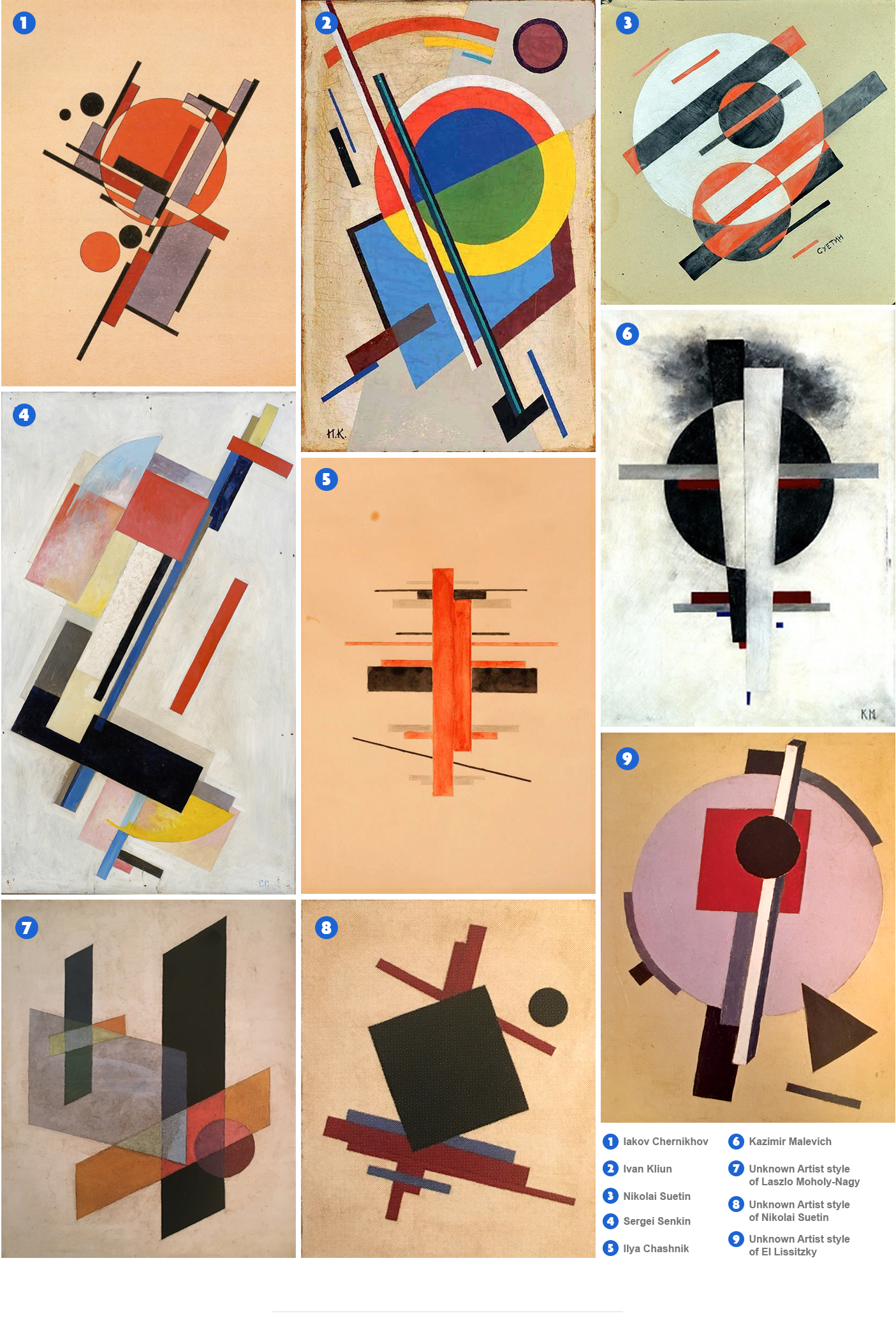
Suprematism, the Russian design movement of the 1920’s, was founded by Kazmir Malevich in response to zaum, or transrational poetry of the day. Many critics describe the Suprematist movement as “highly austere and serious,” but there is a strong element of abstract absurdity that is found as a running theme throughout the genre. The not-so-humble name directly states Malevich’s stance on the movement; it was supreme, and would conquer all other genres of art from past to future.

But what is it actually? The common audience might look at Suprematism, as well as Constructionism, and say “What’s the purpose of this? It’s just a bunch of shapes and lines and blocky text that doesn’t really make any sense.”
This is true, but it does hide a deeper meaning. Although Russian Suprematism may resemble a rudimentary Atari video game, the artists aimed to comment on the real world (AKA the Russian revolution and political environment under Lenin) by “removing the real world entirely and leaving the viewer to contemplate what kind of picture of the world is offered.” (theartstory.org)
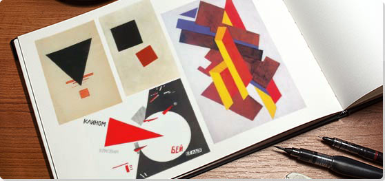
The three visual characteristics of the Suprematist movement were red, white, and black. This was to represent the Nationalists during the Russian revolution (white) and the Bolsheviks, in red. Composition remained open to interpretation. Pieces of the movement can be read virtually any way. Geometric pieces can be seen as floating in space, a birds eye view (pieces that fit more so into this view were later characterized as “Arial Suprematism), or alternatively, from the inside looking out. Energy and tension were also very important components in this movement, and the artists favorite shapes were pure geometric forms. Malevich was in a similar mind to the Grecian philosopher Plato, who believed that geometric shapes were the purest form of beauty.
“Sensitivity is the only thing that matters and it is expressed by absolute forms: the rectangle, the triangle, the circle, the cross.”
Suprematist design was of course the inspiration for Constructivism. To a similar, Atari-sentimenting viewer, it is almost impossible to distinguish the difference between the two. To keep it short and sweet, Constructivists believed that materials commanded the form. Suprematism worked towards losing form completely and moving towards “true abstraction.”
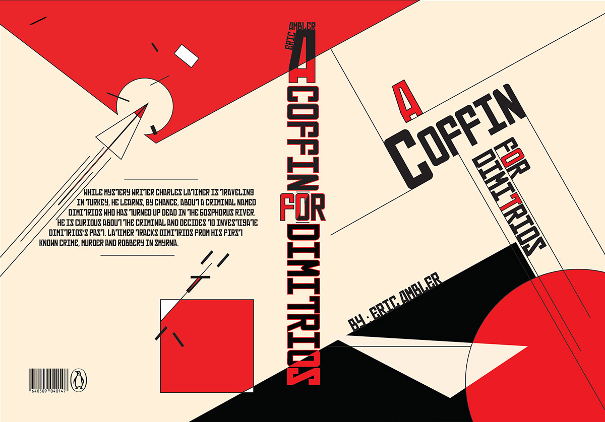
Despite their differences, these two movements have been some of the most influential in history and to the world of graphic design in particular. The simplicity of the suprematist movement combined with it’s somehow maintained abstract message describes perfectly the movement of graphic design in modern day. Constructivism took these main principles and applied them relentlessly to their posters. They took the barren nature of Suprematism and used it to communicate effectivley to a general public that might not understand a complex artistic interpretation of an important message, like those discussed in both movements.
The conditions that this movement was born out of was undeniably shitty, but the inspirational creative wake that it left behind was undeniably great.
Lecture Summary:
This week we focused on the first world war, and everything that came with it. The wars are something that I’ve come across quite often in my education, but I was really happy to look at Russian culture and communication styles, because I feel that in any history course it is always a large group that is skimmed over. The Russian revolution brought a whole different type of art style on to the scene, and unfortunately wasn’t spread to other countries for quite some time. I am such a HUUGE fan of the tri-color schemes and the simple geometric representations, although it’s something that I struggle to execute in my own design work. I’ll definitely have to do some further research, most likely using the website this last picture is from. Interestingly enough, he used those photos and redesigned them in a more 3-D, modern approach, which I find incredible. I’d love to recreate any of the World War propaganda posters with a modern twist, and I actually think it would make a really interesting project within this program.
Resources:
https://www.theartstory.org/images20/new_design/collage/suprematism.jpg?2
https://www.theartstory.org/images20/new_design/collage/suprematism.jpg?2
https://medium.com/@PaulStayt/suprematism-constructivism-a2336332776c
https://mir-s3-cdn-cf.behance.net/project_modules/max_1200/680ea341998071.57bca54faeb63.jpg