Book Cover–Past and Futura (Sorry Judy)

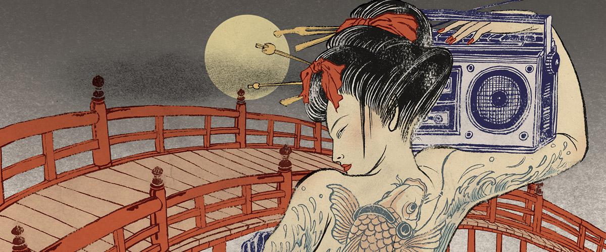
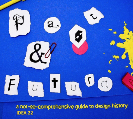
For the final assignment, I was paired with Janelle. We chose to do separate designs that would still have the potential to work together given the chance. Janelle chose to do a fully illustrated backside, and I chose to do a sort of in-progress shot for the front side, using tactical materials that we are all so familiar with during our first semester. I chose to do this design for a multitude of reasons; I wanted to represent the class and our first semester here at IDEA, which has been full of traditional mediums and a multitude of paint splatters and construction paper scraps. I also wanted to honour the class’s humour, as we all have taken on a similar outlook as we’ve grown together through the months (yes, puns have become a common factor within the group, whether we like it or not). 

I wanted to depict a project mid-progress, including how messy and hap-hazard it was. I found myself searching for design solutions in this project in this exact way, and thought it would be nothing but appropriate to embody my ideas thus far. I chose the primary colour scheme to keep the eye pleased and at ease, while keeping each object emphasized and separate while all still remaining cohesive. The title is of course a reference to the communications history course, and the heavy focus on fonts and type.

Overall, although unplanned, I think mine and Janelles sides work nicely together. It’s as if the front cover is the class starting the project, and Janelles illustration on the back is the finished product. If I could change anything, I would suggest the two sides be more similar in their colour palettes. Janelle and I mostly depended on one another for critique and ideation, something that we both expressed that we struggled with. I was glad to work with her regardless of the more independent approach we used. The front and back covers we designed could be selected on their own and be a nice compliment to any other student’s work they could be paired with. 

Overall, I would grade myself as an 8/10. I like my concept, but again it could have been more integrated with Janelles. However, the image did turn out exactly how I envisioned, and I am very happy with the concept and work that I put into it. Breaking out into a non-illustrative design pushed my comfort zone a little, and I am proud of myself for that.

Yuko Shimizu and her modern Ukioy-e

Yuko Shimizu is an award winning, extremely prolific illustrator based out of New York. Yuko brings an extremely unique presence to the illustration community, combining modern aspects while still honouring her Japanese heritage by paying tribute to Ukioy-e.

Shimizu executes a style that can be defined as the epitome of a modern tribute. Often depicting modern women in a traditional style, Shimizu has featured all the way from samurais, to mid 20th century swimmers, to female electric guitar playing rockstars. She consistently is able to redefine illustration in her own way, raising her own bar with each piece while simultaneoulsy besting it each time.

Shimizu teaches her own illustration courses and has been the keynote speaker at countless conferences and events. Her popularity, unlike many other modern illustrators, was built before her presence on social media. Yuko has recently worked for Tourism Japan, Spectrum 25, the Grateful Dead, and many other iconic companies.

Her most recent popular work, a record jacket for the grateful dead, features two interpretations of their classic Singles collection.

One of the largest reasons Yuko maintains relevancy online is not only her popular projects, but because of her unique solutions, flawless execution, and most importantly, the presence of her process on her profile. Yuko ensures that each finished product is accompanied by thumbnails, progress shots, redos, and finally a delivered illustration.

Image result for yuko shimizu instagram progress shots

In conclusion, Yuko Shimizu is a revolutionary illustrator who manages to progress the art form while adding a modern twist. She (and yes, she, a woman who has managed to build a huge reputation in a male dominated sphere) continues to innovate on traditional Japanese art while appealing to a mainstream international audience.


https://www.google.ca/url?sa=i&source=images&cd=&cad=rja&uact=8&ved=2ahUKEwjgl_ecq5bfAhWUMX0KHRLeA2cQjRx6BAgBEAU&url=https%3A%2F%2Fcreate.adobe.com%2F2015%2F9%2F11%2Fillustrator_yuko_shimizu_.html&psig=AOvVaw2AsGqFthwRZUgXP610Ko_Z&ust=1544568238048261

https://www.google.ca/url?sa=i&source=images&cd=&cad=rja&uact=8&ved=2ahUKEwj84PjLq5bfAhWTHjQIHe8DBigQjRx6BAgBEAU&url=https%3A%2F%2Fcuriator.com%2Fart%2Fyuko-shimizu%2Fbeware-of-the-yokai&psig=AOvVaw2AsGqFthwRZUgXP610Ko_Z&ust=1544568238048261

https://www.google.ca/url?sa=i&source=images&cd=&ved=2ahUKEwjE9uvYq5bfAhWFMX0KHcSeAMUQjRx6BAgBEAU&url=https%3A%2F%2Fwww.designweek.co.uk%2Finspiration%2Fliving-with-yuko-shimizu-book-by-road-publishing%2F&psig=AOvVaw2AsGqFthwRZUgXP610Ko_Z&ust=1544568238048261

https://www.google.ca/url?sa=i&source=images&cd=&ved=2ahUKEwjbhdDiq5bfAhXlGTQIHRshB6AQjRx6BAgBEAU&url=https%3A%2F%2Fen.wikipedia.org%2Fwiki%2FYuko_Shimizu_(illustrator)&psig=AOvVaw2AsGqFthwRZUgXP610Ko_Z&ust=1544568238048261

Survey 9 Spread Rationale: Breuer’s Bauhaus


For my final spread I was given an artifact to create from the era of the Bauhaus. I chose to represent furniture created by Marcel Breuer, the teacher who led the cabinetry department and provided the bauhaus with the furniture that is so often sought after, even today. I constructed the chair out of a cut up sock, acrylic paint, paper clips, and lots and lots of gorilla glue. I wanted to represent the chair shown below. Breuer’s inspiration to utilize bicycle wheel designs in his furniture as well as the multi layered designs of his magazine racks caught my attention, and I wanted to focus on them in this spread. I wanted to include the organic red shapes to draw on the geometric branding of the bauhaus, as well as to “dirty the frame,” and pay homage to the primary colour palette the designers of the Bauhaus so often used.

Looking back, I would give myself an 8/10, as the photos required a large amount of colour correcting, and I had to use a small amount of photoshop to insert the title and my name in the lower corner. Additionally,  I think the magazine rack could have been executed in a more interesting way, and I could have included something on top of it to entertain the eye more.