Mentored Portfolio Project: Phase 2 Imagine/Ideate/Explore

This phase took longer than expected! I found that although our initial ideation on our beer brand had potential, since I was using a brief that I created in the first half of second year I was stunted by my original perception/plans for the project. After (multiple rounds of) artboards and tone revision meetings with Patrick, we landed on a brand look/feel that accomplished our original goals and tone revisions, but did so in a much more empathetic and genuine way.

I learned so much in these last couple of weeks nailing down the brand. First, it’s hard to play in the space of “making fun of a group because it’s true and a safe place to play in,” within the beer category. The original brief played off of the snobbish closed-door culture of craft beer drinkers. Turns out, if you’re making fun of these people that makes you exactly the same as them. This is where I realized that although the potential for the idea was there, it resembled my 2nd year, less refined design style than one I wanted to convey now as an almost fourth year student. This stage of problem saving also made me realize what I wanted my voice to be as a designer.

Secondly, there was a lot of knowledge brought to the table about printing and realistic beer business practices. Everything from printing limitations on shrink-wrapped cans to 2-inch clearance areas on alcohol shelving, there’s always so much to learn in specific product categories, which was great and helped narrow down the decision-making process as we continued with the brand revisions.

The most challenging aspect certainly was the conceptual 180 I pulled at the last minute. The old brand just wasn’t sitting right, and I felt like the art direction I had originally brought to the table was stunting my ideation process instead of aiding it, not to mention that the project felt stuck in the style of 2nd year Talia. Although I was confident in the decision, the most challenging part was getting the confidence to present it in that manner. However, this was also the most rewarding, because in order to justify my changes I ended up doing tons of target market research, student peer reviews, and conceptual work to make the brand stronger. At the end of it all, I was able to present the change in a way that made it obvious that it was the correct choice.

Out of 10, I think I’d give myself a 9? Usually, I wouldn’t, but because I did so much work to justify my changes and be 100% sure I was following through with the right concepts, I’m able to say that I fully explored multiple avenues and pushed my ideas as far as possible with the time we had.

Sketches for composition and logo ideation including discarded brand directions:

Final Moodboards (Previous brand iterations not included, but are available if you’d like to see them)

Mentorship Phase 1 Gather and Define

I really enjoyed phase one. I found that the most rewarding part was discovering what the most effective way to communicate with my mentors was and how we can fit each other into our work schedules while maintaining steady communication. Additionally, we decided to revisit an old project of mine, and watching the product get re-vamped and take an improved form in comparison to my original second-year execution is extremely fulfilling (I’ve come so far!).

I came out of the research phase with several insights into the beer industry and what to take into consideration while developing a new brand. Including, but not limited to;

  • More sessional, lower alcohol content beers are becoming more and more popular 
  • Craft beers have oversaturated the market. 
  • People are growing tired of “specialty” beers, as there is so much competition that either 
    • Everyone ends up doing the same thing
    • Everyone tries to out-do each other in a tiring way 
  • “People-centered beer” brands are going to shoot upwards
    • “In 2021, as we recover from the impact of COVID-19, integrate the lessons that the “big pivot” of 2020 taught us, and continue to grapple with polarization and civil unrest, I expect to see industry leaders continue to make groundbreaking strides in welcoming, empowering, and listening to the people that make beer possible.”
  • Whiskey is slowly replacing the craft beer in the alcohol lovers bar as a collection item 
  • With less access to liquor stores and restaurants this year, variety sample packs are growing more and more common 
    • “…breweries think inside the box, leveraging delivery to diversify their products by offering special holiday gift boxes, mixed packs, new subscription clubs, and more. In 2021, it won’t just be delivery itself that sets the trend. But rather what breweries can put inside the box will be the hallmark of the year.”
  • Restaurants are more likely to stock canned brands now, as draught beer access relies entirely on indoor, in-person seatings. With delivery and out door seating being a huge priority at the moment, cans and bottles are the most realistic option.
  • 12-pack boxes are getting more and more common:
    • “The pandemic brought about a widespread consumer shift to buying in bulk—in toilet paper and beer alike. Drinkers increasingly bought 12-packs of beer, returning to trusted lagers and IPAs. People don’t buy 12-packs of new beers for trial and experimentation, says Bandy of Indeed. “If people buy a 12-pack, it’s something they like at all times of day and occasions.””
  • Digital integration to brand storytelling is on the rise with COVID and entirely virtual interaction. Animated packaging, scannable cans, etc allow a new touchpoint with isolated customers
  • After quarantine, more non-alcoholic beverages are needed and wanted from customers.

Additionally, Emily and Claire are experts in the beer field, and were able to provide me with more intimate knowledge of the industry and it’s customers. I learned that although stereotypes can be fun to play up, you have to be exceedingly smart with the education so they don’t fall into what I call “Family Guy Territory,” where the brand unintentionally resonates with the group they’re trying to make fun of.

My biggest challenge was resisting my old brief. I found that because I’d had so much distance from the original project, I was resigned to the brand I had created a year ago and was complacent when it came to my original revisions of it. I was attached to something that, although it felt like a good idea to second year Tal, wasn’t as strong anymore and needed to be changed.

Although it seems pre-emptive to give myself on-base research and brief writing while it’s still subject to change (currently awaiting a tone change approval within an approved brief), I’d give myself a 9/10. I came back with some solid research, delved into the industry and its current trends, and after initial feedback, was prepared to completely re-create a brand I thought was settled.

Final Logo Reflection

I chose my first and final logo because it ticked all my boxes. It feels fun and young, showing that I’m new potential in the industry by featuring my first name and even more casual nickname. I also think that this allows me to remain soft and approachable; I’ll never be worried about taking myself too seriously with this logo. It makes me feel capable but not disingenuously up-tight.

Additionally, the story behind my work is represented by the asterisk, indicating that there’s always something more to what I create. Design with roots in its community and tangible change is really important to me, and I am satisfied with how that comes across in this logo.

Technically speaking, I feel like I broke through a barrier while creating this logo, and that (on a personal level) it shows how far I’ve come in my ability to render out sketches and create custom type.

Compared to the rest of my work, this logo has just the right amount of my style infused into it and just enough of the opposite that, when placed on a finished piece, compliments the work without blending in completely.

On this project overall, I would give myself a high B to a low A. Reflecting on my personal ad, it detracts from the brand I was able to develop, and sticks out too much. That particular ad, although full of things and ideas I like, seems naive when all put together. Additionally, I veered away from my moldboards and my original intentions for my logo. Since I’m working for myself it’s fine, but were I working for a client there would be communication issues as to why the finished product didn’t resemble the moodboards.

Logo Concepts

For my final three blog posts, I wanted to choose a variety of executions that showed three different sides of myself. The first one (refer above) makes me feel capable, and decisive in my work. It’s bold and confident, but still unexpected with the serrated edge and the asterisk. Additionally, the tie-in to the name “Tal” makes me feel like I could enter a workplace feeling confident and professional with fresh ideas, but still have a friendly warmth.

As for the second, I wanted to play with the long-running joke of people mispronouncing my name while feeling fun and youthful. In the field, being young and fresh out of university can sometimes be a disadvantage, but this logo feels fresh and youthful in an abundantly lively way. This logo would make me feel like I brought something new and exciting to a team that needed a young face in the room.

Lastly, the bird logo is completely sentimental and a reflection of my personal accomplishments and interests. Drawn from my love of ornithology and my roots in fine art, this logo would make me feel like I could enter a tight-knit, “family” driven agency and have a meaningful conversation with a new connection if they asked about it.

Creating these logos gave me much more of a grasp on my personal brand. Looking back on my ad from our first week, I’m happy to say I’ve learned how to describe myself with only what’s necessary instead of throwing everything about me into one image.

Personal Ad Takeaways

This process, as always, reminded me that ideas are fluid and can change form as you build them out. Additionally, I learned a lot about where my skillsets restrict me with a shorter project, and how to reshape my ambitions to still communicate my goal with less time available.

This process was wonderful in terms of self-reflection and learning to distill myself. Before this project (and course in general) if you asked me to give you a quick pitch about myself I would’ve turned to someone else and asked them to do it for me, purely out of not knowing what things about me people saw as the most forthcoming. Creating “me” laid out in a poster really helped me to articulate what features of myself I feel are most prominent and do me the most justice.

My target audience for the personal ad was leaders of small, passionate agencies and freelance clients looking to do creatively fulfilling collaborations.

For my mood boards, I’d give myself an 8. I feel like I could have found more accurate material for where I’d like to work (but maybe the exact place in my mind doesn’t exist yet and I need to make it when I open an agency when I’m 40…who knows). My design execution/illustration page was a bit of a struggle in the design execution department. My brief centres around being completely unique and not predictable, which limited what I drew from considerably. I wanted to draw more abstract inspiration and come to my own conclusions in the space between those reference points.

SP1-NKH Character Design

SP1-NKH is a curious, voiceless, teenage robot who collects garbage for a living when he stumbles upon a priceless treasure that makes him a wanted man – robot or otherwise, he has to stay on the run to keep his family safe.

How did your character emerge from the blot exercises?

While creating the blot exercises, I realized I had a tendency to stick with one of two characters. Either they were long, gangly, and awkward, or bubbly and friendly, if not somewhat pompous. I was drawn to this character during the blots because of the way a head emerged suddenly from the bottom.

The inkblots used as a base for SP1-KNH. I originally used the bottom left example, but ended up drawing from a similar design two spots over for the end product.

SP1-KNH in his early development. (pronounced Spinch. Yes, like Spinach. He doesn’t mind because he…well. He’s a robot. He doesn’t know what spinach is. Kind of embarrassing, if you ask me. Every time he runs into a human gang member chasing him down they call him Spinach. It always takes a second for his system to calculate whether he should be afraid or not because the word just sounds so silly. Is it a mean term? A command perhaps? An invitation for tea? His data bases can’t recall. Better run anyways.)

Spinch in action. Curious, gangly, and hates wielding guns.

SP1-KNH

How does your illustration style support the mood of your character?

For the final execution, I envisioned SP1-KNH in a rough, dystopian world filled with bright lights, exotic neon, tempting alleyways, and alien bugs. Being a robot Spinch fits in enough, but his damp colouring and out-dated parts hashed with scrapes and rust make him stand out just enough to show he doesn’t belong. Since Spinch wouldn’t talk, the expressiveness of his arms and eyes are crucial to communicating with others. His rope-like arms and neck create a teenager-like hunch in his back, with no real choice or disposition to him. The only exception to this is his eyes, lively and versatile, showing that he is still a soul full of life. I wanted him to feel gangly, shy, child-like, but still curious and kind. In his world, Spinch would be compared to a toy left in the lost and found.

Lighting, Tone, and Color

Pt. 1: Included as an isolated image for clarity.

In this isolated image, we can see how beaten up and wiry Spinch is. Although he sits on a flat coloured background, we see exactly what a juxtaposition he would be against a lively environment. We easily associate someone like Spinch with back allies, dirty floors, and scrapyards.

Pt. 2 Photo-collage and illustrated composition.

Here in his final illustration, we see Spinch examining a new friend by flashlight while he is hunted down by city gang members. He is illuminated by pure light, making him seem innocent and curious while the threat lurks behind him (highlighted by red neon, to show they are menacing). In the background, we see an innocent shop-owner (highlighted by the green neon lights to show his innocence) pointing them in the direction of the boy with the glowing treasure in his pocket. The scene is very dark, as Spinch would do the majority of his garbage-rummaging by night alongside alien raccoons to avoid suspicion.

David Small’s “Stitches” and its Impact on the Perceived Emotional Intelligence of Modern Youth

David Small’s “Stitches” is a groundbreaking graphic novel that directly confronts the effects of childhood trauma. His novel accurately depicts the events of his childhood and how they alter his adult life. Small paints a picture of his home that is silently torn apart by his parents, his own life being disregarded by the people who are supposed to love him most, and most importantly, himself as a young boy as he becomes acutely aware of it all. 

Small uses static, rigid panels to communicate a feeling of stiffness and rigidity. This combined with his moment-moment panel transitions helps to paint an image of a quietly threatening environment. Small’s parents’ desire to maintain normalcy and an unwavering family dynamic can be represented by the seemingly straight but wobby panels that encase each illustration. This subtle technique helps create instability with the reader. Additionally, Small almost entirely assembles his story via moment-moment transitions, a technique which makes his world seem (no pun intended, I promise) small. The childlike perspective helps drive this fact, as David would only perceive what was directly in front of him. Due to these moment to moment transitions we feel as though we are David, turning his head from one side of the room to another to watch the older people talk. When it is not moment to moment, Small separates the viewer from the narrative and into his imagination, or into an external scene to encapsulate an aspect from the previous scene in an abstract idea. However while inside the panels, we often look at Small over the shoulder of another character, emphasising his insignificance as a decision maker in the narrative. As the story descends and we experience moments of height or tension, Small ditches the frame in favor of a full bleed to let the scene consume the reader. However these “consuming” scenes are often pulled far back to help the quiet feeling that persists throughout the story. 

Small excellently distills his characters down by only using defining dialogue and cutting out any fat. Our first experience of Small’s Father is all that he did to David when he was younger to help cure his sickness, all that he does to appease David’s mother, but has no defining dialogue attached to him. That is of course, until nearly the end of the book, where he breaks his complacent silence and tells David about his cancer. It truly is as if David’s father doesn’t realize the consequence of any of his actions until he is faced with losing his son. And even then, in the presentation of the information, it seems as though it is only to relieve himself of guilt. On the other hand David’s Mother  is introduced through dialogue immediately. By doing this, Small immediately establishes her as the dominant figure in the household. We meet her, in her untiring anger, “Hnf-ing” around the kitchen and making noise to express her displeasure. It is important to note that this develops an important characteristic of his mother from the get-go; she is never direct in her speaking. She will always express her emotions and thoughts in an ambiguous manner. Lastly, we meet David as an emotionally intelligent, ultra perceptive young boy. He picks up on nuances and minute details, even if he does not understand the long term significance of them all. His quiet and private narrative implies he understands more than his parents think. When David does speak at the beginning of the book, it is weak in tone and in conviction. He starts to speak out more as he ages, getting his most brave right before his surgery. Brave for David, that is, as he is still relatively quiet and seemingly complacent. Once gaining his voice back we see David speak more often and with more conviction. It’s as if after being literally silenced (following years of figurative duct-tape having been placed over his mouth by his parents) David feels a new drive to control and define his own life. He starts snapping back, speaking with attitude, yelling at his parents even. His switch in dialogue symbolizes his switch in perspective and awareness of the injustices that happened to him.

The most outstanding use of character development through imagery in Stitches is the author’s illustration—or rather lack thereof—of his parents’ eyes. Small starts the novel off painting his parents as monsters, unemotional people who lack compassion and responsibility for their actions. He withholds from drawing their most expressive part, their eyes, instead illustrating only their glasses. This technique persists until we see them in their weakest or most intense moments. For example, the first time we see the mother’s eyes is when she experiences the same fear that she inflicts upon David while dealing with her deranged mother. As the novel progresses, we start to see the parents eyes more and more as David (and therefore the reader) starts to understand their flaws and view them as more and more human. 

The reader learns a lot from visual cues in Stitches, so Small’s use of text is naturally minimal. He spaces out dialogue over panels to make his relationships seem stale and awkward. There’s an emphasis in spaces between dialogue, and only one person gets to speak per panel. This is broken, of course, when there is an argument or someone interrupts another. The majority of the text in the novel is self narrative—showing that Small is telling his story and his story only, and that he is most comfortable with himself as his own closest companion. 

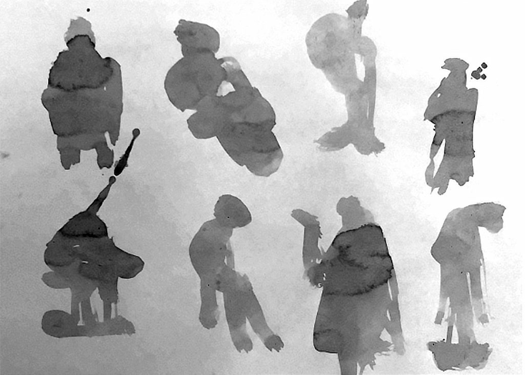
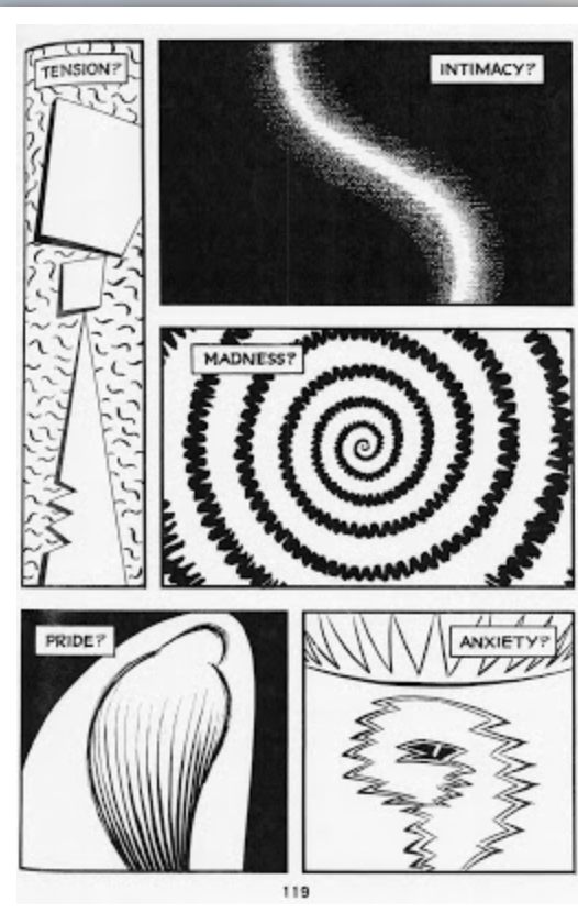
Visually, this novel looks like a storm. Most often it is overcast with a slight drizzle (sometimes literally), in its sparse monochromatic black ink washes.. His color treatment is dark but remains looming, with merely the potential to be loud and booming. It’s the great restraint within his treatment that allows Small to pale-down and ground a story that could be ultra-dramatic. This ink wash technique is paired with a line style that is extremely expressive. It is loose and undefined in places and often extremely simple with a very skillfully placed touch of messiness. When asked by Smith Magazine about his technique, he states he likes to stick to the basics. “I drew with a brush and ink, a fine-point nib pen (the kind you dip, gets your hands dirty and splatters you with ink). Except for the lettering—which was done from a font of my own printing, and which lends a nice element of regularity to my loopy line work,” Small comments. He goes on to provide what is possibly the best review of his graphic novel in the phrase “As you see, all very real, tangible, hands-on stuff.” If anything, “real” and “tangible” are in fact the two words that could sum up Stitches. This line style not only lends itself to a child narrator, but also to an unstable environment that is created completely from memory. Where his line style stays consistent, his font usage differs throughout the book depending on intensity, importance, speaker, and volume. For example, when Small’s internal narrative is the focus, the handwritten font is small, thin, and weak, exemplifying Small’s lack of influence and literally weak character within the narrative. When someone is yelling or there are loud noises the font switches to a heavy brush stroke that has a much more bold and abrasive presence. His speech bubbles are often regulated to thin lined semi-stable boxes and do not vary often, which allows a sense of security in the recalling of information. Had Small varied in his speech bubbles, it may have discredited the information, making it seem as a more feeble memory than a confident declaration and retelling. 

When we look at the presence of metaphor and symbolism in Stitches the usage is sparse and vague. By far the most overt metaphor is the somewhat out of place visual representation of his therapist as the White Rabbit from Alice in Wonderland. Small’s choice to swap these two characters represents the therapist’s ability to guide Small into his subconscious and enable him to re-interpret his real world surroundings. When asked on the seemingly bizarre choice, Small confidently replies;

 “The White Rabbit, in Alice, is the usher into a subconscious world, which Alice sees as nonsense. (She is like a patient rejecting the “curious” evidence of her dreams, which tell her that all is not right in her life.) So, the Rabbit seemed a perfect stand-in for the analyst, who ushers us into the world of the subconscious, where the truth is told at last.”

Additionally, there’s the disturbing fetus that chases David through the hospital halls. It is unclear whether this represents his experiences in hospitals as a young child taking a toll on his body that will haunt him for the rest of his life (the x-rays, the enimas, etc) or his mother’s perspective that David is a nuisance that has ruined her life, endlessly pestering and inconveniencing her since she became pregnant, or something completely different. Regardless of the transparency of the symbol or metaphor, we can assume that these alternate aspects of reality is David—both as a child and as an adult recounting the events while writing—processing his trauma by associating them with extremely unrealistic situations. In an interview with journalist Alex Dueben, Small states “There should be nothing superfluous in the images that take away from the main themes of the story…The reader is the dreamer of a book or, rather, is put in that position, and deserves clarity or, at least, the means to achieve it. And if a dream is going to be included, it should relate somehow to the waking story being told, it should expand that story in a fanciful way, not confuse it for the sake of weirdness.” Although there are certainly parts of the book that are “weird,” they serve no other purpose than to let us into the mind of young David. We may not understand exactly the significance of a drawing of a pit underneath his house with all of his cartoon friends living underneath it, but we do understand the feeling Small wants to communicate.   

Through all of these visual and literary devices, Small curates an ultra-realistic experience filled with universal truths. Although all aspects of the novel are not “real” persay, every reader is able to identify with the events and characters in stitches—even if our mother wasn’t exactly an eyeless monster and our life-saving therapist isn’t the exact replica of a much loved Disney character. More importantly Small’s development of his own young self as a character has created a unique phenomenon within readers and in the literary community. By articulating his memories and trauma, Small has fostered the image in the mind of the reader of an emotionally intelligent and socially aware young person. Often the reader perceives children in literature as flippant and naive, assuming actions will have no long-term effects on them due to their lack of permanence due to their youth. Too often we see the common trope of the abused child being a simple mention in a story. We assume that once a child is removed from trauma, the trauma stops existing.

Small changes this. By carrying his story all the way to adulthood, even to the grieve-less death of his mother, we understand the long term effects of life in his childhood home and how it continues to shape him deep into his adulthood. His writing shapes a new type of young character. One who sees the world through knowing eyes, and although they might not be able to correctly understand significance, they can still feel and process and repress the same as a grown adult.  Most importantly, David paints his own character as unremarkable. He is forgettable, even. By doing this, the reader can assume that although his experiences as a young man are completely unique, David is not. Through the book we begin to understand that David is the ultimate example of a teenager with a complicated home life, and that everyone can fit into his character’s “mold” to some degree. Part of every teen is able to be defined, albeit in small parts, by David Small’s character. 

In conclusion, Small has created a novel that perfectly describes childhood trauma. HIs choice to pair storm-like ink washes accompanied by loose linework creates an unstable and ominous quality to the story. His masterful use of text and limited dialogue to distill characters down to their simplest form allows the reader to perceive them as a child would. Additionally, his short paced moment to moment transitions make us feel hyper connected to the character, acting as a pseudo first person perspective. Lastly, due to his raw, almost visceral recounting of his memories we are able to recognize youth both in and out of literature as emotionally intelligent and aware characters.

Sources

“‘A Conversation with Illustrator David Small,” Julia Tindell.” World Literature Today, 27 Feb. 2015, www.worldliteraturetoday.org/2012/march/conversation-illustrator-david-small-julia-tindell.

Abbott, Alysia, and Alysia Abbott. “From Tales of Wonder to Tales of Horror: David Small Dissects Stitches.” Nieman Storyboard, 14 May 2010, niemanstoryboard.org/stories/from-tales-of-wonder-to-tales-of-horror-david-small-dissects-stitches/.

“David Small: Penguin Random House.” PenguinRandomhouse.com, www.penguinrandomhouse.com/authors/28746/david-small.

“Home After Dark by David Small.” Goodreads, Goodreads, 3 Sept. 2019, www.goodreads.com/book/show/43726550-home-after-dark.

“‘I Don’t Mind Scaring Myself’: An Interview with David Small.” “I Don’t Mind Scaring Myself”: An Interview with David Small |, www.tcj.com/i-dont-mind-scaring-myself-an-interview-with-david-small/.

“Interview: David Small, Author of Stitches: Memoirville.” Memoirville RSS, www.smithmag.net/memoirville/2009/10/06/interview-david-small-author-of-stitches/.

Small, David. “Big Think Interview With David Small.” Big Think, Big Think, 8 Feb. 2019, bigthink.com/videos/big-think-interview-with-david-small.

“Stitches (Book).” Wikipedia, Wikimedia Foundation, 11 Dec. 2019, en.wikipedia.org/wiki/Stitches_(book).

Weldon, Glen. “’Stitches’ Draws On An Artist’s Painful Childhood.” NPR, NPR, 15 Sept. 2009, www.npr.org/templates/story/story.php?storyId=112842179.

Comic Glossary

Comic:

A set or series of images, with or without text or written narrative, that outline a story. There is no set format to comics, all are differing and unique in their own form.

“Juxtaposed pictorial and other images in deliberate sequence, intended to convey information and/or to produce an aesthetic response in the viewer.”

The (comic) book was better: What to read after you've seen ...

Cartoon:

“Amplification though simplification.”

An art form that exaggerates and simplifies a drawing down to its most valuable characteristics. Comics can be both-hyper specific (ie. a character simplified down to beady eyes, a large hook nose, birth mark over their mouth) and extremely general (ie. Calvin and Hobbs) to help the viewer connect in varying degrees to the characters.

Gutter:

“That space between the panels.”

The space between drawings that communicates a shift, and works alongside closure to allow the viewer an understanding of a change in the story. See Panel to Panel Transitions to see what changes can occur.

Scott McCloud - The Gutter | Comics, Mccloud, Storyboard

Closure:

“Closure is an agent of change/time/motion in the medium of comics and the viewer is a willing collaborator.”

“Mentally completing that which is incomplete based on past experience.”

Most comics will vary in how scenes change from one to another. Closure is what happens when the reader bridges the gap using information or observed facts from the story to, in their mind, complete what happens in between frames. Essentially, the viewer processing is acting the ampersand between cause & effect.

Ie. An action. In frame one, we see Fred winding up for a punch. In frame two, we see his victim dazed on the floor with stars around his head. Although we didn’t see Fred hitting the other man, we know it happened due to the common trope of dizziness.

McCloud's Concept of Closure

Panel-to-Panel Transitions

How aspects of the comic change in between panels. This can be a change in time, perspective, location, etc. See below for common panel transitions.

Moment-to-Moment: A heartbeat between panels, with very little time passing in the change.

Action-to-Action: Panels communicate large or small parts of actions in a scene.

  • Ie. Frame one: Fred winding up for a punch. Frame two: Fred’s fist flying through the air. Frame three: Fred’s fist making contact with somebody’s face.

Subject-to-Subject: The change is communicated by switching subjects but staying on the same scene or idea. Think action, reaction.

Scene-to-Scene: Change involves larger changes in time and location/space.

Aspect-to-Aspect: Focuses on describing a place, idea, or mood by switching subjects/settings/views. For example, we can describe New York in different panels showing buisiness men, small apartments, and homeless men in front of a brick wall. We’re still focusing on the same thing, New York as a whole, but visually describing different aspects of it.

Non-Sequitur: “No logical relationship between panels.”

Bleed:

“When a panel runs off a page.”

The frame of a panel is released and set free onto the page. It can travel off the page completely, or fill up parts of it. Especially great for dramatic impact.

This One Summer | Groundwood

Motion Lines:

“Zip-ribbons. Motion lines represent objects moving through space.”

Artistically licensed lines that communicate motion and change.

Excuse Me" - Silent Manga in Motion - YouTube

Synaesthetics:

“Art that might somehow unite the senses and in doing so, unite the different artforms which appealed to those different series.”

Artistically licensed stylization that describes an abstract feeling or emotion by visually manipulating one of the 5 senses.

Representing abstract ideas or feelings in a

Comics use “living lines” that can represent other senses or feelings without having to actually use that sense.

The Benefit of Writing Vs Typing While Note Taking

Many students debate over the benefit of taking notes digitally or traditionally. In favor of typing, it is extremely convenient and provides immediate results. However, working by hand often offers different benefits and utilizes different parts of the brain that offer higher memory retention and cognition. The written word at its core serves as a symbol for an object, and carefully handcrafting a picture of an object will prove more effective for memory retention than pressing buttons to create the same symbol. There is a dissonance when typing on a computer, as the student is only half engaged with the act of note taking and the absorption of information. Lastly, writing by hand requires a significant amount of editing, requiring the student to synthesise the information instead of hoarding it as one would with a laptop. This essay will be based on a 2012 paper from Pam Mueller and Daniel Oppenheimer titled “The Pen Is Mightier Than the Keyboard: Advantages of Longhand Over Laptop Note Taking,” in which they discuss the brain’s activity when engaging with both methods.

To look at it briefly, the science of handwriting compared to typing is simple. Writing can be simplified to drawing small pictures of your subject. Although we are not directly drawing the object we are trying to remember, the word serves as an interchangeable symbol. For example, the written word “dog” symbolizes the actual animal the same way a photograph or simple drawing would. They are all equal when concerning memory retention. When you think about it, of course hand crafting a visual representation of an object is going to ingrain the object in your memory more than pressing three buttons would. After conducting three studies testing students’ general understanding of content with half of the students taking notes by hand, Mueller and Oppenheimer state, “those who wrote out their notes by hand had a stronger conceptual understanding and were more successful in applying and integrating the material than those who took notes with their laptops.” This is certainly due to the aforementioned use of the written word as a symbol.

One might assume that because writing is a more strenuous activity that requires more mental processing, the same parts of the brain are being used for both forms of note taking. Simply put, writing requires more brain activity as opposed to a different type of activity. Handwriting and typing utilize the same three parts of the brain:  the left supramarginal gyrus, the left superior parietal lobule, and the left premotor cortex. This means that the brain is utilizing both processing and fine motor skills for each activity respectively, but writing by hand activates more sections of the temporal lobe.The temporal lobe and hippocampus are responsible for episodic memory, allowing you to store and manage information. This could be a factoid you learned in class or something as simple as the taste of a coffee you enjoyed with a friend last week. The important part is that it facilitates the retention of external information. Additionally, writing involving the complex movement of a pen in your hand requires more attention than typing. As Meuller and Oppeinheimer state in their essay, writing by hand is a more intricate and time consuming activity, thus requiring more editing down of information from ear to page. While writing notes one cannot reproduce a lecture word for word by hand. A laptop provides a much more immediate result and requires less editing, but also requires less analyzing of information. Students become familiar with the minimal movement and disengagement from typing due to high typing speed, autocorrect, and ability to immediately identify errors. As a result, typing note takers passively engage with both the lecture and note-taking, and in turn retain minimal information at the end because they are only half  invested in both activities. It’s a passive physical process typing on a computer, whereas writing by hand requires cognitive awareness and information editing. 

With handwriting, you’re synthesising information and evaluating what content is the most important, because you have less time to record. This way of thinking is purely analytical, taking only the information that is crucial. With laptop writing, the method of note taking is more verbatim, and the net of what is regurgitated into the notes is much more widespread. This can be summed up by a review of Mueller and Oppenheimer’s paper published by Scientific American Journal in 2014, stating;

“Mueller and Oppenheimer postulate that taking notes by hand requires different types of cognitive processing than taking notes on a laptop, and these different processes have consequences for learning.  Writing by hand is slower and more cumbersome than typing, and students cannot possibly write down every word in a lecture.  Instead, they listen, digest, and summarize so that they can succinctly capture the essence of the information.  Thus, taking notes by hand forces the brain to engage in some heavy “mental lifting,” and these efforts foster comprehension and retention.” 

We can think of writing by hand as more of a survival method, taking only the essentials for what we need and using them to our advantage. Typing is more of a hoarding method, grabbing everything close to you regardless of its use. 

From a personal angle, I prefer taking notes by hand when it is more historical or process based information. However, in classes that have heavy demonstrative lectures (like our tech lab classes, for example) I find that I have to take notes on a laptop to get each step down so I’m able to effectively work within a system like photoshop. 

In conclusion, writing by hand offers many different benefits to that of typing. Although typing satisfies an immediate result and writing is a slower form of note taking, writing serves as a symbol of a word that encourages deeper memory retention. The slower form of writing requires more analytical processing and extracts only the essential information while typing resembles more of a hoarding mindset, allowing less room for absorption and retention. 

A Learning Secret: Don’t Take Notes with a Laptop

Mueller, Pam A., and Daniel M. Oppenheimer. “The Pen Is Mightier Than the Keyboard.” Psychological Science, vol. 25, no. 6, 2014, pp. 1159–1168., doi:10.1177/0956797614524581.

David Small Research Essay

Resource material and interviews

https://en.wikipedia.org/wiki/Stitches_(book)

https://en.wikipedia.org/wiki/David_Small

http://www.davidsmallbooks.com

https://www.penguinrandomhouse.com/authors/28746/david-small

https://www.goodreads.com/book/show/43726550-home-after-dark

http://www.davidsmallbooks.com/homeafterdark

https://www.worldliteraturetoday.org/2012/march/conversation-illustrator-david-small-julia-tindell

http://www.smithmag.net/memoirville/2009/10/06/interview-david-small-author-of-stitches/

https://bigthink.com/videos/big-think-interview-with-david-small

https://www.npr.org/templates/story/story.php?storyId=112842179

Points to Cover In Essay:

Small contributing to the increase in youth recognition as emotionally intelligent members of society.

The therapeutic value of looking at your past from a third person perspective

Depersonalization and dissociation

Personifying monsters; how telling someone else’s story helps us relate to bad people, and the value of sympathizing with antagonists