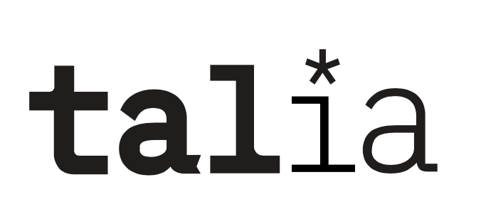
I chose my first and final logo because it ticked all my boxes. It feels fun and young, showing that I’m new potential in the industry by featuring my first name and even more casual nickname. I also think that this allows me to remain soft and approachable; I’ll never be worried about taking myself too seriously with this logo. It makes me feel capable but not disingenuously up-tight.
Additionally, the story behind my work is represented by the asterisk, indicating that there’s always something more to what I create. Design with roots in its community and tangible change is really important to me, and I am satisfied with how that comes across in this logo.
Technically speaking, I feel like I broke through a barrier while creating this logo, and that (on a personal level) it shows how far I’ve come in my ability to render out sketches and create custom type.
Compared to the rest of my work, this logo has just the right amount of my style infused into it and just enough of the opposite that, when placed on a finished piece, compliments the work without blending in completely.
On this project overall, I would give myself a high B to a low A. Reflecting on my personal ad, it detracts from the brand I was able to develop, and sticks out too much. That particular ad, although full of things and ideas I like, seems naive when all put together. Additionally, I veered away from my moldboards and my original intentions for my logo. Since I’m working for myself it’s fine, but were I working for a client there would be communication issues as to why the finished product didn’t resemble the moodboards.