Yuko Shimizu and her modern Ukioy-e

Yuko Shimizu is an award winning, extremely prolific illustrator based out of New York. Yuko brings an extremely unique presence to the illustration community, combining modern aspects while still honouring her Japanese heritage by paying tribute to Ukioy-e.

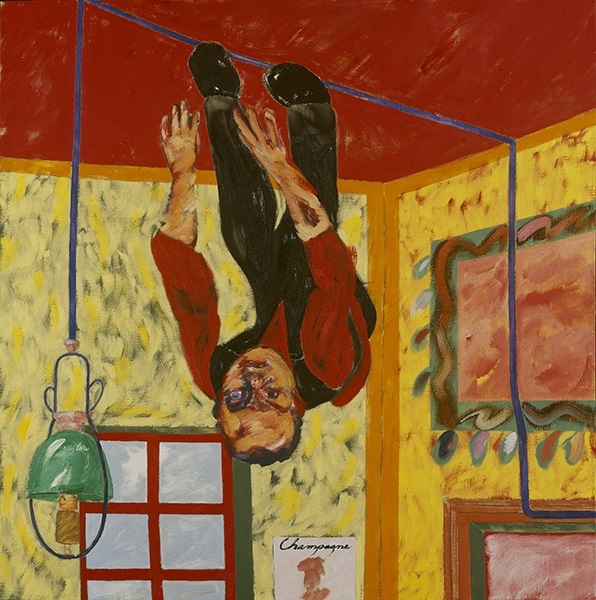
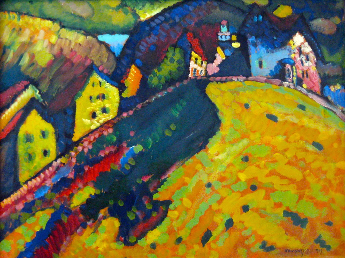
Shimizu executes a style that can be defined as the epitome of a modern tribute. Often depicting modern women in a traditional style, Shimizu has featured all the way from samurais, to mid 20th century swimmers, to female electric guitar playing rockstars. She consistently is able to redefine illustration in her own way, raising her own bar with each piece while simultaneoulsy besting it each time.

Shimizu teaches her own illustration courses and has been the keynote speaker at countless conferences and events. Her popularity, unlike many other modern illustrators, was built before her presence on social media. Yuko has recently worked for Tourism Japan, Spectrum 25, the Grateful Dead, and many other iconic companies.

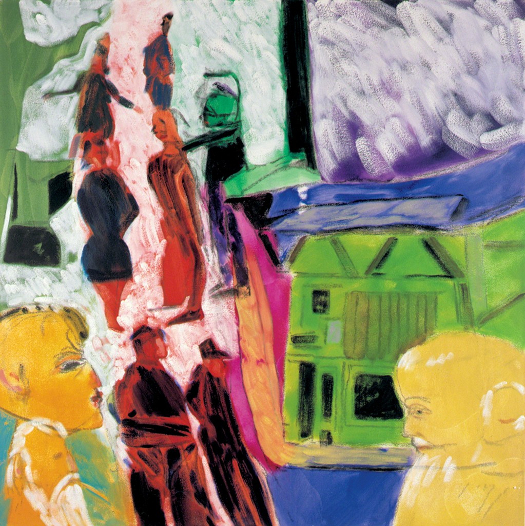
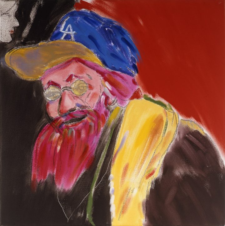
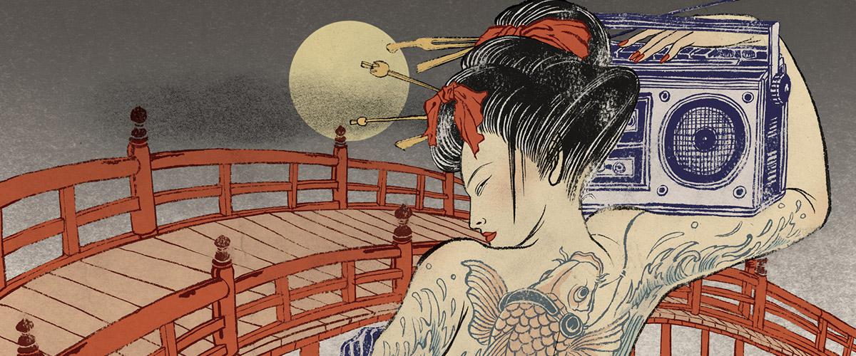
Her most recent popular work, a record jacket for the grateful dead, features two interpretations of their classic Singles collection.

One of the largest reasons Yuko maintains relevancy online is not only her popular projects, but because of her unique solutions, flawless execution, and most importantly, the presence of her process on her profile. Yuko ensures that each finished product is accompanied by thumbnails, progress shots, redos, and finally a delivered illustration.

Image result for yuko shimizu instagram progress shots

In conclusion, Yuko Shimizu is a revolutionary illustrator who manages to progress the art form while adding a modern twist. She (and yes, she, a woman who has managed to build a huge reputation in a male dominated sphere) continues to innovate on traditional Japanese art while appealing to a mainstream international audience.


https://www.google.ca/url?sa=i&source=images&cd=&cad=rja&uact=8&ved=2ahUKEwjgl_ecq5bfAhWUMX0KHRLeA2cQjRx6BAgBEAU&url=https%3A%2F%2Fcreate.adobe.com%2F2015%2F9%2F11%2Fillustrator_yuko_shimizu_.html&psig=AOvVaw2AsGqFthwRZUgXP610Ko_Z&ust=1544568238048261

https://www.google.ca/url?sa=i&source=images&cd=&cad=rja&uact=8&ved=2ahUKEwj84PjLq5bfAhWTHjQIHe8DBigQjRx6BAgBEAU&url=https%3A%2F%2Fcuriator.com%2Fart%2Fyuko-shimizu%2Fbeware-of-the-yokai&psig=AOvVaw2AsGqFthwRZUgXP610Ko_Z&ust=1544568238048261

https://www.google.ca/url?sa=i&source=images&cd=&ved=2ahUKEwjE9uvYq5bfAhWFMX0KHcSeAMUQjRx6BAgBEAU&url=https%3A%2F%2Fwww.designweek.co.uk%2Finspiration%2Fliving-with-yuko-shimizu-book-by-road-publishing%2F&psig=AOvVaw2AsGqFthwRZUgXP610Ko_Z&ust=1544568238048261

https://www.google.ca/url?sa=i&source=images&cd=&ved=2ahUKEwjbhdDiq5bfAhXlGTQIHRshB6AQjRx6BAgBEAU&url=https%3A%2F%2Fen.wikipedia.org%2Fwiki%2FYuko_Shimizu_(illustrator)&psig=AOvVaw2AsGqFthwRZUgXP610Ko_Z&ust=1544568238048261

R.B. Kitaj, Survey 9


Image result for rb kitaj
“The Refugees”

Kitaj was an American born artist from Cleveland Ohio. He would go on to study at the Vienna Acadamey of Art. Kitaj would go on to study at many artistic institutions, including the Royal College of Art and the Ruskin School.

Kitaj’s style is one that could be defined as “polarizing” to say the least. The general public may have viewed his work as naive, rough, or even unfinished, and they’re not completely wrong in saying that. Kitajs work do resemble underpaintings, but their conditions serve great purpose. The seemingly ragged images exemplify moments in their entirety; capturing the emotion of a instant. He captures what it’s like to really take in your surroundings, where you can only fully interpret parts in full and others with fleeting ability.

Image result for rb kitaj
“The Man on the Ceiling,” 1989

“His more complex compositions build on his line work using a montage practice, which he called ‘agitational usage’. Kitaj often depicts disorienting landscapes and impossible 3D constructions, with exaggerated and pliable human forms. He often assumes a detached outsider point of view, in conflict with dominant historical narratives.”

Image result for rb kitaj
“Juan De La Cruz”

Kitaj credited his influence to British pop artists, his work resembling collages in their busy and overlapping nature.

“Allusions to political history, art, literature and Jewish identity often recur in his work, mixed together on one canvas to produce a collage effect.” ~Wikipedia.com


Image result for rb kitaj the psychopathology of every day life
“The Psychopathology of Every Day Life”

Kitaj lived an interesting personal life as a Russo Jewish artist living in the states. Growing up in the WW2 and post war period, there would have been undeniable tensions. He would spend the majority of his life in England and as a merchant seaman in Norway in his teenage years. His first wife would commit suicide in 1969, but would remarry in 1994 in her 40s. Needless to say, in the way of being a “tortured artist,” Kitaj had plenty of material to draw on. He died in 2007, and the coroner would declare the cause as death by suffocation, stating that the artist had suffocated him with a plastic bag over his head.

Related image
“The Oak Tree”

In light of his legacy, Kitaj is known as one of the world’s leading draftsmen, often being compared to Edgar Degas. He was taught draughtsmanship by a 3rd generation pupil of Degas, which would explain the resemblance.

His style and ability is greatest exemplified by his masterpiece “Autumn of Central Paris”, resembling a semi cubist interpretation of a cafe, showcasing his unique interpretation of distorted figures and settings.

Image result for rb kitaj self portrait
“Self-Portrait After Rembrandt’s Last Self-Portrait” (2004)

https://www.wikiart.org/en/r-b-kitaj/the-autumn-of-central-paris

https://www.tate.org.uk/art/artists/r-b-kitaj-1416

https://www.artsy.net/artist/r-b-kitaj

Franz Klein


Klein next to his one of his large scale pieces

When discussing the wide array of variety that is abstract exoressionism, Franz Klein is an important yet complicated character. One might say that he is the epitome of the genre— with his bold, semi brutalist brushstrokes. On the other hand, another might add that he is not like his counterparts, and creates a category of his own, standing apart from the abstract community entirely.

“Cardinal”

Klein is most well known for his black and white pieces that have oddly enough been linked to the New York skyline. It definitely takes an eye of an artist to see this in his work. His work is bold, and the definition of conceptual. An average onlooker would not be incorrect if they were to exclaim, “Well I could have done that. Throw some black paint on a canvas and anyone can be an artist.”

“Orange and Black Wall”

But you see, that statement in itself is what gives Klein’s work its captivating quality, its deep and unyielding sense of mystique. The thing is, is that truly, anyone could have created Klein’s pieces, but they didn’t. Simple as they may be, the works are a departure from the though out pop art of the 40’s and 50’s, and even the abstract expressionism of his fellow counterparts, Klein truly put emotion on to a page. His work appears to be the visual representation of instinct, energy, and much more.


Klein starred his artistic career as a realist, as many do, coming from a strict academic background. His moving to New York, a newly deemed cultural hub for activity and outrageous personalities, influenced him to convert to pure abstraction. He was particularly influenced by Willem de Kooning. This change served him well, as he received international praise for his simplistic yet immensely bold pieces.

Klein also sets himself apart from the expressionists, claiming that his work is less so an expression of himself rather than a way to “physically engage the viewer.”  To put it simply—Klein was not one for hidden meaning or whimsical artistic influence. As stated by theartstory.com, Klein’s “powerful forms of his motifs, and their impression of velocity, were intended to translate into an experience of structure and presence which the viewer could almost palpably feel.” The absence of secret meaning in his work would later go on to influence the minimalists of the 20th century as well.

Untitled

On a more personal note, it took some effort to come around to abstract expressionism and pop art. For the most part, I must say it’s not for me, and when searching for artists to work on this week I was struggling to find one that captivated my attention. When I came across Klein though, I was fascinated. How bold and defiant and new his work seems! Even today, when we as the audience have unlimited access to all different types of art, his work seems refreshing. I will always have respect for those who simply follow their minds eye. I find myself especially partial to Klein’s work because of its lack of meaning or symbolism. I love that the pieces are there to simply see and feel, not to contemplate and fret over. Additionally, I respect the expert composition his pierces feature, seeming effortless in nature.


https://uploads4.wikiart.org/images/franz-kline/cardinal-1950.jpg!PinterestSmall.jpg

https://www.mfah.org/art/detail/30412

https://www.theartstory.org/artist-kline-franz.htm

https://www.paintingstar.com/item-new-york-n-y-1953-s202732.html

https://www.allposters.com/-sp/Untitled-1957-Posters_i382950_.htm

Robert Deluanay

“Painting by nature is a luminous language.”

This quote by Robert Deluanay serves as an excellent precursor to his relationship to his art form. Hearing this way in which he speaks about his art–the mere idea of a “luminous language”–can thrill a viewer without having had a look at his creations. Even further, Deluanay does not dissapoint any expectations upon first viewings.

Robert Delaunay
Self Portrait, Oil on Canvas. This painting is an excellent example of his cube-like strokes and use of blank canvas space.

Deluanay started out his career influenced by “Neo-Impressionism,” a subsection of art that includes pointillism and division-ism.  His defining characteristics of his style is his unique “mosaic” type interpretations, often leaving areas of canvas blank while using squares to depict his subjects. Later in his career the mosaic style grew into a complex relationship between abstract ideas and geometric interpretations. Later in his career, Deluanay was accredited with pioneering his own versions of color theory. 

Rhythm, 1912 - Robert Delaunay
Rhythm, 1912 – Robert Delaunay, displaying his work with color theory and geometric relationships.

He was born in 1885 in a well off family but ended up being turned over to his aunt and uncle. He was raised near Bourges for the rest of his life. As many modern artists were, he was heavily inspired by Cezanne and Vasily Kandinsky.

Eiffel Tower, 1909 - 1914 - Robert Delaunay
Eiffel Tower, 1909 – 1914 – Robert Delaunay

His works that were the most recognized were his series that were commonly displayed in galleries and salons across France. He was familiar with Galerie Barbazanges, of Paris, and the Salon d’Automne. One can infer from his prolific showings that he was well recieved within the art world, regardless if the public was able to fully appreciate the intensity behind his work. He was supported by many important figures in the art community, those who built him up through personal relationships and through business opportunities.  Without a doubt he was supported and respected by his contemporaries, and with good reason.

The City of Paris, 1912 - Robert Delaunay
The City of Paris, 1912
Man with a Tulip (also known as Portrait of Jean Metzinger), 1906 - Robert Delaunay
Man With a Tulip, 1906 A beautiful example of Delaunay’s Neo-Impressionist work, using his signature long square-like strokes and color combinations.


https://www.theartstory.org/artist-delaunay-robert.htm

https://www.guggenheim.org/artwork/artist/robert-delaunay

https://www.wikiart.org/en/robert-delaunay

Wassily Kadinsky, the Master of Abstract

Image result for wassily kandinsky
Gorge Improvisation, Oil on Canvas

Wassily Kandinsky, a native of Russia, sits in a rare position among Matisse and Munch under the labels of “‘Fathers of Modern Art.”  Similarily, Kandinsky is often hailed as “The Painter of Sound and Vision.” He is most known for his “Composition” series, where he expertly explores the idea of complex abstract symbolism and as it’s name suggests, compositional elements that were unheard of before his time. Although labelled as an expressionist, several pieces of his can also be applied to the genre of fauvism. However, it would be wisest to say that Kandinsky creates his own category of revolutionary abstraction.

Related image
“Cossacks,” oil on on canvas

Kandinsky waited until his thirties to become an artist. Perhaps it is for this reason that his art defies all historical guidelines; that he branches out into unfamiliar territory fearlessly and without mind for critic opinion. He was inspired by the creations of Claude Monet. His love of forward moving ideas eventually would gain him a career at the Bauhaus, a school of art and design that valued morals like “form follows function,” and produced many interesting and modern-looking pieces of work, ranging from furniture to appliances to pieces of design and art.

Related image
“Color study, squares with concentric circles”

I keep using the word “revolutionary” when referring to Kandinsky’s work, and that is not without great cause. Many sources attribute him as not only one of the Fathers of Modern art, as mentioned earlier, but as the sole Father of Abstract. Notablebiographies.com describes him as many others do, stating:

“Kandinsky is still greatly admired today for his own paintings and for being the originator of abstract art. He invented a language of abstract forms with which he replaced the forms of nature. He wanted to mirror the universe in his own visionary world. He felt that painting possessed the same power as music and that sign, line, and color ought to correspond to the vibrations of the human soul.”
Related image

“The Houses at Murnau”These may seem like bold claims, but Kandinsky does not fall short of his modern legacy. His outstanding use of color and line, his overwhelming yet harmonious compositions, and his unmatched ability for translating indescribable phenomenons and feelings into a visual manifestation without a doubt earn him the hundreds of heroic titles attributed to him.

“Kandinsky viewed non-objective, abstract art as the ideal visual mode to express the “inner necessity” of the artist and to convey universal human emotions and ideas. He viewed himself as a prophet whose mission was to share this ideal with the world for the betterment of society.”

~www.theartstory.org

However, regardless of his famous modern day reputation people regarded the expressionists as a whole as illegitimate artists, and their success was often owed to only a handful of people that believed in them. This could certainly be said of the Bauhaus for Kandinsky.  He would go on to inspire the students of the Bauhaus before their dismissal during World War 2, as well as the entire generation of Abstract Expressionists that arose in the post war period.

Composition IX (1936) by Wassily Kandinsky

Composistion IX, 1936https://www.notablebiographies.com/Jo-Ki/Kandinsky-Wassily.html

https://www.wassilykandinsky.net/

https://www.theartstory.org/artist-kandinsky-wassily.htm

Odilon Redon; A Fascinating Mind

“My drawings inspire, and are not to be defined. They place us, as does music, in the ambiguous realm of the undetermined.”

~ Odilon Redon

Image result for odilon redon

Odilon Redon, a frenchman, stands alone in the artistic community in his unique use of his historic inspiration and innovative immagination. He combines the brushwork of his contemporaries, the Pre-impressionists with the previous influences of the great Baroque and Rococo masters. Redon’s work is an odd combination of Francisco Goya’s otherworldly imagination and Turners’s aggressive layers of brushwork and color. Other pieces, however, maintain the simplicity of Ukio-e, while his religious interpretations compare to no other. He was a creative that the artistic audience seldom experiences, mixing the real world into the depths of his imagination; the product being a surreal journey through his psyche. Redon heavily employed symbolism, and his paintings contained complex meanings that are still debated and pondered over.

“Muse on Pegasus”

“Redon’s work represents an exploration of his internal feelings and psyche. He himself wanted to “place the visible at the service of the invisible”; thus, although his work seems filled with strange beings and grotesque dichotomies, his aim was to represent pictorially the ghosts of his own mind.”

~odilon-redon.org

Redon was native to Bordeaux, France, and had always been entwined with the arts. From the times of grade school he was recognized for his innate ability for draftsmanship. He would later join the war. Upon Redon’s return, his reputation would lay dormant for a number of years. It was an appearance in a  novel by Joris-Karl Huysmans, titles “Against Nature” that thrust Redon into the public eye. Oddly enough, Redon was celebrated within the artistic community and would recieve the Legion of Honor in 1903.  Acceptance and support was an extreme luxury for him, as many of his contemporaries were heavily criticized to the point of public rejection.

“Apparition”
Redon did many works under this title, ranging in topics, composition, and subject matter.
“Christ and his Disciples”


I myself harbor a love for all things odd and strange, that defy category and speak volumes on their subject regardless of their given context, and Redon does exactly this for me. His work ranges from extremely complex to the simplest of color palettes and subject matter, and I cannot help but appreciate such a versatile artist. Apparition is an excellent example of how Redon molded the real world (recognizable figures like the butterflies and two figures on the right) combine with abstract shapes of his own mind.For myself, his art almost works as a precursor for surrealism, one of my favorite times in art history. I adore his use of colors and textures, and his religious works resonate deeply with me. This is hard to achieve with me, as I have no religious interest or background, but Redon’s renditions of the Biblical features (featured above) seem real for the first time. (Yes, this includes Caravaggio’s Jesus, even Grunewald’s Madonnas. I suppose Redon is the first one to make them seem flawed, raw, and emotional, rather than stagnant and completely void of sin, like real people are.)

“Poet’s Dream”

https://www.topofart.com/artists/Redon/art-reproduction/3589/Poet-s-Dream.php

https://www.google.ca/url?sa=i&source=images&cd=&cad=rja&uact=8&ved=2ahUKEwjovt-IgK3eAhXxFzQIHf08AegQjRx6BAgBEAU&url=https%3A%2F%2Fen.wikipedia.org%2Fwiki%2FThe_Cyclops_(Redon)&psig=AOvVaw0DXkkSs4VAk2nyUJWXQr-b&ust=1540948871580649

http://liturgy.slu.edu/28OrdB101115/main.html

https://www.google.ca/url?sa=i&source=images&cd=&cad=rja&uact=8&ved=2ahUKEwibzuLbja3eAhUEL30KHcznBE0QjRx6BAgBEAU&url=https%3A%2F%2Fwww.pinterest.com%2Fpin%2F559501953679403844%2F&psig=AOvVaw3GFBeOKuucXH6C0AQbc21F&ust=1540952535610220

http://artmuseum.princeton.edu/collections/objects/22394


The Man who Challenged Everything: Honoré Daumier


Image result for honore daumier
“Ungrateful country, you will not get my work!”


Honoré Daumier (1808-1879) was a French satirical  caricaturist and painter, who harbored a confusing yet fascinating history. His godfather was a painter, who most likely persuaded Daumier to pursue the trade of arts. However, his mothers family hailed from an extremely primitive village and his father spent all of Daumier’s youth in an asylum after a claim to fame via his poetry , where he would pass away in Daumier’s teen years. His childhood was eclectic, to say the least. Daumier would later pursue his artistic career at the age of 18. He was the type of man to stick a pipe in his mouth to hide his lisp, one who had beady eyes and a large nose and stuck out like a sore thumb. This unconventional appearance worked itself into his art. His style was ugly in a way, and Daumier depicted figures who fit a similar description to himself.

His subject matter was often ugly in a way too; his art was filled with difficult, abstract topics that the every day upper class consumer would certainly want to confront.  The harshness of his lithographic black-on-white made his topics seem even more abrasive.

Below Daumier  depicts French King Louis Phillippe in Gargantua, a highly controversial figure in the history of French rule. King Louis was responsible for the economic collapse of France of 1847. Daumier’s depiction of King Louis landed him behind bars from time to time, but never caused a blow to his popularity or work, as his opinion was favored by the middle and lower class. However it can be assumed that Daumier had a troubled relationship with the upper class of France (the bourgeois) as they made up the majority of King Louis’s support. Daumier earns himself the title as “one of the greatest satirical illustrators of French history” by confronting social and political conflicts with a brazen attitude; even detainment could not stop him from fighting for the desires of the middle class through his art.  


Related image
“Gargantua” Lithograph


Above, Daumier depicts French King Louis Phillippe in Gargantua, a highly controversial figure in the history of French rule. King Louis was responsible for the economic collapse of France of 1847. Daumier’s depiction of King Louis landed him behind bars from time to time, but never caused a blow to his popularity or work, as his opinion was favored by the middle and lower class. However it can be assumed that Daumier had a troubled relationship with the upper class of France (the bourgeois) as they made up the majority of King Louis’s support. Daumier earns himself the title as “one of the greatest satirical illustrators of French history” by confronting social and political conflicts with a brazen attitude and shameless artistic style; even detainment could not stop him from fighting for the desires of the middle class through his art.  


Image result for honore daumier
Meeting of 35 Heads of Expression Oil on Canvas, Honore Daumier


Throughout the rest of Daumier’s work we see people as we have never seen them before, with such animated expression and character that they could fit the role of a modern day cartoon villain or oaf. Above, we see Daumier’s commitment to the satirical caricature mixed with his classical training as a painter. He stayed faithful in rendering textures and skin tones, as well as composition and theory. This piece, “Meeting Of Thirty Five Heads Of Expression,” is crowded, but seemingly maintains its composition by the curve of dark clothed limbs at the top of the canvas.


Image result for honore daumier
“Le Passe. Le Presente. L’avenir.” or, “The past. The Present. The Future.”


Overall, Daumier’s work stands out to me because of the transcendence of his concepts. “Gargantua,” for example, is a political piece focusing on a long gone European King of the 19th century, but could easily speak volumes to the communist revolution of Russia in 1917, nearly a hundred years later. Daumier seems to speak on troubles that plague the world over and over again. The struggle of the working artist, the unjust hierarchy of classes, the inconsistency of politics and its figures, and the hopeless plagues of war are all common themes in his work that still prevail in today’s struggling international environment. Daumier belongs to a special group of artists and political figures who are able to speak through time. In other words, even though he lived roughly 200 years ago, any viewer could enter a gallery of his works and immediately understand his message through any frame of reference. Perhaps that is why I find his work so strikingly significant.


Image result for honore daumier
“The Witnesses,” the sign above them reading “War Coucil.”

Sources and Photos:

https://www.britannica.com/biography/Honore-Daumier

https://mentalmuseum.wordpress.com/2008/04/09/honore-daumier/

https://en.wikipedia.org/wiki/Louis_Philippe_I#King_of_the_French_(1830%E2%80%931848)

https://fineartamerica.com/featured/meeting-of-thirty-five-heads-of-expression-daumier-honore.html

https://www.relewis.com/daumier-ingrate.html

https://www.metmuseum.org/toah/works-of-art/22.63.7/

https://theartstack.com/artist/honore-daumier/le-passe-le-present-l-avenir


Francois Boucher: Survey Week 3

Francois Boucher (1703-1770) was perhaps one of the most celebrated Rococo painters of the eighteenth century. Born in Paris, he would start his lengthy and prolific career as staff to the Royal Painting and Sculpture Academy in his hometown and would eventually go on to become the Premier Peintre du Roi (First Painter of the King) in 1765. In the end of his career, repeated accusations against his character were made by French philosopher Denis Diderot. These statements certainly ruined his reputation, as Diderot claimed that he was “prostituting his wife” and “illustrated the extramarital relations of the king” (www.francoisboucher.org).

“[Boucher] forgoes traditional rural innocence to portray scenes with a definitive style of eroticism, and his mythological scenes are passionate and amorous rather than traditionally epic”

~www.francoisboucher.org

Personal actions aside, Boucher possesses an incredibly imaginative and romantic mind that rivals that of Fragonard and Watteau. His playful interpretation of erotica was a uniquely naive look into the sexualized nature of the average citizen as well as the powerful gods. Such is displayed in his pieces shown below, with emphasis on his piece “Jupiter and Callisto,” one of the few paintings that focuses on same-sex romantics, although veiled in mythological trickery.

Jupiter and Callisto
Hercules and Omphale, 1735

Hercules and Omphale is an excellent example to Boucher’s interpretation of love and sex. It is a gentle kind, with no fault or crudeness. We see here that the infant Cupids are relaxed, unconcerned with the activities going on, signifying no wrongness. Each of the figures is covered and rendered in a loving embrace with delicate skin.

Charms of Life Champetre
Are They Thinking About the Grape?
The Toilet of Venus 1751

Even here, where Boucher depicts a company-less Venus, she is carefully rendered with love and compassion. We see love in the playful strokes of Boucher’s art, regardless of the topic, sensual or otherwise. We gain an intimate knowledge of the scene, and it feels as if we could be peering in from behind the bushes to observe each character as opposed to the separated audience we are. Boucher marks the Rococo period excellently with his work, and does so in a playful yet refined manner.


Sources:

https://www.google.ca/url?sa=i&rct=j&q=&esrc=s&source=images&cd=&cad=rja&uact=8&ved=2ahUKEwi1ltav1ubdAhVVIDQIHfngC_0QjRx6BAgBEAU&url=https%3A%2F%2Fcommons.wikimedia.org%2Fwiki%2FFile%3AFrancois_Boucher_Heracles_and_Omphale.jpg&psig=AOvVaw0EyHfiUbtXUS8XgSbxBjmX&ust=1538532493936357

https://www.francoisboucher.org/biography.html

https://www.google.ca/url?sa=i&rct=j&q=&esrc=s&source=images&cd=&cad=rja&uact=8&ved=2ahUKEwjX5J2U2ebdAhXTFzQIHRiDAlYQjRx6BAgBEAU&url=https%3A%2F%2Fen.wikipedia.org%2Fwiki%2FJupiter_and_Callisto_(Boucher%2C_1744)&psig=AOvVaw3iMklEhWfc28ER_on7wi7x&ust=1538532352318447

https://www.google.ca/imgres?imgurl=https%3A%2F%2Fupload.wikimedia.org%2Fwikipedia%2Fcommons%2Fd%2Fd9%2FBoucher_charmes_de_la_vie_champetre.jpg&imgrefurl=https%3A%2F%2Fcommons.wikimedia.org%2Fwiki%2FFile%3ABoucher_charmes_de_la_vie_champetre.jpg&docid=78KaPoYLrkZcsM&tbnid=iOYLwQf0NvizKM%3A&vet=10ahUKEwirk-S12-bdAhUiNX0KHUu5D5UQMwg4KAAwAA..i&w=758&h=520&bih=657&biw=1396&q=the%20charms%20of%20life%20champetre%20analysis&ved=0ahUKEwirk-S12-bdAhUiNX0KHUu5D5UQMwg4KAAwAA&iact=mrc&uact=8

https://www.google.ca/url?sa=i&rct=j&q=&esrc=s&source=images&cd=&cad=rja&uact=8&ved=2ahUKEwjencTh3ObdAhXkIDQIHagzBbgQjRx6BAgBEAU&url=http%3A%2F%2Fwww.sightswithin.com%2FFrancois.Boucher%2FAre_They_Thinking_About_the_Grape%253F%2F&psig=AOvVaw2mqnLxreXbsSvmWI-PlXiS&ust=1538534210852180


Jan Steen

Jan Steen (1626-79) was a Flemish painter best known for his lively rendition of the everyday scene. Steen’s youth found him studying at the University of Leiden, but dropped out after two years to take a painter’s apprenticeship. He studied under the direction of Jan van Goyen, Nicholas Knupfer, and Adriane van Ostade. In 1648 he co-founded the Leiden guild of artists. His work is often referred to as a “comedy of manners,” satirical interpretations of contemporary society. Steen’s work focuses on the regular citizen, and many are titled by seemingly mundane activities when compared to the dramatic Italian works that preceded the Baroque era. “The Dancing Couple,” “Doctors Visit,” “Adolf and Catharina Croeser on the Oude Delft,” and “The Happy Family” (pictured below) are all perfect examples showing where Steen’s interests lay.

The Dancing Couple
Adolf and Catharina Croeser on the Oude Delft


Doctors Visit


The Happy Family (The Merry Family)

Steen has been described as “a man with no restraint” (riksmuseum.nl), and I can understand why biographers may describe him as so. In the 17th century painters were focusing on an authentic representation of human experience and form, and the audience would need some adjusting. For baroque artists, coming off the tail of mannerism, this would not have been an uncommon experience. However, in comparing his work even to others at the time I highly favor his work. If I were to compare him to someone like Caravaggio, I would say that they were complete opposites who complimented eachother.  Caravaggio’s work was intense, precise, heartfelt and dramatic. Steen is heartfelt but joyful, simple, and full of life. Caravaggio’s characters seem to writhe in pain on each canvas, where Steen’s bustle with joyful activity. This is excellently displayed in the pieces displayed below. Additionally although Steen still worked in chairoscuro, it is because of the movement of the body and the joy of the characters that it affects each artists work so differently. We see below Caravaggio’s Supper at Emous, and although it resembles a similar scene to Steen’s The Merry Familiy,  the seperation in the two artists style is defined between these two pieces.

Image result for Supper at Emmaus
Supper at Emaus, Carravagio, Oil on Canvas


Resources:

https://www.britannica.com/biography/Jan-Havickszoon-Steen

https://www.rijksmuseum.nl/en/rijksstudio/artists/jan-havicksz-steen

Paolo Veronese

Paolo Veronese (Venice, 1528-1588) first gained notoriety when commissioned to work with Venetian authorities to decorate the Palazzo Ducale. He first gained public admiration here, but later went on to become a master of fresco, and is most well known for said pieces. Veronese is hailed for his compositions of foreshortened groups, as well as his masterful pairing of figures in motion against strong, sturdy backgrounds. He was a master of lighting and texture, adorning each figure with the richest fabrics that could be soft to the touch. Additionally, he is one of few of his time who personified the biblical figures. Veronese’s Jesus and Mary became real people at the tip of his brush. Their genuine expressions and renderings break the typical relationship the audience has with religious artwork. The juxtaposition is one that will later define his work, but first showed up in the ceiling piece of “The Story of Esther” (pictured last below).

His style defines itself with masterful juxtaposition and illusionist perspectives. It is although the viewer is walking among his pieces; the audience is removed from their roles as observers and placed directly among the action of the piece. The Summit Lighthouse in their article “Paolo Veronese” describes his legacy.

“The striking use of color was not Veronese’s only gift to Renaissance art. Paul saw beauty as the most powerful catalyst for enlightenment, and he endowed the figures of Jesus, the apostles and saints with lifelike expressions. By associating them with easily identifiable places and things, he put them within the reach of the common people…
With fresh perspective, he approached serious and sacred subjects with a simple familiarity that shattered the idolatry inherent in previous medieval and Renaissance painting—an idolatry which had separated the common people from God and his saints and oppressed them with a sense of their own sin. Veronese opened the world of the holy to all, portraying it with a delight and a sense of mirth.”

A prime example of Veronese’s collection  of skills is his series “Four Allegories of Love,” pictured below.

Scorn, Four Allegories of Love
Happy Union, Four Allegories of Love
Respect, Four Allegories of Love
Unfaithfullness, The Four Allegories of Love
The Story of Esther, ceiling piece

Articles and Photos:

https://www.nationalgallery.org.uk/paintings/paolo-veronese-unfaithfulness

https://www.nationalgallery.org.uk/paintings/paolo-veronese-scorn

https://www.nationalgallery.org.uk/paintings/paolo-veronese-respect

https://www.nationalgallery.org.uk/paintings/paolo-veronese-happy-union

https://www.britannica.com/biography/Paolo-Veronese