“Pintori is considered the source of all the initiatives contributing to the Olivetti image: design coordination, graphics, typography, advertising image, sales-outlet design, and furnishing,”
(H. Waibl)
Giovanni Pintori is an Italian born designer and fine artist, most well known for his advertising work with Olivetti typewriters. He was born in Sardinia in 1912 to a dairy farmer. However, after pursuing art during his early education he was able to obtain a scholarship to the ISIA in Monza. Here Pintori studied under influential designers Marcello Nizzoli and Edoardo Persico.
It was post-graduation that brought Pintori to Olivetti, and after just three years with the company he was promoted to head of the Development and Advertising department. He designed countless ads that were suited to billboards, papers, advertisements in magazines, each one gaining Olivetti an impressive international reputation for the innovative and exciting ads. During the 1950’s alone he would be recognized for his work with solo exhibitions, awards, and honorary diplomas. as listed by storymarks.it;
“In 1950 he won his first of a series of awards: the Palma d’Oro of Italian Federation of Advertising.. In 1952, the MoMA in New York organized the exhibition Olivetti: Design in Industry, in which his work is widely represented. In 1953 he joined the ACI (Alliance Graphique International). In 1955, with an exhibition at the Louvre, a room dedicated to his work for Olivetti. Also in 1955 received the Certificate of Excellence of Graphic Arts of AIG (the Association of American graphic designer) and the following year, the Gold Medal and Diploma in First Line Award Graphics and Fiera Milano. In 1957 he was awarded the diploma of the XI Triennale Grand Prize in the same year he exhibited in London with the AGI.”
Pintori was best known for his use of color, geometry, and unexpected combinations of designs. His imagination and creativity set him apart from his contemporaries in huge way, as he truly was revolutionizing the idea of corporate identity.
Pintori was able to create an exciting, dynamic brand identity for something that was perfectly suited to graphic design; type. More specifically typewriters, but his work was best known for his innovative use of type and integration into the image. Personally, I’ve heard and seen examples of the phrase “Type should work with the design, not just stand on top of it,” and no body of work better exemplifies this for me than Pintori’s. He worked with a bland object and made it exciting, desirable, and modern, and his designs fit all of the same attributes.
Last summer, I spent a good amount of time rummaging through old things in our house. I was moving out for the first time, and I was fully engaged in the stereotypical teen-moves-out-for-the-first-time montage. I was emptying my parents costume trunk (which had been a go-to for halloween costumes for the majority of my childhood) when I came to the bare floor of the trunk. All the costumes were on the ground, the old wooden box empty, and staring up at me was this… thing.
It wasn’t until further research that I discovered the importance of the naked child in my costume trunk, or his origins. The baby, more well known as the Kewpie, was created by Rose O’Neill in 1908. O’Neill was American illustrator most known for the creation of the character. She started out in rural Nebraska and from a young age harboured a love for fine art, illustration, and sculpture. Her illustration career started with an art contest when she was 13, entering and winning with a piece titled, “Temptation Leading to an Abyss.” At the age of 15, she was creating illustrations for local Omaha magazines, gaining herself a decent-sized reputation.
Her early works were extremely well done, composed, and were interesting to look at. From the start O’Neill’s characters had personality and presence. As seen below, the young woman emanates power and seduction, while the old woman appears cooky and senile. Even the cat looks pissed off, and the audience is able to learn about the scene and the exchange without seeing the article this illustration would have gone with. Rose’s work was consistent in this way, and it was what gained her so much respect in the illustration world. She could draw, and she could do it well, but instead turned to a much more exciting route with her comics and characters.
One of O’Neill’s earlier illustrations for an Omaha magazine.
In 1983, Rose and her father moved to New York City to help further her career. She joined the team at Puck magazine, where she was the only female on staff. While experiencing this, O’Neill became heavily involved in the “New Woman” movement, which focused on the central idea of women as strong independent figures in society. O’Neill accompanied many other female artists in this movement, including Violet Oakley. “
“[Female artists] played crucial roles in representing the New Woman, both by drawing images of the icon and exemplifying this emerging type through their own lives”
` Art historian Laura Prieto
It was during this time of suffrage and feminist movements that O’Neill started creating original artworks and not just magazine commissions. It’s here that the Kewpie came about, his name derived from the traditional “Cupid” of roman mythology. She incorporated the characters so often that O’Neill once stated; “I thought about the Kewpies so much that I had a dream about them where they were all doing acrobatic pranks on the coverlet of my bed. One sat in my hand.””
The little cherubic characters were debuted in Ladies Home Journal, and as they gained popularity, would appear in Women’s Home Journal and Good Housekeeping. The comics style would become just as iconic as the beloved characters, and would become a signal of the mid-century comic. O’Neills characters were featured constantly getting into trouble and causing mischief in their little lovable way. Most importantly, they frequented advertisements and campaigns favouring women’s rights. The Kewpie’s may have seemed out of place on a Suffrage poster (as seen below) but were actually highly effective. The mischievous character who always ended up doing good was a well thought out placement. It was almost as if O’Neill was saying “Of course it’s going to be troublesome to get there, but everything will work out in the end.”
Eventually the well loved characters would be produced in porcelain as one of the first mass-produced toys in America, and became a household, well loved toy. So well loved in fact, that it ended up in the hands of my dad. It still sits in the basement, but now on a shelf standing upright and not laying in the bottom of a costume chest.
On a personal note, I find O’Niell’s work very admirable. She really emphasizes the importance of consistency in ones style, harking back to the saying “If you’re everything, you’re nothing. ” Especiallly seeing her early work, with her expert draughtsmanship and technique, I always have respect for an artist who chooses heavily stylized work over impressive academic skill. Overall, I think the most incredible thing about Rose O’Neill was that she created a world and lived inside of it. She describes her Kewpies as “a sort of little round fairy whose one idea is to teach people to be merry and kind at the same time,” and conducted her life in that exact same way. Her work could be summed up by the same principles. Both her early and mature work was merry, kind, and jovial to say the least, which is what made the Kewpie so adored by the public in the end.
“The art by this well-known illustrator will forever be preserved and it will remain an inspiration to other striving illustrators and artists of today and the future.”
~ MacArtherMemorial.org
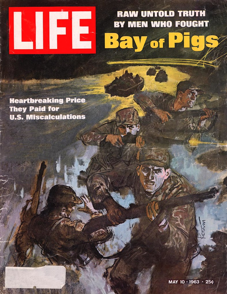
Sanford Kossin stands among a unique group of illustrators, ones that stand apart from the rest of history both in subject matter, style, and importance. Of course, I speak of the great post-war illustrators responsible for chronicling America in the late half of the 20th century. Among his contemporaries, Kossin provided his audience (as well as the present-day) with a unique interpretation of post-war culture, political commentary, and literature visuals all while doing doing so in an exciting colour palette. His collection of works is home to a wide range of clients, from “paper back book covers, science-fiction magazines, children’s books and magazines, and fiction art for Boy’s Life, Reader’s Digest, Saturday Evening Post, and others.” (macarthurmemorial.org)
Known as Sandy Kossin among his contemporaries, Kossin has been hailed as one of the greatest illustrators of the 20th century. Kossin started his artistic career with an education in the California Jepson Art Institute, and afterwards worked primarily in New York as an illustrator. However, Kossin’s prior service in World War Two would go on to influence every illustration created in his career, and would prove to be some of the most influential artistic commentary as the United States plummeted in and out of the Cold War and other international conflicts.
Apart from subject matter, Kossin is most well known for his highly conceptual fictional content, as well as his striking dark line work and high contrast colour. He credits this unique approach to his work with lino-cuts at a young age. As seen above, Kossin developed a style that was bold, rough, and striking, all while maintaining his incredible skills of draughtsmanship and faithfulness to realism.
On a final note, during his peaking Kossin was, and still remains, an extremely important illustrator that helped break down the barrier between fictional illustrations and real-world events. He is equally recognized for his political commentary and for his science-fiction related drawings. Kossins unique style and ability enabled him to make a tangible difference in the every-day home, not just in the lives of avid-readers or art collectors.
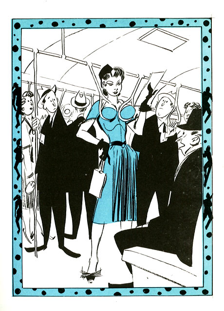
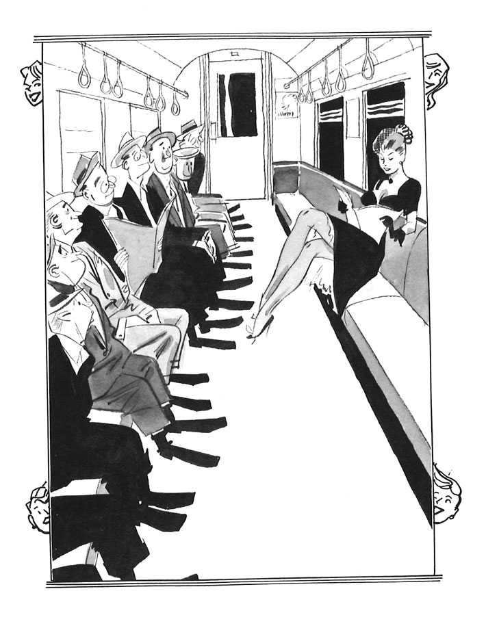
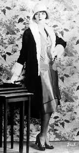
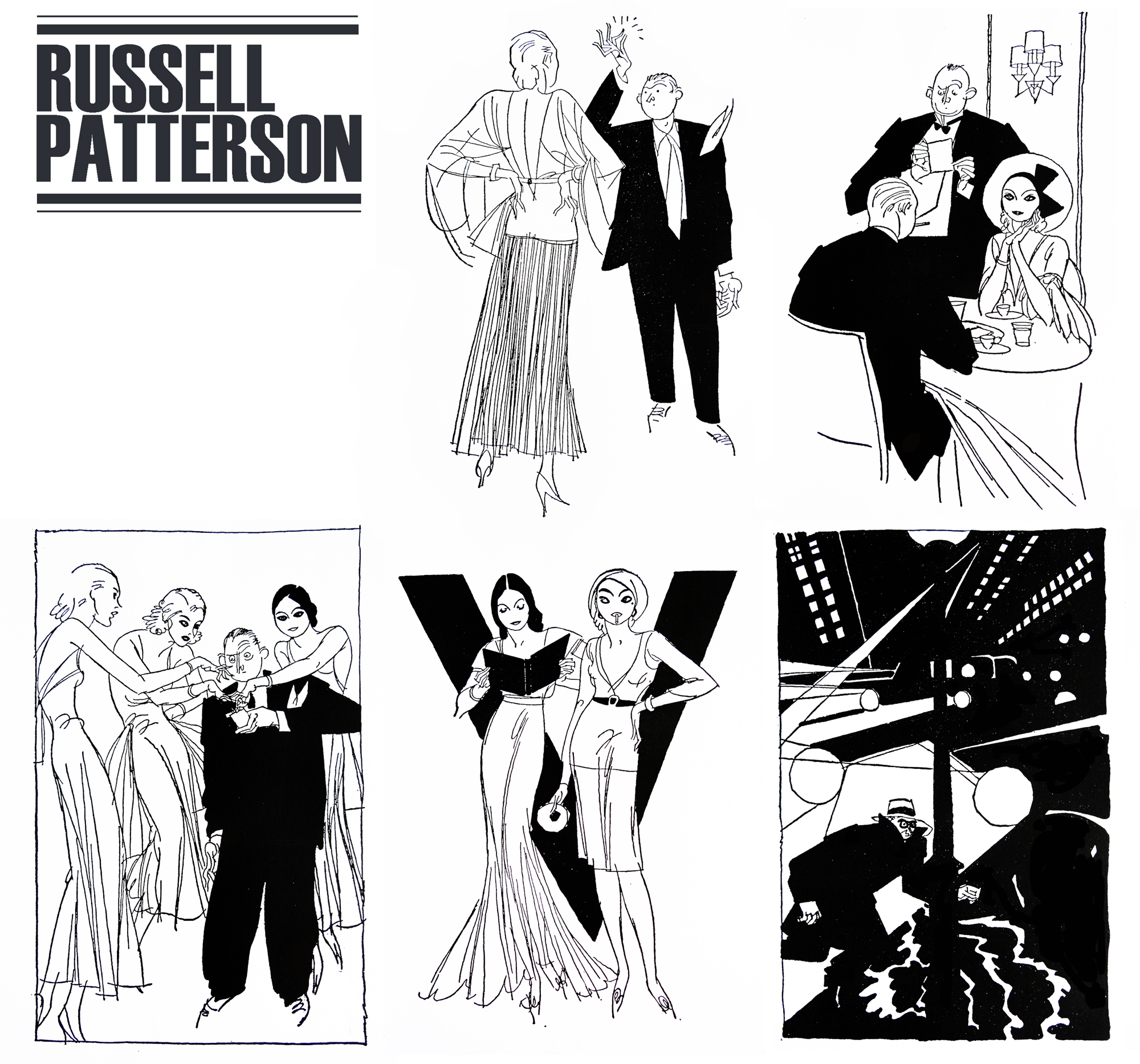
Many of us know that the iconic image of 1920’s fashion isn’t truly representative of the everyday citizen of the time. The average woman was not walking around draped in glass beads and with a parabola for an eyebrow. Much like the Gibson girl or the Arrow Collar man the flapper is a character made to sell products, experiences, and most prominently, a lifestyle. Russel Patterson was instrumental in creating the image of the flapper. He illustrated bold, desirable women who emanated fun and powerful sexuality, an image that previous to the 20’s was viewed as more taboo than not. Pattersons work teeters on the edge of pornography, but somehow still manages to keep the woman in a powerful position. Many of the other artists creating similar work at the time made the woman weak and powerless. Patterson reversing the roles set him apart from his contemporaries.
In his childhood Patterson was confident about his career path, claiming from his teenage years that he wanted to become a magazine cover artist. However, he would attend McGill University for architecture, do cartooning work, and have a full career in interior design before attempting to join the army and getting rejected. It wasn’t until after an extremely expensive pleasure trip to Paris that he would decide to pursue illustration full time, and would do so at the Art Institute of Chicago. For a time Patterson attempted to work as a fine artist but struggled in creating work that was suited to the prestigious gallery environment.
Patterson became frustrated with not seeing eye to eye of those in the fine art world, and in 1925 and decided to seek fresh ground in the artistic centre of the universe; New York City. He started to inject the glamorous culture of Paris into his illustrations, and appealed to the taboo humour of the American audience by making his subject matter blatantly suggestive and dynamic. He brought his lively characters to the covers of College Humour, Life, Ballyhoo magazine, and many more in the following years
His illustrations served not only as comical images, but soon became inspiration for clothing, creating that distinct appearance among New Yorks upperclassmen that is still known today. Pattersons women were however more revealing than the average women on the street, and his influence presented itself in the real world in a much more subdued nature. Specifically shape-wise, as Pattersons women had defined waists and hips, and the real trends were virtually the opposite.
When speaking of Patterson’s style, there are a few key words that come to mind. Its as if he is the child of Aubrey Beardsley and Rea Irvin, with his simple line work, taboo topics and high contrast use of flat colour. His compositions certainly fit the era of Irvins New Yorker illustrations, but his characters and subject matter is rather like that of black-sheep Aubrey Beardsley (and by extension, Will Bradley).
As the 1930’s approached and Pattersons fame was on the steady increase, he started to design sets for Broadway shows and musicals which were known for their elaborate and complex designs. This job of his was short lived, and when the Depression took hold of America Patterson had to turn away from the stage. Instead, he turned to department store window sets for the likes of Macey’s and I.J. Fox, as well as continuing his illustrative advertisements.
During World War 2 Patterson continued to build his multi-faceted reputation. While creating a comic strip of his own, he also designed the Women’s Corps uniforms, train and restaurant interiors, as well as hotel lobbies.
Russel Patterson was one of the lucky illustrators who, although their work was heavily set in the style of the luxurious 1920’s, was able to continue building a name for himself throughout the Great Depression and the War. The public was enthralled by his curious and powerful characters. Additionally, his humour translated well into the years after the stock market crashed, keeping the attention of the suffering public. Pattersons comical sexuality was entertaining, and wasn’t at risk of being shut down with changing times. He was almost the opposite of contemporary John Held Jr, and evolved with the times to find work that suited the demands of the changing public.
Personally, I find Patterson’s work enthralling. Although heavily sexualized and most likely degrading in some senses, I find his work entertaining and funny. I think the difference between him and previous artist’s I’ve explored who focus on taboo topics like these is that Patterson never makes the woman weak. By no means are his works feminist or anything along those lines, but it is refreshing to see the depiction of the woman change. Perhaps thats why the public kept their attentions on him and not on his contemporaries. Additionally, I find that his diversity of skill ranging into all aspects of design is extremely admirable and shows in his work greatly. His curious compositions in his illustrations transfer over to his stage work, his fashionable drawn characters inspire his costume and fashion design, and so on and so forth. It is always admirable to see a “Renaissance man,” excel in every avenue of their work.
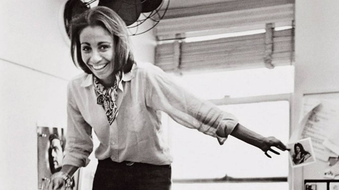
Bea Feitler was a Brazilian-born art director and designer who is most recognized for her revolutionary photographic concepts that appeared on the likes of Ms, Harpers Bazaar, Vanity Fair, and Rolling Stone Magazine. Her work can be summarized as professional, fun and youthful while still maintaining the essence of class and sophistication. Her work primarily featured female subjects, and being one of the few female art directors of the time, Bea was able to capture her models in a profound yet honest fashion.
“Bea Feitler only lived 44 years, but filled them with energy, enthusiasm and a passion for life and design. Hundreds of people attended her memorial service, and as a living tribute her friends and family established the Bea Feitler Foundation, which funds a full one-year scholarship for a junior graphic-design student at the School of Visual Arts. She believed a graphic designer’s work matters because the culture is expanded and enriched by those who shape and form information. She is missed for the vision, passion, and vitality she brought to each day’s life and work and remembered for her profound contribution.”
~ American Institute of Graphic Arts, 1990
Like many of her contemporaries, Feitler’s childhood was shaped by the after-effects of World War Two. Her Jewish parents fled Nazi Germany to Rio de Janeiro, where Feitler would be born in 1938. The War ended and the family moved to New York, where Feitler was introduced to the design that was embedded into the east-coast culture. She was enthralled by illustration, the ballet, fine art and fashion, hobbies which naturally led her into the world of design. She studied design at the Parsons School of Design, and would land her first major job creating album covers for Atlantic Records.
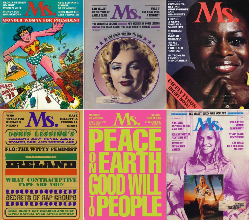
At only 25, Fielter was appointed as an art director for the famous Harpers Bazaar. She had been working as an art assistant with former Parsons instructor Marvin Israel who was impressed with her work, and promoted her and fellow student Ruth Ansel to co-directors in 1961. This promotion launched her career into a seemingly unstoppable whirlwind of success. In the next 20 years Bea produced creative content for the likes of Rolling Stones, countless book designs, and most prominently, the Relaunch of Vanity Fair and the introduction of Ms. magazine. Her work with this companies was forward thinking and refreshing. Feitler was constantly creating innovative ideas that spoke to the female viewer directly, as well as appealing to the general audience with their dynamic visuals and expertly paired body copy.
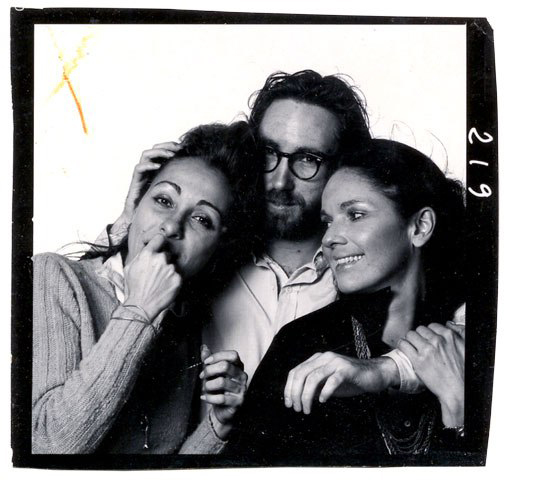
From left to right; Bea Feilter, Bill King, Ruth Ansel, 1965.
Throughout her career Bea gained several reputations; she was full of energy and quick witted, kind and professional, and was always willing to foster talent where she saw it. She introduced famed photographer Annie Liebowitz to fashion during Feilters reboot of Vanity Fair. She paid attention to at the time student Keith Harring when nobody else would.
When recounting all of Feilters accomplishments, it’s hard to believe that her career only spanned 20 or so years. On April 8th, 1982 Bea lost the battle against cancer. Her absence was felt all across the art world, and she is still continuously recognized as one of the most influential art directors of her time.
Growing up as the son of noted political caricaturist John Doyle, Richard grew up in his fathers art studio, absorbing any illustrative teachings he had to offer. Richard Doyle grew up in a creative environment, and aged with a love of the fantastical and the grotesque. Childhood consisted of a love of fairytales and stories, and would become his life’s work as he pursued his illustrative career.
Doyle’s first published illustrations appeared in the Eglinton Tournament, a comedy set in the middle ages. The ornate, dark, and natural feel of Doyle’s work lended itself to the time period. It was a natural fit. Shortly after, he would collaborate with several artists to illustrate a set of Charles Dickens books, including The Chimes, The Battle of Life, and A Cricket on the Hearth. Once again this commission was perfect for Doyle’s style. Theres a traditional feel to his work, most likely because he originated the style, but the idea of Dickens and Doyle are almost synonymous because of it.
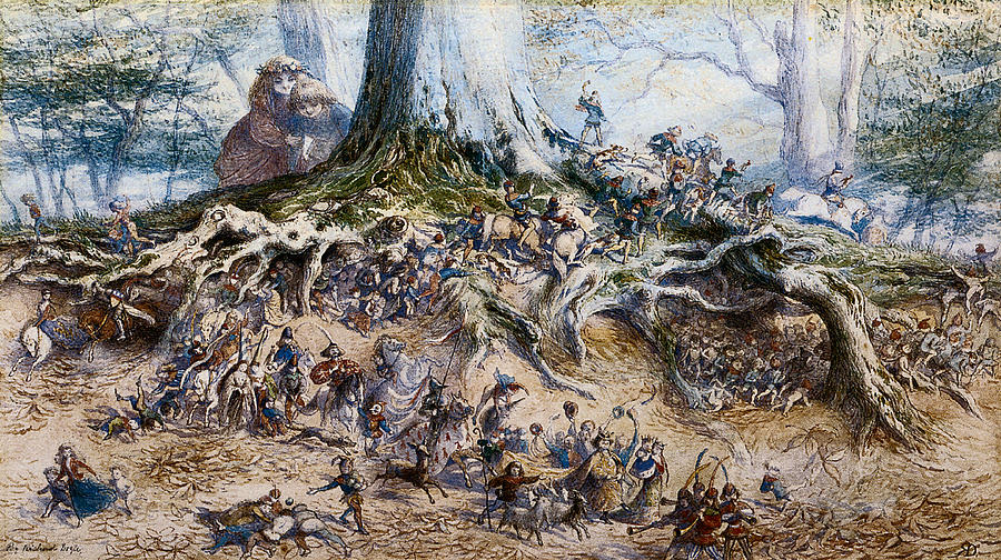
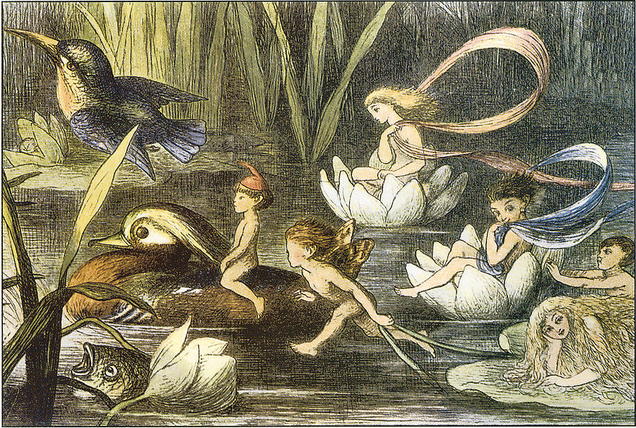
Most prominently, and what solidified Doyle’s reputation, was his illustrations for the book “The Fairy Ring,” by the Brothers Grimm. From then on, Doyle was the go to name when thinking about fairytale illustrations. He provided the visuals for what are now the stereotypical images of fairies. Much like Howard Pyle’s creation of the typical pirate, Doyle was responsible for the modern day fairy.
The strange thing about Doyle’s career is that he was an extremely devout Roman Catholic. One wouldn’t expect a man of such intense faith to spend his life illustrating monsters and fairies, but that’s exactly what he did for many years. However, while employed under Punch he resigned his position when tasked with commissions that featured a theme of “papal aggression.”
In summary, looking at an overview of Doyle’s work brought me back to many favourite childhood books. I hadn’t realized that Doyle basically formed the idea of the child-like fairy. Although seen before with previous artists and illustrators, Doyle left a lasting impression on the publics conscious in regards to the word “fairytale.” His dark, curiously fascinating world he created is most effective in the way that it is not covered in bright colours and sparkly characters. The illustrations make it appear as if this world is occurring at the same time as ours, in the corners of our gardens, in the middle of our forests. Reviewing his work, that’s exactly what I love the most about it, the mix between real and fantastic, and that my world could be equally as real and fantastic as Doyle’s.


:focal(536x587:537x588)/https://public-media.si-cdn.com/filer/36/4a/364a861f-9f2f-43d5-810b-006b2b3ba2d0/kewpies-woman-suffrage-voting-kewpie-korner2.jpg)