R.B. Kitaj, Survey 9


Image result for rb kitaj
“The Refugees”

Kitaj was an American born artist from Cleveland Ohio. He would go on to study at the Vienna Acadamey of Art. Kitaj would go on to study at many artistic institutions, including the Royal College of Art and the Ruskin School.

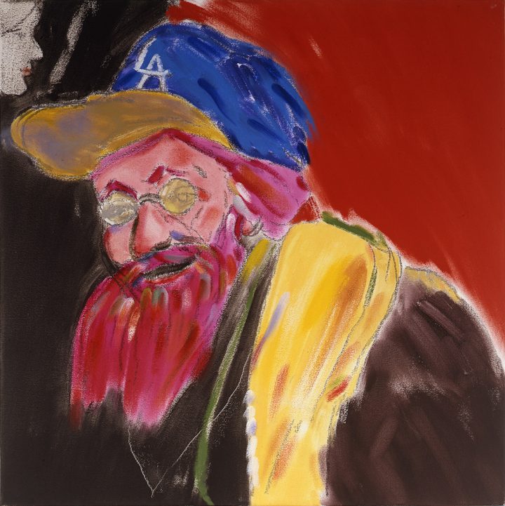
Kitaj’s style is one that could be defined as “polarizing” to say the least. The general public may have viewed his work as naive, rough, or even unfinished, and they’re not completely wrong in saying that. Kitajs work do resemble underpaintings, but their conditions serve great purpose. The seemingly ragged images exemplify moments in their entirety; capturing the emotion of a instant. He captures what it’s like to really take in your surroundings, where you can only fully interpret parts in full and others with fleeting ability.

Image result for rb kitaj
“The Man on the Ceiling,” 1989

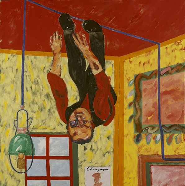
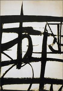
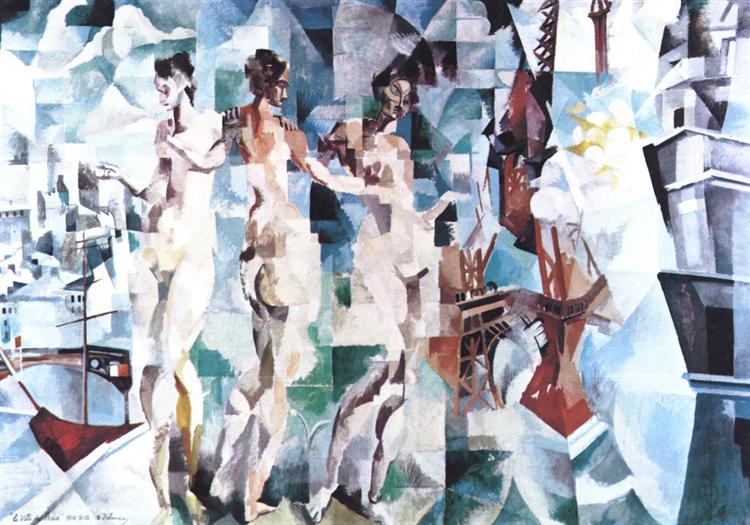
“His more complex compositions build on his line work using a montage practice, which he called ‘agitational usage’. Kitaj often depicts disorienting landscapes and impossible 3D constructions, with exaggerated and pliable human forms. He often assumes a detached outsider point of view, in conflict with dominant historical narratives.”

Image result for rb kitaj
“Juan De La Cruz”

Kitaj credited his influence to British pop artists, his work resembling collages in their busy and overlapping nature.

“Allusions to political history, art, literature and Jewish identity often recur in his work, mixed together on one canvas to produce a collage effect.” ~Wikipedia.com


Image result for rb kitaj the psychopathology of every day life
“The Psychopathology of Every Day Life”

Kitaj lived an interesting personal life as a Russo Jewish artist living in the states. Growing up in the WW2 and post war period, there would have been undeniable tensions. He would spend the majority of his life in England and as a merchant seaman in Norway in his teenage years. His first wife would commit suicide in 1969, but would remarry in 1994 in her 40s. Needless to say, in the way of being a “tortured artist,” Kitaj had plenty of material to draw on. He died in 2007, and the coroner would declare the cause as death by suffocation, stating that the artist had suffocated him with a plastic bag over his head.

Related image
“The Oak Tree”

In light of his legacy, Kitaj is known as one of the world’s leading draftsmen, often being compared to Edgar Degas. He was taught draughtsmanship by a 3rd generation pupil of Degas, which would explain the resemblance.

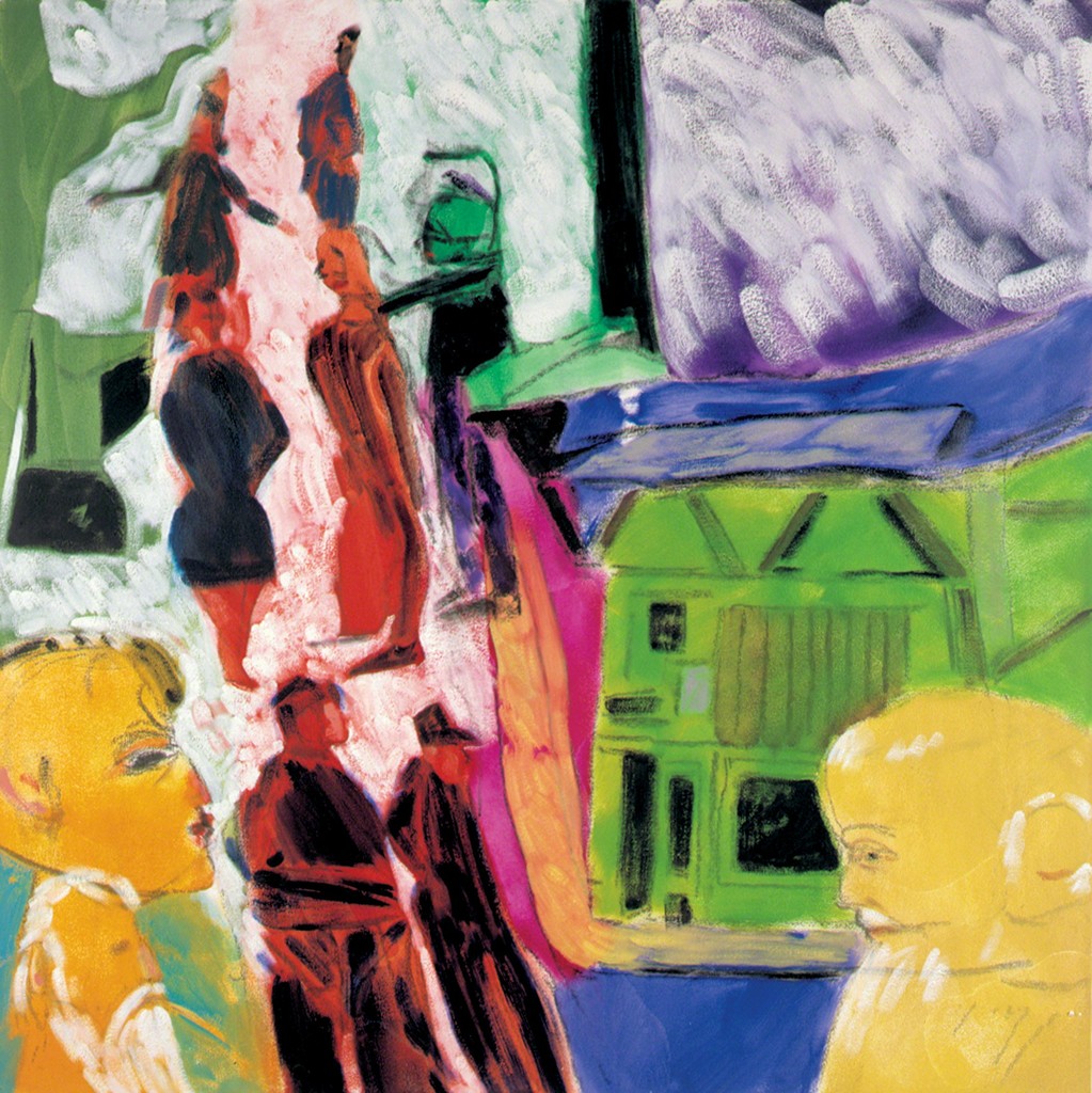
His style and ability is greatest exemplified by his masterpiece “Autumn of Central Paris”, resembling a semi cubist interpretation of a cafe, showcasing his unique interpretation of distorted figures and settings.

Image result for rb kitaj self portrait
“Self-Portrait After Rembrandt’s Last Self-Portrait” (2004)

https://www.wikiart.org/en/r-b-kitaj/the-autumn-of-central-paris

https://www.tate.org.uk/art/artists/r-b-kitaj-1416

https://www.artsy.net/artist/r-b-kitaj

Franz Klein


Klein next to his one of his large scale pieces

When discussing the wide array of variety that is abstract exoressionism, Franz Klein is an important yet complicated character. One might say that he is the epitome of the genre— with his bold, semi brutalist brushstrokes. On the other hand, another might add that he is not like his counterparts, and creates a category of his own, standing apart from the abstract community entirely.

“Cardinal”

Klein is most well known for his black and white pieces that have oddly enough been linked to the New York skyline. It definitely takes an eye of an artist to see this in his work. His work is bold, and the definition of conceptual. An average onlooker would not be incorrect if they were to exclaim, “Well I could have done that. Throw some black paint on a canvas and anyone can be an artist.”

“Orange and Black Wall”

But you see, that statement in itself is what gives Klein’s work its captivating quality, its deep and unyielding sense of mystique. The thing is, is that truly, anyone could have created Klein’s pieces, but they didn’t. Simple as they may be, the works are a departure from the though out pop art of the 40’s and 50’s, and even the abstract expressionism of his fellow counterparts, Klein truly put emotion on to a page. His work appears to be the visual representation of instinct, energy, and much more.


Klein starred his artistic career as a realist, as many do, coming from a strict academic background. His moving to New York, a newly deemed cultural hub for activity and outrageous personalities, influenced him to convert to pure abstraction. He was particularly influenced by Willem de Kooning. This change served him well, as he received international praise for his simplistic yet immensely bold pieces.

Klein also sets himself apart from the expressionists, claiming that his work is less so an expression of himself rather than a way to “physically engage the viewer.”  To put it simply—Klein was not one for hidden meaning or whimsical artistic influence. As stated by theartstory.com, Klein’s “powerful forms of his motifs, and their impression of velocity, were intended to translate into an experience of structure and presence which the viewer could almost palpably feel.” The absence of secret meaning in his work would later go on to influence the minimalists of the 20th century as well.

Untitled

On a more personal note, it took some effort to come around to abstract expressionism and pop art. For the most part, I must say it’s not for me, and when searching for artists to work on this week I was struggling to find one that captivated my attention. When I came across Klein though, I was fascinated. How bold and defiant and new his work seems! Even today, when we as the audience have unlimited access to all different types of art, his work seems refreshing. I will always have respect for those who simply follow their minds eye. I find myself especially partial to Klein’s work because of its lack of meaning or symbolism. I love that the pieces are there to simply see and feel, not to contemplate and fret over. Additionally, I respect the expert composition his pierces feature, seeming effortless in nature.


https://uploads4.wikiart.org/images/franz-kline/cardinal-1950.jpg!PinterestSmall.jpg

https://www.mfah.org/art/detail/30412

https://www.theartstory.org/artist-kline-franz.htm

https://www.paintingstar.com/item-new-york-n-y-1953-s202732.html

https://www.allposters.com/-sp/Untitled-1957-Posters_i382950_.htm

Elektro The Moto-Man: Yes, This Really Happened. Survey 10


Stop everything you’re doing and read this. You think pop culture is weird now? Get a load of this shit.

Elektro the Moto-man was, indeed, the worlds first robot celebrity. He doesn’t quite stand up to apples Siri and Amazon’s Alexa, but has some pretty astounding endearing qualities for the day.

Standing approximately 9 feet tall, the man-made-of-gears represents an odd optimism that was harboured among American citizens during the great depression. People were looking forward to better times, and that meant being terribly imaginative. Things were pushed to futuristic extremes, and Elektro was quite literally the physical embodiment of it.

He was talented! Tall! Handsome! And could perform a whopping 26 tasks! Ladies, who needs a man when you can have a nine foot robot who can smoke?

If it sounds like Elektro’s creators were trying to make him be the optimal interesting human, you’d be correct. He (It?) was designed to be an entertainer above all else. He could blow up balloons, smoke a cigarette, even flirt with audience members using his 700 words of built in vocabulary. Flirting was popular with Elektro. “Toot” was a popular adjective within his vernacular, because it was the 1930’s and when you’re a 9 foot electric human in the 1930’s, that’s what you call people. Obviously.

Image result for elektro the moto man
SEE? I told you. He can smoke.

His limbs were functional, he could move them, but whether or not he could successfully walk is unclear. His (still unsure if this situation requires pronouns) body consisted of gears, a speaker, and aluminum sheets, which appear to be spray painted gold. A dream man if you ask me, even complete with a bushy moustache.

The phenomenon was popular at the time, but Elektro the Moto-Man has mysteriously been swept under the rug within the discussion of history. Possibly because he was solely created for entertainment and didn’t serve the public in any other way than making them laugh and blush on occasion, but most likely because people prioritized the War and the technical innovations that occurred in more useful areas (no offense, Elektro).

Image result for elektro the moto man
The poster for Elektros big unveiling.

However, whether Elektro is on the covers of our history books or not, there is no question of his influence. Today we see artificial intelligence making its way into almost every aspect of our homes: we have Google Homes, Amazon’s Alexa, and not to mention Siri.

You could say that a direct descendant of Elektro is Sophia the Robot, a highly controversial AI creation that pushes the boundaries of technology and blurs the lines of artificial humans and real breathing ones. Perhaps we would never have these robotic companions had it not been for our faithful Elektro.

Our tin-clad companion was first unveiled at the New York World’s Fair in the 30’s but now stands tall in the Washington D.C. National Building Museum. Well, kind of. It’s a replica, but pretty damn close to the real thing. No word on whether his flirting game is still as strong, but one can only hope.

Lecture Summary:

Today we had our last lecture! I’ll never see “Done Talkin'” again, and I’m a little heartbroken. I’ve really genuinely enjoyed this class and the lectures that come with it. It’s fascinating to see the context in which our entire modern communication is built, and I feel fulfilled leaving with a whole new lexicon of inspiration to work into my art. Thanks Judy, for being so patient with us and always being kind. I really appreciate your class and the way you’ve taught it.

Anyways, sappy shit over, today we talked about the 1930’s and 40’s. This is a particular topic that I happen to know quite a bit about, so it was really nice to learn more about a time period that I’m passionate about. I was particularly interested to hear about the designers migrating to the US, seemingly in flocks, and the way that they immediately brought American design from a mediocre-genre to an iconic representation of businesses on an international level. Especially the Container Company, and their conceptual representations of their brands. It was kind of mind blowing that business ads did not have to directly focus on the product. I’ve never seen that before, but I’ll certainly be incorporating it in to future projects.


Sources:

https://www.history.com/news/1939-worlds-fair-new-york-technology-robot-flashback

https://www.theatlantic.com/technology/archive/2011/02/elektro-the-moto-man-one-of-the-worlds-first-celebrity-robots/71505/

https://www.grunge.com/101415/bizarre-things-happened-great-depression/

1939 New York World’s Fair Presented By Elektro The Smoking Robot – In 80 Photos

Survey 6 Spread Rationale : Getting the Vote

For this spread, we focused on women’s suffrage in the years 1905-1915. I wanted to contrast the typical feminine depiction of the Art Nouveau style of the time with the brazen determination of the Suffragettes. I had a couple of struggles with this layout–I forced myself to redo it three times. I knew that i wanted to depict a strong woman, but I kept running into barriers of how to illustrate it in a way that would do the cause justice, especially with the factor of the airy art nouveau colour scheme and whiplash curves. Finally I settled on the design attached here with some brainstorming help from classmates. I chose to have the suffragette large and featured across both pages, and vertically to make the figure stand out even more in her size. The blue background and text is symbolic of art nouveau as well as to introduce an aspect of stereotypical masculinity that the suffragettes were fighting against. I wanted this aspect to contrast with the idea of feminism and the character on the ride hand side. For my title, I used Arnold Boecklin Std Regular, a font that was typically used in decorative art nouveau posters. I would give myself an 8/10, simply because the text could have been done better, especially the area in the last paragraph where it bleeds onto the green of the bush.

Bauhaus Furniture: Concussed Edition, Survey 9

Image result for bauhaus furniture

The Bauhaus (1913-1933) was a school of art and design that existed in        pre-war Germany before being shut down by the Nazi party in the face of World War 2.  Founded by Walter Groimus, the primary objective of the Bauhaus was to redefine the relationship between function and design. In other words, as stated by www.metmuseum.com, the objective was to “reimagine the material world to reflect the unity of all the arts.”

Image result for bauhaus furniture

The Bauhaus housed a multidisciplinary focus. Students learned painting, architecture, sculpture, and design, as well as specialized workshops like cabinet making, among others. Their coursework was intensive and diverse, allowing students to make creations that drew on a large vocabulary of historical and artistic references. Students themselves were diverse as well, bringing their own cultural influences and social-economic lenses to each discipline.

“The Bauhaus combined elements of both fine arts and design education. The curriculum commenced with a preliminary course that immersed the students, who came from a diverse range of social and educational backgrounds, in the study of materials, color theory, and formal relationships in preparation for more specialized studies.”

~ www.metmuseum.com

Image result for bauhaus furniture

One of the most culturally impactful outputs of the Bauhaus was their furniture. It was created with the goal of “form follows function.” The furniture and cabinetmaking department was headed by Marcel Breur, who is said to have “reconceived the very essence of furniture, often seeking to dematerialize conventional forms such as chairs to their minimal existence.” (metmuseum.com).

An excellent example is the chair below. The extremely basic design is complimented by the unique use of material, contrast, color and essence of extremist minimalism. In contrast to the arts and crafts/art nouveau movement of the previous decades, the modern qualities of the Bauhaus designs were refreshing to say the least. This had an especially profound effect in its homeland of Germany, notorious for its heavy gothic design style during the early 20th century.

Image result for bauhaus furniture

Lecture Summary:

Unfortunately I was not able to attend this weeks lecture, but I was able to review the notes and handouts. The things that jumped out to me tended to stay within the geo-political sphere, mostly the famous “Persons Case” in Canada with the supreme court. This is always something that I’ve been appalled by, and to an extent I can’t believe that this event had to happen at all in history. Additionally, my spread from a couple weeks ago focused on women’s suffrage, and the persons case highlighted the Famous 5. I found that I will always be partial to women making advances in government throughout history, but that feeling is not the same for current politics. I also gravitated towards The Lindberg making its way across the Atlantic, as plane technology is something that I’m still fascinated by today every time that I’m in one. Slightly terrifying, but very cool to know where it all started.

Sources:

https://www.metmuseum.org/toah/hd/bauh/hd_bauh.htm

https://i.pinimg.com/originals/9a/ff/fc/9afffc258132091576588ad0ec82d94a.jpg

https://dengarden.com/interior-design/Bauhaus-Furniture

https://www.widewalls.ch/bauhaus-design/

Robert Deluanay

“Painting by nature is a luminous language.”

This quote by Robert Deluanay serves as an excellent precursor to his relationship to his art form. Hearing this way in which he speaks about his art–the mere idea of a “luminous language”–can thrill a viewer without having had a look at his creations. Even further, Deluanay does not dissapoint any expectations upon first viewings.

Robert Delaunay
Self Portrait, Oil on Canvas. This painting is an excellent example of his cube-like strokes and use of blank canvas space.

Deluanay started out his career influenced by “Neo-Impressionism,” a subsection of art that includes pointillism and division-ism.  His defining characteristics of his style is his unique “mosaic” type interpretations, often leaving areas of canvas blank while using squares to depict his subjects. Later in his career the mosaic style grew into a complex relationship between abstract ideas and geometric interpretations. Later in his career, Deluanay was accredited with pioneering his own versions of color theory. 

Rhythm, 1912 - Robert Delaunay
Rhythm, 1912 – Robert Delaunay, displaying his work with color theory and geometric relationships.

He was born in 1885 in a well off family but ended up being turned over to his aunt and uncle. He was raised near Bourges for the rest of his life. As many modern artists were, he was heavily inspired by Cezanne and Vasily Kandinsky.

Eiffel Tower, 1909 - 1914 - Robert Delaunay
Eiffel Tower, 1909 – 1914 – Robert Delaunay

His works that were the most recognized were his series that were commonly displayed in galleries and salons across France. He was familiar with Galerie Barbazanges, of Paris, and the Salon d’Automne. One can infer from his prolific showings that he was well recieved within the art world, regardless if the public was able to fully appreciate the intensity behind his work. He was supported by many important figures in the art community, those who built him up through personal relationships and through business opportunities.  Without a doubt he was supported and respected by his contemporaries, and with good reason.

The City of Paris, 1912 - Robert Delaunay
The City of Paris, 1912
Man with a Tulip (also known as Portrait of Jean Metzinger), 1906 - Robert Delaunay
Man With a Tulip, 1906 A beautiful example of Delaunay’s Neo-Impressionist work, using his signature long square-like strokes and color combinations.


https://www.theartstory.org/artist-delaunay-robert.htm

https://www.guggenheim.org/artwork/artist/robert-delaunay

https://www.wikiart.org/en/robert-delaunay

Bold of You to Assume You’re Better Than Everyone: Russian Suprematism, Survey 8

Russian Suprematism

Suprematism, the Russian design movement of the 1920’s, was founded by Kazmir Malevich in response to zaum, or transrational poetry of the day. Many critics describe the Suprematist movement as “highly austere and serious,” but there is a strong element of abstract absurdity that is found as a running theme throughout the genre. The not-so-humble name directly states Malevich’s stance on the movement; it was supreme, and would conquer all other genres of art from past to future.

Related image

But what is it actually? The common audience might look at Suprematism, as well as Constructionism, and say “What’s the purpose of this? It’s just a bunch of shapes and lines and blocky text that doesn’t really make any sense.”

This is true, but it does hide a deeper meaning. Although Russian Suprematism may resemble a rudimentary Atari video game, the artists aimed to comment on the real world (AKA the Russian revolution and political environment under Lenin) by “removing the real world entirely and leaving the viewer to contemplate what kind of picture of the world is offered.” (theartstory.org)

The three visual characteristics of the Suprematist movement were red, white, and black. This was to represent the Nationalists during the Russian revolution (white) and the Bolsheviks, in red. Composition remained open to interpretation. Pieces of the movement can be read virtually any way. Geometric pieces can be seen as floating in space, a birds eye view (pieces that fit more so into this view were later characterized as “Arial Suprematism), or alternatively, from the inside looking out. Energy and tension were also very important components in this movement, and the artists favorite shapes were pure geometric forms. Malevich was in a similar mind to the Grecian philosopher Plato, who believed that geometric shapes were the purest form of beauty.

“Sensitivity is the only thing that matters and it is expressed by absolute forms: the rectangle, the triangle, the circle, the cross.”

Suprematist design was of course the inspiration for Constructivism. To a similar, Atari-sentimenting viewer, it is almost impossible to distinguish the difference between the two. To keep it short and sweet, Constructivists believed that materials commanded the form. Suprematism worked towards losing form completely and moving towards “true abstraction.”

Despite their differences, these two movements have been some of the most influential in history and to the world of graphic design in particular. The simplicity of the suprematist movement combined with it’s somehow maintained abstract message describes perfectly the movement of graphic design in modern day. Constructivism took these main principles and applied them relentlessly to their posters. They took the barren nature of Suprematism and used it to communicate effectivley to a general public that might not understand a complex artistic interpretation of an important message, like those discussed in both movements.

The conditions that this movement was born out of was undeniably shitty, but the inspirational creative wake that it left behind was undeniably great.

Lecture Summary:

This week we focused on the first world war, and everything that came with it. The wars are something that I’ve come across quite often in my education, but I was really happy to look at Russian culture and communication styles, because I feel that in any history course it is always a large group that is skimmed over. The Russian revolution brought a whole different type of art style on to the scene, and unfortunately wasn’t spread to other countries for quite some time. I am such a HUUGE fan of the tri-color schemes and the simple geometric representations, although it’s something that I struggle to execute in my own design work. I’ll definitely have to do some further research, most likely using the website this last picture is from. Interestingly enough, he used those photos and redesigned them in a more 3-D, modern approach, which I find incredible. I’d love to recreate any of the World War propaganda posters with a modern twist, and I actually think it would make a really interesting project within this program.

Resources:

https://www.theartstory.org/images20/new_design/collage/suprematism.jpg?2

https://www.theartstory.org/images20/new_design/collage/suprematism.jpg?2

https://medium.com/@PaulStayt/suprematism-constructivism-a2336332776c

https://mir-s3-cdn-cf.behance.net/project_modules/max_1200/680ea341998071.57bca54faeb63.jpg

https://www.theartstory.org/movement-suprematism.htm

https://markhickenfineart.wordpress.com/2015/06/02/compare-and-contrast-examples-of-suprematist-constructivist-and-neo-plasticist-painting-and-sculpture/

Wassily Kadinsky, the Master of Abstract

Image result for wassily kandinsky
Gorge Improvisation, Oil on Canvas

Wassily Kandinsky, a native of Russia, sits in a rare position among Matisse and Munch under the labels of “‘Fathers of Modern Art.”  Similarily, Kandinsky is often hailed as “The Painter of Sound and Vision.” He is most known for his “Composition” series, where he expertly explores the idea of complex abstract symbolism and as it’s name suggests, compositional elements that were unheard of before his time. Although labelled as an expressionist, several pieces of his can also be applied to the genre of fauvism. However, it would be wisest to say that Kandinsky creates his own category of revolutionary abstraction.

Related image
“Cossacks,” oil on on canvas

Kandinsky waited until his thirties to become an artist. Perhaps it is for this reason that his art defies all historical guidelines; that he branches out into unfamiliar territory fearlessly and without mind for critic opinion. He was inspired by the creations of Claude Monet. His love of forward moving ideas eventually would gain him a career at the Bauhaus, a school of art and design that valued morals like “form follows function,” and produced many interesting and modern-looking pieces of work, ranging from furniture to appliances to pieces of design and art.

Related image
“Color study, squares with concentric circles”

I keep using the word “revolutionary” when referring to Kandinsky’s work, and that is not without great cause. Many sources attribute him as not only one of the Fathers of Modern art, as mentioned earlier, but as the sole Father of Abstract. Notablebiographies.com describes him as many others do, stating:

“Kandinsky is still greatly admired today for his own paintings and for being the originator of abstract art. He invented a language of abstract forms with which he replaced the forms of nature. He wanted to mirror the universe in his own visionary world. He felt that painting possessed the same power as music and that sign, line, and color ought to correspond to the vibrations of the human soul.”
Related image

“The Houses at Murnau”These may seem like bold claims, but Kandinsky does not fall short of his modern legacy. His outstanding use of color and line, his overwhelming yet harmonious compositions, and his unmatched ability for translating indescribable phenomenons and feelings into a visual manifestation without a doubt earn him the hundreds of heroic titles attributed to him.

“Kandinsky viewed non-objective, abstract art as the ideal visual mode to express the “inner necessity” of the artist and to convey universal human emotions and ideas. He viewed himself as a prophet whose mission was to share this ideal with the world for the betterment of society.”

~www.theartstory.org

However, regardless of his famous modern day reputation people regarded the expressionists as a whole as illegitimate artists, and their success was often owed to only a handful of people that believed in them. This could certainly be said of the Bauhaus for Kandinsky.  He would go on to inspire the students of the Bauhaus before their dismissal during World War 2, as well as the entire generation of Abstract Expressionists that arose in the post war period.

Composition IX (1936) by Wassily Kandinsky

Composistion IX, 1936https://www.notablebiographies.com/Jo-Ki/Kandinsky-Wassily.html

https://www.wassilykandinsky.net/

https://www.theartstory.org/artist-kandinsky-wassily.htm