My Yearbook Spread: Music & Cityscape
Creative Process
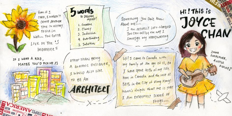
The music-themed design for the yearbook spread was inspired by my passion for music.
During the brainstorming phase, I did a few different layouts and I tried adjusting the composition with text and other graphic elements. I also experimented with different colour scheme and imagery that best represents my characteristics: creative, clumsy, indecisive, overthinking and intuitive. At the end, I decided to utilize a warm colour scheme (mainly yellow) with a theme focused on music, sunflowers and cityscape. The main medium I used for this piece is patterned tape and illustration with coloured-pencil and watercolour. Ultimately, I wanted to create a very leisure and cheerful atmosphere that reflects my creativeness and spontaneity.
Reflection
I would rate myself 7.5 out of 10 on the idea and execution. Initially, my first idea was doing a bullet journal inspired yearbook spread. However, I completely changed my idea later on as I thought the music and vacation theme would better embody the key words. I realized that the outcome does not entirely aligned with the vibrant look I envisioned because I failed to use watercolour on the sketchbook paper. I believe it would have been better if I planned ahead and used watercolour water instead. Nevertheless, I am glad that I challenged myself to explore with a style that is more unfamiliar to me (as I am not very familiar with drawing cartoon characters) and different tools (patterned tape and mixed medium) to create my piece. I also like the effect I created with the spontaneous shapes breaking the outlines of the sunflower and the self-portrait illustrations.
Recent Comments