Lecture: Steam & The Speed of Light (1750 – 1850)
Fun Fact (Throwback to 141 Survey 3!):
Did you know that the book of hours by the Limbourg brothers cost the buyer an entire farm to trade in the 15th century? Crazy, right?
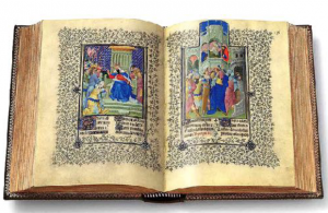
Limbourg brothers, “The Book of Hours”, 1412-16 from Judy’s Blog
Well, luckily that’s not the case in the 19th century!
By the 1800s, manufacturing companies finally began to aim for mass production with a broader audience.It was the invention of cast-iron press by Lord Stanhope that changed the game of typography and print production. Despite the fact that it was still not fast enough to satisfy public’s high demand for information, the mechanized type-setting machine was efficient and reduced the force of Gutenberg’s wooden press by 90%. On the other hand, the prevalence of advertising and print production resulted in another impactful invention in this era. It was the steam engine invented by James Watt in 1769 that made a radical change in transportation! If you were born in that day and age, you would surely be amazed by how you can finally travel around the country much more conveniently.
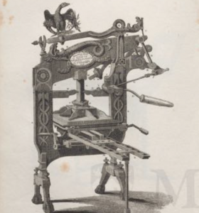
Cast-iron press by Lord Stanhope in 1800
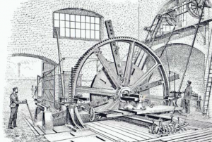
Steam Engine by James Watt in 1769
Within just a span of a hundred years, tremendous change happened to the fields of science and design. The high demand in consumption sparkled the the beginning of industrialization with technological development we have yet to see before.
Research: Typography
Taking cues from the Baroque and Rococo, designers developed distinctive styles that represent the two major artistic periods in 18th – 19th centuries. As a reaction against Baroque design, Rococo design unfolds a new light-hearted style with the motifs of delicate curves, shell forms and ornamentation. In this week’s blog research, we will be focusing on typographic styles and layouts that encapsulate the essences of Rococo and Baroque era.
Typefaces & Aesthetics
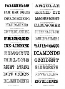
MacKeller, Smiths & Jordan.
Book Specimens (1881)
Humanist Type in Baroque Period
Developments in type printing press can be traced back to Baroque type founder, Pierre Simon Fournier. At an early age, Fournier invested the majority of his time in understanding typographic principles. Eventually, he pioneered the concept of typeface (type family) and point measurement (a standardized type unit). Since craftsmen and punch cutter in the 1700s had to hand-crave individual letter in different sizes and fonts, Fournier’s new principles undoubtedly helped type foundries to develop systematic approach in organizing types. Inspired by the Roman and Greek styles, a set of fonts within a typeface usually consists of roman, black letter, italic, and grotesque. The main styles can also be categorized into the Humanist serifs and display fonts. Examples of Humanist serifs like Baskerville, Didot and Bodoni are composed of high contrast of thick and thin strokes. It was considered a transitional type style that marked enlarged x-height and strong vertical stress.
Moving away from the Baroque clean and simple aesthetics that are more familiar today, Rococo type founders adapt to display fonts including the fat face and slab-serif. The costumed types with decorative serifs were generally featured in luxurious magazines that echoes the chic style in Rococo period.
Typographic Hierarchy
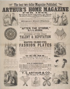
Timothy Shay Arthur. Arthur’s Home Magazine (1852-98)
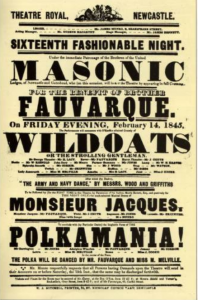
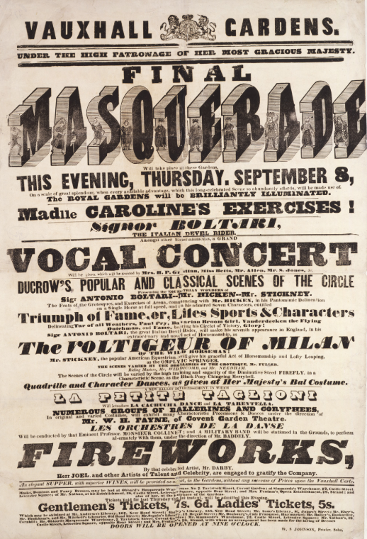
Decorative Poster in Rococo Period
Opposed to the minimalist approach in design nowadays, Rococo poster generally consists of a mix of styles and typefaces. The goal was to fill up the page as much as possible with almost little to no negative space!
Phew! Imagine how much it will drive designers crazy these days..? In order to grab the viewers’ attentions, type was often condensed and stretched to fit into the page. Similar to first example of decorative poster, Arthur’s Home Magazine‘s cover also features centered text along with distinctive fonts, including Humanist serifs and display fonts, in various sizes. As you probably have noticed, display fonts are not suitable for paragraphs because it reduced legibility at a distance. In that regard, a more simple humanist typeface (with roman font) would be used for big blocks of text.
Moving away from just manuscripts and books production, type founders adapted new typographic principles to keep up with demands of newspapers, magazines and posters. The shift from minimalism to meticulous decoration in Baroque to Rococo makes us realize that like fashion, interior design and art, graphic design is also highly affected by the cycle of trends. As we know that “beauty is in the eye of the beholder”, it is hard to judge Rococo’s design based on our aesthetics and standards now. Maybe in the future, we will move back to the extravagant and flourish styles in Rococo? Who knows.
Reference:
http://blog.thepapermillstore.com/history-of-typography-rococo/
design.tutsplus.com/articles/a-brief-history-of-type–cms-30372
Recent Comments