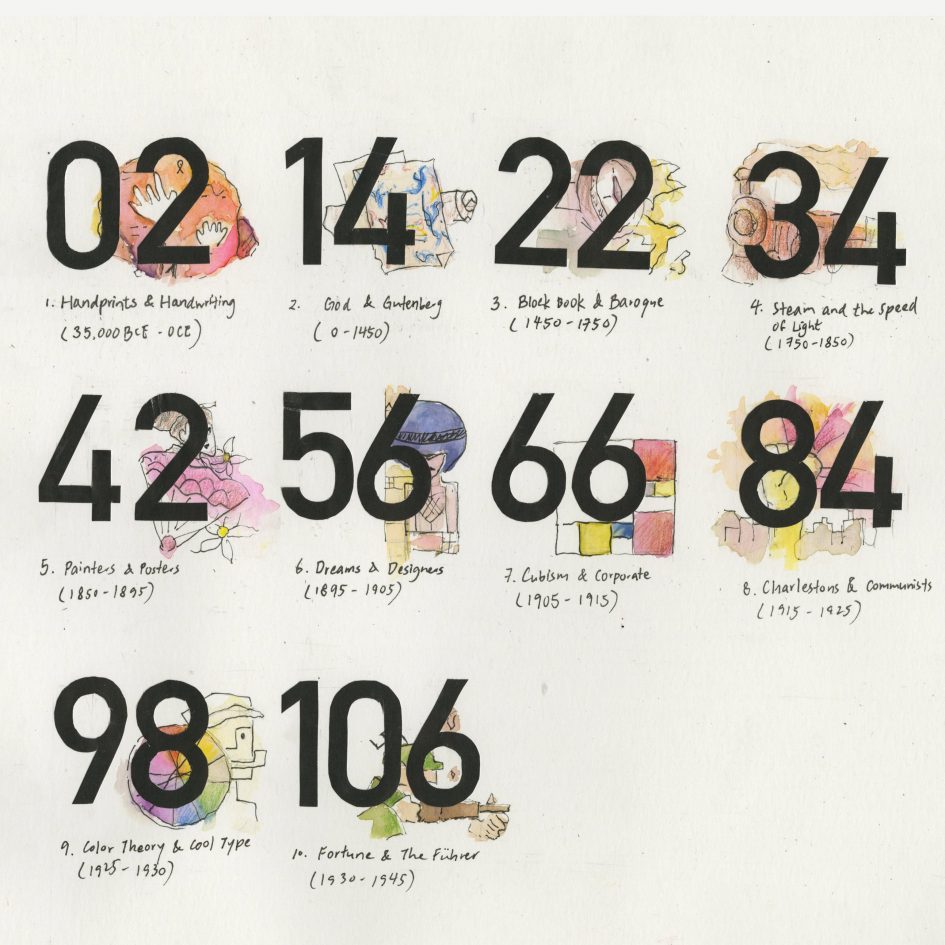
I was assigned to do the index for our IDEA 22 history yearbook. The brainstorming process started with me doing thumbnail sketches with different themes (ancient greek/roman, avant-garde styles inspired by modern art/design movements). At the end, I decided to incorporate Bauhaus poster and book design style on my index page.
Some of the elements I really emphasized on were the big-sized numbers and negative space inspired by Bauhaus posters and book covers.The spontaneous style of the spot illustration behind as well as the small survey titles also add another contrasting effect. Overall, I would give myself a 7.5 out of 10. I really enjoyed painting and inking the spot illustrations. I had a fun time planning the artistic themes for each period as well. However, since I had to add the number cut-outs at the very end, the main thing I wasn’t satisfied with was the fact that the big numbers completely take away the spotlight for the illustrations. I feel like each illustration provides an unique artistic style from different movements. It would have been better if I could do place the numbers first and plan the illustrations afterwards.
Leave a Reply
You must be logged in to post a comment.