For this yearbook spread, I was assigned to do a comparison within the scope of culture. I decided that doing a historical comparison of ancient and modern Olympic Games comparison will be an interesting approach to show its evolution.
The main challenge to me in designing the spread was arranging the layout and composition. Since its a hand-rendered spread, I kept reminding myself to holistically think about the composition before putting any inks or colours on paper.
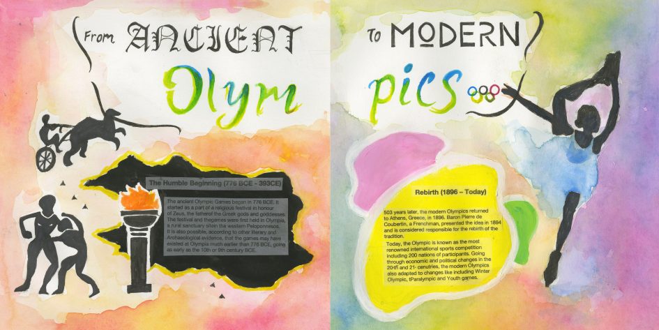
The result was a watercolour spread with silhouettes of an Olympic ice dancer and ancient athletes. The colorful background on the right represents the Olympic rings and the cultural richness of the International modern Olympic; whereas the left with dominant warm tone shows the traditional feel of ancient Olympic. The typefaces for “ancient” and “modern” were also used to emphasize the contrast of the past and present. The body type was printed on tracing paper to create a translucent background. I would give myself 7 out of 10 for this spread. Although I think I did pretty well on demonstrating the contrast of the ancient and modern aspects, the rendering of the piece could have been more refined and clean.
Leave a Reply
You must be logged in to post a comment.