Psychedelia and the Psychedelic movement 1960-1975
It’s surely interesting to see how the 60s aesthetics went to flip side of the coin from the 50s! Within just a mere decade or two, the minimalist and modern New York art style drastically shifted to the wild extreme characterized by neon colours, spiral patterns, kaleidoscopic and groovy calligraphy. With the name psychedelic referring to the drug use of “baby boomers” youth culture, the psychedelic movement was a representation of social, political and artistic changes emerged in the mid-60s.
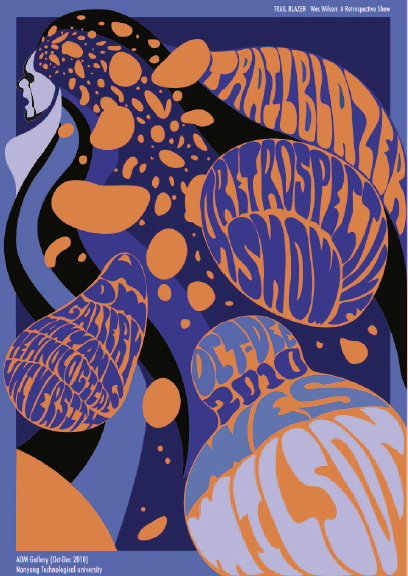
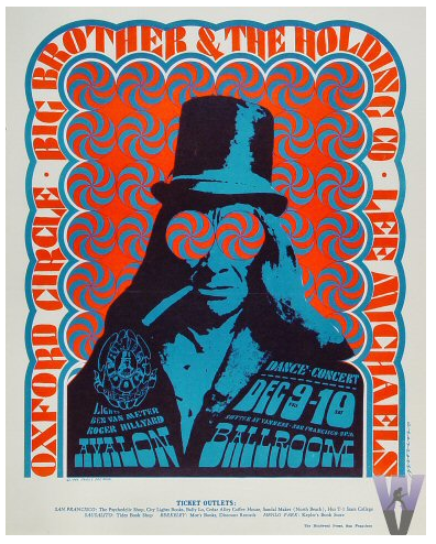
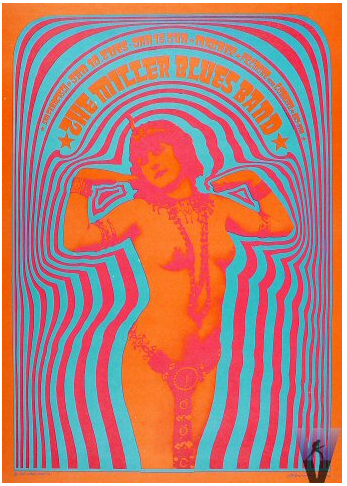
Note that the vibrancy and abstract swirls of psychedelic posters and album covers were meant to recreate a hallucinatory experience from drug use (LSD). For instance, these groovy, psychedelic fonts (below) from Wes Wilson’s music venue posters are so hard to read that it’s almost illegible.


Nevertheless, it’s effective as essentially appeal to their target market of the hippies with his graphic style. It’s also interesting to see that the colour vibration is achieved by taking colours from the opposite end of the colour wheel (eg. Victor Moscoso’s posters). Although they might not be considered “harmonious” with its colour juxtaposition, the optical illustration achieved is staggering and is what eventually separate it from other art movements.
Recent Comments