The origin of Supergraphics can be traced to its introduction along with Supermannerism back in the 1960s. With the generation embracing free expressions and the 60s American urban culture/art, the application of graphic elements and International Typographic Style to architecture became a hugely popular art concept. In relation to architecture, supergraphics generally consist the use of bold geometric shapes, san serif typefaces, bright colours and scale changes.
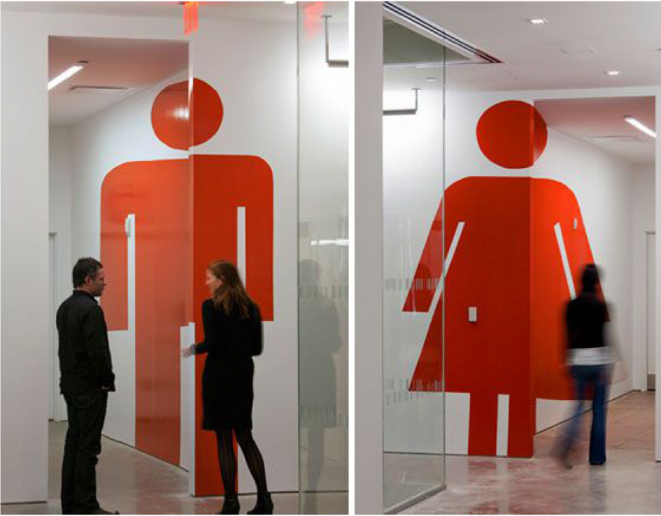
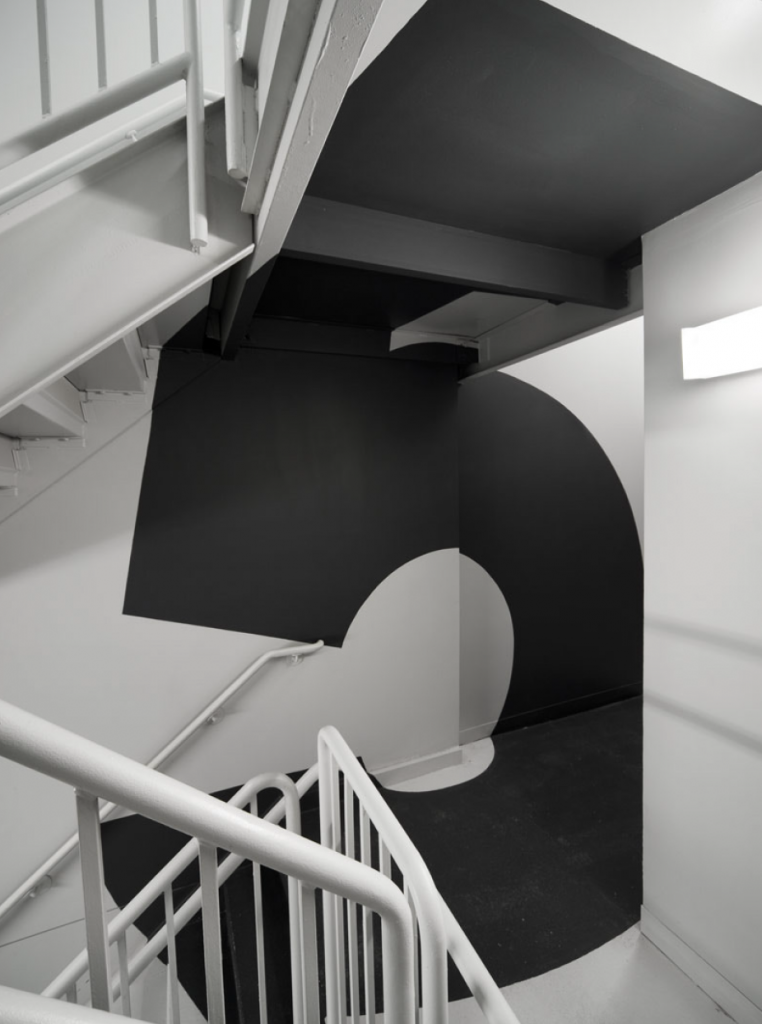
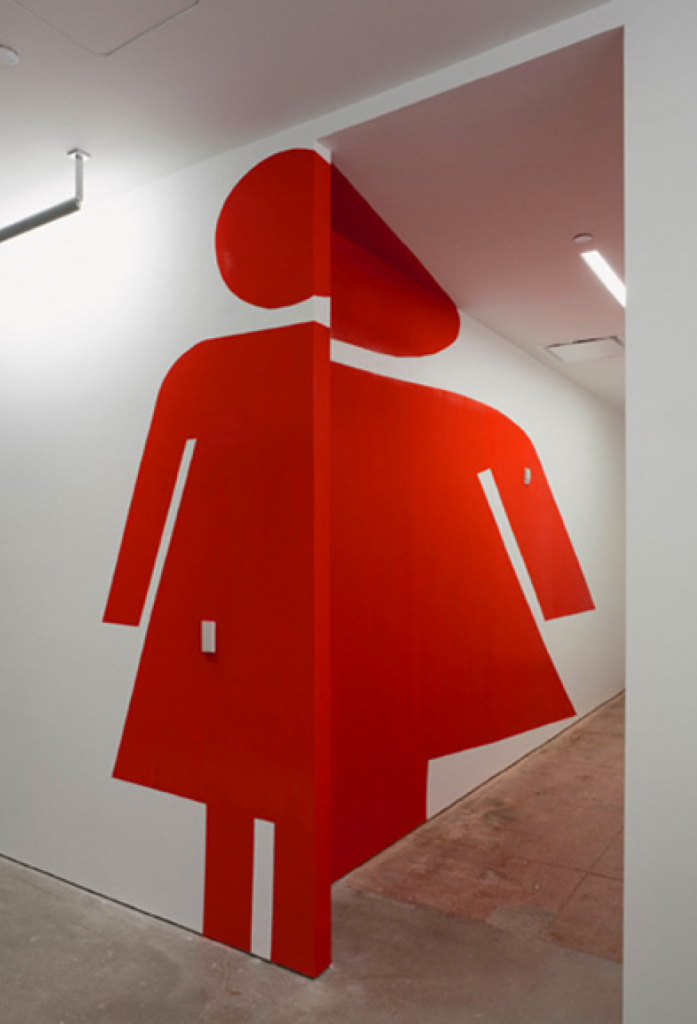
In particular, I really like the examples of designer, Paula Scher as her supergraphic applications to buildings’ interior often give us a feel of both flatness and depth depending on what angle we see it in. It is almost like her team has completely disregarded the three-dimensionality and apply the type as if the interior was a two-dimensional space.
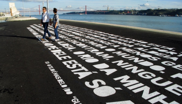
Other than architecture, type can also be integrated as a linear pattern on the ground for street art and guide. A real life application is the street of Lisbon Bikeway in Portugal we can see today. Not only is supergraphic used for decoration, it also has a practical purpose of indicating bike lanes, speed limits and other information.
References:
https://www.fastcompany.com/90162145/a-tour-of-the-worlds-coolest-supergraphics
http://www.historygraphicdesign.com/the-age-of-information/postmodern-design/871-supermannerism
Recent Comments