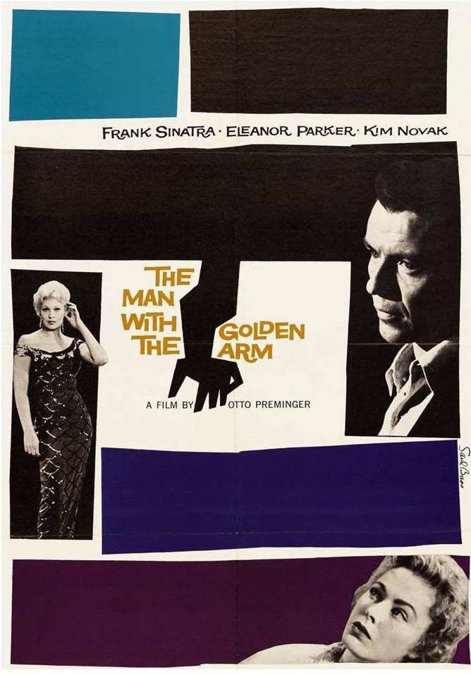
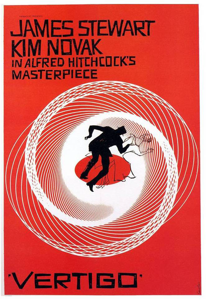
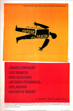
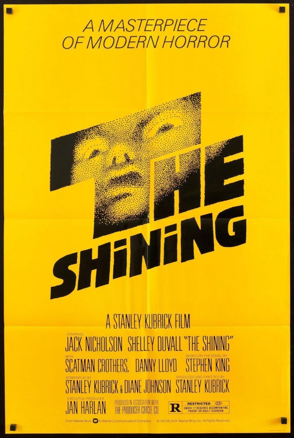
This week’s survey highlights some really innovative modern design! In particular, I was completely blown away by the works of American graphic designer as well as academy award winning filmmaker, Saul Bass (1920 –1996). Instead of opting for a photographic or illustrative approach, Saul Bass conveyed powerful messages with abstract, geometric marks that resembles paper-cutouts.
Link: Anatomy of a Murder’s Title Sequence
Film posters like The Man with the Golden Arm and The Shining and title sequence like Anatomy of a Murder, for instance, demonstrate Saul Bass’ sophisticated concepts as the Art Director. Though most of the shapes he used seem spontaneous, they often have a clear structure through alignment, and minimal colour palettes.
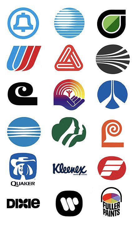
Needless to say, Saul Bass also designed some groundbreaking corporate logos for clients like Bell System, AT&T and United Airlines. His signature modernist style is also evident in his corporate logo design.
Saul Bass’ creative solutions for film and corporate identity are truly game-changing! No wonder why many of these logos still remind the same after many decades.
References:
https://adage.com/article/behind-the-work/a-favorite-saul-bass-logos/241361/
https://en.wikipedia.org/wiki/Saul_Bass
https://99designs.ca/blog/famous-design/saul-bass-graphic-designer-of-a-century/
Recent Comments