Post modernism Design: New Wave, Retro and Vernacular Design
While Modernists see “less is more”, Postmodernist went against the current and say “less is a bore” . Essentially, Postmodernism was a philosophy and art movement emerged in the 70s as a reaction and skepticism towards Modernism. Experimentation and variety of solutions are often the key concepts for Postmodern practitioners.
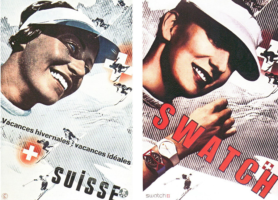
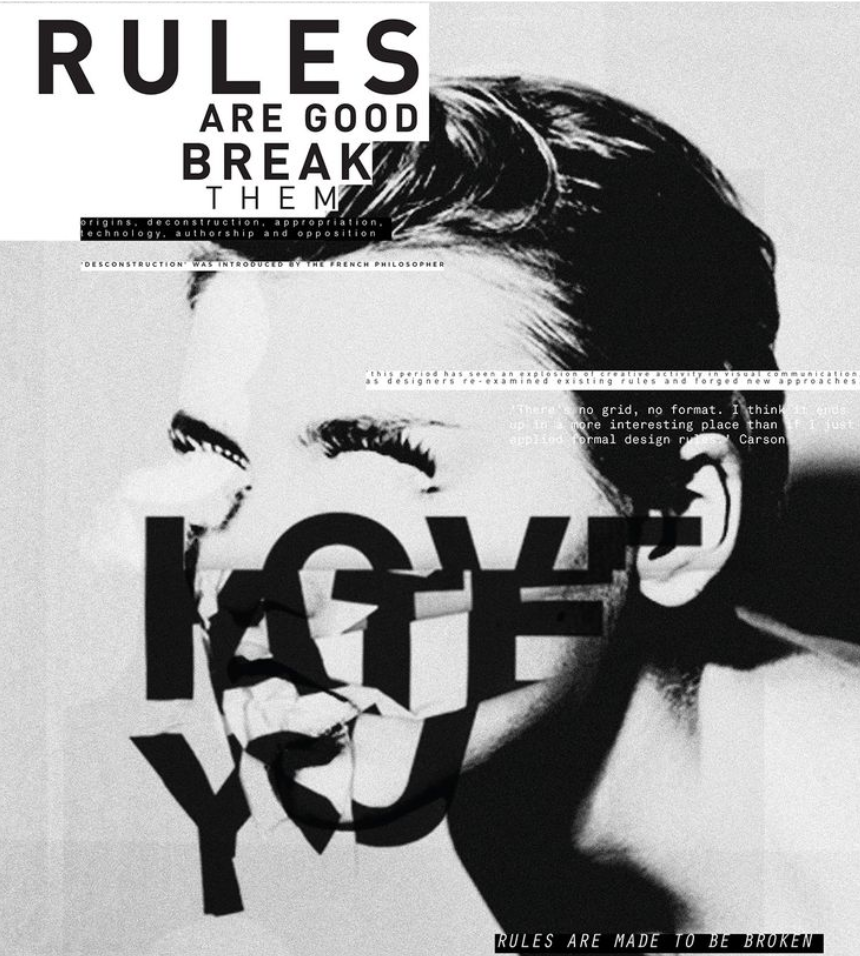
Within the scope of Postmodernism, New wave typography was first introduced by Wolfgang Weingart through his teaching at a Swiss design school. The experiments of New Wave style usually involve juxtaposed visual arrangement and challenging strict grid conventions. His early works usually included typographic experiments, but later by mid-70s, he started to include photographic imagery with collage elements as well. His progressive style was also adapted by American designers like April Greiman, Dan Friedman and David Carson. Designers further deconstructed Weingart’s New Wave design and played with deconstructive and chaotic arrangements rather than legibility.


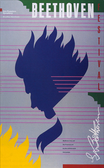
Retro design emerged in the 80s New York City as a style recycling earlier genres and styles in pop culture and new contexts. Some of the major designers taking parts in retro design were Paula Scher, Louise Fili and Carin Goldberg.


Vernacular Typography was another postmodernist style exploring urban and contemporary cultures. Through the form of typographic expressions in local signages, graffiti and posters, “voices” of local culture were represented through typefaces and hand-crafted fonts. If you look around, vernacular Typography is still present in some local areas of Vancouver, but unfortunately due to gentrification, many of the signages and graffiti were slowly being erased from our urban environments.
References:
https://www.tate.org.uk/art/art-terms/p/postmodernism
http://www.designhistory.org/PostModern_pages/NewWave.html
http://danielgalea93.blogspot.com/2015/01/new-wave-design.html

Recent Comments