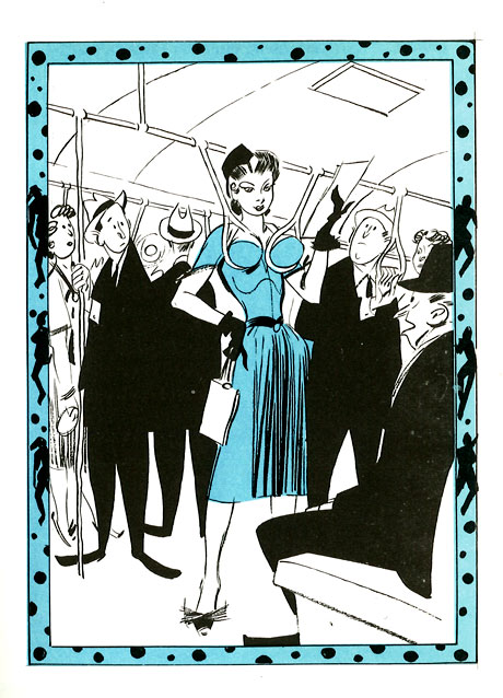
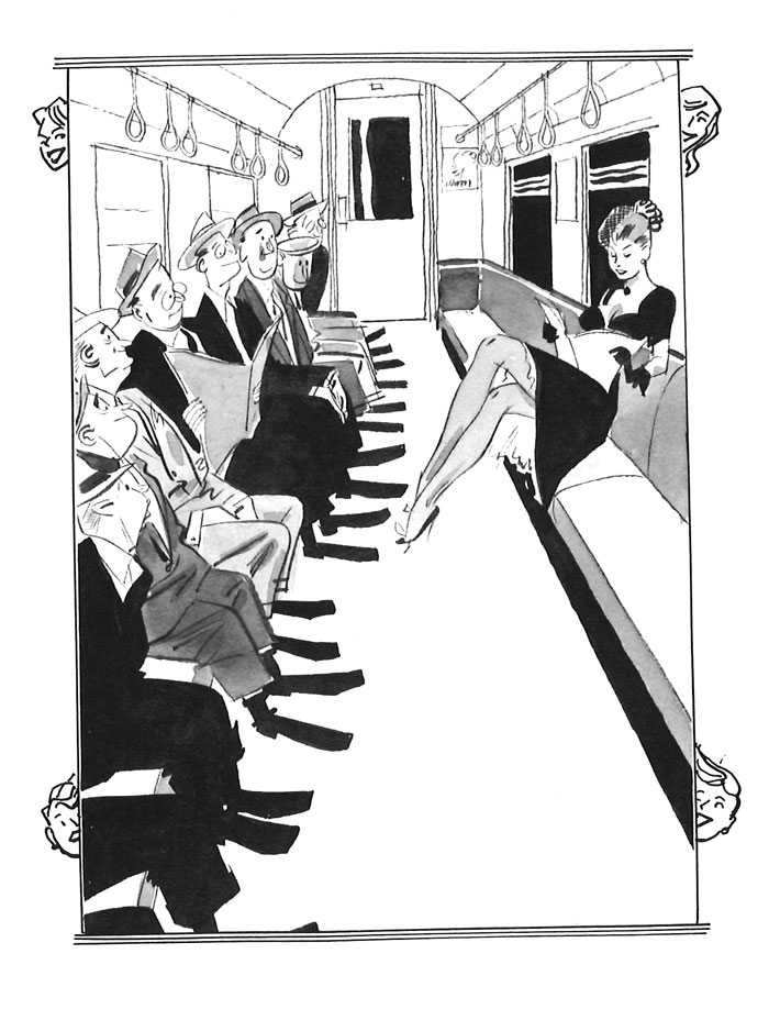
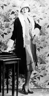
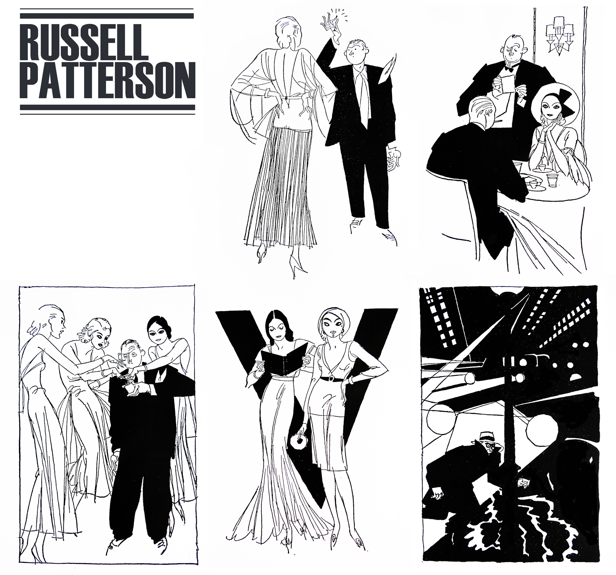
Many of us know that the iconic image of 1920’s fashion isn’t truly representative of the everyday citizen of the time. The average woman was not walking around draped in glass beads and with a parabola for an eyebrow. Much like the Gibson girl or the Arrow Collar man the flapper is a character made to sell products, experiences, and most prominently, a lifestyle. Russel Patterson was instrumental in creating the image of the flapper. He illustrated bold, desirable women who emanated fun and powerful sexuality, an image that previous to the 20’s was viewed as more taboo than not. Pattersons work teeters on the edge of pornography, but somehow still manages to keep the woman in a powerful position. Many of the other artists creating similar work at the time made the woman weak and powerless. Patterson reversing the roles set him apart from his contemporaries.

In his childhood Patterson was confident about his career path, claiming from his teenage years that he wanted to become a magazine cover artist. However, he would attend McGill University for architecture, do cartooning work, and have a full career in interior design before attempting to join the army and getting rejected. It wasn’t until after an extremely expensive pleasure trip to Paris that he would decide to pursue illustration full time, and would do so at the Art Institute of Chicago. For a time Patterson attempted to work as a fine artist but struggled in creating work that was suited to the prestigious gallery environment.

Patterson became frustrated with not seeing eye to eye of those in the fine art world, and in 1925 and decided to seek fresh ground in the artistic centre of the universe; New York City. He started to inject the glamorous culture of Paris into his illustrations, and appealed to the taboo humour of the American audience by making his subject matter blatantly suggestive and dynamic. He brought his lively characters to the covers of College Humour, Life, Ballyhoo magazine, and many more in the following years

His illustrations served not only as comical images, but soon became inspiration for clothing, creating that distinct appearance among New Yorks upperclassmen that is still known today. Pattersons women were however more revealing than the average women on the street, and his influence presented itself in the real world in a much more subdued nature. Specifically shape-wise, as Pattersons women had defined waists and hips, and the real trends were virtually the opposite.
When speaking of Patterson’s style, there are a few key words that come to mind. Its as if he is the child of Aubrey Beardsley and Rea Irvin, with his simple line work, taboo topics and high contrast use of flat colour. His compositions certainly fit the era of Irvins New Yorker illustrations, but his characters and subject matter is rather like that of black-sheep Aubrey Beardsley (and by extension, Will Bradley).

As the 1930’s approached and Pattersons fame was on the steady increase, he started to design sets for Broadway shows and musicals which were known for their elaborate and complex designs. This job of his was short lived, and when the Depression took hold of America Patterson had to turn away from the stage. Instead, he turned to department store window sets for the likes of Macey’s and I.J. Fox, as well as continuing his illustrative advertisements.
During World War 2 Patterson continued to build his multi-faceted reputation. While creating a comic strip of his own, he also designed the Women’s Corps uniforms, train and restaurant interiors, as well as hotel lobbies.

Russel Patterson was one of the lucky illustrators who, although their work was heavily set in the style of the luxurious 1920’s, was able to continue building a name for himself throughout the Great Depression and the War. The public was enthralled by his curious and powerful characters. Additionally, his humour translated well into the years after the stock market crashed, keeping the attention of the suffering public. Pattersons comical sexuality was entertaining, and wasn’t at risk of being shut down with changing times. He was almost the opposite of contemporary John Held Jr, and evolved with the times to find work that suited the demands of the changing public.

Personally, I find Patterson’s work enthralling. Although heavily sexualized and most likely degrading in some senses, I find his work entertaining and funny. I think the difference between him and previous artist’s I’ve explored who focus on taboo topics like these is that Patterson never makes the woman weak. By no means are his works feminist or anything along those lines, but it is refreshing to see the depiction of the woman change. Perhaps thats why the public kept their attentions on him and not on his contemporaries. Additionally, I find that his diversity of skill ranging into all aspects of design is extremely admirable and shows in his work greatly. His curious compositions in his illustrations transfer over to his stage work, his fashionable drawn characters inspire his costume and fashion design, and so on and so forth. It is always admirable to see a “Renaissance man,” excel in every avenue of their work.
Sources:
https://www.comixology.com/Top-Hats-and-Flappers-The-Art-of-Russell-Patterson/digital-comic/490256
http://artofrussellpatterson.blogspot.com/
https://www.societyillustrators.org/russell-patterson