FOUND Campaign Process

Starting this project, I knew that my views on decolonization and indigenous relations would be vastly different than my target market’s. When talking to my mom about the issue she brought up the inconsistencies in medical care when treating aboriginal children and families, and eventually we landed on the topic of the foster care system.

Initially, I wanted to focus on the failure of the government dating back to the Sixties Scoop. I knew I wanted to focus on the individuals to gain empathy from the target market, but I knew I couldn’t call the children broken or incomplete, and at the same time I couldn’t villainize the parents partaking in the foster care system who were providing positive experiences.

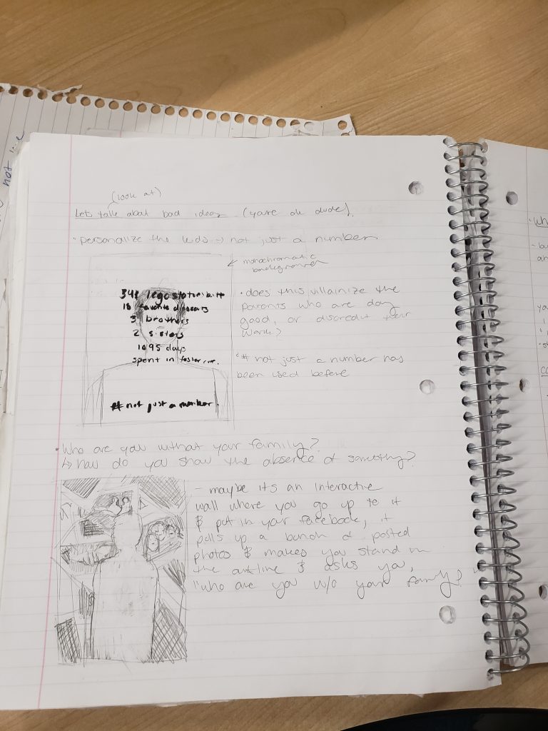
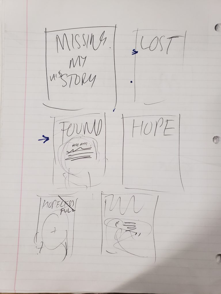
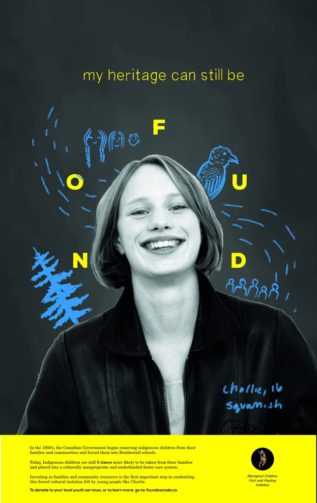
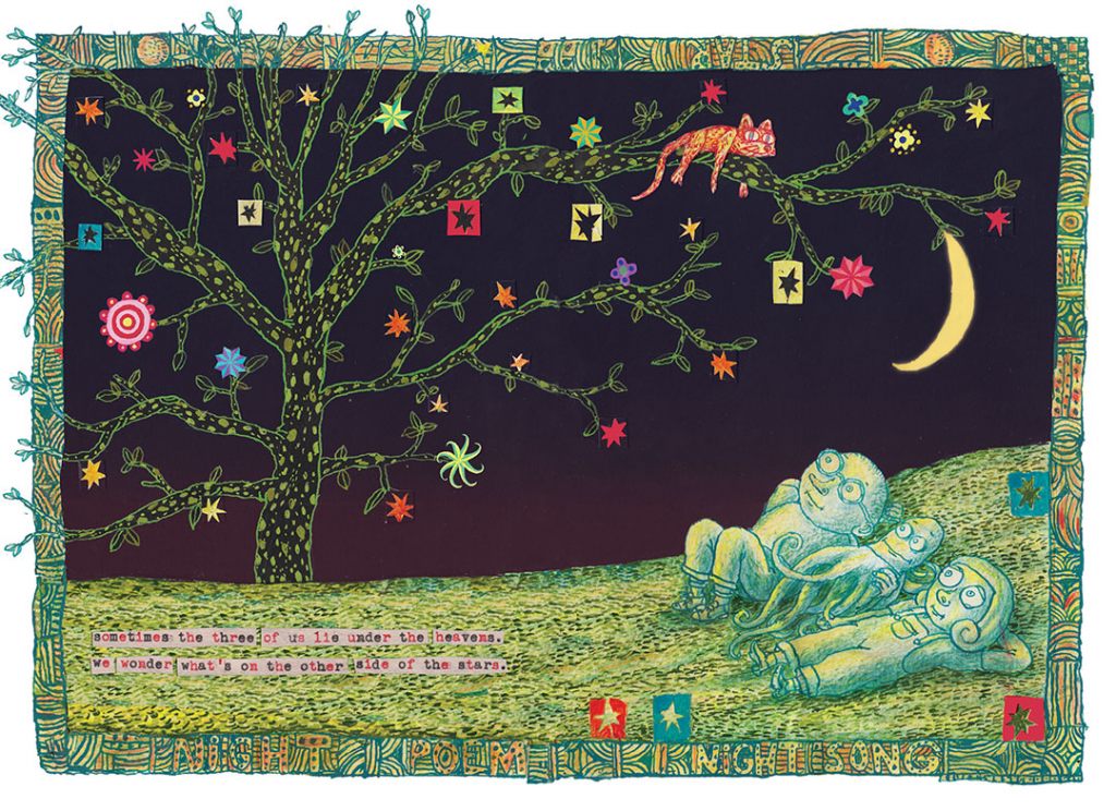
With this in mind, I originally landed on the phrase “Missing But Not Lost,” intended to address the Indigenous identities of the children separated from their communities who’s culture/language/family ties were “missing but not lost,” intending to build awareness for the issue and inspire change in elections. However, this sounded too close to the Missing and Murdered Indigenous Women campaigns, and it pointed fingers in the wrong directions. It was through ideation with peers and professors like Vida that landed the idea of the “FOUND” posters. The idea of being found vs. yet to be put the exact positive spin on the campaign that I needed, and gave footing to the funding it needed. Although this removed it from the direct problem (intergenerational trauma and a lack of parenting skills due to the Canadian Government) it re-contextualized the campaign into one of hope and community building, not loss and mourning.

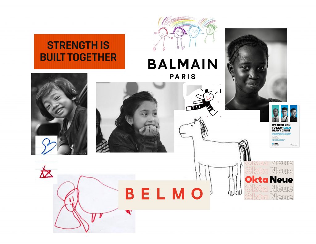
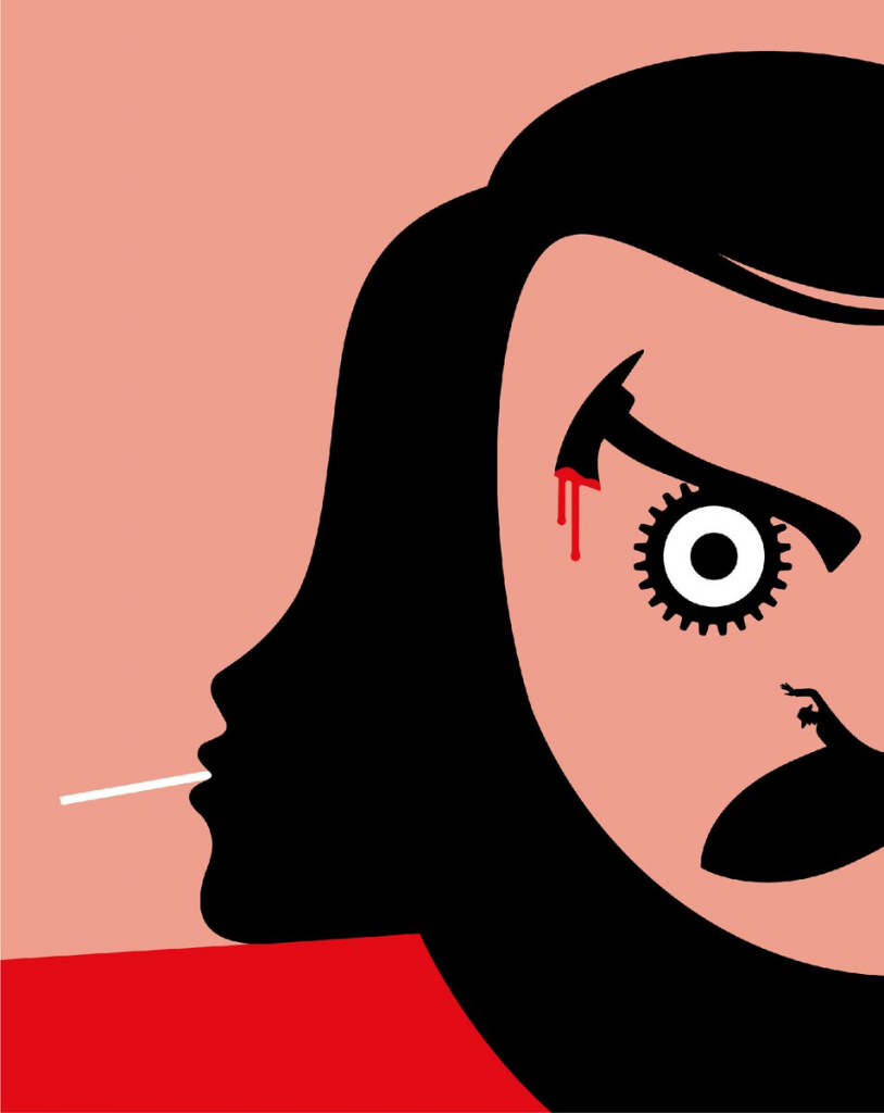
To keep with the positive, youth centred theme I chose to utilize bright colours and children’s illustration. I wanted the posters to be eye catching and dynamic to make them stand out. (See mood boards above.)
I understood that the target market would easily look past a regular poster with a child’s face on it, so I wanted to play to the emotional appeal by showing showing a child in a way that they would want their own to feel. Happy, whole, and inspired. This is also why I decided to incorporate an animated aspect into the campaign, to catch the eye and confront them with an image that seemed alive as opposed to static.

Concept for animated version of posters that could be applied in multiple ways.

These animations could take form in a number of ways. A short 5 second ad with a simple found logo and link at the bottom, a long form narrated commercial, replacing the photography and illustrations exactly the same as the posters above, an animated card on the website, etc.

Final Poster 1/3
Poster 2/3
Poster 3/3 (Color when importing into WordPress extremely oversaturated, please refer to PDF for accurate color.)

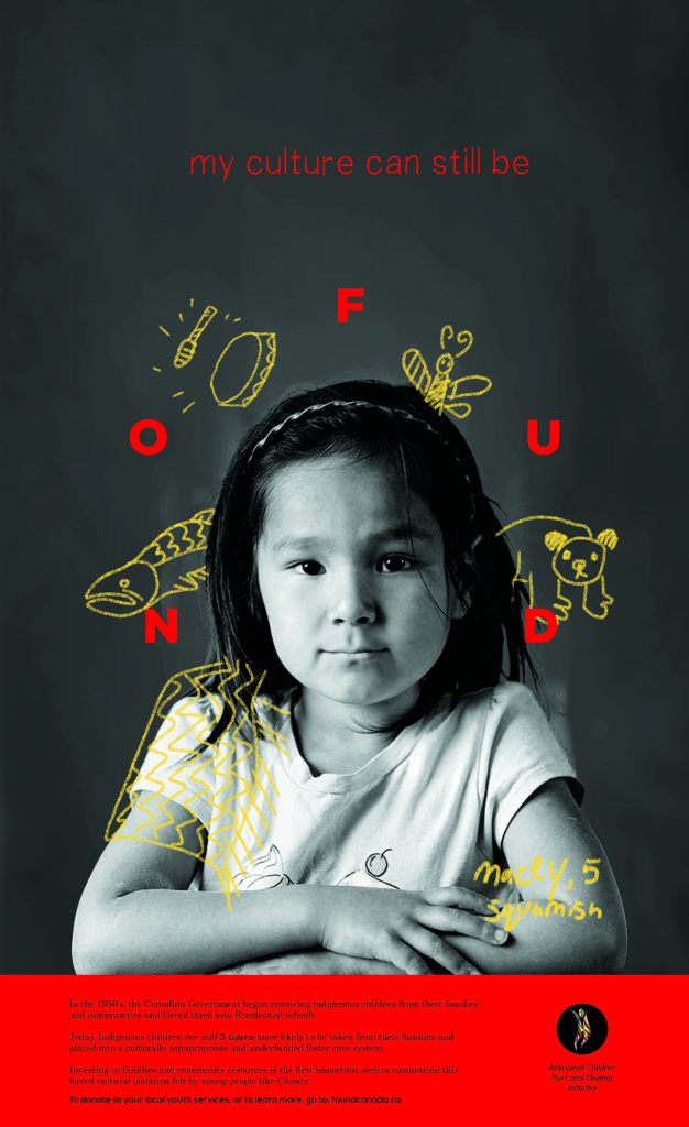
I also decided to include a website to provide an opportunity for education and further explanation of the initiative. The first step in removing cultural barriers is always education, allowing the viewer to build sympathy and de-mystifying the other group step by step. At Found.ca, the visuals match that of the poster, and then provides culturally relevant information for each of the illustrations to start educating the viewer in an approachable and comfortable way. Now that you have an emotional tie to the main child shown (Marcus) and you feel like you understand him a little, it explains the reality of the situation lower down the page as to not shock you with it straight away.

Landing Page Design for Found.ca, the face of the campaign lead by the Aboriginal Children Hurt and Healing foundation.

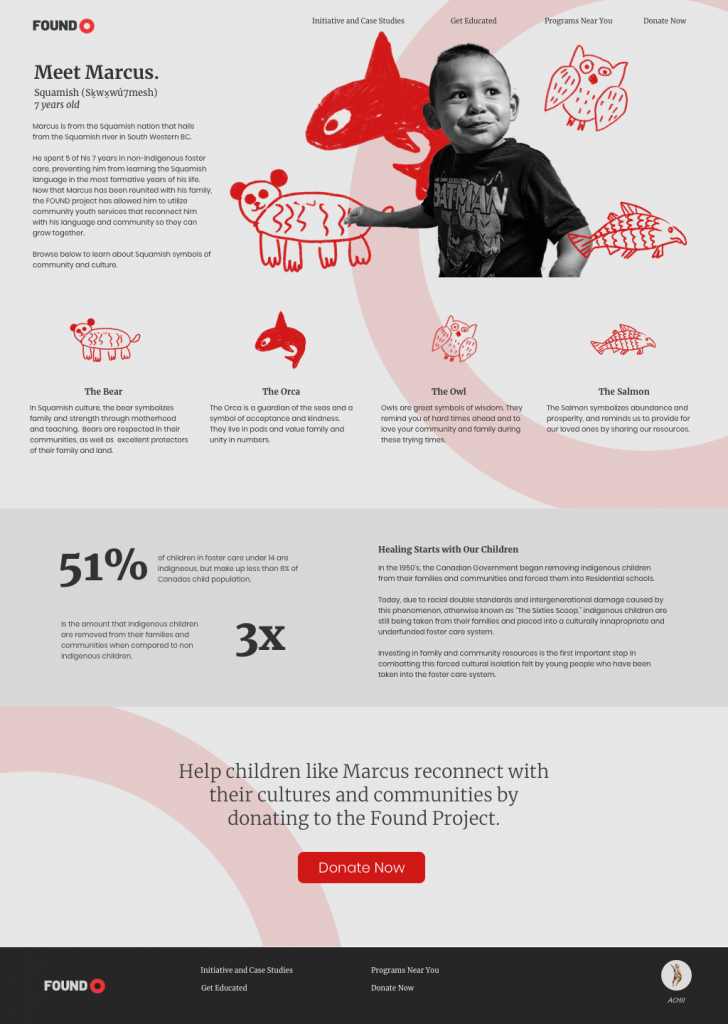
Overall, I wanted this campaign to be an approachable, positive way to address, educate on, and fund the very intense process that is rebuilding culture within indigenous youth that have been separated from their communities. The Found project builds up and helps fund organizations that help youth to reconnect with their cultures, languages, communities, and families. These are local youth groups, night-classes for Indigenous languages, Indigenous lead art camps, etc. that contribute to a sustainable community children in foster care would not have had they been without services that the Found project provides.

Self Evaluation

Although I’m happy with my final product, research, and strategy rationale, I think my ideation process and workflow could have been streamlined. I stressed myself out too much in the beginning stages and delayed my working time significantly. In the final product, I am happy with the aesthetic and art direction. I worked very hard on the copyrighting and hierarchy but recognize that there is always room for me to improve in those two areas. If it makes sense, I’d give myself a low A for execution and a B for process.

Decolonization Project Direction

Indigenous Families are separated 3x more often than white families in favour of placing the children into a broken underfunded foster care system.

“The Sixties Scoop” refers to the mass separation of indigenous children from their families in 1960’s Canada, where they would be taken away to Residential School. Although promised as a temporary action, almost all of the children fell extremely ill, lost the skill to communicate using the language they shared with their families, or died inside these schools. Instead, the children who survived became displaced, forced to assimilate into white communities that refused to accept them on an equal level.

Cut to present day, and the Canadian Government has just been sued for the exact same offence. Indigenous families are separated by social workers and government officials three times as often as white families. This is due to prejudices and misrepresentation of First Nations in Canadian healthcare, as well as a long-standing double standard regarding what it takes for a parent to be deemed as “fit” to care for children. For example, although a white parent and indigenous parent might be enduring similar struggles, the bar for the indigenous parent is unrealistically higher. Because of this, children are taken away much more often than in white families even though the household could be exactly the same. In Manitoba during the early 80s, provincial officials estimated they took in 600-700 indigenous children every month.

“A recent study found that 52% of children under 15 in foster care are indigenous. Yet Indigenous children are just under eight per cent of the under-15 population in Canada today.

More than 90 per cent of Manitoba’s 11,000 kids in care are Indigenous. In B.C. 64 per cent of our 6,804 kids in care identify as Indigenous, even though they make up just under 10 per cent of the population under 19.”

Katie Hyslop, TheTyee.ca

The children would then be placed in chronically underfunded foster care systems, where the adults responsible for care are grossly under assessed and without proper monthly allowance. This meant children were placed in abusive homes without sufficient opportunity for care, often with no opportunity to maintain their culture. This underfunding is the direct fault of the Canadian government, and the system they operate on is still modelled after the settlers ideas of First Nations upon first contact.

“Like every social issue facing Indigenous people in Canada, the origins date back to colonization.

The earliest settlers’ writings show their misunderstanding of Indigenous child-rearing and how their feelings of racial and cultural superiority clouded their judgments.

Early missionaries saw First Nations child-rearing practices as ‘negligent, irresponsible and uncivilized’ because they refused to physically punish their children and respected them as individuals, instead of seeing them as clean slates on which to write. Settler governments viewed Indigenous people, adults and children, as wards of the state. The 1876 Indian Act, …effectively gave government control over First Nations people’s lives, dictating where and how they would live, hunt, work and play…And how their children would be raised. Three years after the Indian Act was passed, then-prime minister Sir John A. Macdonald sent MP Nicholas F. Davin to the United States to study its system of industrial boarding schools for Native American children.”

Katie Hyslop, TheTyee.ca

To say this issue is multi-faceted would be an understatement. It is a perfect example of the cyclical damage caused by residential schools and the Canadian governments neglect to repair it. It demonstrates the depth of the mis-representation of Indigenous families, while showcasing the direct role that the government plays in perpetuation those stereotypes. As of September of 2019, the Supreme Court ruled in favour of the Indigenous groups suing the Canadian government. It was intended that as of 2020, each child affected up until 2006 would be payed out a maximum of $40 000 dollars each for the trauma the government caused. The Trudeau Government announced in November that they planned to settle the class-action lawsuit after asking for an appeal in October.

With this project, I hope to do two things.

  • Educate non-indigenous Canadians on the humanitarian crisis and cyclical, deep-rooted nature of the displacement of indigenous children in the foster care system in an engaging, emotionally appealing way that bridges the gap of these being real families, as opposed to groups and statistics on the news. I want families who aren’t necessarily invested in the affairs of first nations children to realize the depth of the issue and that our past of residential schools are not yet behind us.
  • Create a call to action for those who are entitled to compensation to utilize an advertised service (most likely a website, or office in their city) to take the next steps in receiving compensation.

Research Links:

Noma Bar- Lecture 10/11

“Bar’s work has been described as “deceptively simple”, featuring flat colours, minimal detail and negative space to create images that often carry double meanings that are not immediately apparent.”

Noma Bar is an Israel born graphic designer and illustrator who’s work has gained numerous recognitions and awards in recent years. His provocative, stark works are extremely conceptual while utilizing the most simplistic forms. He has truly refined the conceptual image, and is known for his flawless rendering of the “visual innuendo.”

Bar boasts a heavy publication list, including, but not limited to the likes of:

“Time Out London, BBC, Random House, The Observer, The Economist and Wallpaper*. Bar has illustrated over one hundred magazine covers, published over 550 illustrations and released three books of his work: Guess Who – The Many Faces of Noma Bar in 2008, Negative Space in 2009 and Bittersweet 2017, a 680 page 5 volume monograph produced in a Limited Edition of 1000 published by Thames & Hudson.”

~ Dutchuncle.com

Noma’s career is currently based in London, but began in his childhood. He would make caricatures of his teachers at school, and although crude, showed his potential from an early age. He also credits his creative influence to his neighbour, who would create life-sized sculptures out of extra farm machinery parts. He says that this laid the groundwork of his artistic visions, saying that it showed him that ‘you could take something and make it into something radically different, just by composition. That is the basis of all my work now.’

During the 1990 Gulf War, while seeking refuge in a bomb shelter in Israel, he noticed the striking resemblance that Iraqi leader Saddam Hussein’s face had to a radioactivity symbol, and he created the first portrait that would later exemplify his symbolic style. He would go on to create similar images of Hitler, as well as icons of the times.

He would study calligraphy, graphic design, and Hebrew typography at the Jerusalem Academy of Art where he would refine his graphic style. He would meet his wife and fellow graphic designer Dana Bar. Upon graduating in 2000, Bar would move to London to pursue his career, with his first major publication afterwards being a full page of William Shakespeare for the popular publication Time Out London. The couple is currently settled in Highgate, where they work doing freelance and contract labels, and live with their two daughters Mia and Lili. Bar has produced multiple books collecting his works in recent years, the most popular being “Guess Who? The Many Faces of Noma Bar,” and “Negative Space,” both acting as a purchase-able portfolio of his extensive works.

In summary, Noma Bar is a unique illustrator of the day. There are not many who can compare to the sheer intellect and wit that is able to be conveyed by such minimal shape and line. As a budding designer and illustrator, I can easily say how admirable his work is. It’s always easier to include more, to overcomplicate your pieces and to justify them via the image. Bar’s work sits on a level of sophistication that makes this a non-issue. He’s able to convey recognizable and high-level concepts while providing the smallest amount of information possible, something that I think all illustrators should strive for sometimes. He really redefines what the word “graphic” (giving a vivid picture with explicit detail) means. Unlike others, Bar trusts the audience to fill in the missing pieces on their own. The work stands on it’s own, and that’s hard to come across.


https://www.dutchuncle.co.uk/noma-bar

Herb Lubalin: Post Modernism

Herb Lubalin studied at the Cooper Union of New York and continued on to build a reputation of being one of the most influential designers of the late 20th Century. During his career he would take on the role of art director, in house designer, and would open his own company: Herb Lubalin Inc.

Image result for Herb Lubalin

Lubalin’s reputation is very expansive. He boasts a large portfolio of logo designs, corporate branding, and others, but is primarily known for his innovative and groundbreaking word marks. Before this section of his career, he worked for the likes of Eros, Upper and Lowercase, and Avante Garde as an art director creating provocative and eye-catching cover works.

Overall, Lubalin’s career revolutionized the use of type. Instead of being a part of the image, he made type become the image. As seen with his inventive word marks, the type is the only thing that’s needed to tell the story, and he does so without using any illustration or additional visual material.

http://www.lubalin100.com

http://www.historygraphicdesign.com/the-age-of-information/the-new-york-school/681-herb-lubalin

Henrik Drescher – Lecture 9

“In his artist statement, Drescher writes: “Since an early age I’ve been an image scavenger, my mind has always been alert to image debris, keeping ideas and images in books, which then spill into my painting and illustration. In my image making I try to register the idea of ‘everything at once,’ a sort of Sears & Roebuck mail-order catalog filled with an inventory of all that has ever existed in the course of organic history and human memory…scars, tattoos, cracks, memories, impressions, flashbacks, and forgotten instructions.”

~ hdrescher.com

Self describing his works as “everything at once,” Dreschers work is loud loud and visually abrasive in the best way possible. He incorporates so much texture into his work that viewing it is almost a tangible experience. If it was possible to use a physical sensation to describe an artwork, Drescher’s peices would be itchy.Although an illustrator, he manages to blur the line between fine art and classic illustration, bringing personal metaphor into every work he creates.

His children’s books are for the most part, more comfortable, although his titles are anything but. (See below, McFig and McFly, a Tale of Jealousy, Revenge, and Death). Through using a calm colour palette and a decisively more friendly line, he changes his jarring style into one that is more viscerally settling.

Otherwise, his work is similar to that of a mushroom trip. Don’t worry, I’m not basing this off of a personal experience but rather the work of Bryan Lewis Saunders, a fine artist who has become famous for creating a body of work that can certainly relate to Drescher’s aesthetic. Lewis has created upwards of 8500 self portraits under the influence of different drugs (I don’t know about you, but I didn’t even know there was more than 8000 drugs). The piece I’m specifically referring to, seen below, has that same itchy and tangible quality. Both Saunders and Drescher’s work has the same effect on me. I’m not sure if it’s the searing stares of Bryan’s self portraits, or the way I can practically feel the beard hair of Saunders 2-cap taking portrait that reminds me of Drescher’s unsettling, almost auditory line work.

The rest of Saunders work can be found here: http://bryanlewissaunders.org/drugs/

Although his pieces vary greatly, they bare a striking resemblance to Dresher’s illustrations, mostly in the way that they both induce that tangible physical response. Some of them are plain terrifying, and they’re certainly an anti-drug PSA if I’ve ever seen one, but they’re worth checking out.

Back to Drescher: his signature noisy style began in notebooks, taking form in rough sketches he created while travelling. Originally born in Copenhagen, Drescher immigrated to the United States when he was 12, and would attend the School of the Museum of Fine Arts in Boston on a full ride scholarship. In the years after his education, he took his career on the road and travelled throughout North and Central America and Europe. His sketchbooks are the root of all of his portfolio work, he claims, filled with ideas, images, and icons from his travels. He still creates extensive sketchbooks today, and claims that the majority of his ideas come from them. Drescher takes inspiration from these for client work and for his personal fine art career.

“Winter,” from Drescher’s ambiguously titled “Geriatric Kamasutra”

Publishing his first book in 1982, he would go on to create more than 50 books in his career. The titles range from children’s books, fine art collections, notebooks, kamasutra’s, and others. Drescher is currently working as a freelance illustrator for major publications in North America. Nowadays, he credits the work of Chinese landscape painters as the main inspiration for is work, a result of 10 years living there. He has been recognized by the United States Library of Congress, showing his work in an entirely solo exhibition.

Overall, Drescher brings a completely fresh perspective to what it means to be an illustrator. His work stands out from his contemporaries in a way that in my mind is rivalled only by 8000+ drugs. His work defies category, but still resonates with the viewer. Although they do admittedly make me physically uncomfortable–if I haven’t mentioned that enough in this post–they bring comfort in other arenas. His pieces harbour and indescribable sense of nostalgia and familiarity. Maybe it’s the fact that his illustrations have so much going on that doesn’t make sense that make everything else in the world of similar diagnosis feel better. Or maybe I’m reading into it way too much, but the more work of his I discover the more I appreciate its business and jumble of textures.

http://www.hdrescher.com/illustration/

Francis Livingston

The word “extraordinary” didn’t mean much to me until I discovered the world of illustration. Unlike photos, or even abstract fine art, illustration was able to take the mundane and make it just that, more. More than ordinary, but in a way that was believable and somehow more than real.

I’ve often found that while searching through the lists of illustrators for these blogs that there is one who stands out among the rest. While perusing this particular collection of names, however, there was nobody that jumped out to me. There was Braldt Bralds who has one of the most interesting names of all time and happens to paint only cats, which was interesting enough, but then I stumbled upon Francis Livingston.

Livingston’s work didn’t immediately catch my eye. The first images that come up after searching his name are city landscapes and beautifully lit buildings. Sure, they’re well done, and somebody else could easily write five hundred words talking about his quality of light and faithful devotion to intricate colour studies. But I wasn’t about to spend my time on just buildings when there were so many more attention grabbing artists out there.

But then I found this picture.

“Light Stream, 2012-2019”

I was in awe, and immediately enthralled with the work of this man that I knew quite literally nothing about. He could be a murderer, for all I knew, but I didn’t care. This was one of my most favourite pieces I’ve ever seen, and it will be for a long time. Something about the quiet grandeur of the scene, the humbleness of the paint strokes and the nonchalant nature of the whale that peacefully swims above the unassuming crowd. This illustration makes me want to be there, to live in the world that Livingston has so deftly crafted.

And yes, obviously his quality of light and immaculate handling of colour and brushstroke quality is incredible. We can’t really talk about his work without recognizing his ability as the rest of the artistic world has. His biography on medicinemangallery.com touches the edges of his reputation, stating:

“Born in Cortez, Colorado, Francis Livingston is in the top ranks of American illustrators, and his work has been widely published. Francis Livingston’s paintings have been exhibited in San Francisco, Los Angeles, and New York. Livingston was awarded both Gold and Silver Medals from the New York Society of Illustrators, San Francisco Society of Illustrators, and Society of Illustrators of Los Angeles.”

~ medicinemangallery.com

Livingston credits his inspiration to the likes of Sargent and Whistler, and studied Diebenkorn alongside the more modern Wayne Thiebaud. Looking at his more traditional illustrative works, this makes perfect sense. We can see that his landscapes strike a jarring resemblance to Whistler (as shown below), but add a twist of the “Bay Area flare” that Livingston was surrounded by during his formative years as an artist.

Winter Landscape by Livingston
“Crepuscule in Flesh Color and Green: Valparaiso” James Abbot McNeill Whistler, 1886.

After a 10 year teaching career in San Francisco at the Academy of Art College, Livingston and his family relocated to Idaho. Much like James Elliot Bama Livingston completely switched genres and client bases. His earlier career had consisted of painting the San Francisco Board Walk for years, but now focuses on the stretching plains of the mid-west (see “Winter Landscape,” above).

However, his newest work consists of ones similar to the original “Light Stream” that caught my eye. Livingston continues to combine natural elements with 20th century architecture and mundane scenes to create striking, jealousy-inducing images. He creates a whole other universe within his paintings, which now tend to fall under the category of fine art instead of illustrations. Livingston brings to life the classic “Night at the Museum” concept in a lively, mature, more believable way. Additionally, he does so with the intent of making it seem situationally realistic. It’s this factor that makes these works of Livingston’s resonate so intensely with me. It appears as if you’ve just hung around Penn Station too long and you’ve just caught a glimpse of some of the largest creatures on earth commuting home from work.

That being said, I think this quality will give Livingston’s work lasting importance. Perhaps not in the eye of critics, or even in the world of professional illustration. These are the type of images that children see that make them want to become illustrators–much like the drawings that I credit my ambition to–that leave lasting impressions and stay in their mind forever. Dreamlike images (in my experience) tend to be far more impressionable than landscapes or portraits, no matter how great the lighting or colour palette is. I guess what I’m trying to say, in my oh-so-round-about way, is that Livingston’s works deserve value and permanence because of how inspirational and extraordinary they are. They made me feel like I did when I first discovered art and illustration, sitting on the carpeted floor of my childhood bedroom, putting together puzzles of a golden fairy queen, realizing that I wanted to create things like that. Personally, it’s works like these that deserve recognition and lasting praise over landscapes and immaculately done portraits.


https://www.deviantart.com/francis-livingston/gallery/ https://www.medicinemangallery.com/francis-livingston-biography/ https://www.tate.org.uk/art/artworks/whistler-crepuscule-in-flesh-colour-and-green-valparaiso-n05065

Steff Geissbuhler

Geissbuhler is hailed as one of the most important designers in the field of integrated brand and corporate identity. His portfolio owns almost every form of media; from posters and illustrations to architectural graphics. He is the founder of Geissbuhler design, his self titled independent design company.

Born in Zofingen, Switzerland, Geissbuhler entered the world of design through Geigy Pharmaceuticals designing promotional material for them. This encompassed advertising, packaging, and other medias. Prior to this, however, Geissbuhler studied at the Basel School of Art and Design to get his diploma in graphic design, where he studied with Arman Hoffman and Emily Ruder.

After Geigy, he went on to teach at the Philadelphia University of arts and packed up his whole family to move in 1967. He would later go on to become the chairman of the Graphic Design Department. He would move to New York in 1973 and continue his career while raising a family there.

Geissbuhlers body of work is perhaps one of the largest to be seamlessly integrated into every day society. His work is everywhere, and it carries an undeniable presence along with it. His perfected style speaks volumes, whether it’s in the form of the iconic NBC peacock, or in the Alvin Ailey logo that is entirely made up of dancers bodies. Geissbuhlers creations are responsible for a massive chunk of corporate culture, identity, and what it means to be successful within a brand.


Although he didn’t do the stereotypical Paula Scher-esque super-graphics, he did do these amazing pieces of large scale environmental graphic design. Although Geissbuhler’s designs were considerably less abstract and more logo centric, they still stand out as iconic pieces of design that have been integrated into the environment.

Take this installation titled “Freedom Movement” Geissbuhler did for Radio Free Europe in Prague. From one angle it reads “LIBERTY” in English, and “SVOBODA,” also meaning “liberty” in Czech, the same word from the other angle. I can’t help but be reminded of Scher’s painted on super-graphics, especially in the way that if you were to look at this from virtually any other angle it would appear to only be a miss-matched heap of metal with nicely cut edges.

While perusing his website, there was a long long list of experience, past employments, founded companies, and achievements. At the very bottom of seemingly endless blocks of all capitalized text was a single bolded phrase.  

MY FAMILY IS MY GREATEST ACHIEVEMENT.

I’m not sure why I feel the need to include that, but when you’re reading lines and lines of capitalized Helvetica Light, it’s nice to know that the people behind such influential professional portfolios don’t entirely live by their work.

“I’M HAPPILY MARRIED TO MY WIFE AND PARTNER, ELISSA, AND HAVE FOUR TERRIFIC AND TALENTED SONS, PHILLIP, A PHYSICIST, LIVING NEAR BOSTON; LUKE, A CINEMATOGRAPHER, LIVING IN BROOKLYN, NY; ALEX, AN ACTOR AND MASTER TRAINER, LIVING IN HARTSDALE, NY; AND BEN GRADUATED WITH A DEGREE IN SCULPTURE AND LIVES IN SEATTLE.
MY FAMILY IS MY GREATEST ACHIEVEMENT.”

~STEFF GEISSBUHLER

Etienne Delessert

Originally born in Switzerland, and now residing in Connecticut, Delessert creates work that could be summed up in one word: unnerving. Upon visiting his website, one of the first sentences written in to his biography states the following.

“For more than thirty years this self-taught artist has been translating his-and the world’s-ideas, passions, fantasies and nightmares into the visual language of books, magazine illustrations, posters, animated films, paintings and sculptures. He reaches both children and adults with his imaginary creatures and landscapes, juxtaposing the familiar with the fantastic to clarify this world and create new and lasting universes”

~ etiennedelessert.com


Ok. Reading this the fist time, I thought to myself, “Yeah. Yeah! That seems like a normal artists statement.” And then I reread it, and reread it again, because something didn’t sit right with me. Later I realized that it was the use of the word “nightmares” in such close proximity to the phrase “reaches both children and adults.” I let this sit for a moment while I clicked my way over to the gallery portion of his self-titled website. And then I understood.

Image result for etienne delessert

Although Delessert’s most identifying pieces are geared towards children, there is an undeniable uncomfortable quality to every single one of them. Sometimes it’s as simple as the unnatural colours of his characters eyes, or their strange, elongated features. It’s hard to put it into developed, educated words, but let me try and explain to you how these pieces make me feel.

Image result for delessert the endless party

It’s almost like these scenes all occur in the opening scenes of CSI Miami, or even worse, Law and Order. There’s always the sense that you’re watching something that you’re not supposed to; or that you’re doing something immoral by observing the scenes Delessert creates. That aside, though, these creepy illustrations have appeared in over 80 books, translated in over 14 languages, and have sold millions of copies world wide. So I’m seemingly alone in the whole crime show sentiment, and the public and professional world is enamoured with his work.

Image result for etienne delessert

So much so, that his website states: “Twice he was honored by the Premio Grafico of the Bologna World Children’s Book Fair. His illustrations have appeared in leading magazines and newspapers such as The Atlantic Monthly, Le Monde and The New York Times. His animated films include the adventures of the endearing Yok-Yok and creations for Sesame Street.” 

His illustrative work’s reputation surpass the threshold of expectation. Delessert boasts a one man retrospective housed by the Louvre, as well as a separate travelling collection that now lives in the Library of Congress in Washington DC. His autobiography, titled “The Blue Bear”, was published by Slatkine Editions in 2015. Perhaps the most remarkable fact of his career is that Etienne is self taught. Still working as an illustrator, his process changed from an entirely traditional approach to a combination of tactile mediums and digital methods. His primary goal of his career, he states, is “to create stories that make children ask questions.” And whether the viewer is a child or adult, there is no denial that Delessert’s work does exactly that, and will for the rest of his promising career. That being said, his work is creepy as hell. Just saying.

Image result for moon theatre illustrations etienne delessert

http://www.etiennedelessert.com/bio.php

Ben Shahn

Ben Shahn is most well known for his fine art, illustrative and literary works. He was born in Lithuania to parents Joshua and Gittel, but his family was exiled when he was four for revolutionary activities of his father. Continuing his families ideals of speaking out against political injustices, Shahn’s work took on this very characteristic and would for the rest of his career.

He would study at the National Academy of Design, where his main interests would lie in lithography, graphic design, and egg tempera painting. During his travels Shan studied European masters but afterwards shifted his efforts toward a realist style that served as a vessel for his social/political commentary. This came to light in the form of a 23 piece series detailing the case of Sacco and Vanzetti, two Italian-American anarchists. Two Italian men had been convicted for murder and were sentenced to execution by electric chair after  only a couple hours of deliberation. Afterwards, the case was deemed unconstitutional due to instances of racial-prejudices, refusal of retrial and disregard for political civic liberties.

Shan’s work was heavily influenced by current events as often as it was by the people he surrounded himself with. Walter Evans, Shan’s temporary roommate, worked alongside Dorothea Lange to document the Great depression in rural america under the Farm Services Administration. Evan’s influence can be seen in Shahn’s unflinching confrontation of the human figure, and his acknowledgment of flawed facial features. The same could be said for Mexican painter Diego Rivera. with the depiction of the human form and facial expressions, as well as the politically charged images that appeared in both Shahn and Riveras works. Shahn would assist Rivera with his Rockefeller mural, and would go on to apply Riveras methods to numerous federal mural commissions.

Following the Great Depression, Shahn worked for the Office of War Information. The OWI hired him to create anti-war pieces, but the companies idea of the sentiment differed greatly from Shahns. His pieces lacked the essential nationalistic views that the company advertised, and as a result the OWI would only publish two of his posters. . Afterwards Shahn changed directions and worked with large scale “general” publication companies, including CBS, Time, Fortune, Harpers, and others. Going forward, Shan set high bars for himself. Post OWI, he only accepted commissions that aligned with his moral values.

After the 1940’s, Shahn changed styles from what he called “Social Realism” to “Personal Realism,” which has been described as “a universal expression through the devices of symbolism and allegory, the stylized line, and the colorful palette…he could evoke worlds with a single pen stroke or color overlay.”

In summary, Shahn’s reputation lives on in that he was a powerful political activist who prioritized citizen voice. This is unquestionably displayed in his works surrounding Jewish identity, citizen voice, war protests, and civil political liberties. He inspires countless generations of artists who came after him, his unique style and combination of colour and line gaining a timeless reputation.

Sources:

https://www.wnyc.org/story/ben-shahn/]

https://www.museothyssen.org/en/collection/artists/shahn-ben/identity

https://www.invaluable.co.uk/auction-lot/ben-shahn-silent-music-275-c-c4d612b72e

https://www.moma.org/collection/works/64565

http://www.museivaticani.va/content/museivaticani/en/collezioni/musei/collezione-d_arte-contemporanea/sale-28-e-29–il-secondo-novecento-negli-stati-uniti/ben-shahn–the-burial-society.html

https://www.wsupress.wayne.edu/books/detail/ben-shahns-new-deal-murals

https://www.artic.edu/artworks/194744/this-is-nazi-brutality

Milton Glaser

“A modern renaissance man — one of a rare breed of intellectual designer-illustrators, who brings a depth of understanding and conceptual thinking, combined with a diverse richness of visual language, to his highly inventive and individualistic work.”

~(miltonglaser.com)

When you think of iconic mid-century design, you think of Milton Glaser. Responsible for some of the most iconic images of North American advertising, Glaser continues to create even today into his late 80’s. He’s the man behind the “I <3 NY” logo, the Bob Dylan poster, and more recently, Trumps famed “Space Force.”

8PVPJEcgZJjQuTp9FTHYzgi9e_mu-vKfBta1Q8RWlQ7BqHWjvB63-YGtewJhU-nwfEFGChBDJSJJ83QFynthd6lSvS9xShuU_nR77oxEwh4xE8___lpa2p-NhYMAYgILxkD7mj84MjA.png

He began to build a name for himself with the co-founding of Pushpin Studios (1954) in collaboration with Seymour Chwast, and would continue the reputation he built for himself by once again cofounding the New York Magazine in 1968. In 1977 he would design the most commonly used logo of all time, the famous I Love NY. Originally Glaser had been bored of the project, not finding a singluar design that did the idea justice, and came to a point where he decided to do the work pro-bono. Thats right, Glaser did not receive a cent for what is now one of the most easily recognizable images in the world. He ended up scrawling down something in the back of a taxi cab and calling it a day.

3KM3c6YrfPTJ3gRiosoVcfZPQA5HT6OOvvaUONiUo8IQw6a1Q99ZLwBg4ZMPsCx4Li0yWhI2LUtPmo2EgjERFHC7-uyDt2j5Ba6ikja404NA-x2DpW0iJLVeiQq_Ne_kn6iJ3RuRu9c.png


Image
Originally used to boost citizen morale and the general conception of what was a ratty and crime-stricken New York, Milton created the logo. In efforts to push the image into the public eye, the city decided to withhold copyright claims for a number of years. When they finally did, the crackdown on public use was so intense that even Milton got sent a cease-and-assist letter for using his own design.

Glaser boasts a prolific portfolio consisting of  almost 400 works, including “posters for Lincoln Centre, Carnegie Hall, Juilliard, the Holocaust Museum…  Cooper Union, the Philadelphia Zoo, the 1984 Olympic Games, the Van Gogh Estate… the Metropolitan Opera, Bob Dylan, and others.” (hyperallergic.com)

A short overview of his accomplishments includes, but is not limited to:

  • Designing over 50 magazines,
  • Remodeled Washington Post, La Vanguardia, O Globo
  • Created over 400 promotional pieces in his career
  • Graphic and Architectural Design
  • 2004 Lifetime Achievement Award
  • 2009 National Medal of Arts

In the way of the psychedelic 60’s, Glaser contributed many influential pieces to the world of music. His work for Bob Dylan remains one of his most iconic works, but also proudly owns works for Aretha Franklin, and others. The work is trademarked by his signature limited colour palette, flat, islamic inspired geometry, and countless historical/artistic references that show through each piece. In a modern sense, Glaser showed his expertise in the realm of 60’s design when he created the graphics for the final season of Mad Men, debuting in 2015.

4aG_-7cHbi4L187jE3gu787hZDnWhqHLEQxoy0p4X3LWM1559v79g62cTlFS1Mx7CJtvSnHVK34d_j0fBcSlju-is943Llatz0agLVL_sp-ul-_ccen_F5p4p8zeapPd-tuvQIcLnWI.png

Although one would typically end a post like this with the classic “In summary…” it’s hard to put the works of Milton Glaser in to a few simple sentences. Only a small part of his career has been covered in this post, and there are years and years worth of revolutionary design that comes with the name “Milton” attached to it. He is often regarded as one of the most influential designers to date, and for good reason. He is equal to the likes of Saul Bass, Paul Rand, Peter Saville, and others, and will always be regarded as a pioneer of modern design, as well as what it means to be a working creator.

Sources:

https://www.fastcompany.com/3043692/milton-glaser-reveals-how-he-made-the-legendary-bob-dylan-even-more-legendary

https://www.miltonglaser.com/milton/#3

https://en.wikipedia.org/wiki/Islamic_art

https://www.fastcompany.com/3043692/milton-glaser-reveals-how-he-made-the-legendary-bob-dylan-even-more-legendary

https://www.fastcompany.com/90211323/designer-milton-glaser-nailed-the-logo-for-trumps-space-force

https://frieze.com/article/aretha-franklin-honoured-national-portrait-gallery-milton-glaser-work

https://www.bloomberg.com/news/features/2018-07-27/eight-logos-for-trump-s-space-force-from-milton-glaser-and-more

http://www.pushpininc.com/gallery/original-illustration/

https://en.wikipedia.org/wiki/I_Love_New_York

http://www.miltonglaser.com/files/milton-16279-93.jpg

https://www.miltonglaser.com/thumbs/665×408/files/far/WHO-3807.jpg

https://www.miltonglaser.com/the-work/565/rubin-museum-of-art-logo-sketches/

https://www.miltonglaser.com/the-work/565/rubin-museum-of-art-logo-sketches/